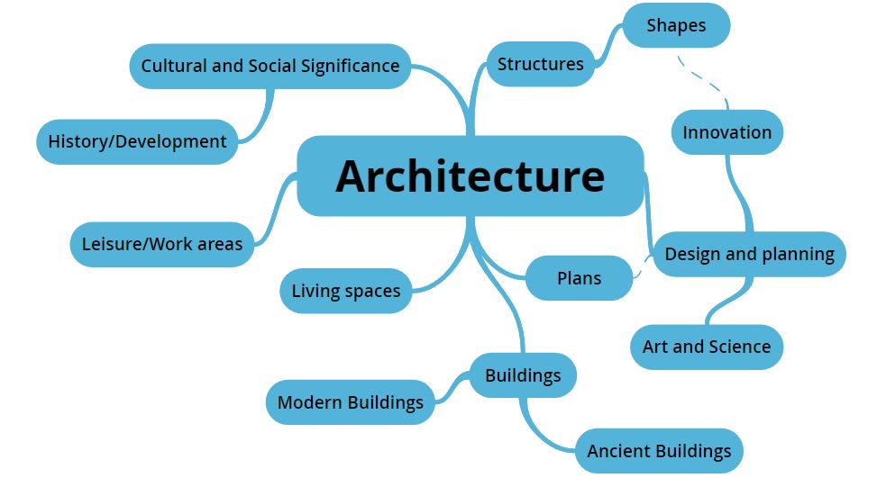
Architecture
"Throughout the history of photography, buildings have been highly valued photographic subjects, mirroring society's appreciation for architecture and its cultural significance. By the 1860s, architectural photography started to become an established visual medium."
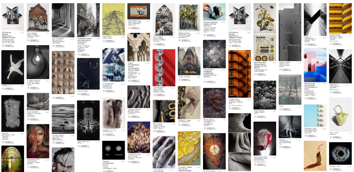
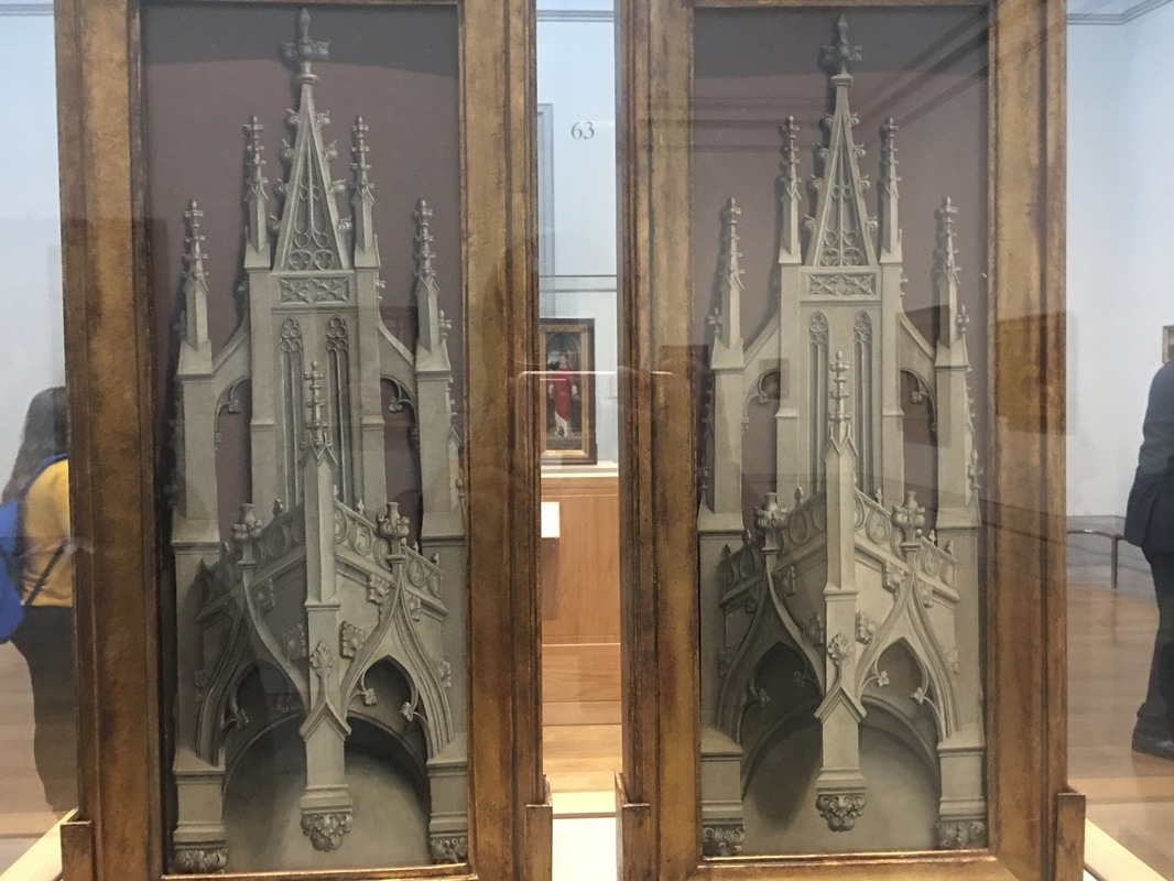
From the list of themes we were given to choose from, Architecture stood out to me as an option that would allow room for creativity and space to develop my ideas. Architecture has many branches that can be explored and it will be interesting to see what can be discovered. When I think of architecture, the first thing that comes to mind is creative and unusual buildings although there is much more to architecture than I'd initially thought of: my research started on pinterest, as shown below, and I found many new ideas.
In order to arrange my ideas and the certain aspects of architecture that interest me, I made a mind-map of the different sections of architecture I could explore as a starting point;
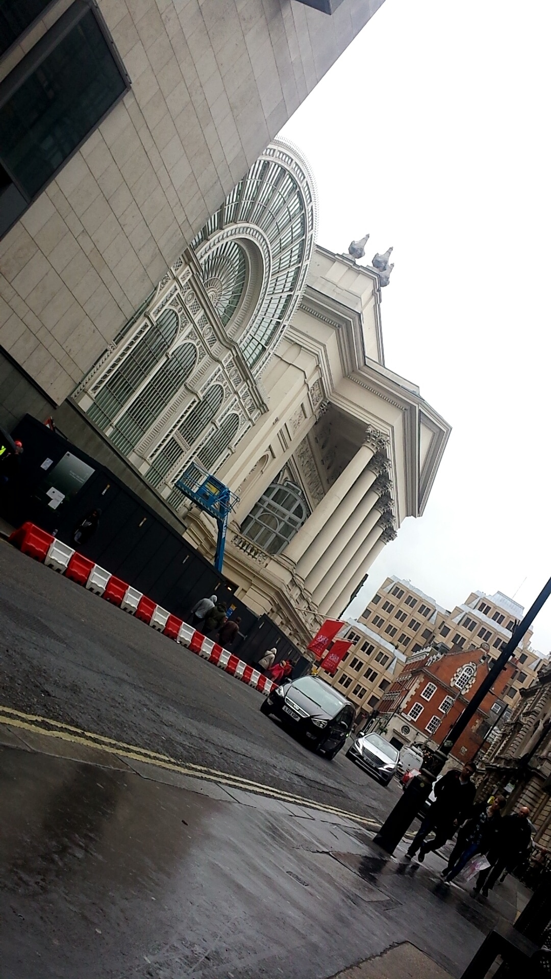
Images
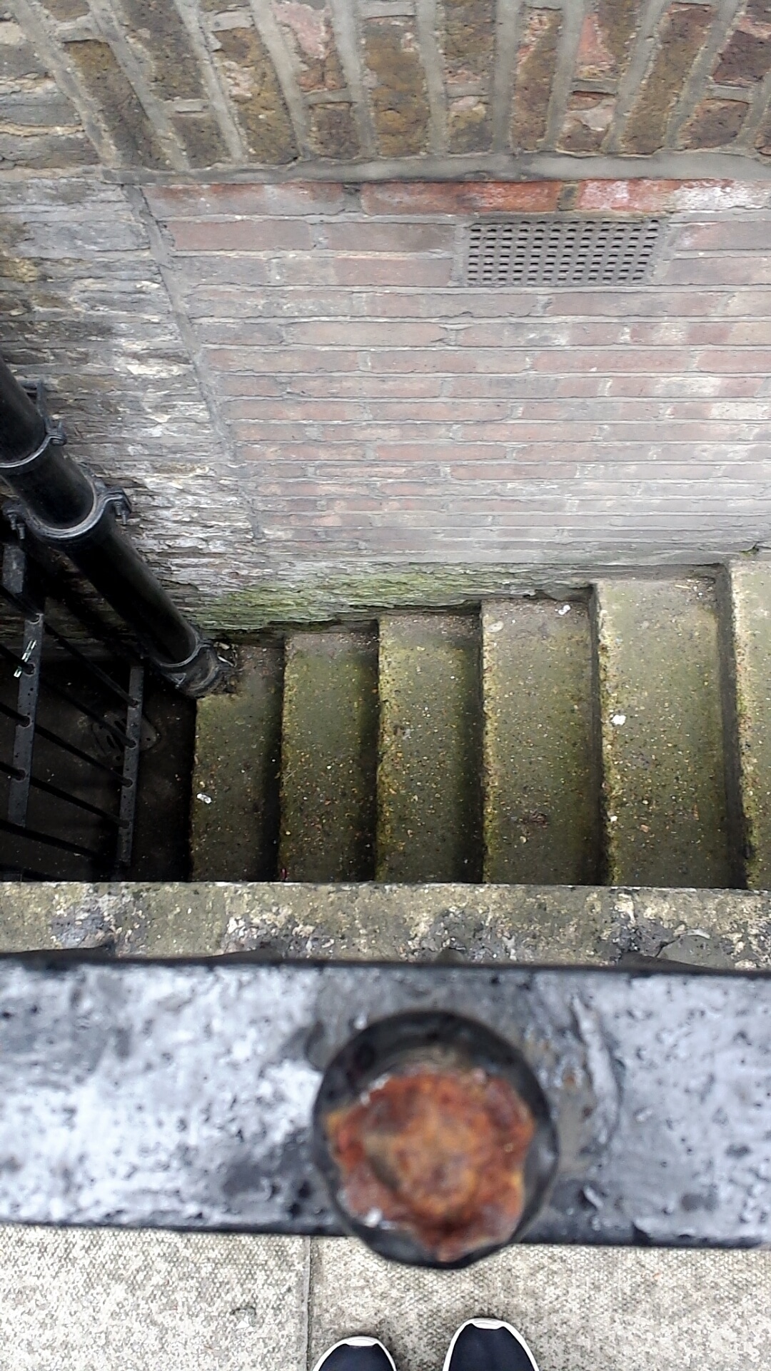
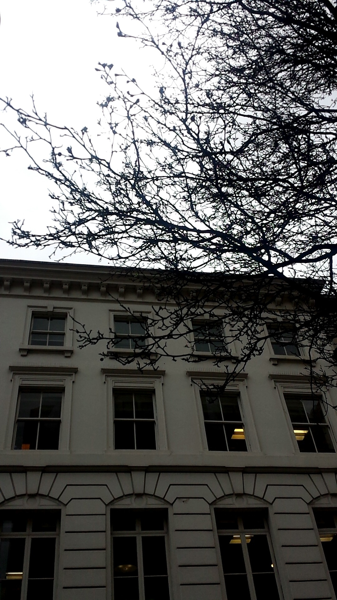
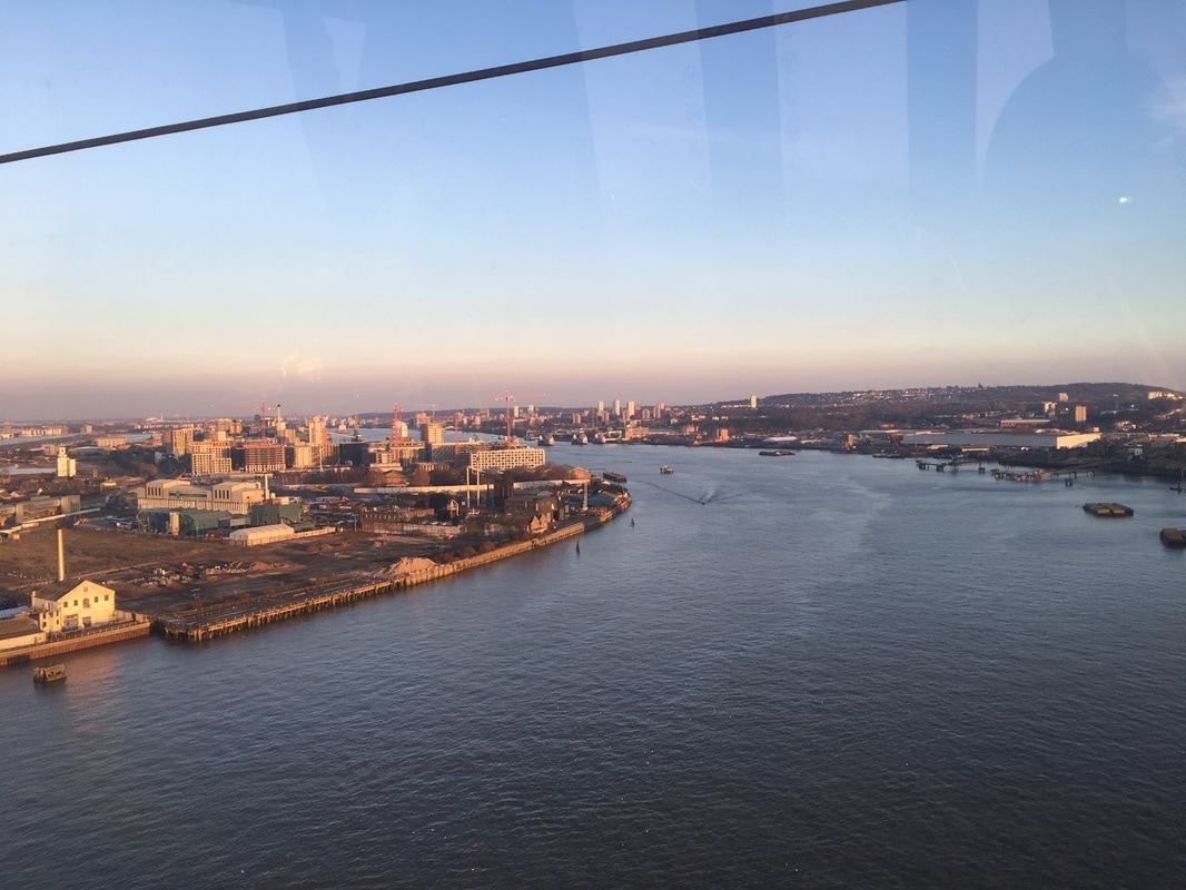


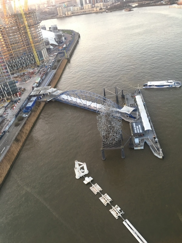

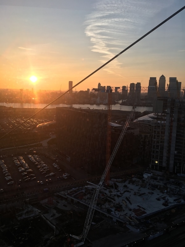
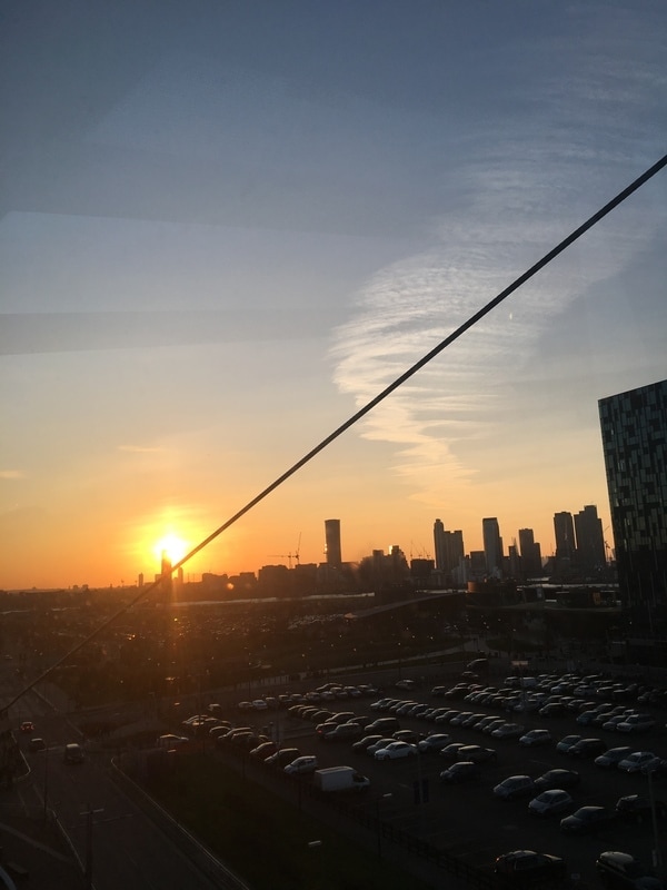
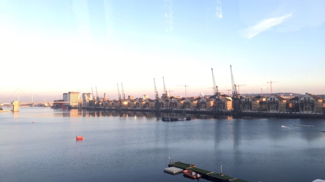
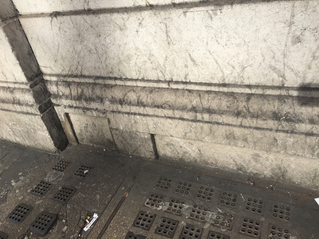
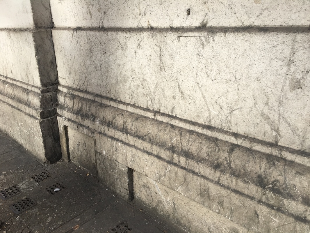
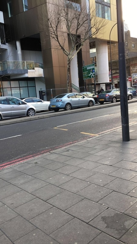
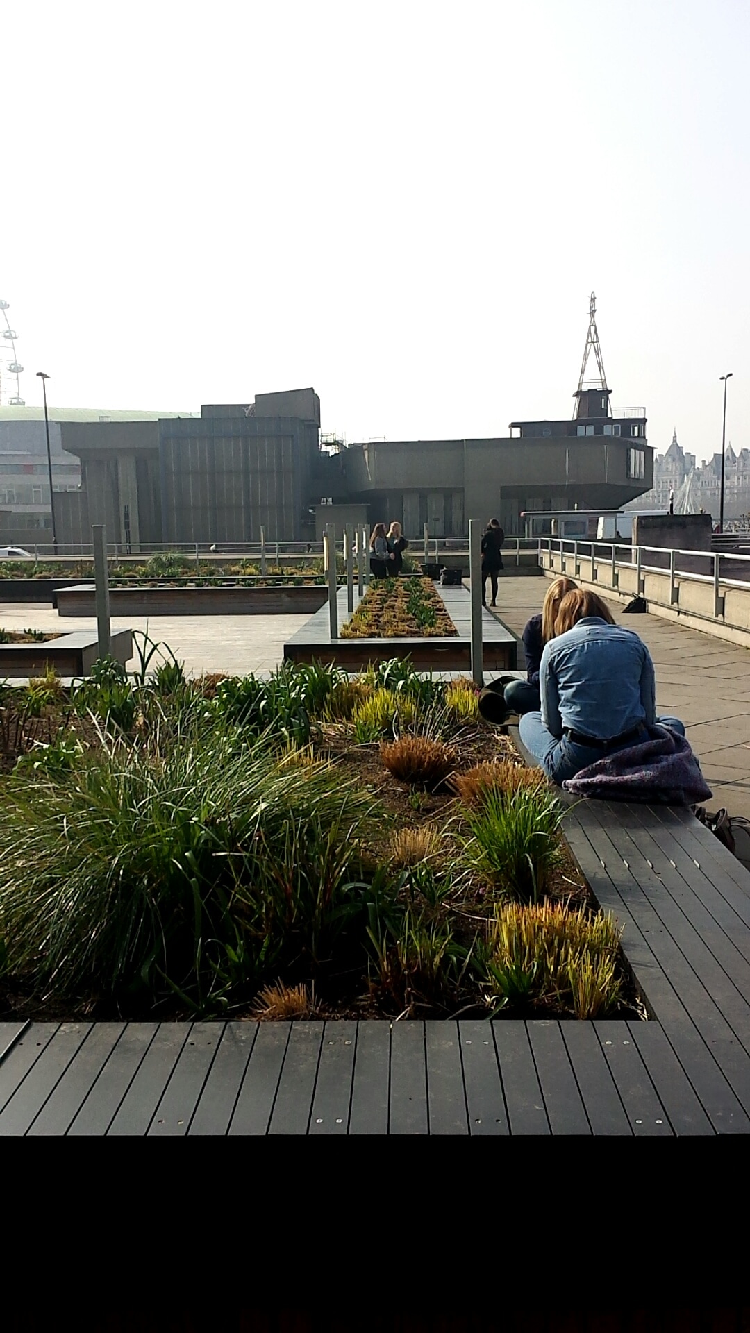

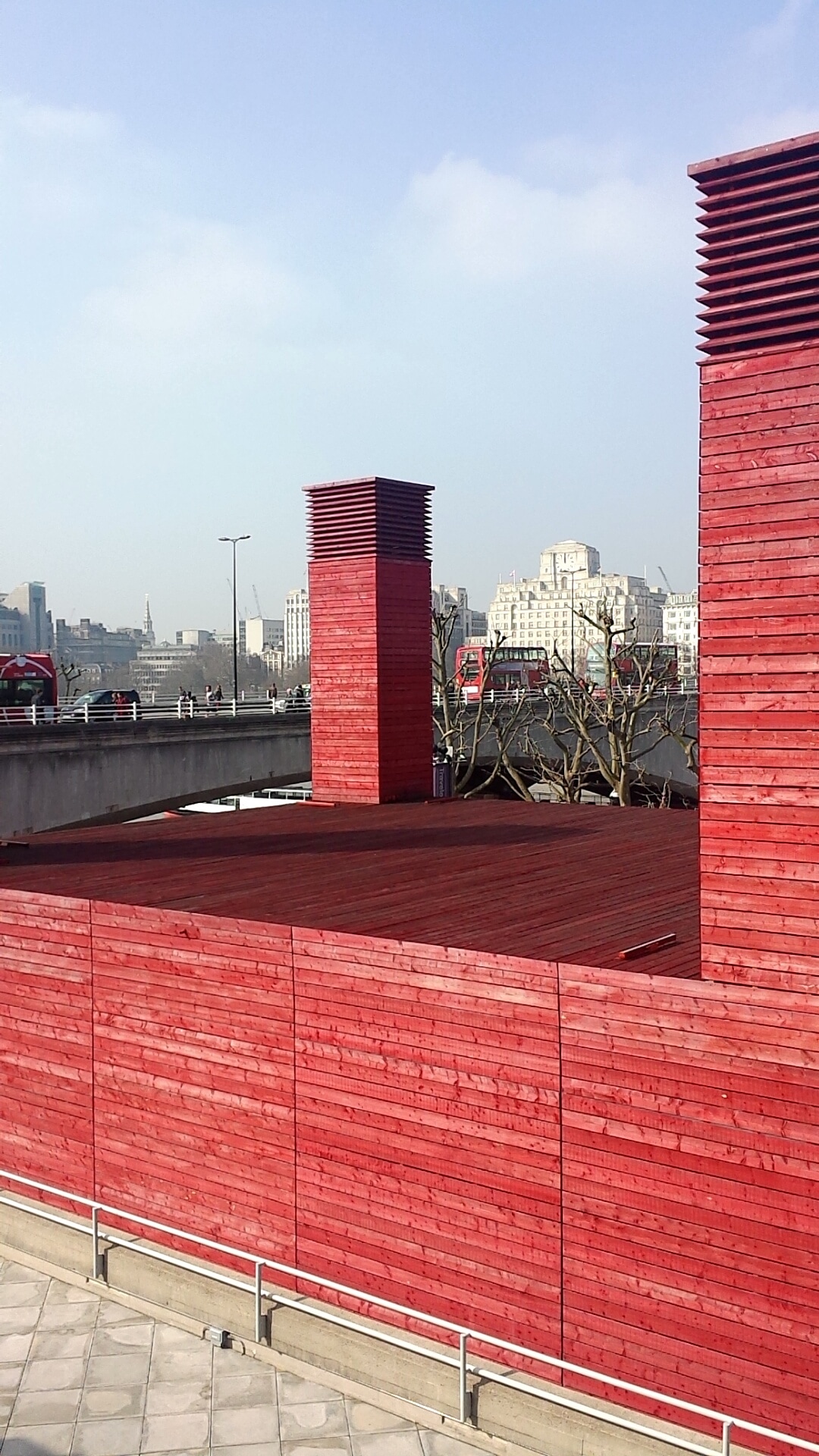
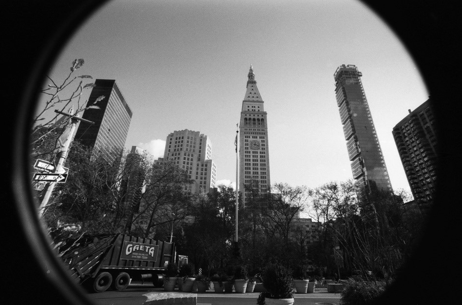
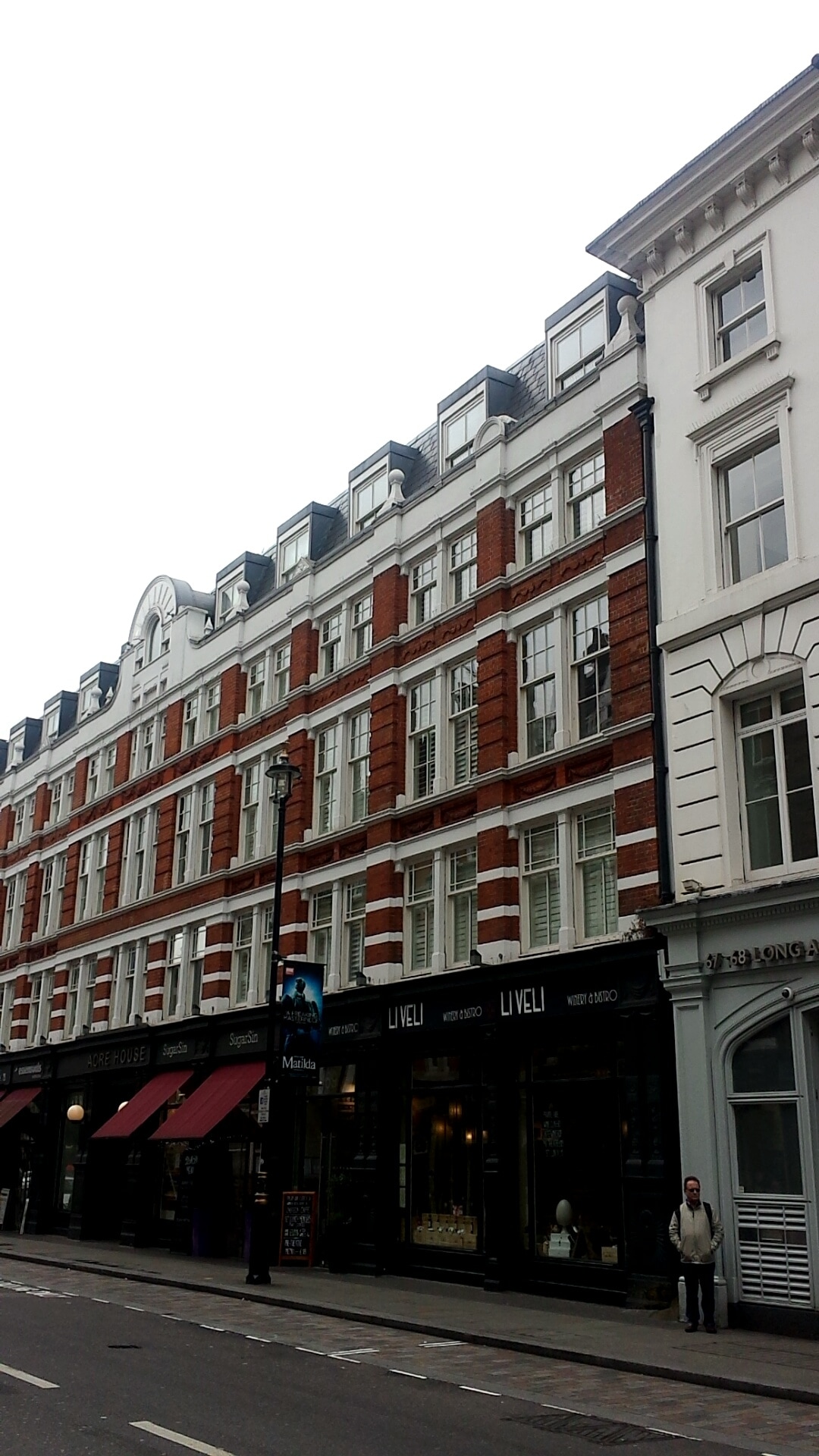
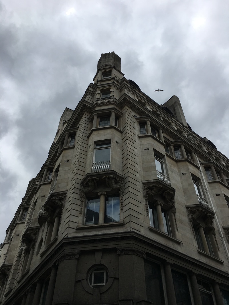
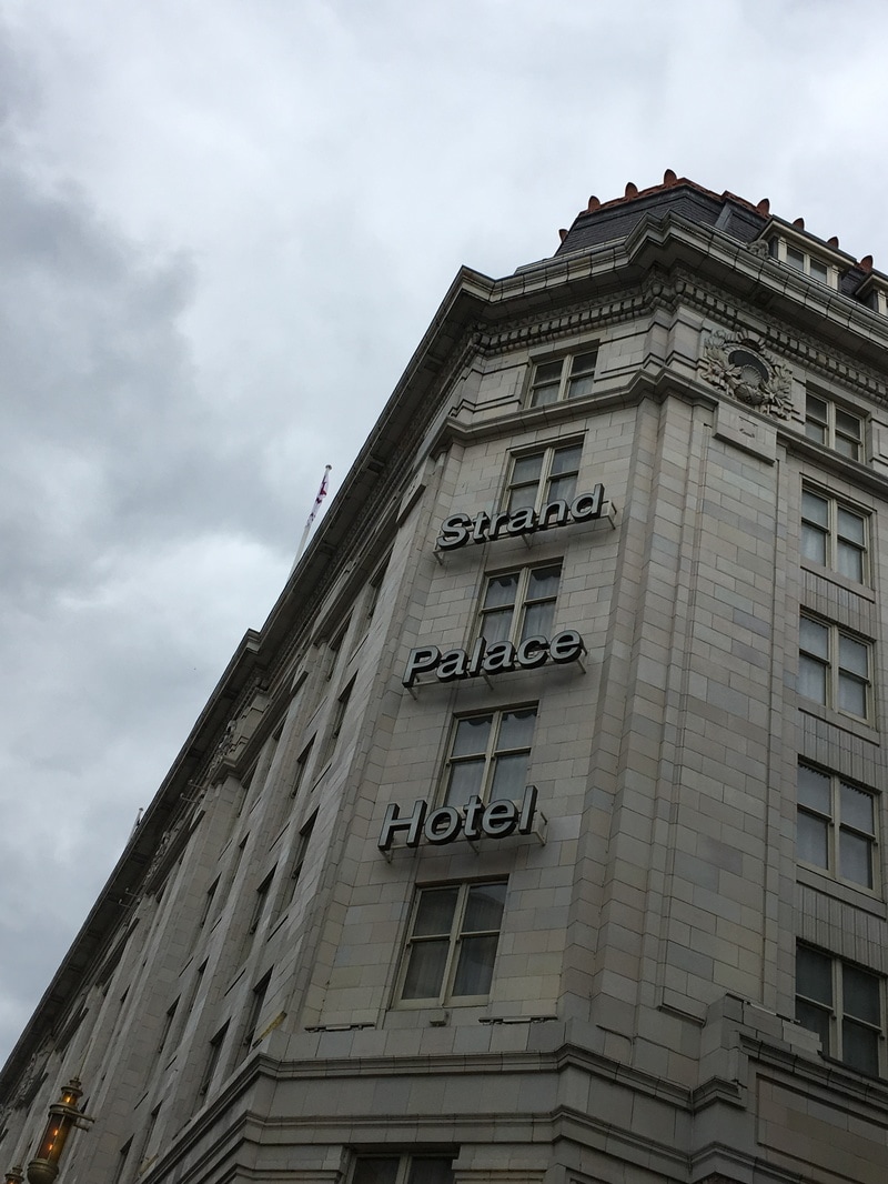
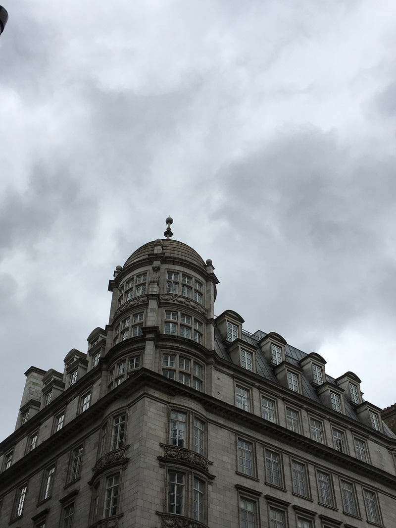
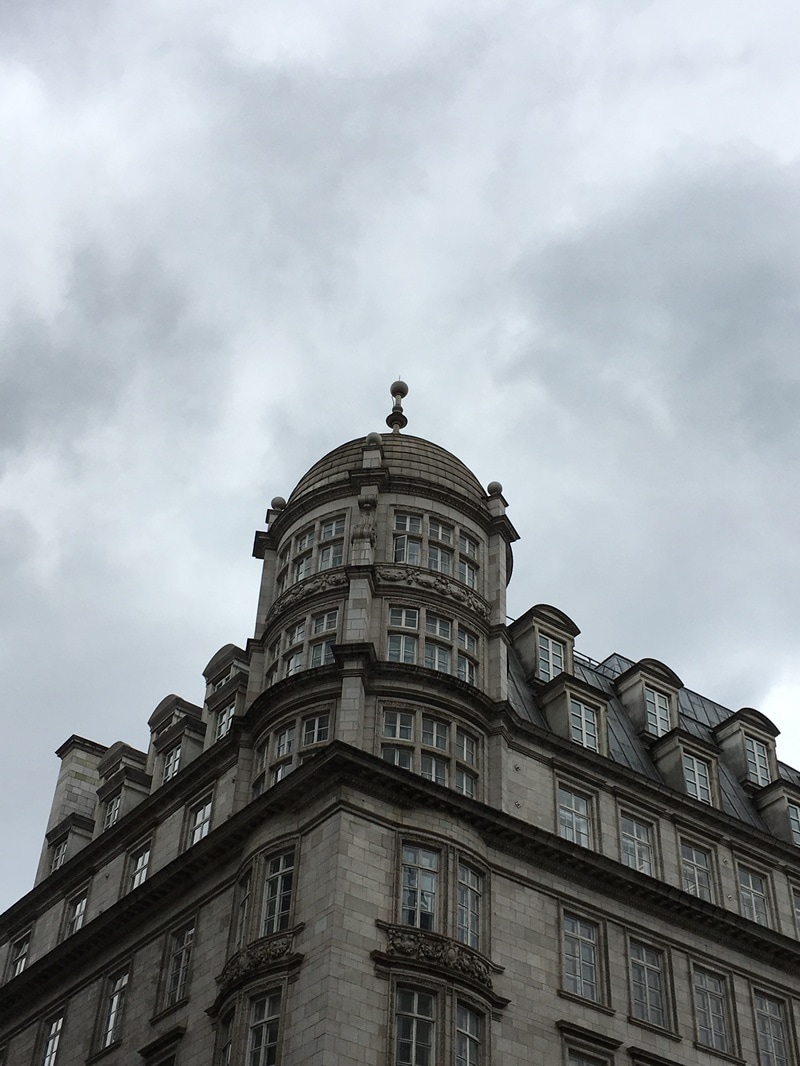
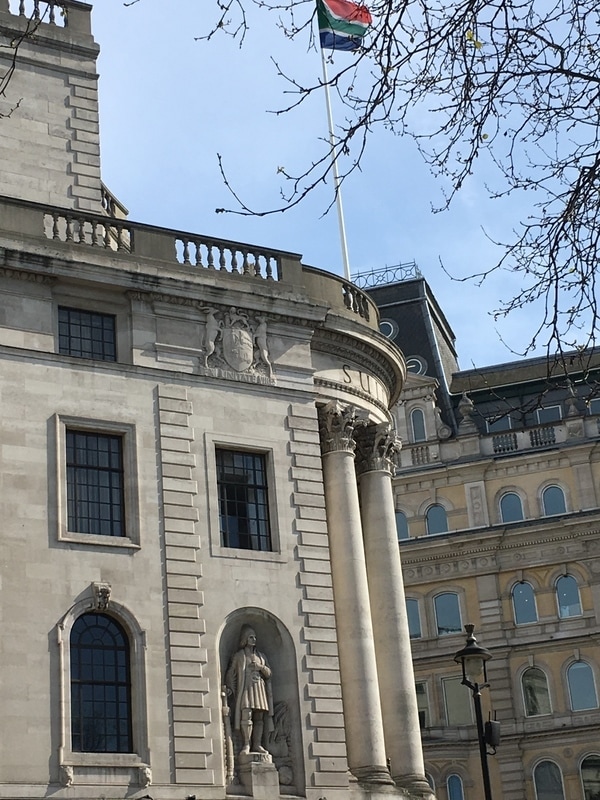
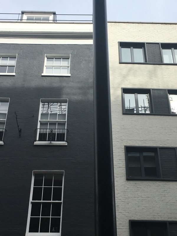
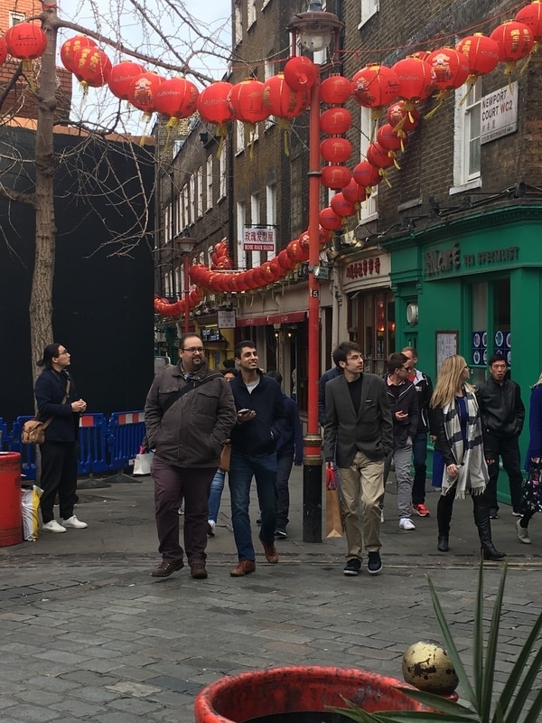
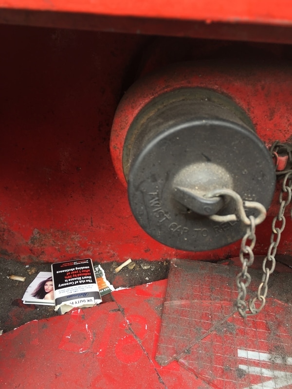
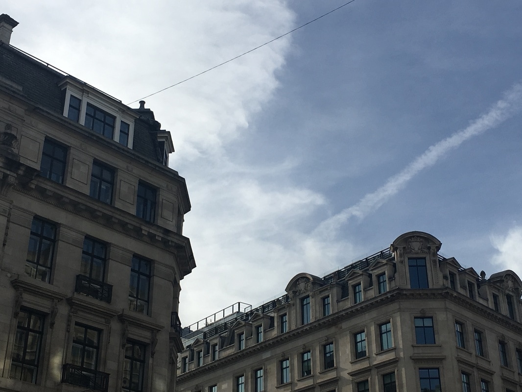
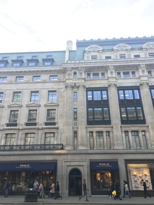
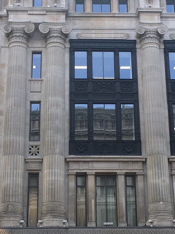
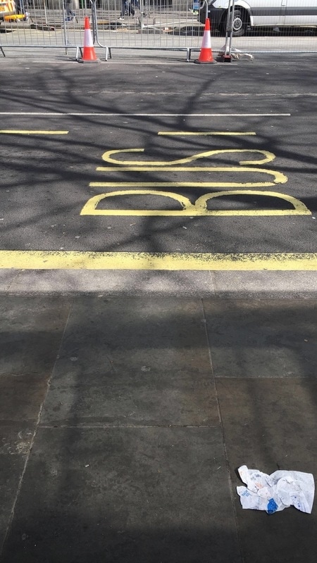
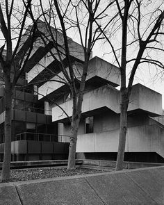
The images above are my first attempt at taking pictures without the research of artists or ideas and were taken across several days. I think that they show a general and unrefined display of architectural photography because I was mostly experimenting with what could be photographed to represent photography. Some of the images turned out better than others since some of it was aimless picture taking, rather than looking for a specific subject and considering the contents of the image with the motive of a certain outcome.
The three images above suit each other very well, although the compositions of them could have been more thought through. What I like most is the fact that all the images represent the layout of a section of buildings together and the middle image also contains construction equipment which puts to light the process by which all these images are here.
Berenice Abbott
|
|
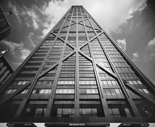
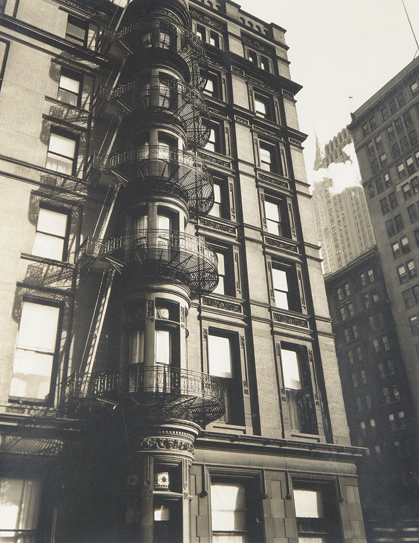
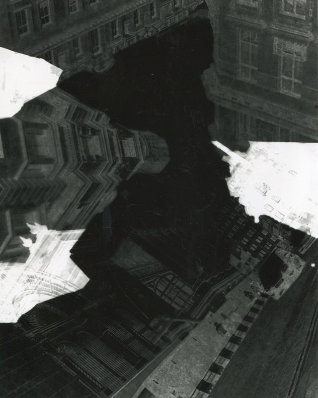
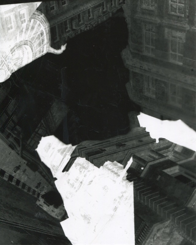
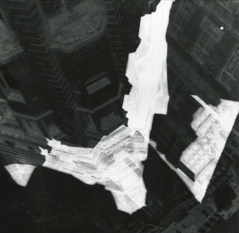
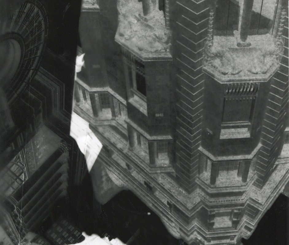
Berenice Abbott is a photographer who supported the idea that images should not be manipulated, whether it is the pictures content or development, known as the 'straight photography movement'. Abbott also did not favor pictorial-ism. Her own work often displayed the expansion of technology and society. The images to the side supply content that is heavily architectural based which shows her interest in the structure of buildings. I enjoy the way she plays with angles to portray her pictures from a different perspective. The buildings seem magnified and appear overpowering in most areas. Abbott also invented equipment and one of her biggest contributions are a distorting easel which gives abnormal effects on images developed in the darkroom and the 'auto-pole'. What I most like about Abbott's work is her ability to present the buildings in such a detailed way that they leave a realistic impression. Her carefully chosen composition also adds to this. It is inspiring to know these are images of local streets and landmarks.
|
|
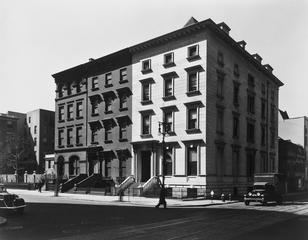
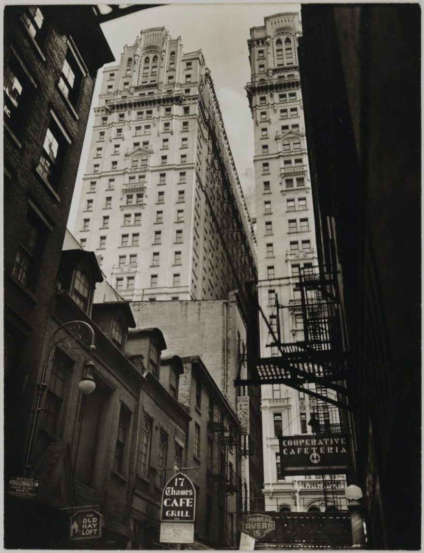
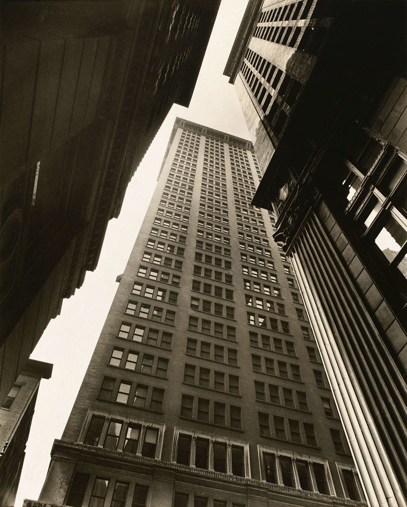
The image to the side, taken by Berenice Abbott is one of my favorites from her work. What struck me first was the contrast presented in the image, from the colour to the space and the size of the buildings. The display of the shape dynamic between the buildings additionally provides a prominent effect upon first sight. Each component of the image seems to be different but they have been placed in such a way that they compliment one another and result in this particularly distinct visual. The sky is empty and this makes the taller buildings appear even taller and substantial, as if they have proceeded the clouds. Because of the colour contrast to the shorter buildings they almost appear like trees rising from a forest. There are levels created within the image because of the way some of the buildings are angled which applies a three-dimensional characteristic to image. I think my favourite thing about the image is the outline of shape created by each building. I would like to explore with taking images of my own that resemble this and to experiment with cutting out the outline and investigate another method to develop it.
|

|
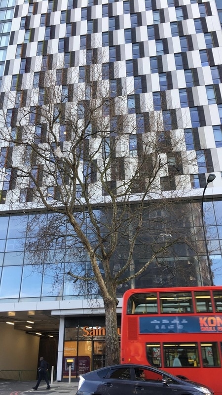
Images 2.0
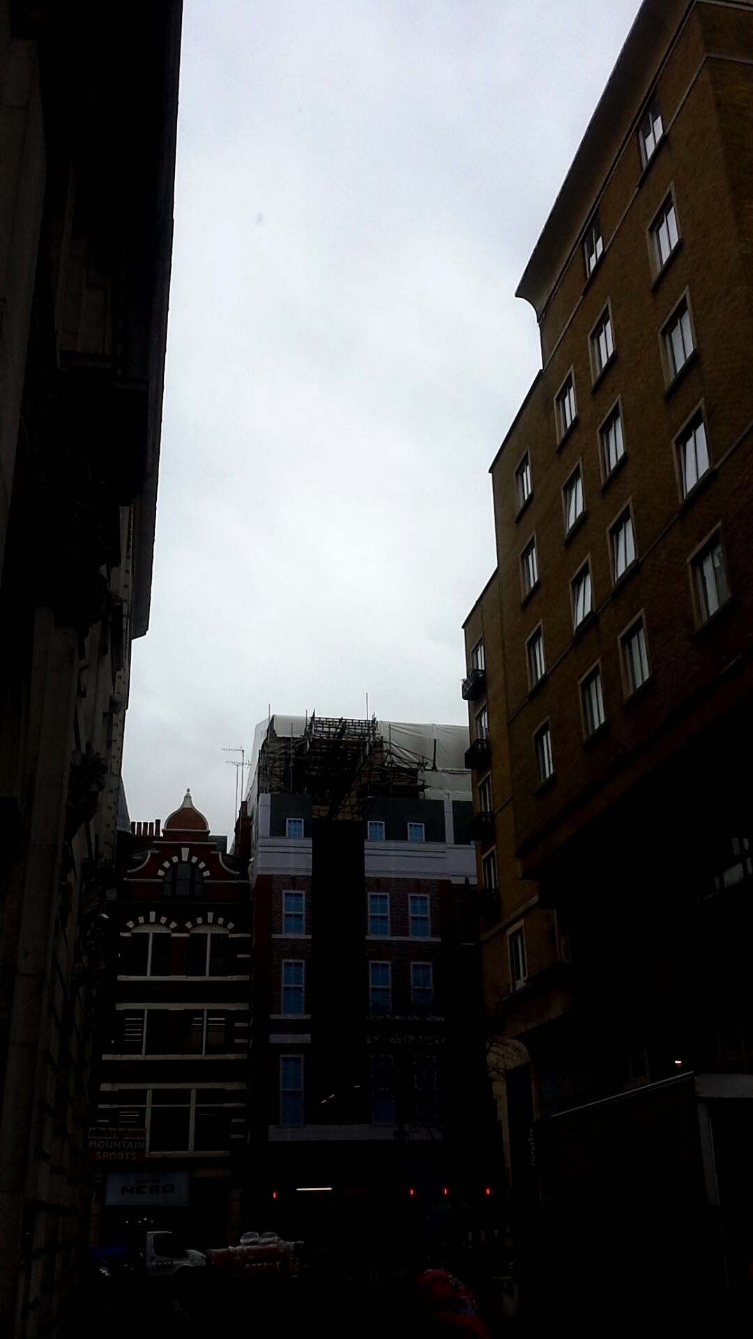
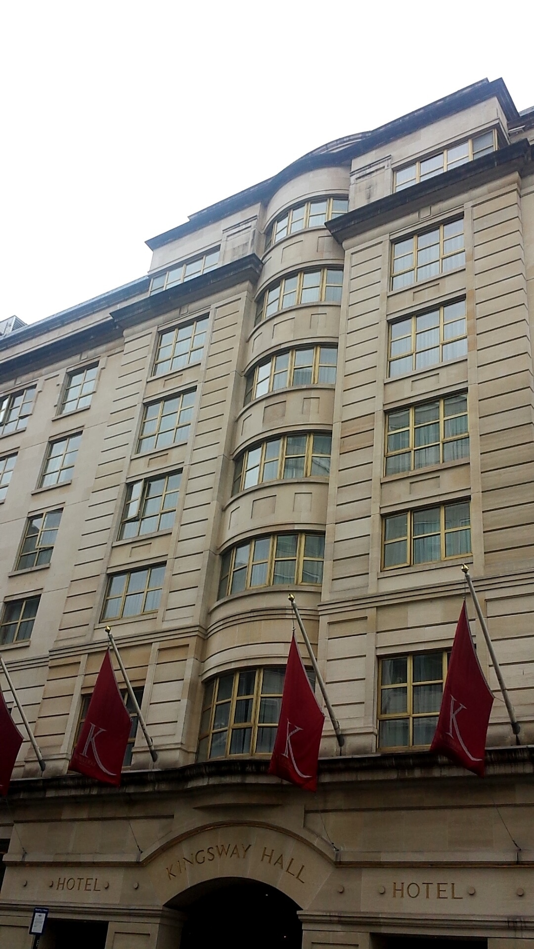
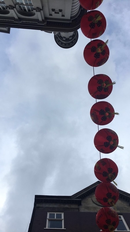
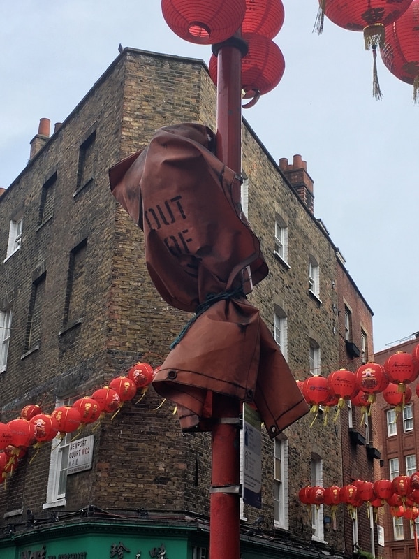
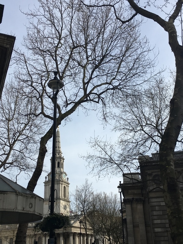
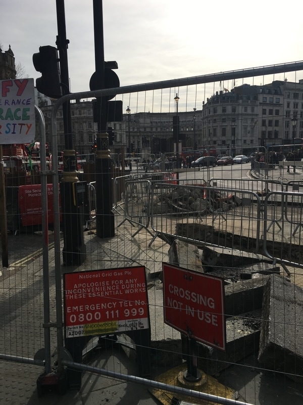
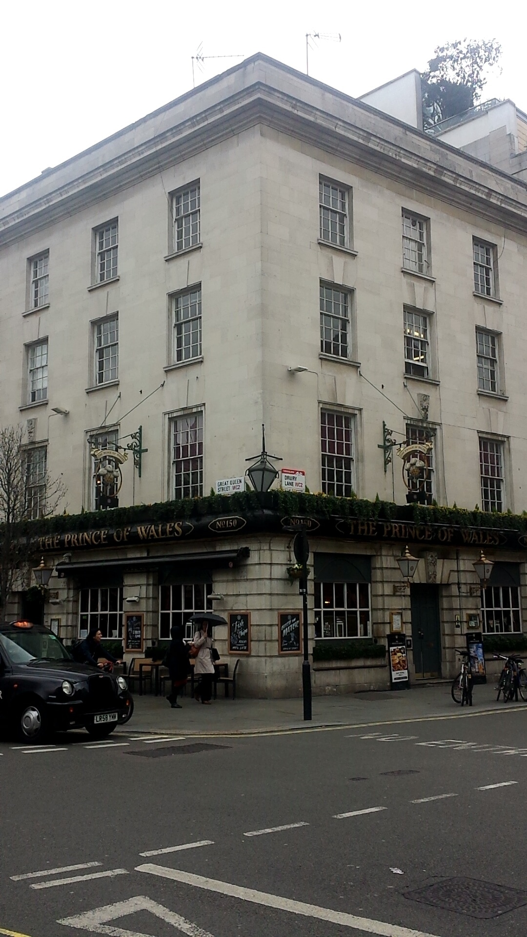
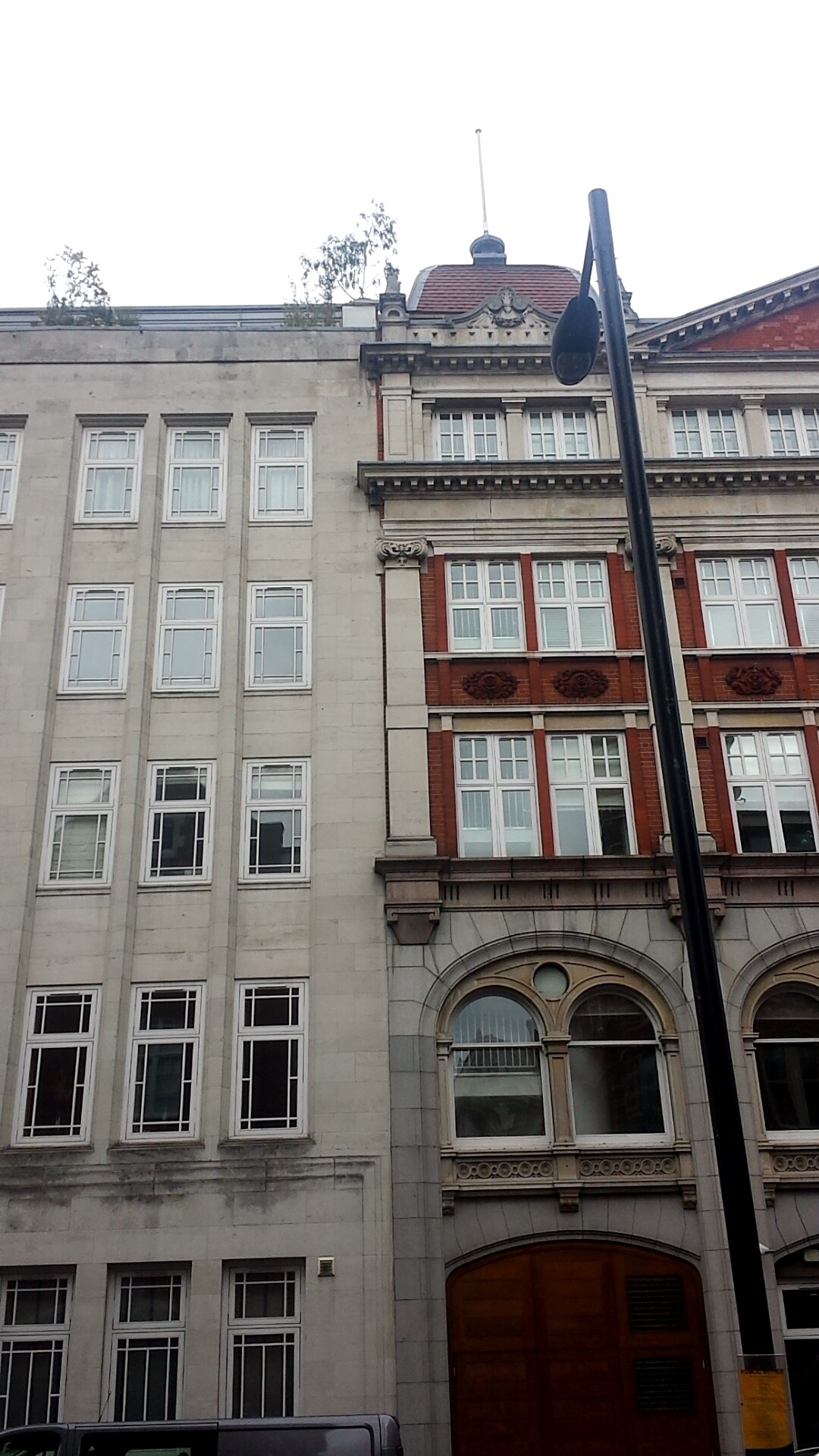
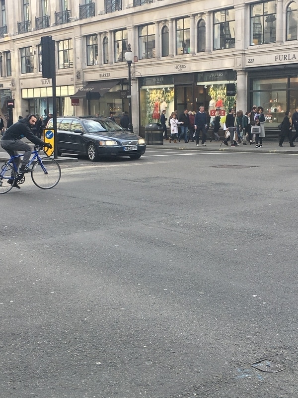
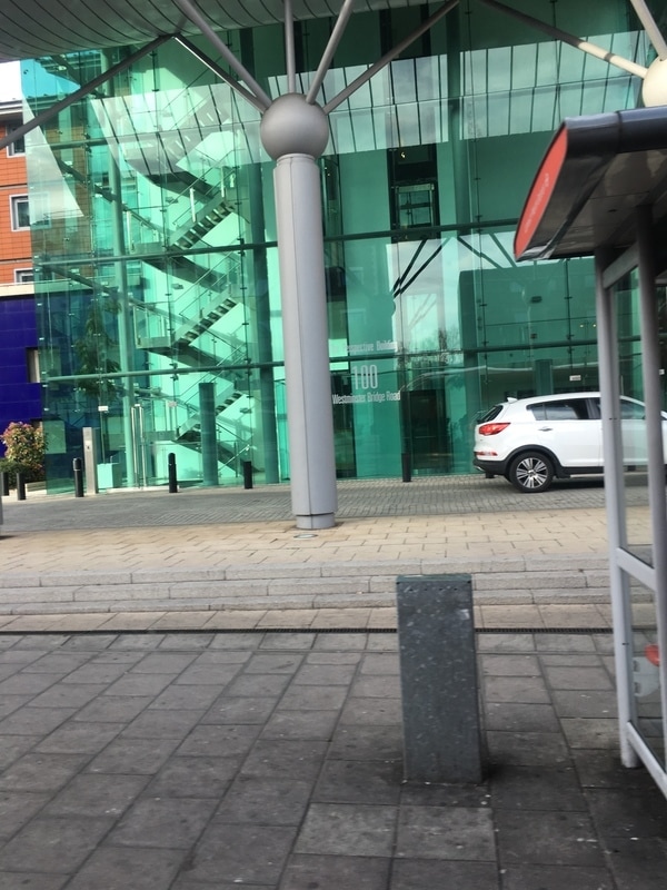
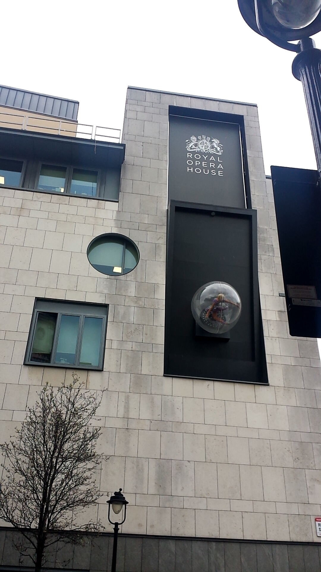
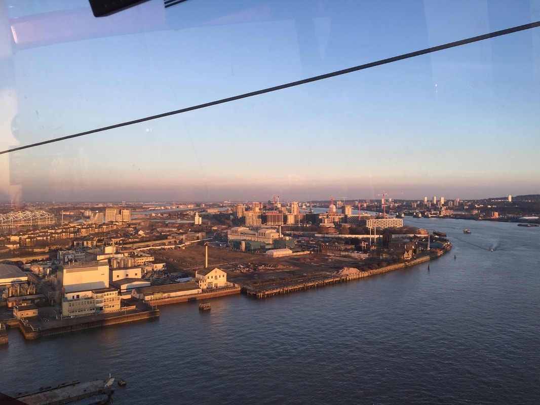
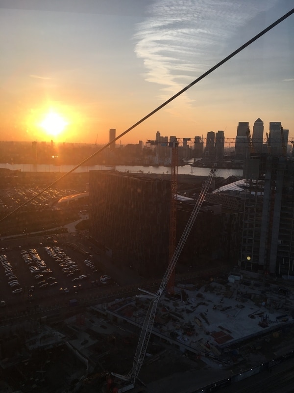
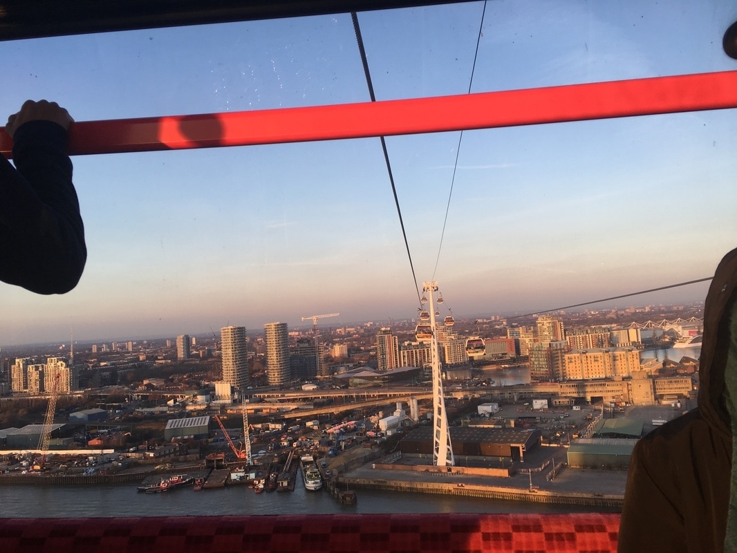
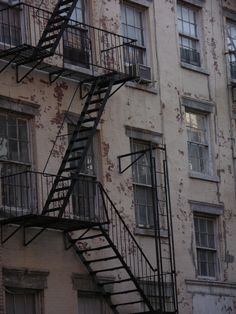
I took the images above on a weekend out to central London and I tried to use Berenice Abbott as inspiration. Some of my images were taken because the subject interested me and reminded me of my theme. I still need to refine the process in which I take my images and also put in more initial thought before taking the picture so I can form rational composition and use the components of my image as best I can. Despite this, I think there were some images that turned out good.
Idea 1: Outline
|
|
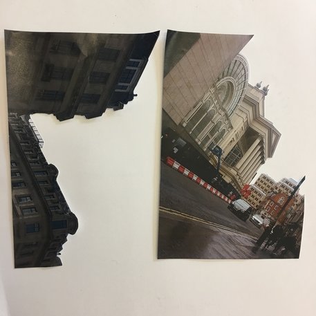
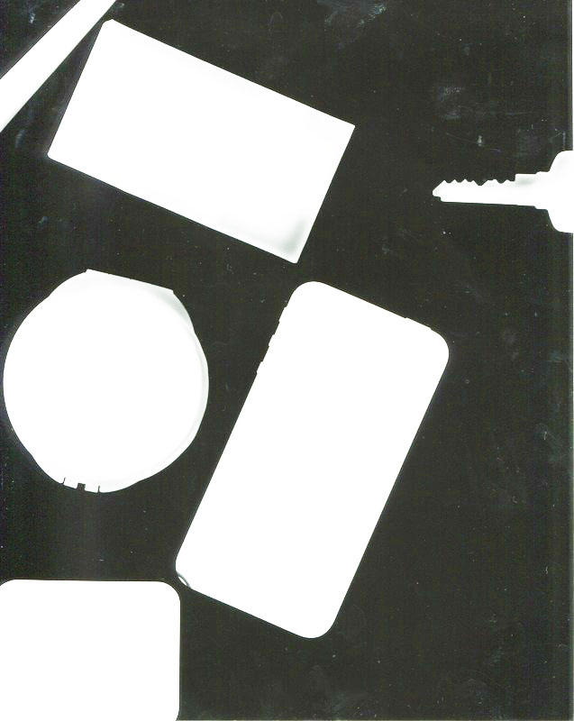
Because I was inspired by the shapes and edges created by Berenice Abbott's work, I thought it would be interesting to take some of my own images with the best outlines of buildings and to separate the the building from its background. From this, I used the outlines of two pictures above for an experiment with photograms. The images were place onto the film in various compositions, sometimes by themselves and other times layered and joined in one photogram. I really appreciate the outcomes of these images because they really show a completely different side to the images that were initially taken;
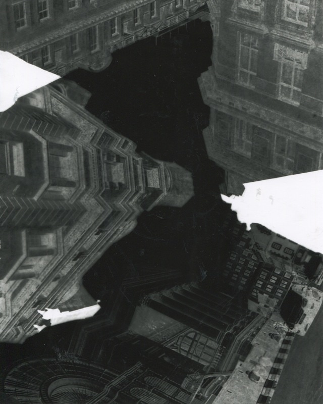

The pictures above share a sense of distortion and give the impression that they are underwater. I love this effect because the buildings that have been constructed and made to look a certain way have been completely destroyed and it is almost as if new constructions have been made. If you look closely, you can still see the original building in some areas. The dark sections where the film paper was fully exposed to the light has made a new and interesting outline but this creates visual of a building itself. This is the same for parts where the image is darker and the paper has been under-exposed (this effect was likely where two or more parts of images was layered). The buildings feel as though they were pictured from a low angle, and they look as if they are magnified by the position of the 'camera'. Also, the perversion of the original images combined with the influence of the photogram process has made the images to look as if they have been taken underwater since the surface of the image is disturbed and resembles the waves within water. Alternatively, it seems as if ink has been spilled on an image; corrupting it. In some cases, where there are lighter section, there is an impression that the photogram has been scratched out.
Overall, I am very pleased with these images.
Overall, I am very pleased with these images.
Stephanie Jung
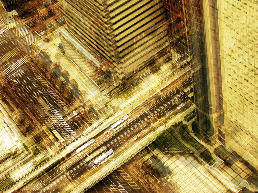
Stephanie Jung is a freelance photographer who focuses on travelling and taking images of cities and capturing moments of time that will be forgotten. Her images are very busy and vibrant, there is a stress and confusion but exhilaration about her images because of the high contrast and brightness. She expresses the hectic nature of a city with people rushing and transport and light by using a multiplier effect or multiple exposure. Her images are not solely focused on architecture but do consist of many images that relate to the topic and I find the vivid portrayal of the cities very capturing and intriguing.
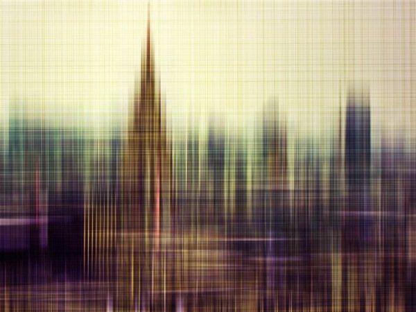

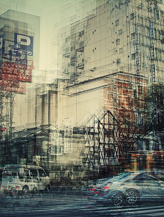
The muted (although still bright) colours of this image create a serene and fluent sentiment within the image. Patterns created because of the effect used on the image cause repetition and uniform within the image. I think what would have been a simple image has been turned into a energetic parallel because of the multiplication of everything. The enhancement of lines over crossing and perpendicular lines creates a disrupted geometric effect, the image seems very soft and delicate despite this. My favourite part of this image is the detail, which is faint but is there. You can see road line, bushes, benches and even people regardless of the distorting impact and the height or angle the image was taken at.
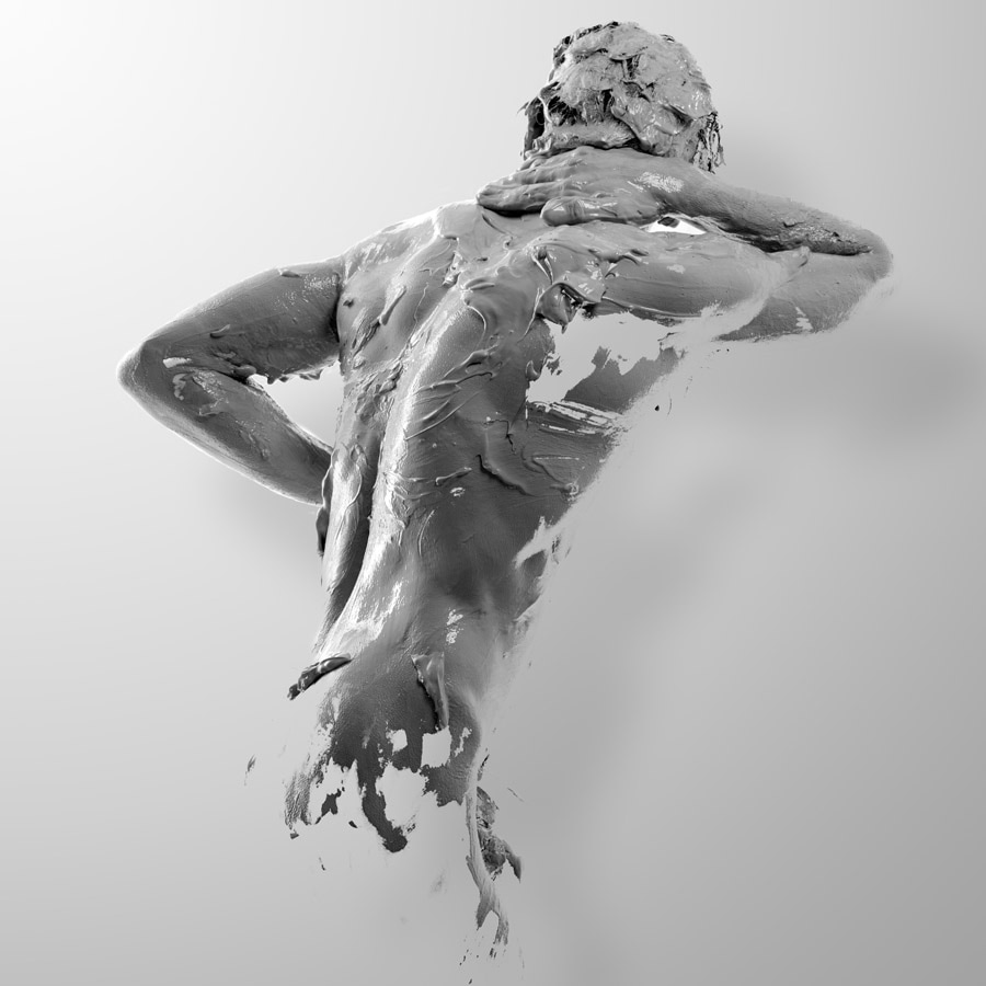
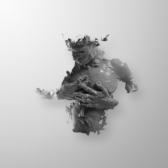
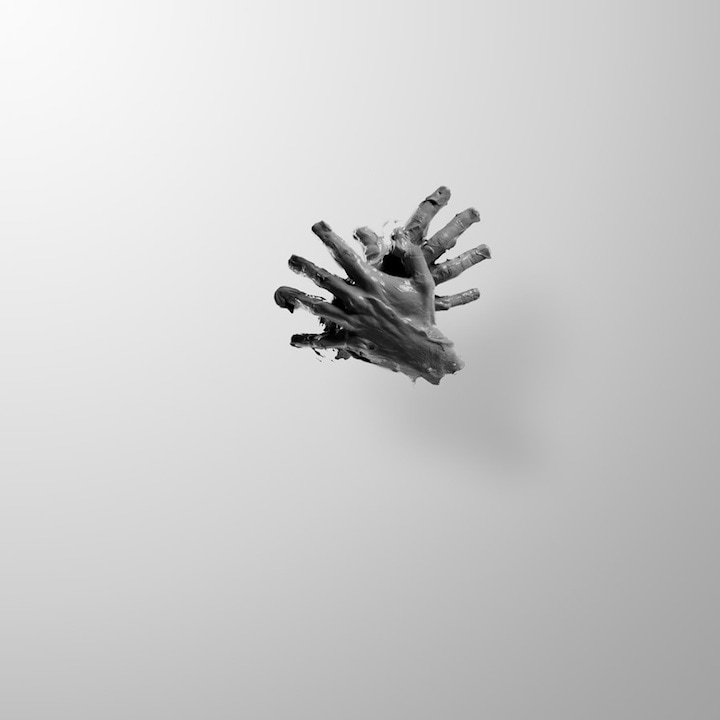
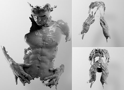
ALEJANDRO MAESTRE
|
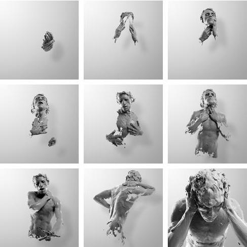
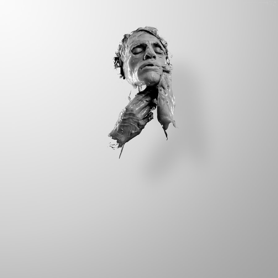
Alejandro Maestro Gasteazi is an artist who used elements of sculpting and Photoshop to create the images on the side. I find the images very visually pleasing, but they also display creativity and I especially found the odd presentation of the model intriguing. At first, I imagined it to be a model covered in mud or a liquid that resembled the material of ordinary statue the poses also appear like the cliché of real-life statues and this lead to my initial opinion. However, upon further study, I realized that the model could be covered in lather and maybe be carrying out the actions of washing(washing his face, hair and body lead to the positions that he has been captured in). This type of photography has caught my attention because my original mind-map of different areas of architectural photography contained sculptures/sculpting. Maestro's potential use of the actions that make up washing routines also links to architecture because the word could mean "the complex or carefully designed structure of something". I want to be able to explore this technique more and see how much I can develop on it or interpret it in my own style.
|
|

Experimentation; Model Statue
To try an imitate Alejandro Maestro's work, I used a classmate as a model and asked them to pose how they would imagine a statue is shaped. There were some interesting outcomes and I liked the shapes made with her body. I wanted to isolate her, so I used Photoshop to attempt this.
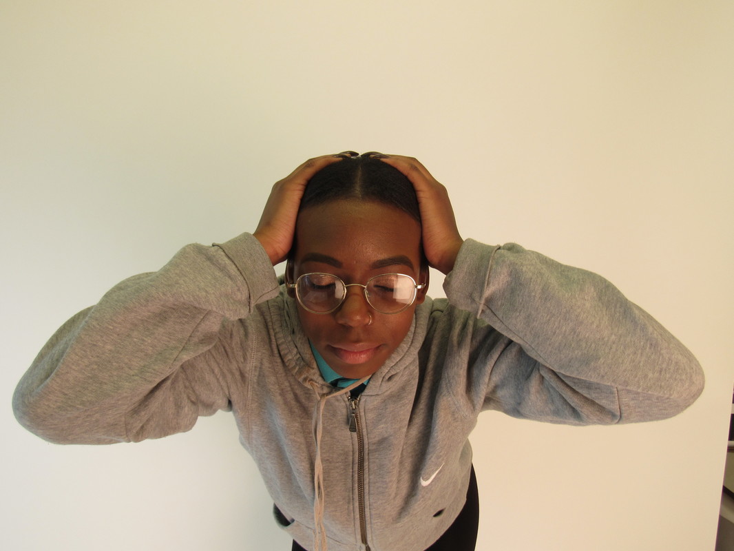
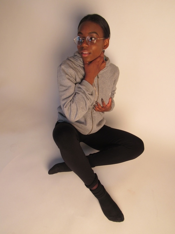
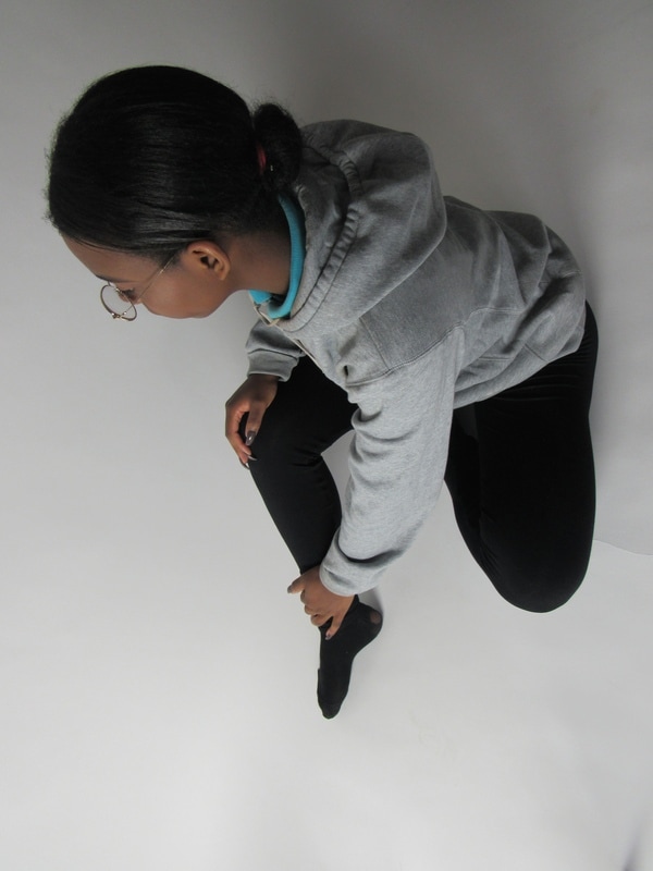
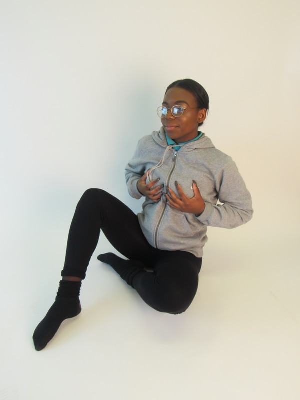
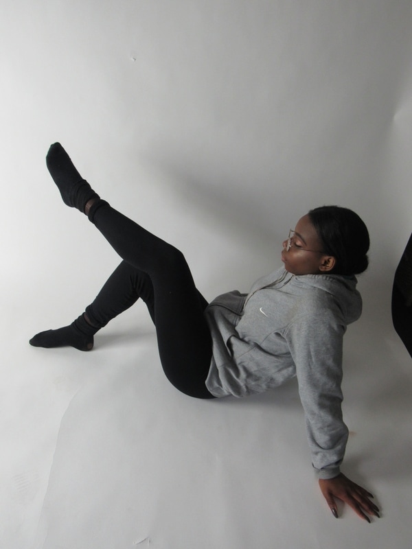
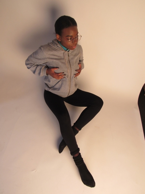
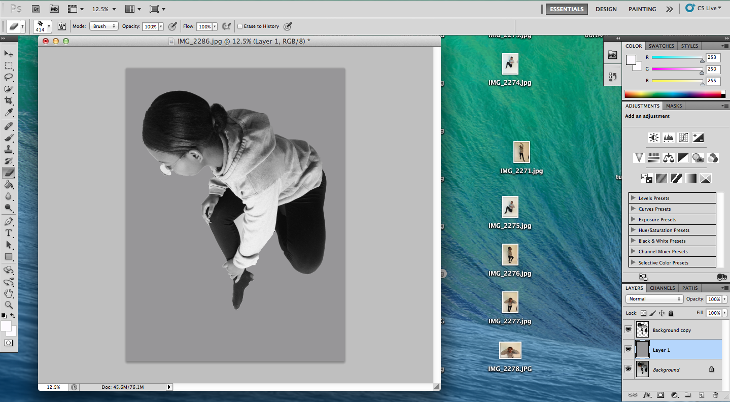
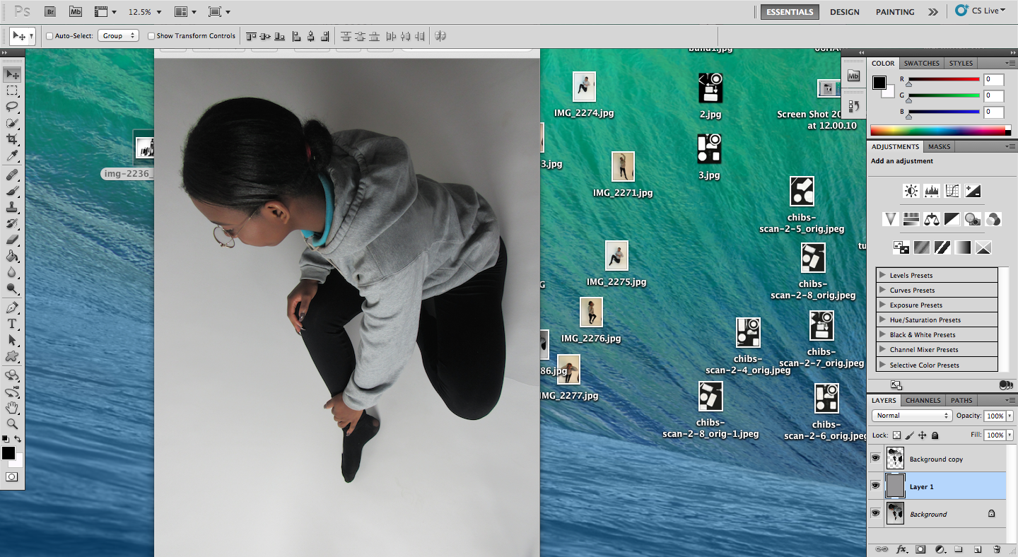
The outcome was not how I had imagined it and it seems unrefined. However, using selection tools to remove everything in the image that was not the model and putting this against a grey background highlighted the angles and shapes. The model also looks more three dimensional. Overall, this experiment did not go where I wanted it to.
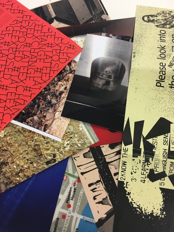
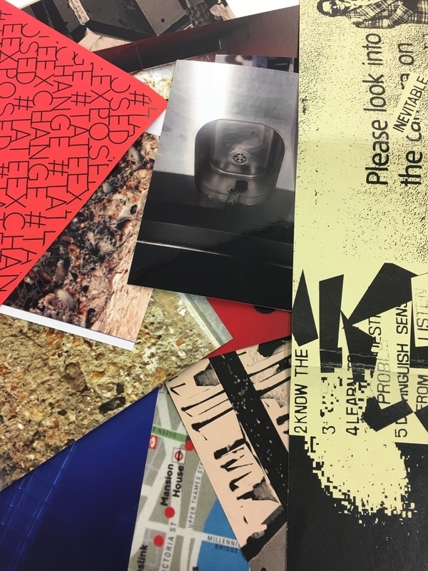
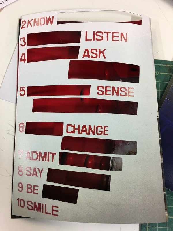
Fanzines
During class, we were given collections of card from Tate gallery and other materials to create a personal magazine made only from the materials given to us. I enjoyed this project because it allowed me to be creative without limits and worry of making a mistake. Some of the techniques I used were cutting out and replacing in another part of my fanzine, overlapping materials and creating windows as well as making messages with letters from certain areas.
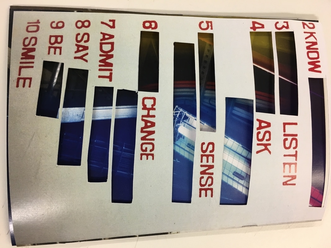

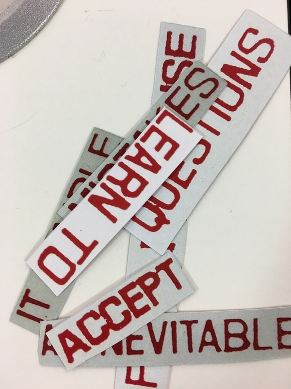
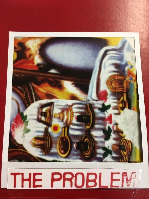
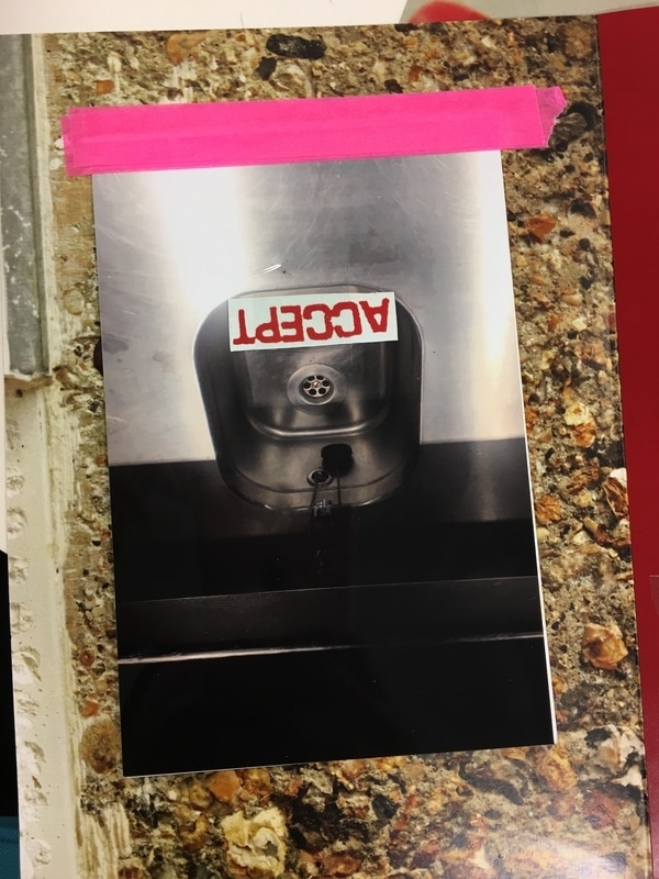
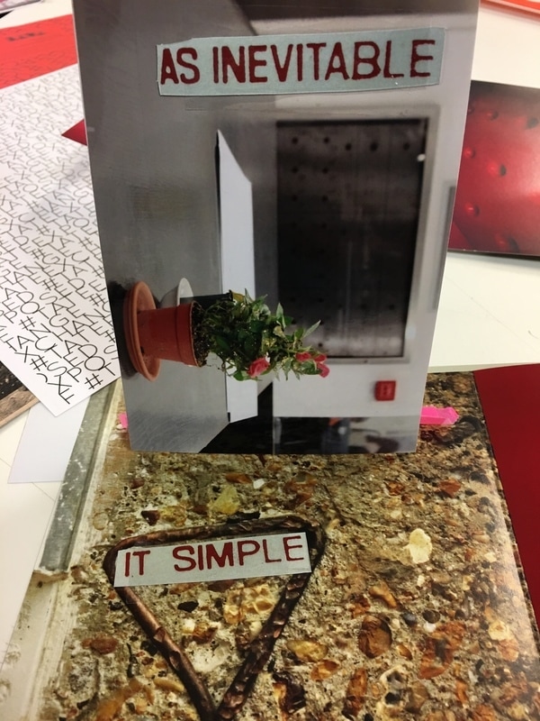
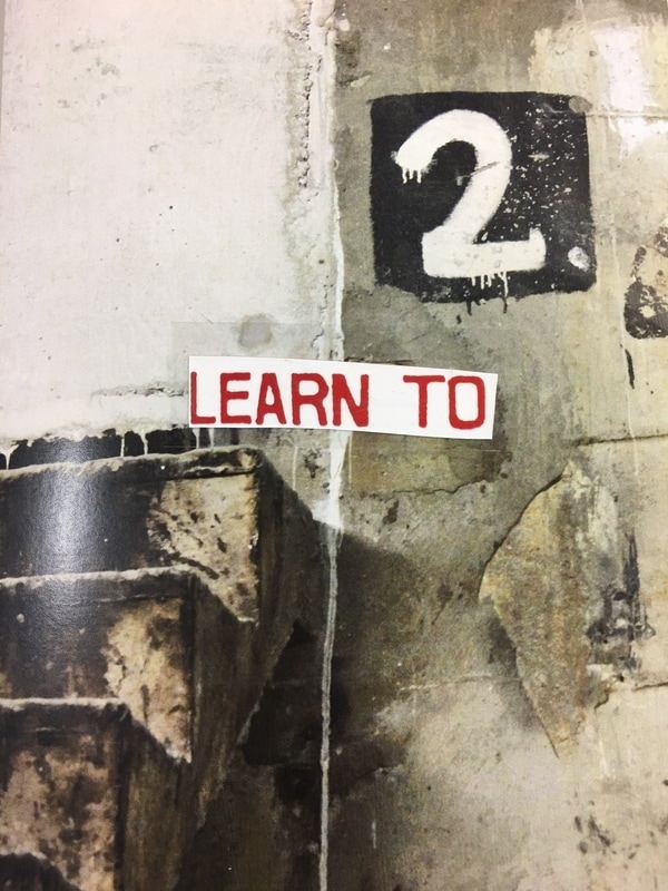
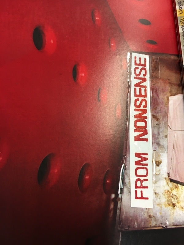
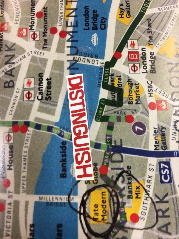
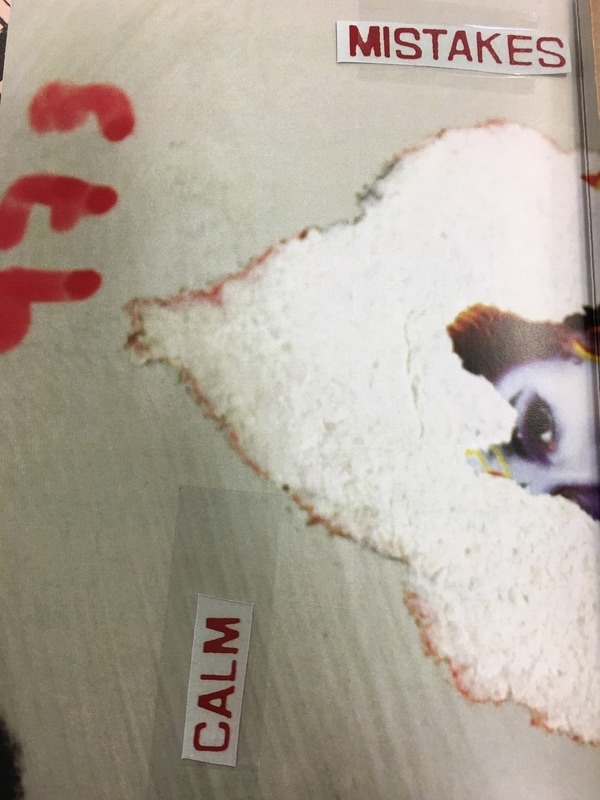
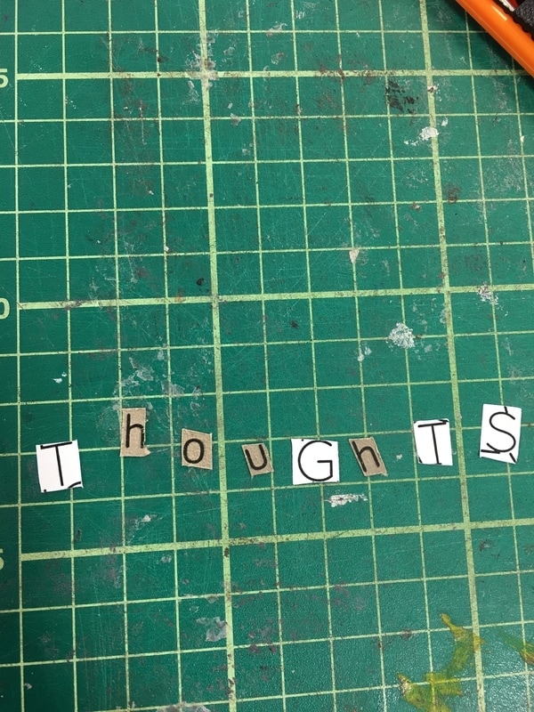
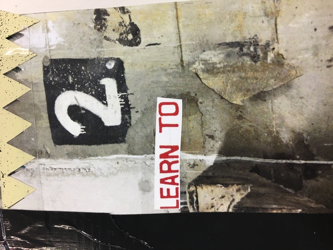
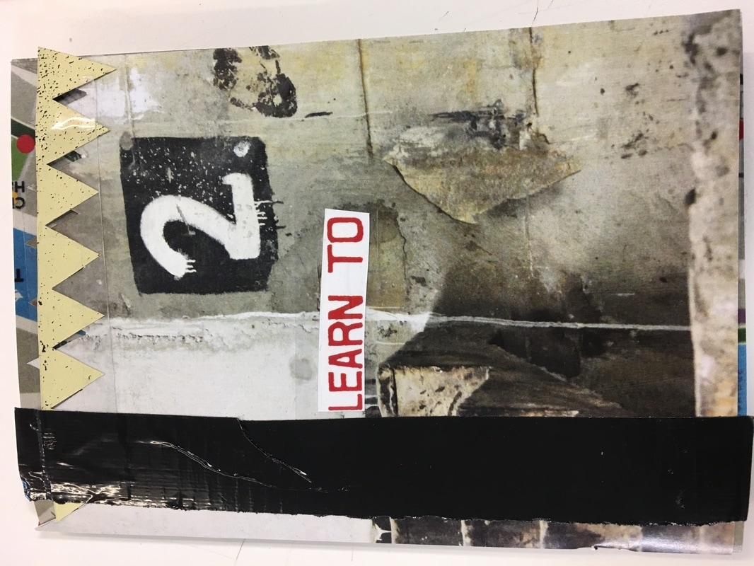
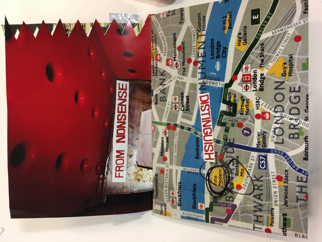
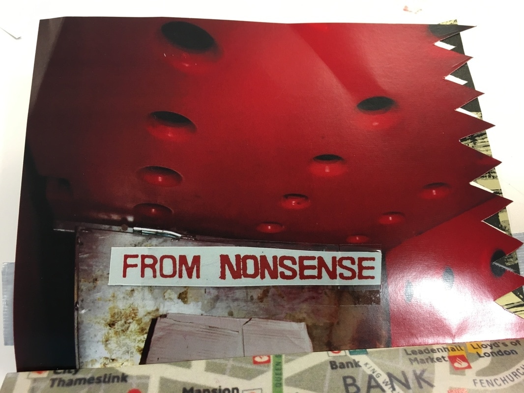
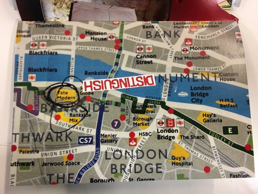
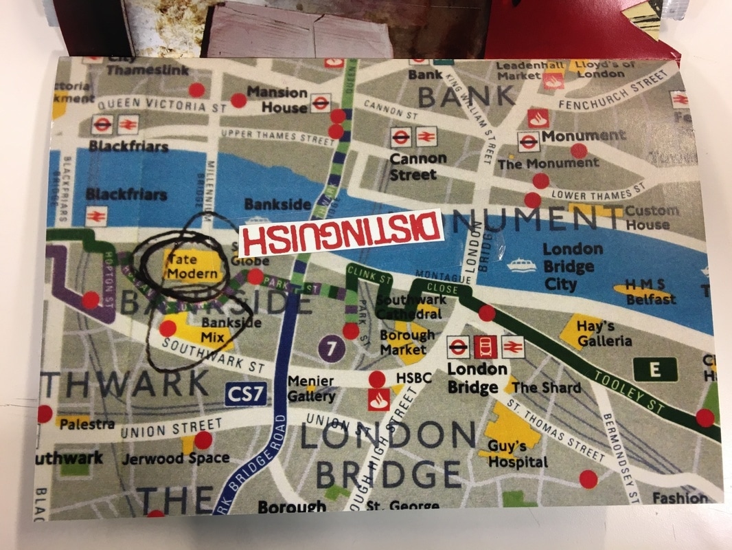
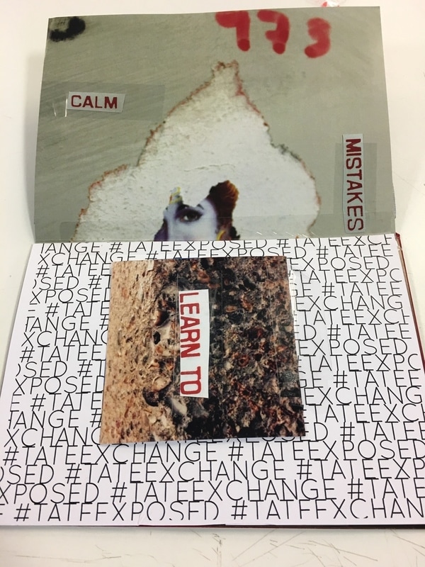
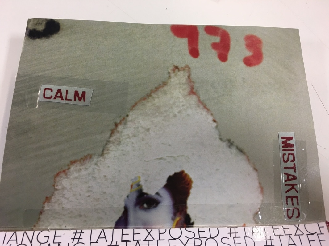
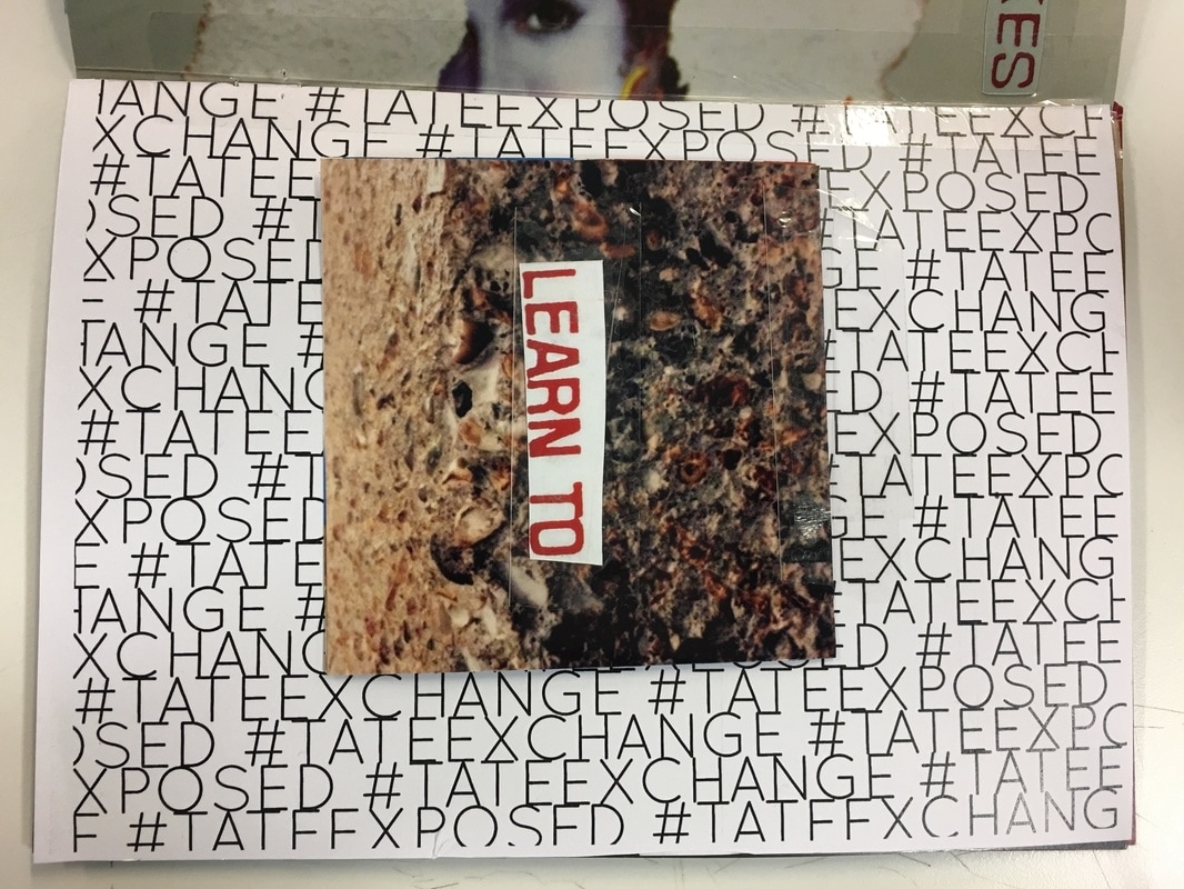
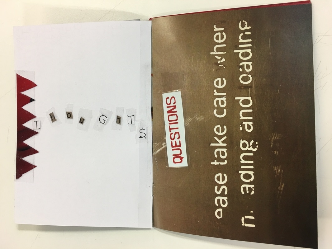
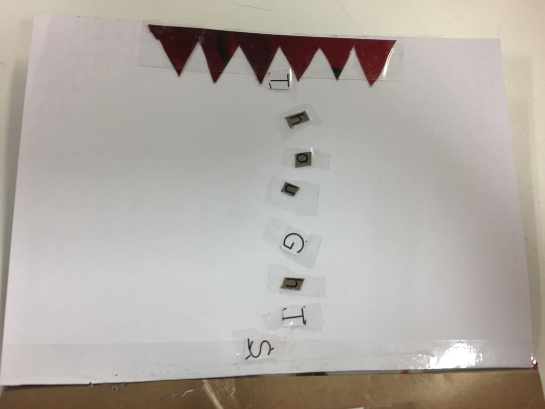
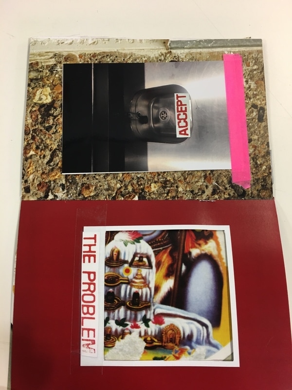
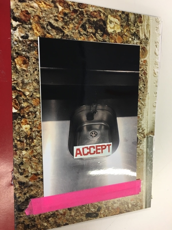
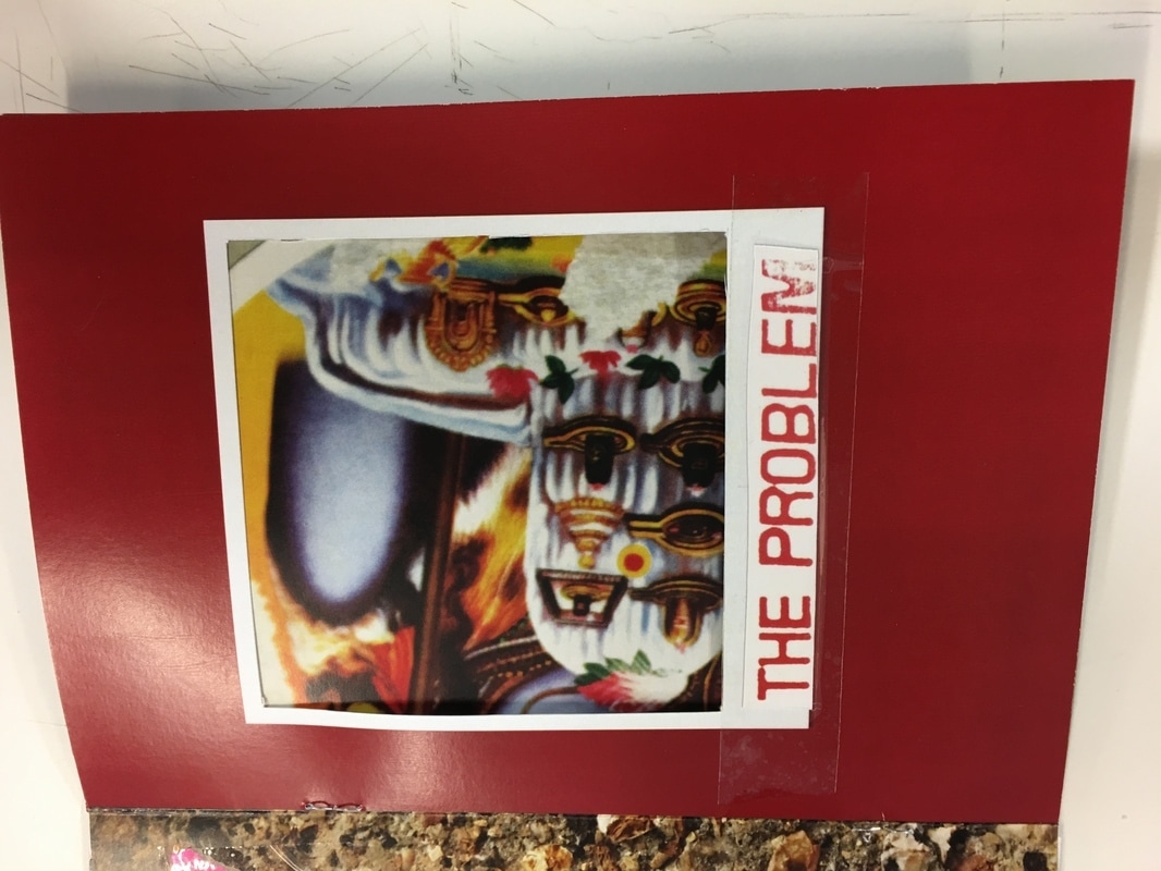
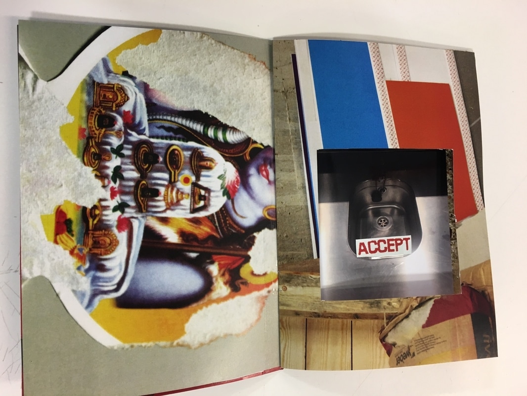
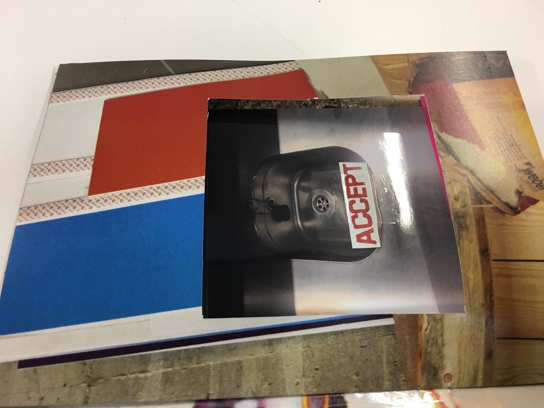
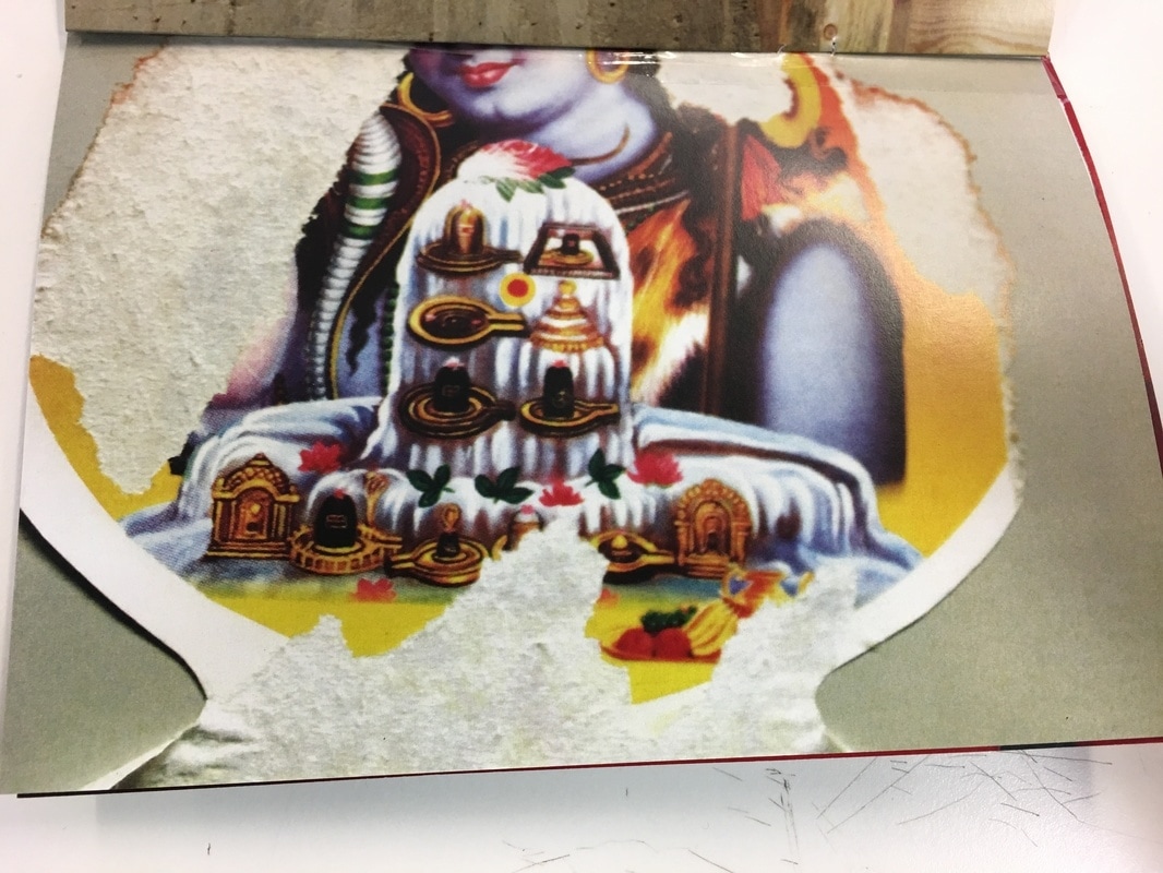
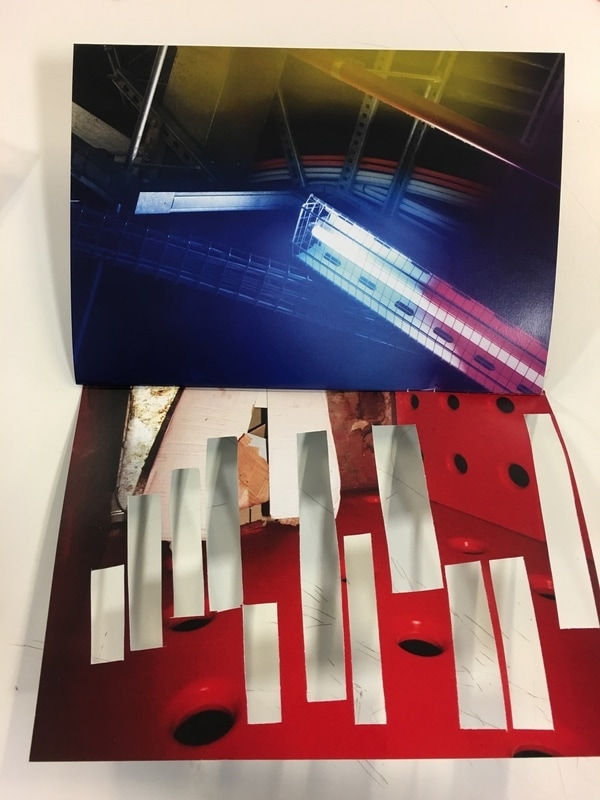
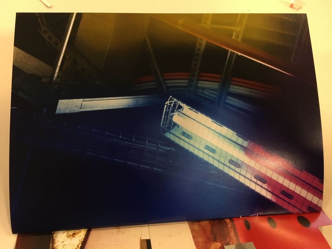
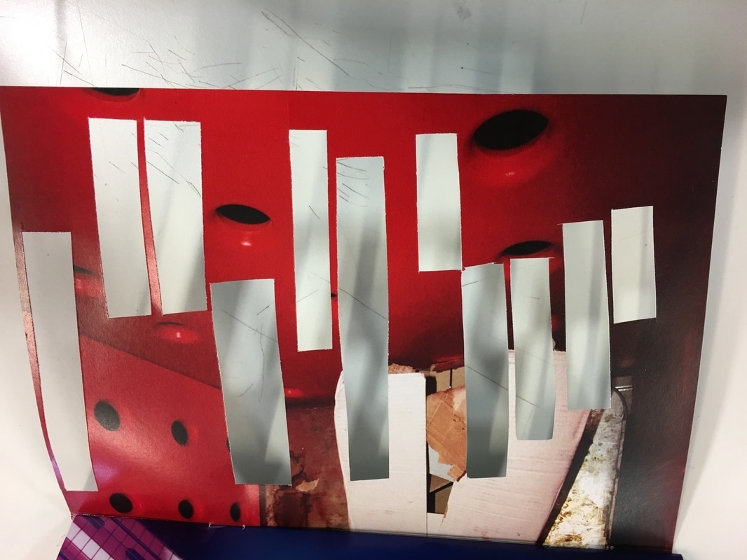
The page below is one of my favorites because it is very intriguing to question what was there before it was cut out but also because it creates room for you to add your own interpretation of what was there before. The words and phrases I cut out were used in different sections of the fanzine which links the whole fanzine together.
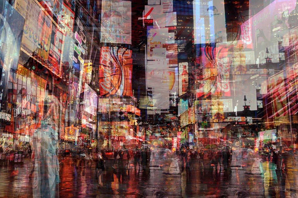
Comparison of Architectural Images:

|
|
|
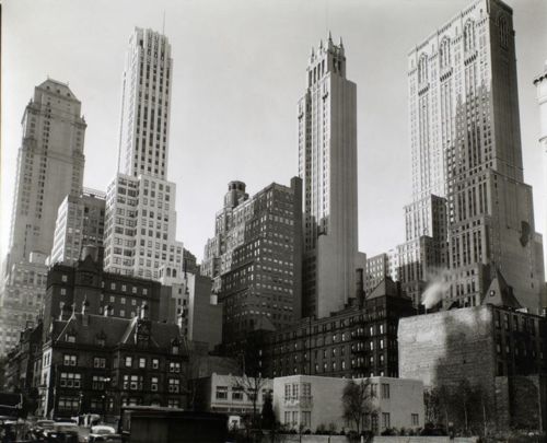
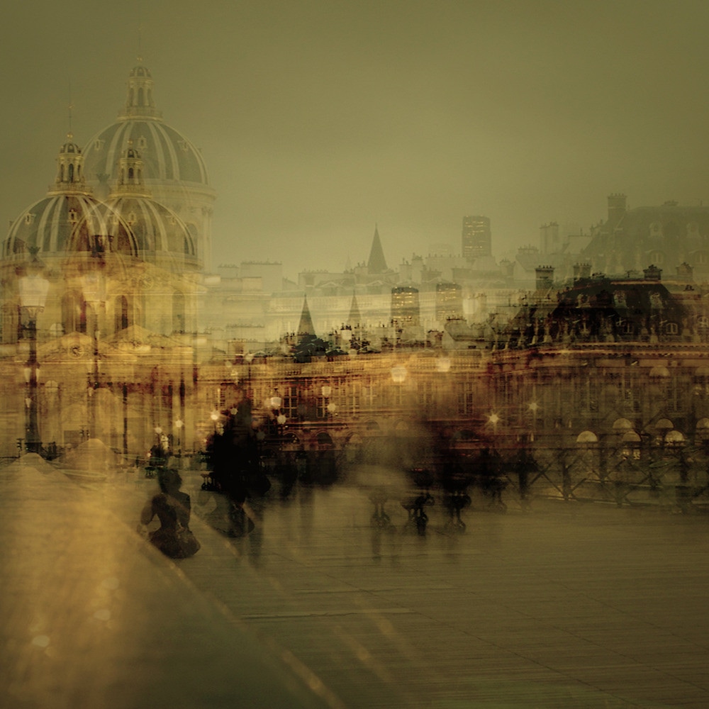
Stephanie Jung uses the effect used in most of her images in this picture which here creates a sense of confusion and distance. The buildings along the horizon of the image add depth to the image as well as the empty space at the front of the picture. The colours in this image are not as bright as Jung's other pieces which has a calming effect on the multi-exposure and the lights in the image. The combination of the buildings makes a layered effect in the image and causes the the space within the image to appear more than it is. I think this is a very special image, even compared to the rest of Jung's work because of the feeling of sentiment and the fact that it looks less busy than other subjects she has chosen to photograph. The empty space within the image strikes me as most interesting because of the hectic display in parts of this picture and her other pictures. I think this picture was made because the location is important to the artist. It is very different from the way we would normally imagine seeing a picture and is definitely a interesting representation. My favourite part of this image would be the 'reflection' of the buildings onto the sky in the picture that is caused by the multiple exposure. This creates a sense of echo in the image which is what led me to believe that this image is important to it's artist.
|
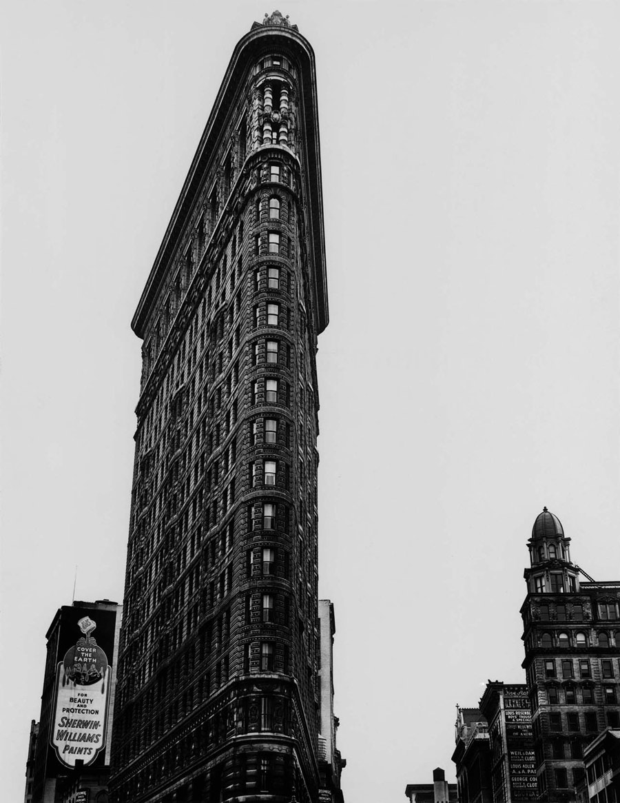
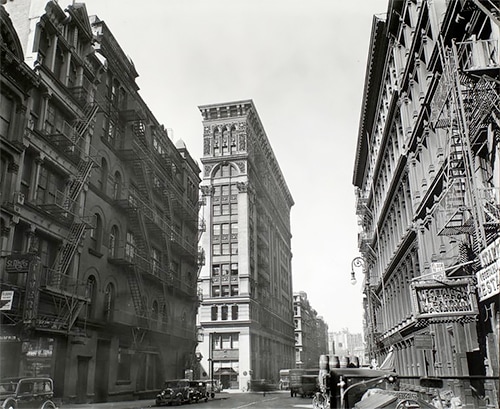
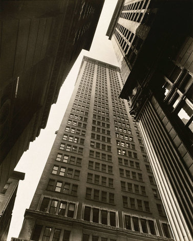
Berenice Abbott has continued the theme of making the buildings in her image seem overpowering and creates a clear portrayal of what she photographs. This image, consisting of the buildings rising above from the angle of photography, is simple and powerful. There is nothing new about this image and everything is a familiar concept, however, the composition has caused it to stand out against similar objects. The combination of the buildings overlapping one another and the toning of the image have a bold effect, the white appearance of the sky also makes them stand out. This image reminds me of many I have seen before, but at the same time, it is unique and does not compare to others because of the way it is presented. There is a combination of roughness and sharpness with fluidity or uniform about the image, the contents almost look the same and show repetition whereas the flattening of the buildings has caused the outlines to highlight the sharp edges and corners. It emits a sense of little space and containment because of the way the image is taken, with the depth of field being limited too. This image doesn't work as well because of the reminder that it is like many other images, but the unreserved display of these buildings is very interesting and unique to this image itself.
|
Both these images are successful and interest me in their process and appearance. The main difference is the technique used to take each image; while 'Magic Paris 2' is disturbed and corrupted because of multiple exposure, Berenice Abbott has a clear and untouched image taken of her subject. There are also differences in why each picture was taken because Abbott takes images to capture the scale and advancement of architecture and technology and this image seems to fit with that goal : in addition to Jung's passion for capturing moments of passing time in an attempt to save them for recollection, and this image also seems to hold sentiment and significance. Both images contain patterns and shapes although they are very different to one another. The biggest difference I've noticed is the general emotion the each image carries - one being prominent and striking whilst the other is mild and almost represents nostalgia.
Margaret Stratton
Margaret Stratton uses her images to tell a history of buildings and architectural structures. The texture and appearance of her images creates a mood for each image which may reflect the subject of the photograph. I really like her use of simple photographing to display a whole story about a destination.
Michael de Courcy
|
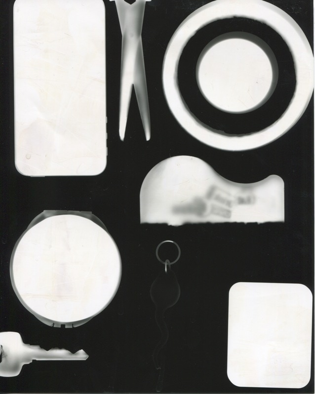
Michael De Courcy uses the idea of using his images as sculptures in exhibitions. I really like this idea because I want to interpret Architecture as a whole process rather than one aspect of it. The idea of making images that are part of a process that was inspired by architecture and then going on to develop those into physical representation of my ideas is something that I am very interested in. I want to start at the beginning of most architecture which is planning and development. The intention of Michael De Courcy may here may not have been the same as mine but the idea is still the same. From what I can see in this image, there appears to be photograms or black and white images of nature. I want to explore this concept and see what the outcome will be like.
|
|
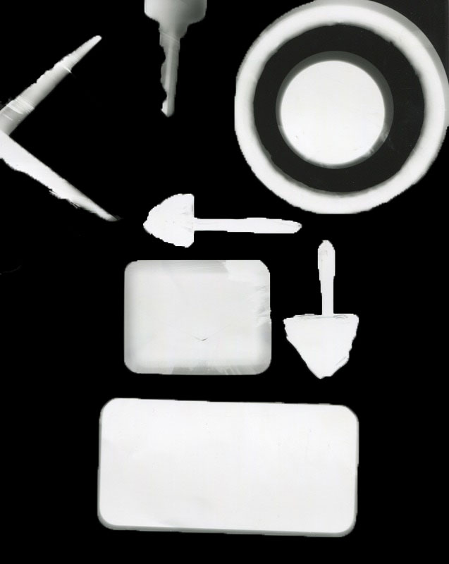
I have started by using whatever basic shape materials I could find around the classroom, I tried to use objects that would usually be used for creating or planning. The arrangement was done in order to reflect the process that takes place when an architect may be planning on another build. On one of my photograms, I used paint to represent the act of planning and refining building plans.
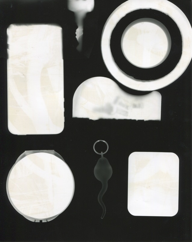
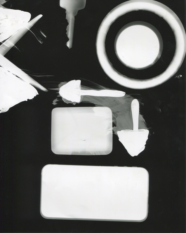
I used Photoshop to clean up and refine the photograms, especially where the paint had smudged so it would look clearer.
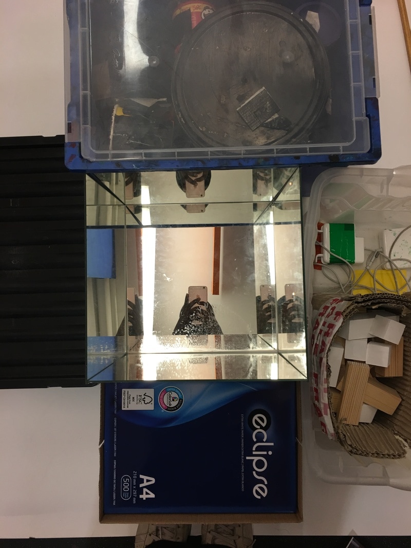

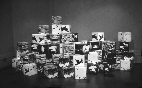
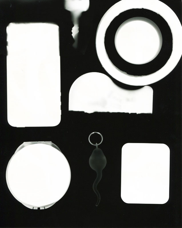
After printing off several of the photograms, I used wooden blocks of different sizes and when the images were trimmed I used masking tape to wrap them around the block. I then arranged mirrors so that there was a small box of mirrors facing each other and I put the structures into the box so they stood like buildings. The mirrors were used to reflect the fact that so many buildings are built, have been and will be built. I really like this idea because it shows the process that I went through from the beginning and the development has been like that of aspects of architecture.
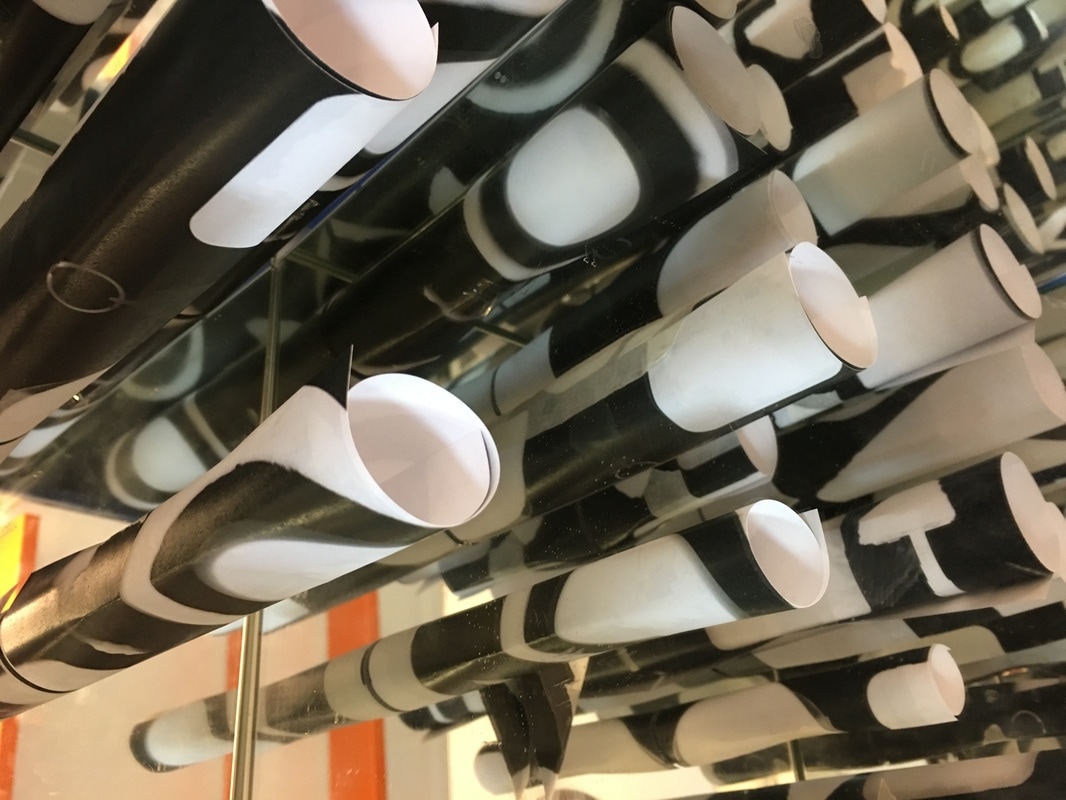
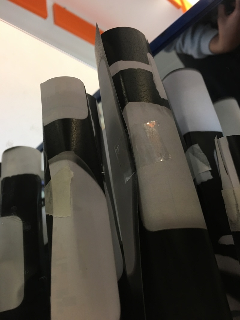
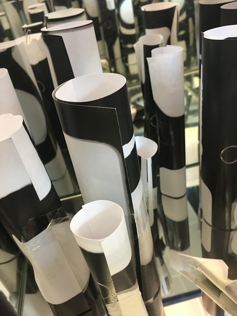
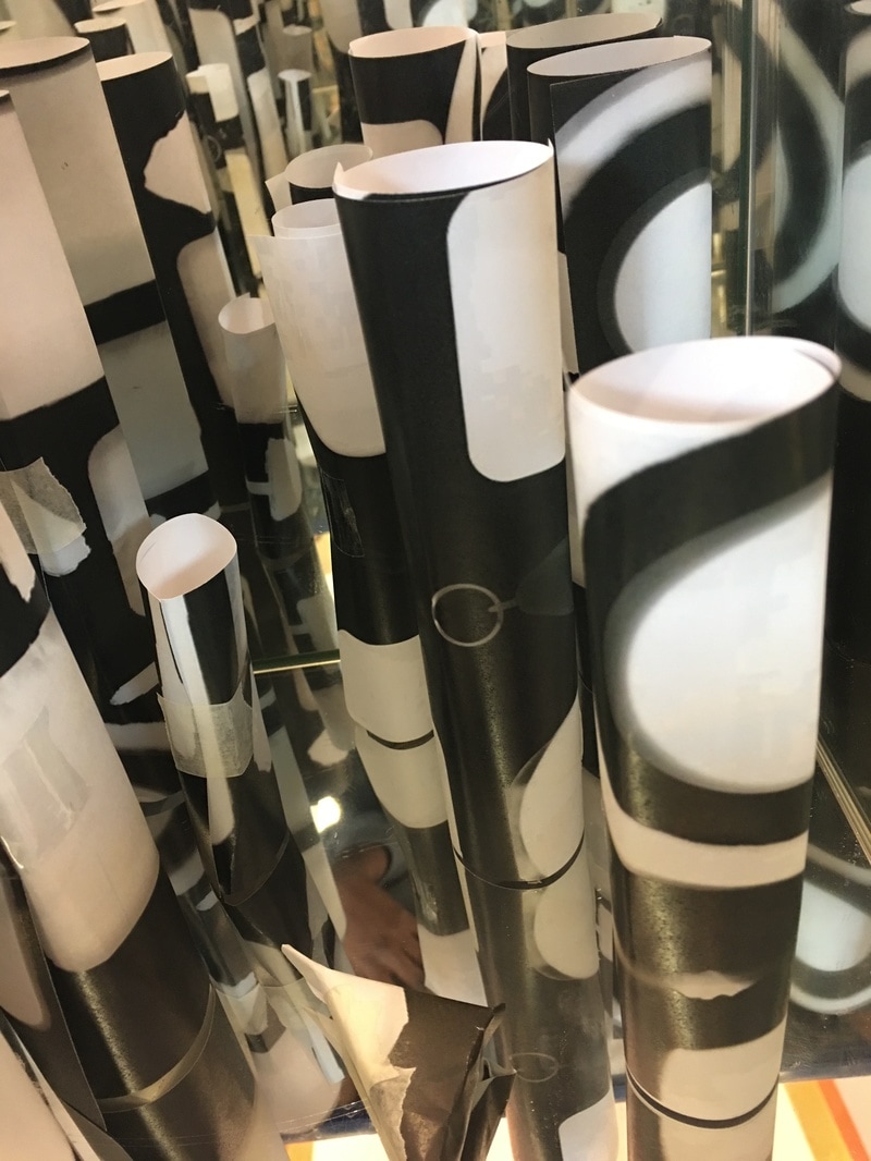
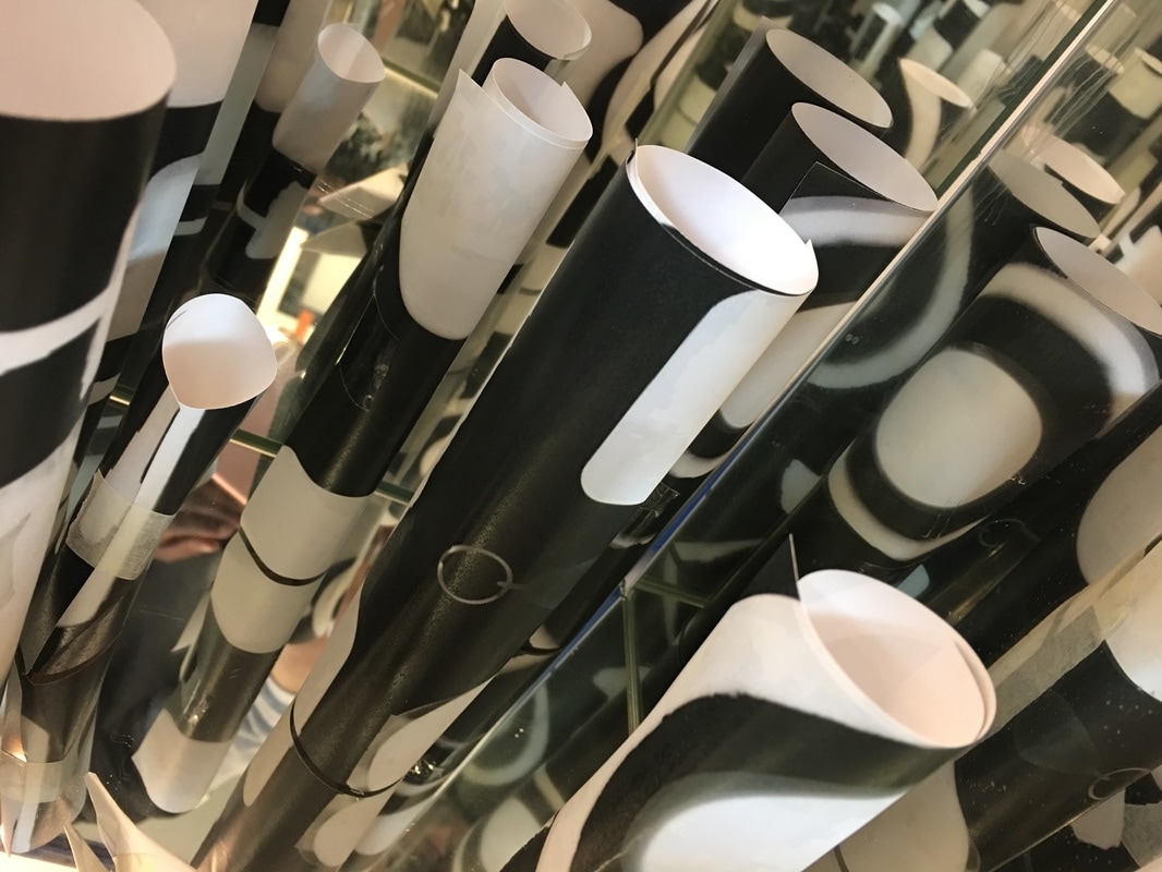
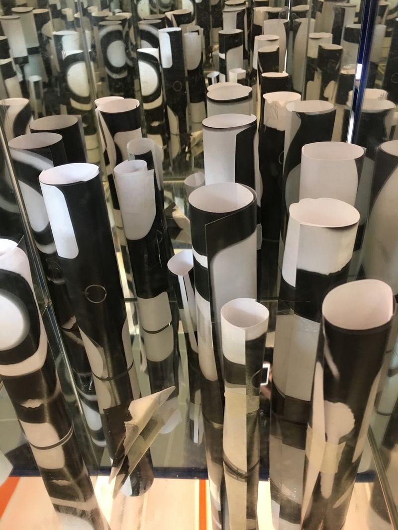
Final Piece
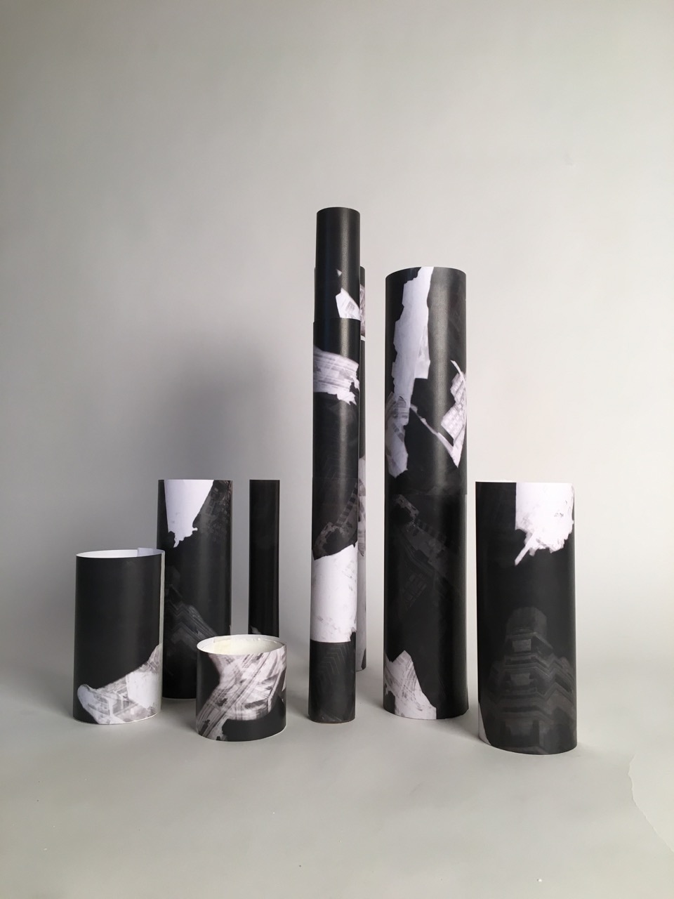
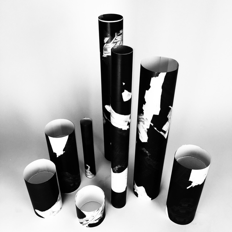
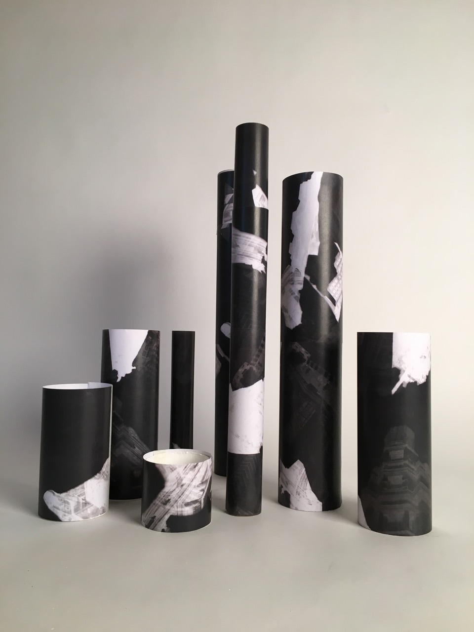
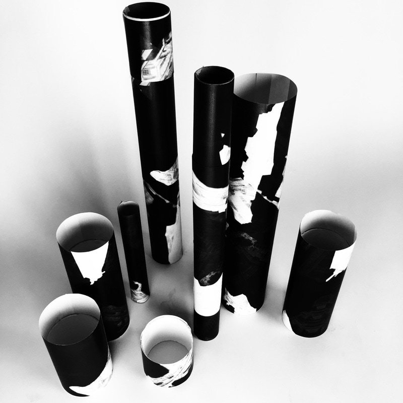
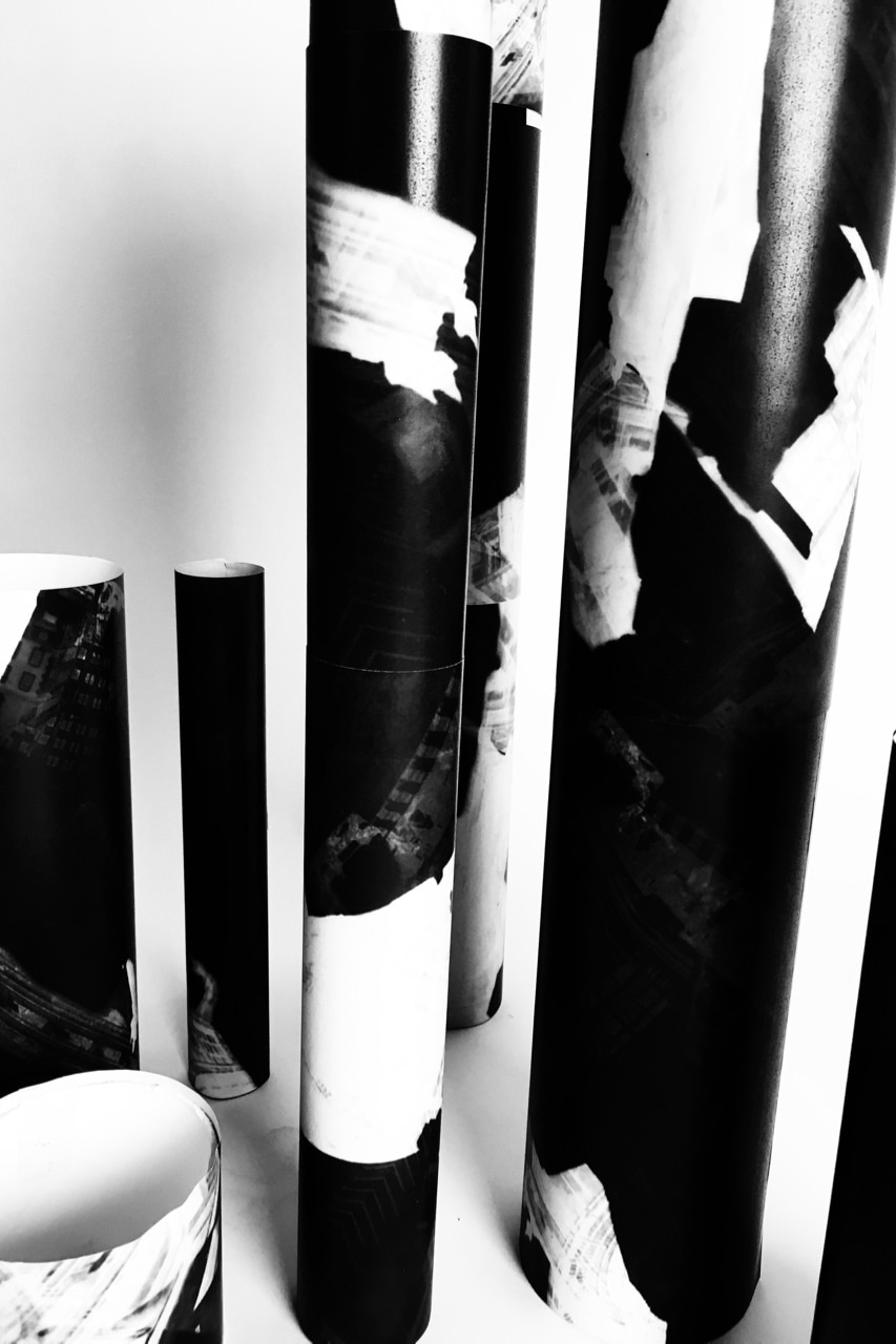
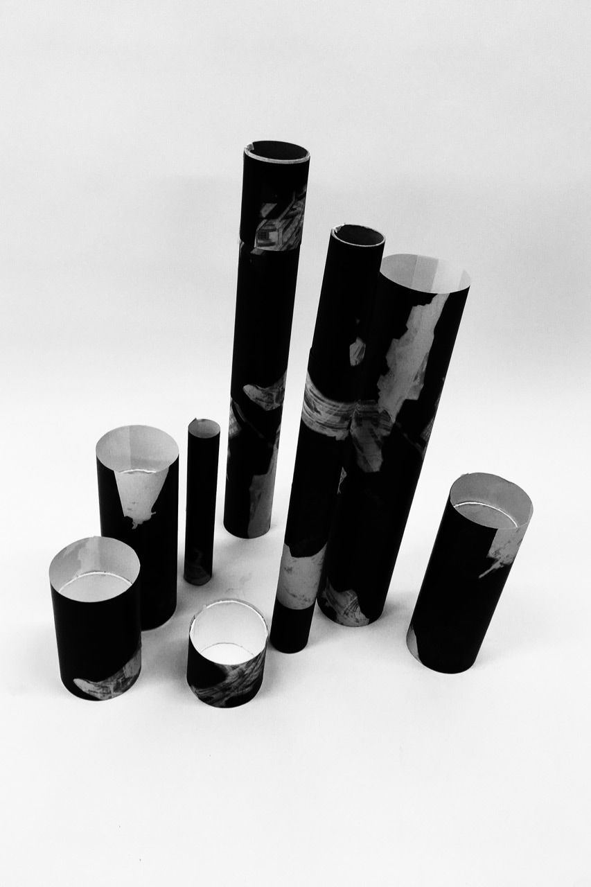
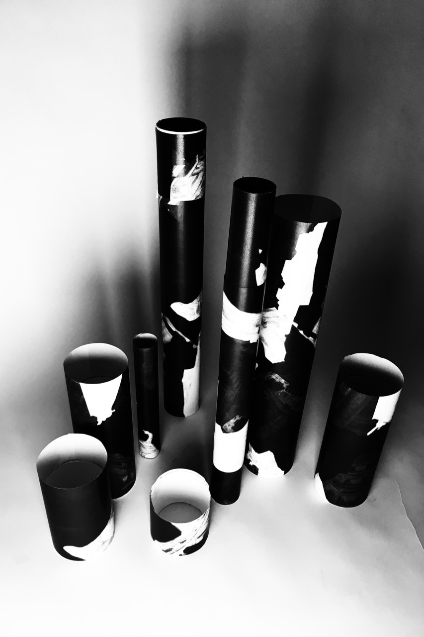
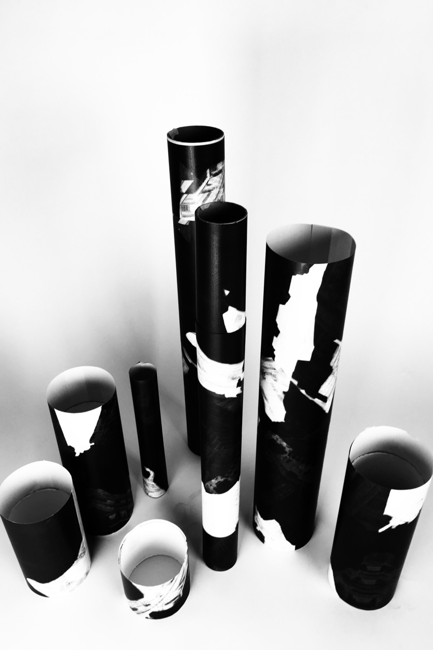
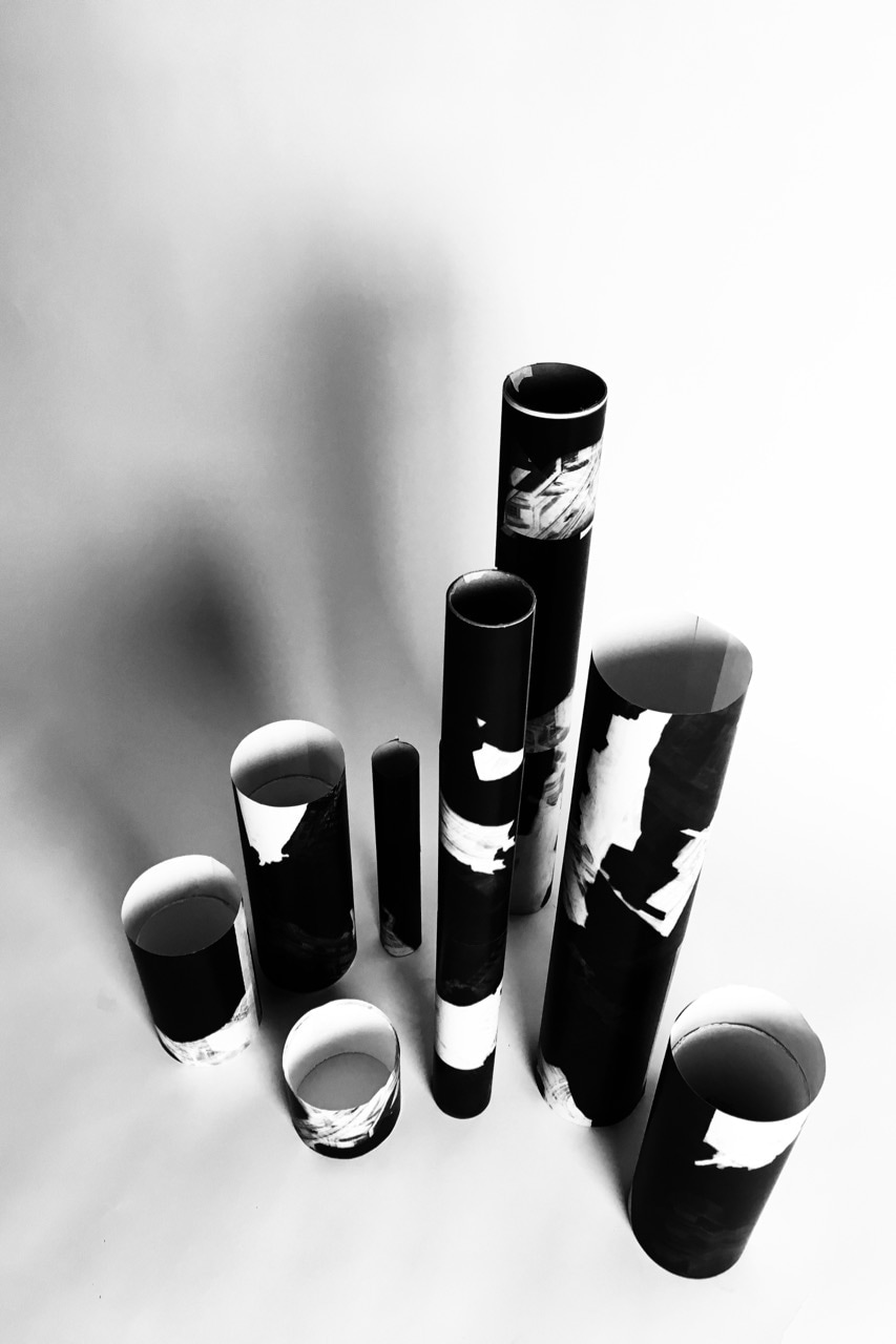
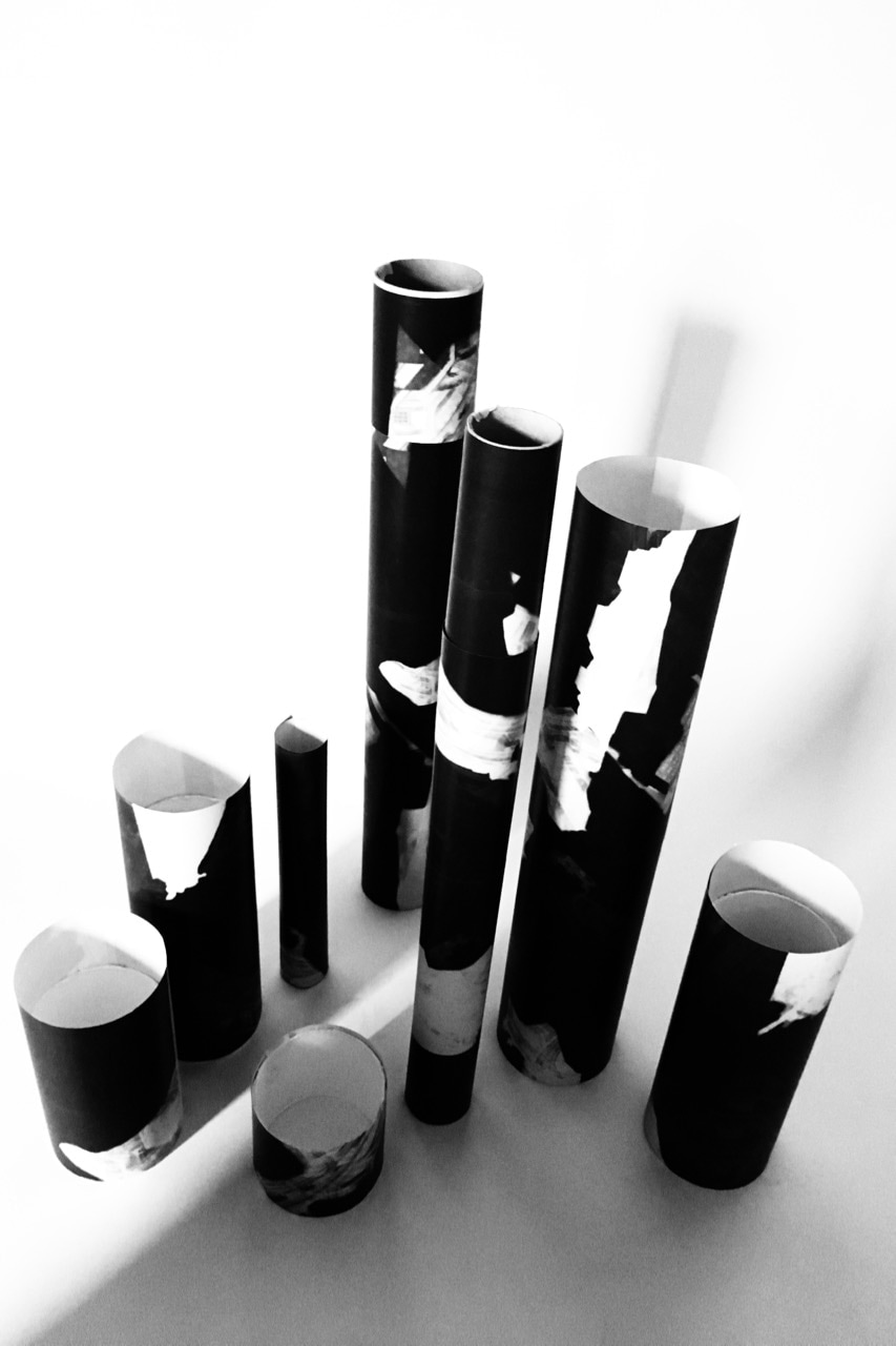
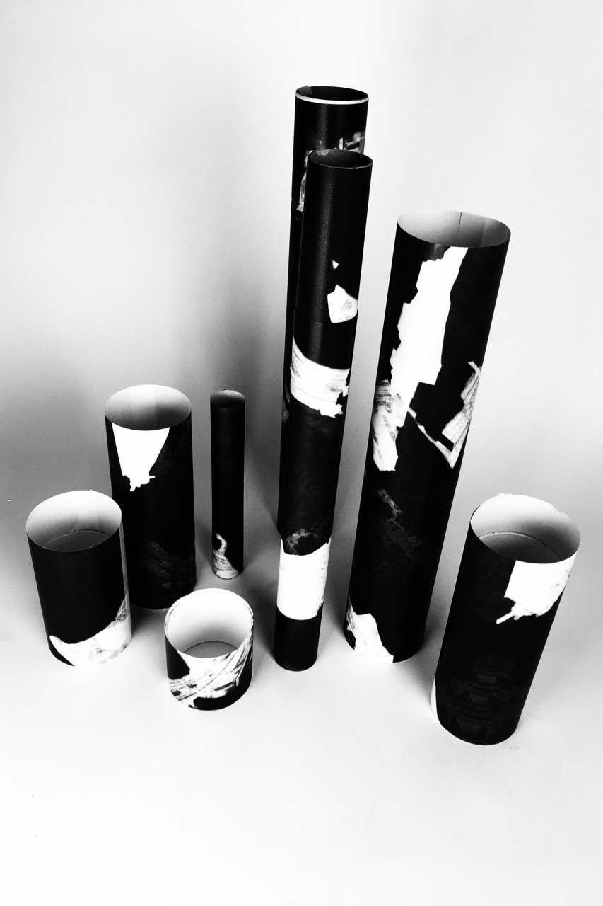
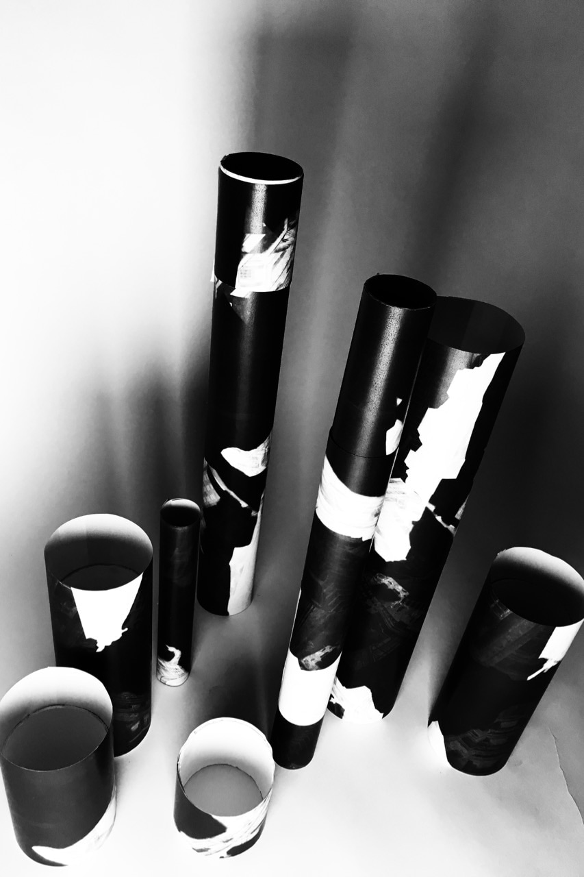

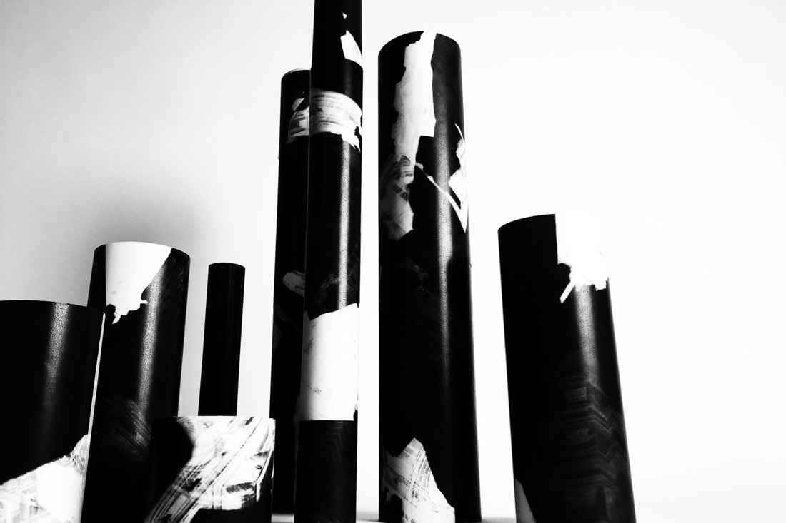
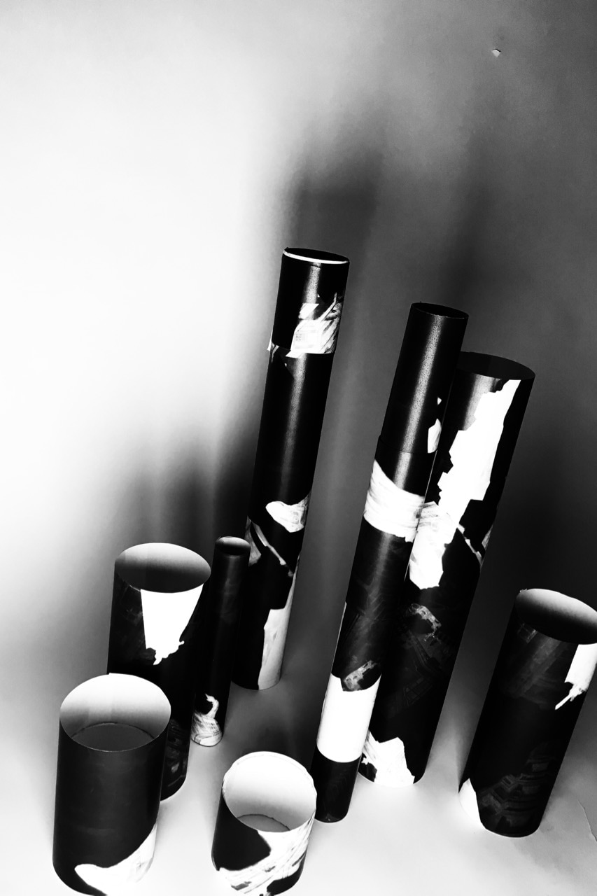
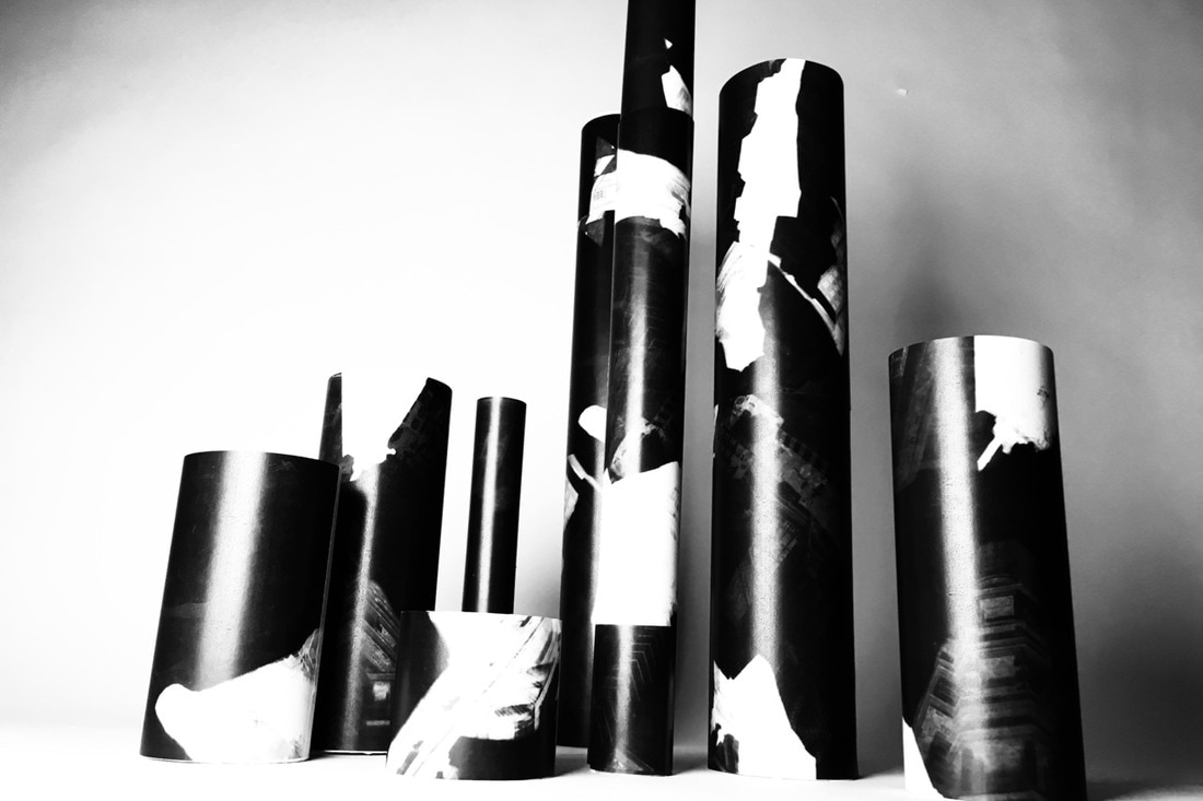
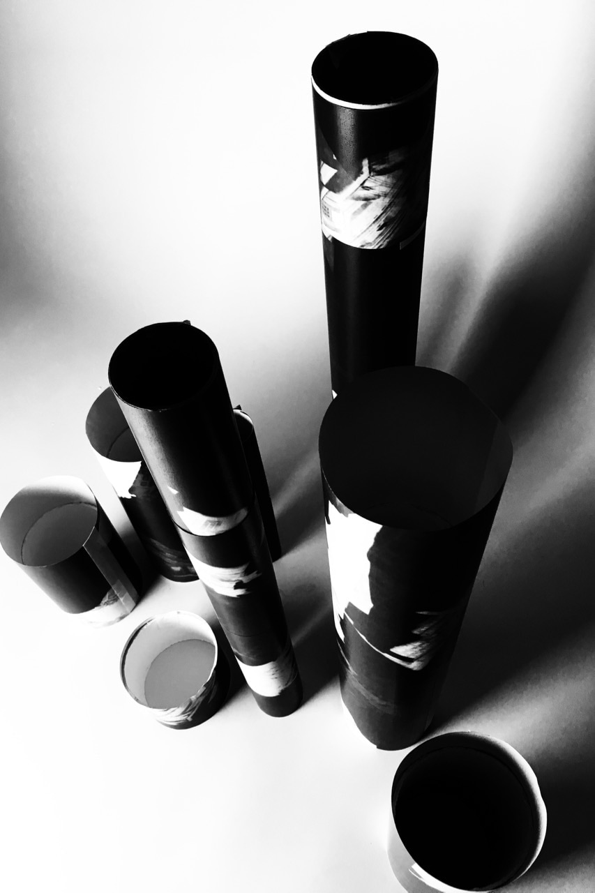
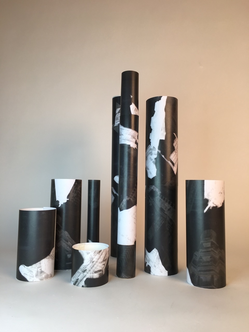
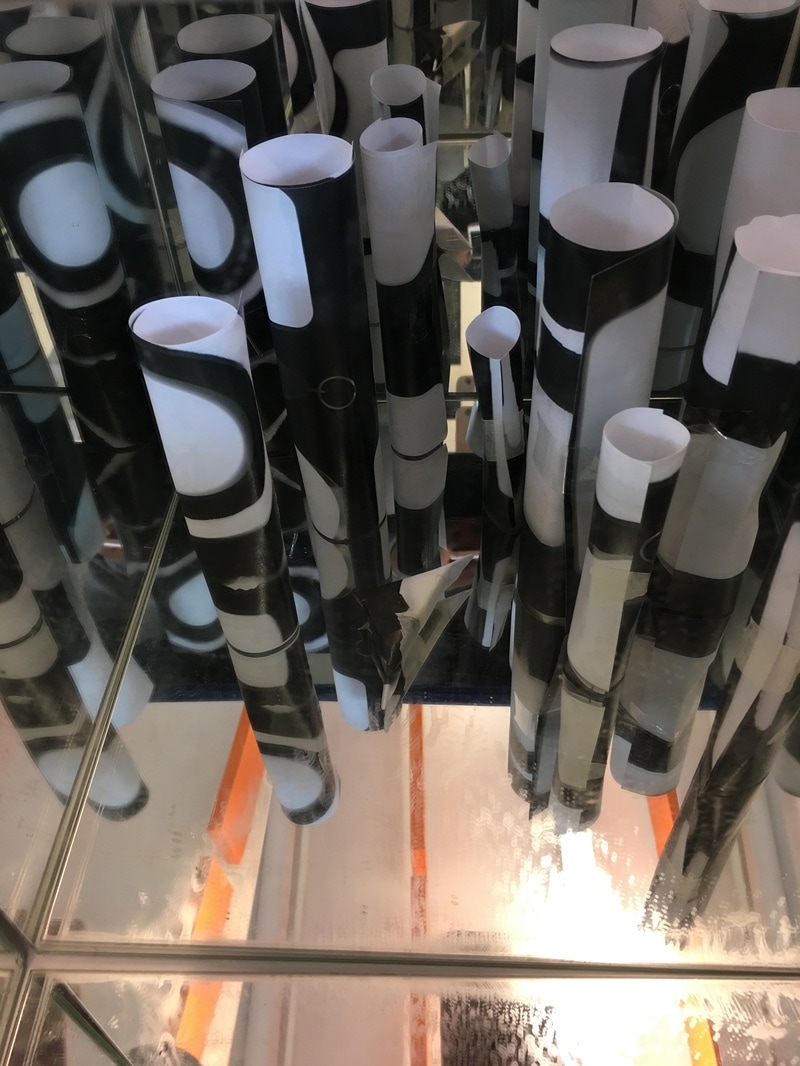
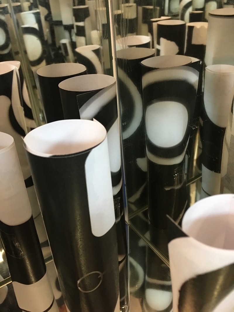
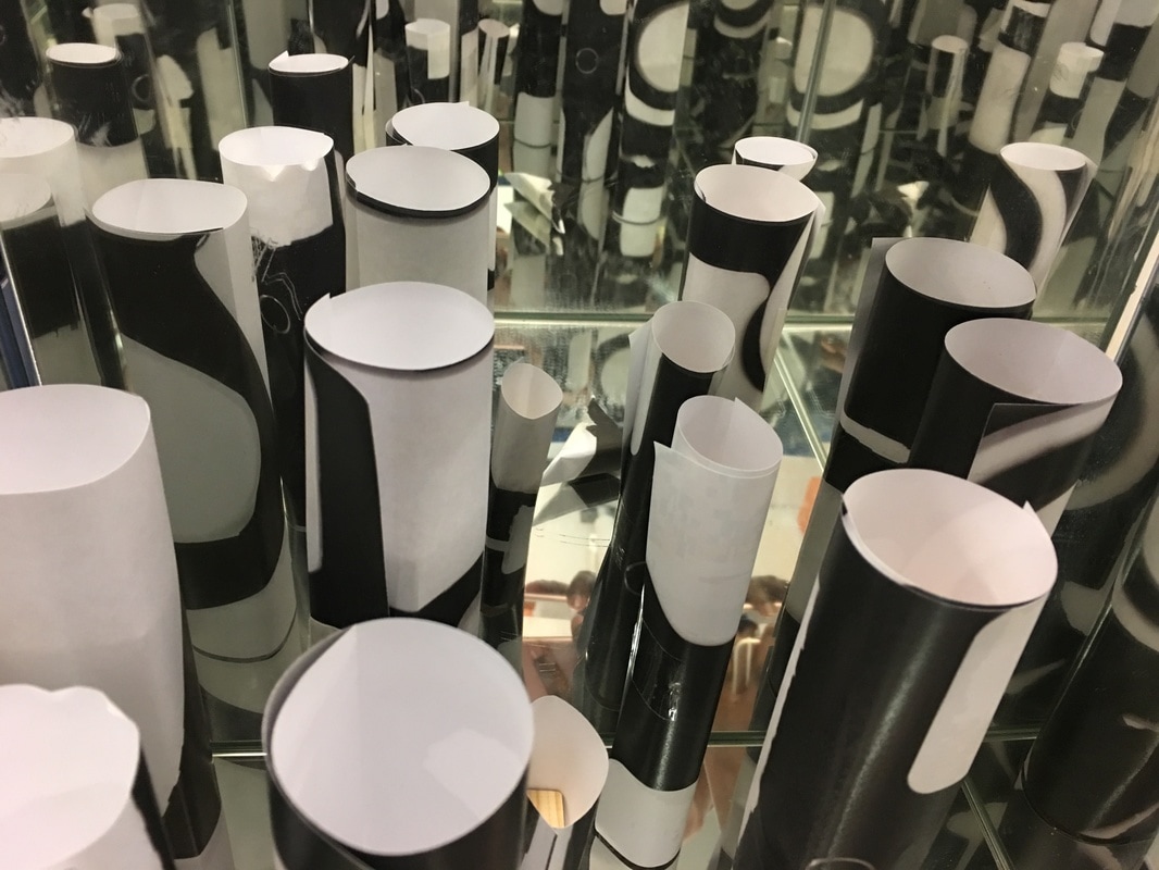
For my final piece I have just refined and developed my previous idea. I used the photograms from my first idea of outlines an used circular tubes to improve the appearance. I have used a white backdrops and lighting to make my structures appear as if they are a collection of towers. I also like the contrast of the black photograms and the white background. When I was taking the images, I used apps to heighten the contrast and to also add shadows. Overall, I a, very pleased with the outcome of my Final Piece. I want to mount three images that are the result of the different lighting sets I had used.

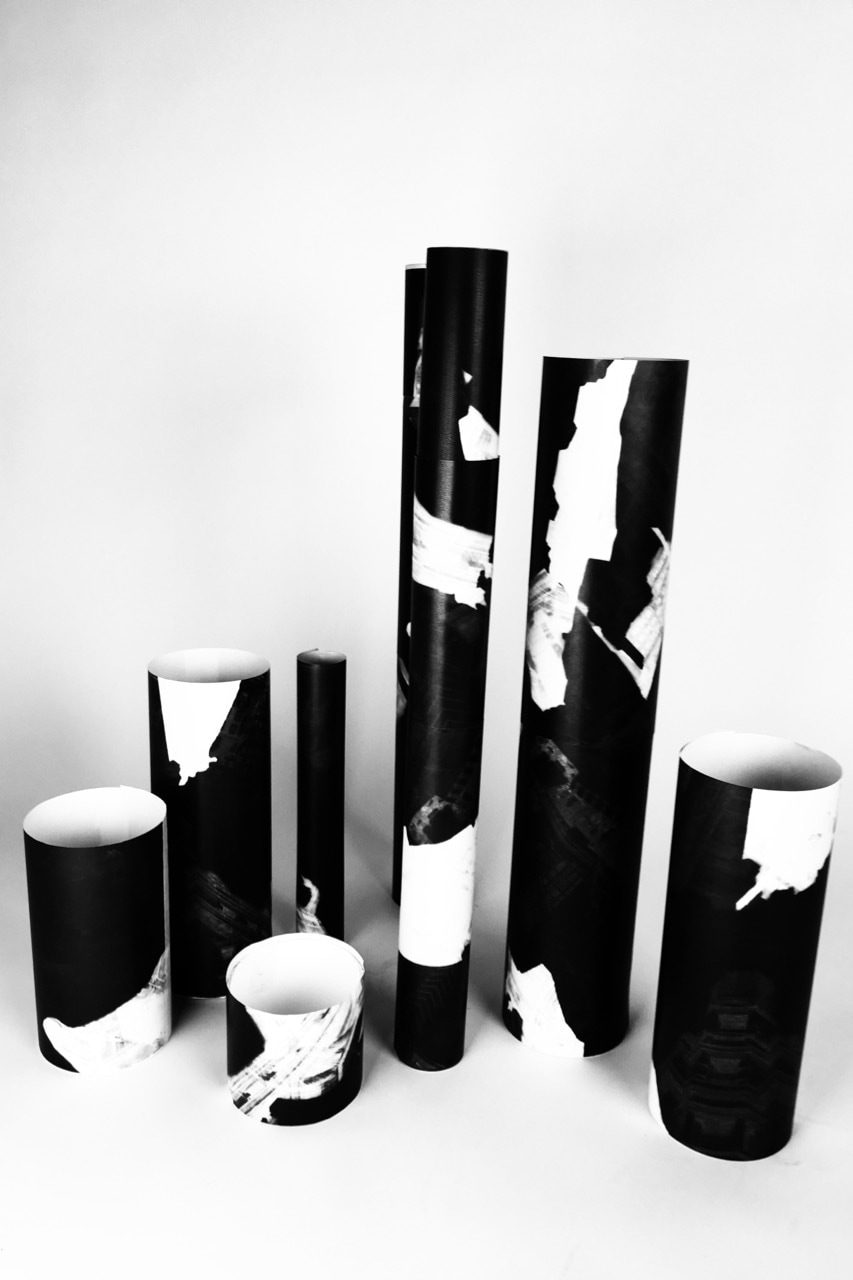

The images above are the three that I will mount because I love the way they have turned out compared to the others. They were the best combination of lighting and app features.
Final Evaluation
I chose Architecture as a theme because it stood out as a theme that would allow me to be creative and generate many ideas from several sections of the theme. I also imagined that it would have allowed me to use the most resources.
At the beginning of this project, I wanted to analyse and explore the full meaning of Architecture and I think I have successfully done that. With the research of different artists and their ideas and personal approaches on architecture meant that I had a full perspective of what I could investigate. I especially enjoyed Berenice Abbott's work because she displayed that some of the simplest images can be powerful and carry a story and sentiment of a building. When I made the photogram response, I wanted to be able to focus on the detail of her images which is why I cut out the outlines of my own images (since hers had interesting shapes just from looking at the contrast of sky and building). That was the first real development of my ideas of this theme and I am very happy with how that turned out. The research I did on Alejandro Maestro was simply so that I could see another aspect of architecture that wasn't simply taking images of constructions. This allowed me to think outside of the box and I could see that there maybe a physical response to the theme other than simple images. Lastly, making fanzines allowed me to think about how I could link my ideas and develop them as one complex response.
I have used many resources for this theme due to the exploration of different parts of architecture. Photograms were used because I wanted to make details of pictures the main focus of images and the photograms permitted this. I also attempted to use Photoshop with the Sculpturing and even though I have discovered I need more practice using Photoshop, the idea I had came out generally good even though it was uncompleted. Refining my ideas occurred where I used images and developed ideas from the beginning of my theme and linked it with my final piece. I have focused on producing a final piece or ideas that displayed the complete aspect of architecture to the best of my ability and I think I have achieved this.
My response is personal because it reflects the thoughts I've had and discoveries I have made throughout the investigation of this theme. I have turned my opinion on what architectural photography means into a response of images and experiments that have gone both wrong and right. The final piece I have created is a result of research and refinement of ideas that I think are what makes up architecture including history and memories, planning, development, physical aspects.
