Abstract
adjective (abstrakt/)
1.existing in thought or as an idea but not having a physical or concrete existence.
2.relating to or denoting art that does not attempt to represent external reality, but rather seeks to achieve its effect using shapes, colours, and textures.
Introduction
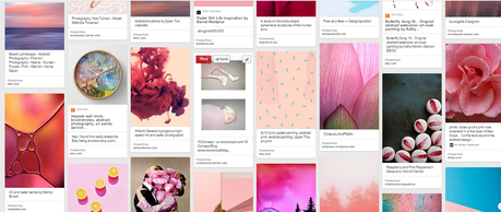
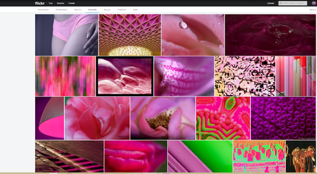
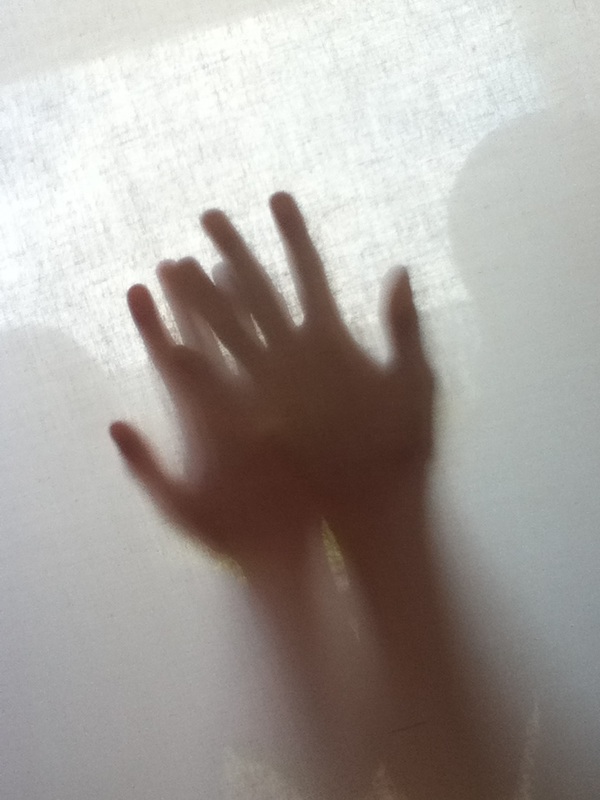
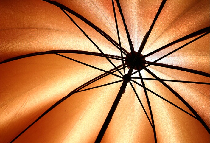
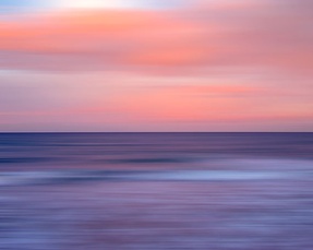
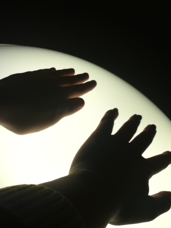
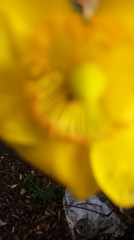
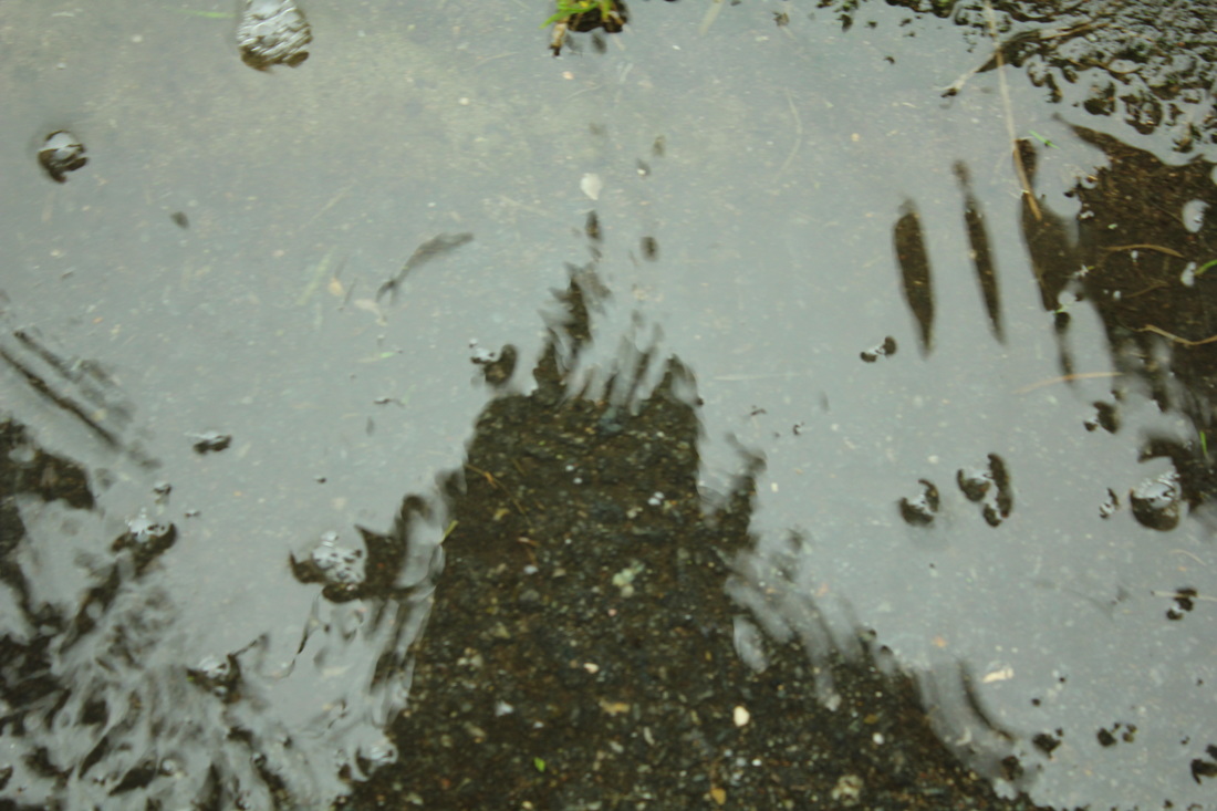
The picture above, which I found on Pinterest, is one of the few favourites that I have stumbled upon. When I first thought about some of the common characteristics of abstract photography I based my ideas on abstract art instead of photography and this lead to the perception of indistinguishable objects, use of shapes and pattern and texture to create effect or illustrate emotion. However looking at many photographs that have been labeled "Abstract" I have realised that my first notion was in fact misplaced.
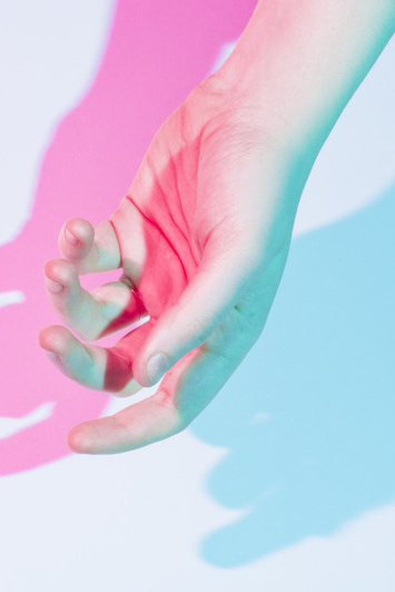
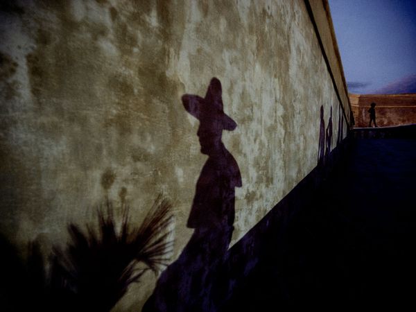
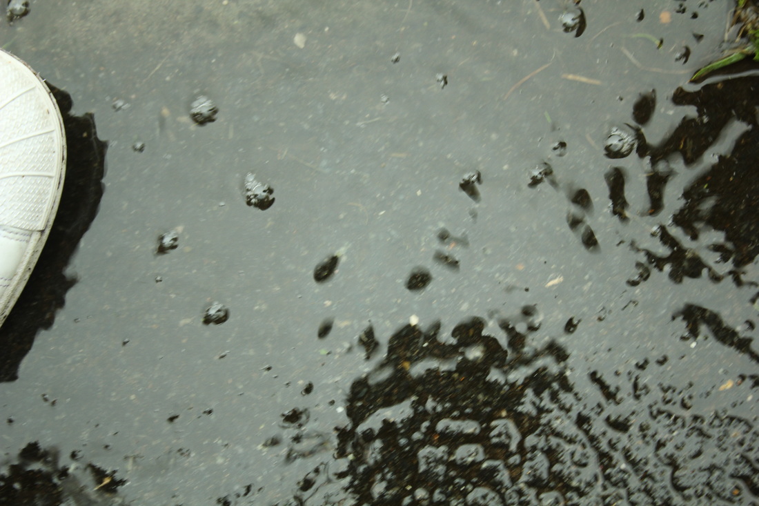
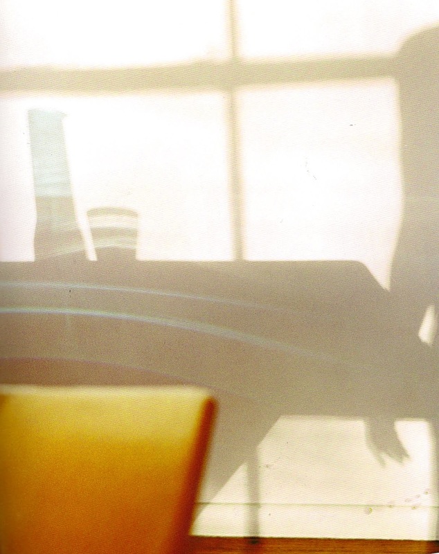
Judging from this picture I can tell that it can be considered abstract because of the colours and the shadows. What mostly intrigues me to the picture is the shadows created by the hand and how they somehow overlap each other. I think this picture is very interesting and the colours and light arrangement is so aesthetically pleasing at first sight, that it demands a second glance. These images that I have analysed or looked at so far are less abstract than other photographs out there, every picture is abstract due to the fact that as soon as you take an image it is made abstract by flattening (the world is not flat) - if an image is black and white it is more impressionistic. However every photo can be made more abstract, by zooming or cutting out parts and at some point I would like to attempt doing this.
|
For this personal project we are focusing on Abstract photography and what that could mean.
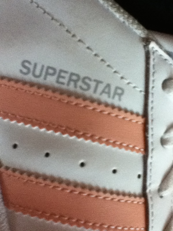
In photography, abstract is word to describe non-objective or experimental photography that doesn't have a concrete or identifiable origin. The image can be cut up to show only bits of an original image, however what abstract photography usually aims to influence is more to do with sentimentality than anything else. For me personally, abstract is something I relate to art and being unique or unidentifiable - as in unable to be explained or describe. I have many interests in artists that particulate in abstract art (Robert Delaunay 1885-1941, Henri Matisse 1869-1954 and more modern artists such as Jean-Michel Basquiat 1960-1988 and Jesus Raphael Soto 1923-2005), however abstract photography is not something that I have thought about. |
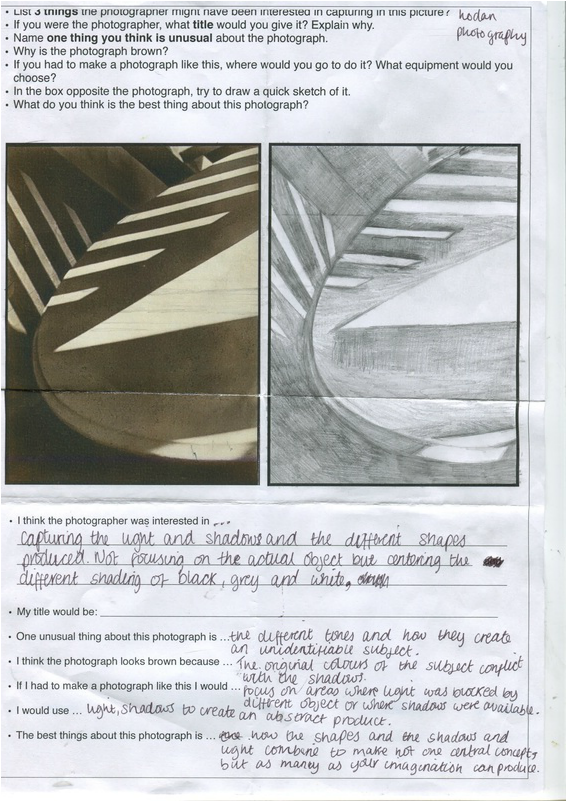
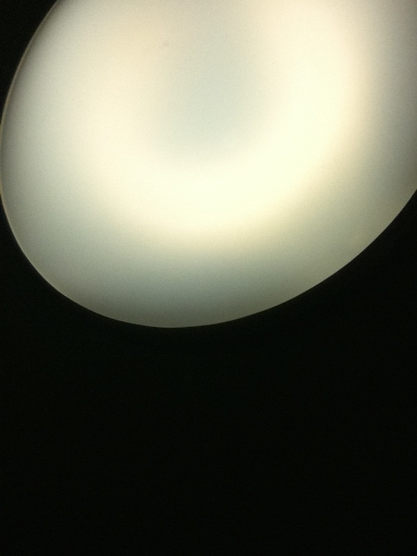
The image above is one we have been asked to study and carefully think about. We were asked to draw what we saw probably because it would help us really look at and observe the image. We were also asked a series of questions underneath which I have answered.
I think the photographer was interested in? Capturing the light and shadows and the different shapes produced. Not focusing on the actual object but centering the diverse shadings of black, grey and white.
My title would be? Conflict because this image portrays conflict between objects and the light, ending with a product of shadows and divided light.
One unusual thing about this image is? The different tones and how they create an unidentifiable subject.
I think the photograph looks brown because? The original colours have conflicted with the shadows and characteristics of the camera to produce a brown colour. Also brown is the usual colour of shadows.
If I had to make this photograph I would? Focus on areas where light is blocked by different objects or where shadows are available.
I would use? Shadows and light to create and abstract product.
The best thing about this photograph is? How the shapes and the shadows and light combine to make not one central concept, but as many as your imagination can produce.
|
|
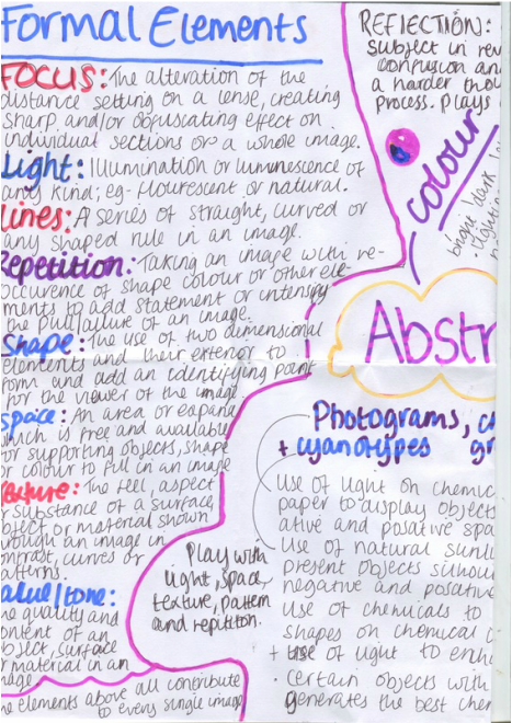
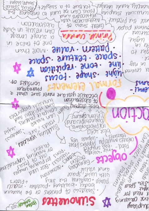
Above we were asked to write an abstraction mind map, where we display what we think abstraction is. Some of the main things I have explained are;
- Camera-less photography
- Formal elements
- Colour
- Reflection
- Silhouettes
- Objects
Image analysis:
|
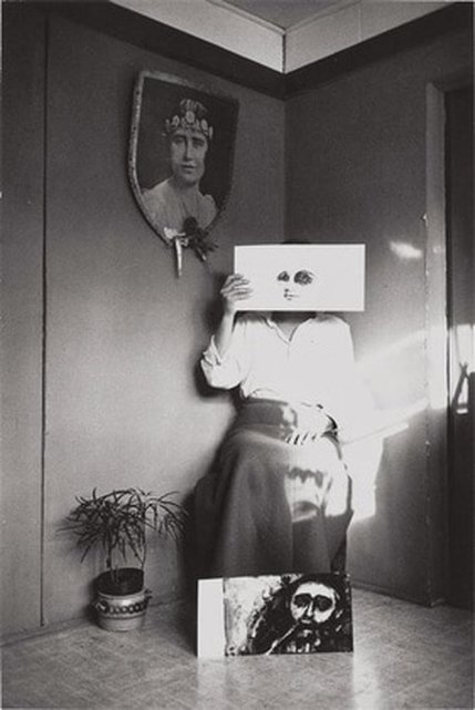
The photography which we were given to analyse is of a woman who appears to be sitting on a chair, in the corner of a room - she is holding a drawing up to her face. The illustration looks like a painting of, mainly, two eyes which are heavily outlined by black (giving the impression of the eyes maybe being punched and bruising or portraying a sense of tiredness). The right eye is more outlined than the black. The painting also includes some sort of outlining or shading under the eyes; a nose - and also a barely visible, (as the nose) mouth. The woman is wearing a plain white button-up shirt, which is tucked into a long maxi skirt of which the colour is not recognisable because of the chosen effect, (the skirt is most likely brown or a deep/dark red). Her clothes are simple but add up to an outfit that looks modern and outdated or traditional at once. At her feet, there is, what looks like another painting. This time of a mans face. On this picture, the eyes are also heavily outlined, (up to his eyebrows) but more equally than the facial features before. There is dark paint, supposedly hair, surrounding him. At the top left-hand corner of the image (a large portion of it), is white covered here and there by grey splotches. On the left hand corner, also near the woman's feet, is a plant pot, (with an actual small plant) inside a metal bucket of some sort.on the wall to the woman's top left, there is a picture (photograph) of another woman with dark hair and a headband. The frame of the picture is in the shape of a shield The colour of the rooms walls appear to be the same, almost the same as the woman's skirt, but more on the red side.
Starting from the woman's mid-waist to just below her knees and from the middle of her legs to the mid-section of the left hand side of the picture, there is the only patch of light in the photograph. |
My eyes are immediately drawn to the painting that the woman is holding up to her face; there are many reasons why. Firstly, the image is closest to the middle of the picture, and also, (being a mostly white painting patch) it contrasts to the rest of the picture, which is mostly dark toning. I am also drawn to the peculiar facial features, especially the eyes; since they stand out from the bright background. Although the photograph is toned in dark colours, resembling a black and white photo, the elements used are fairly modern. So concluding from this, I would say this was taken around the 1990-2000. Judging from the from the clothes, tones and colours and objects used I do not think the gender of the photographer is distinguishable.
I feel a certain number of emotion when I look at this picture; I feel curios: there a many questions I want to ask the photographer about his decisions and why he chose to arrange this photo the way it is. Such as; Why is there a single patch of light? Why are so many faces included? What has a shield got to do with the rest of the picture. There are so many unexplained elements that I want to find the answers to.I also feel confused, I do not know what to feel about the picture and I don't know if there is some sort of message it is trying to portray. Lastly, I am very intrigued, there are many things that lure me in, and I want to find out more. There are many thins that I find interesting. For starters, there is the consistency of the faces. What do they mean? Are they some sort of symbol? Could it mean that woman and/or men have personality changes or that they have different personalities. The other thing that interests me is the photograph shaped like a shield. Does it have anything to do with the number of faces? Could it mean that people, in general, have different personalities/faces that they show at certain times to protect themselves? The thing the that I find most interesting is the plant pot that is included. It is a minor element but to me it could have a large role in the arrangement of the picture. Could it mean that it is natural for people to have many faces? That it's what everyone does?
If I had the chance to ask the photographer a question, I think it would be; does this picture reflect you emotions or your point of view? If I were naming this photograph, I would call it ; 'Natural Human Defences'. I would choose this name based on the elements used in the picture. The plant pot would symbolise the nature, the shield shaped picture portrays the defence, and the consistency of the faces would be the defence mechanism.
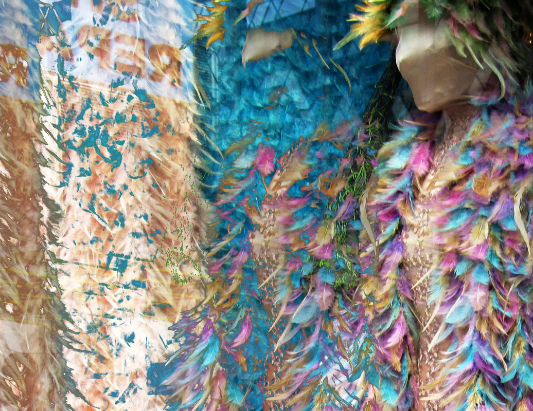
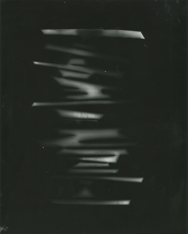
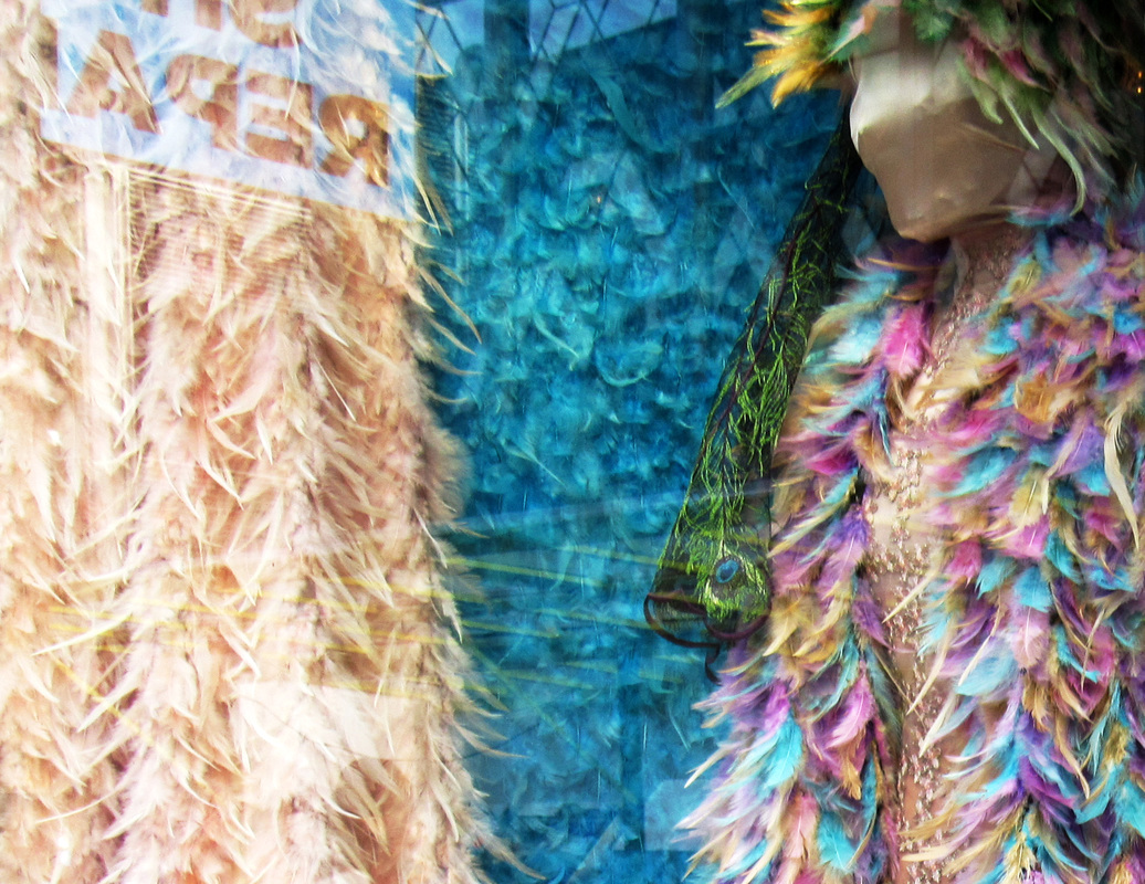
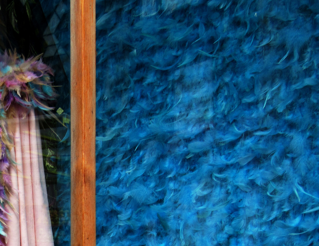
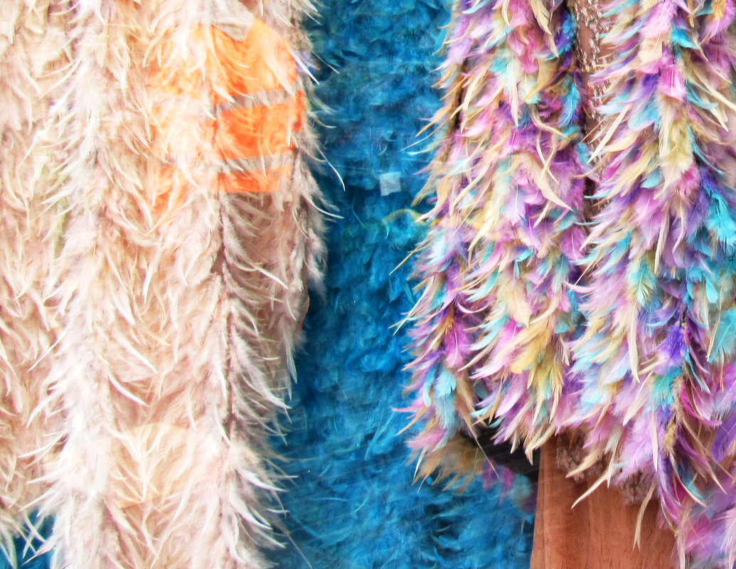
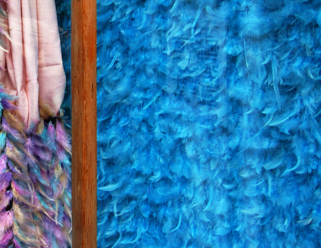
Taken in school #1


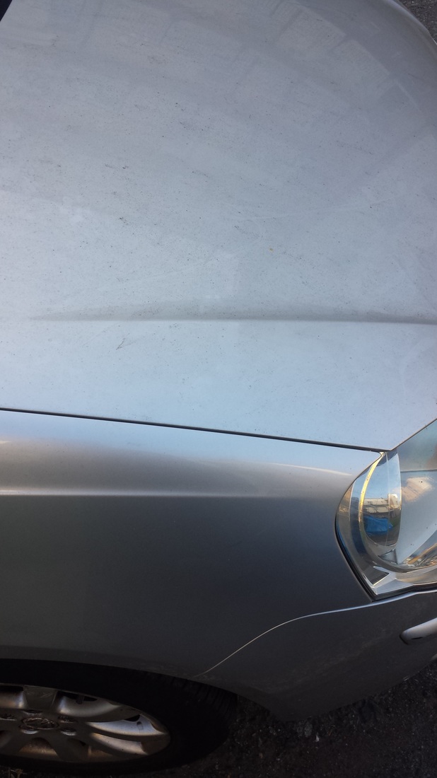
These are images taken at school as the first go at trying to take what we thought were abstract images and how we would display an image without a concrete concept. Throughout my images I have tried to capture this and in my opinion it did not work out in most of my images and the few that I have uploaded are the ones that have some resemblance to abstractness.

|
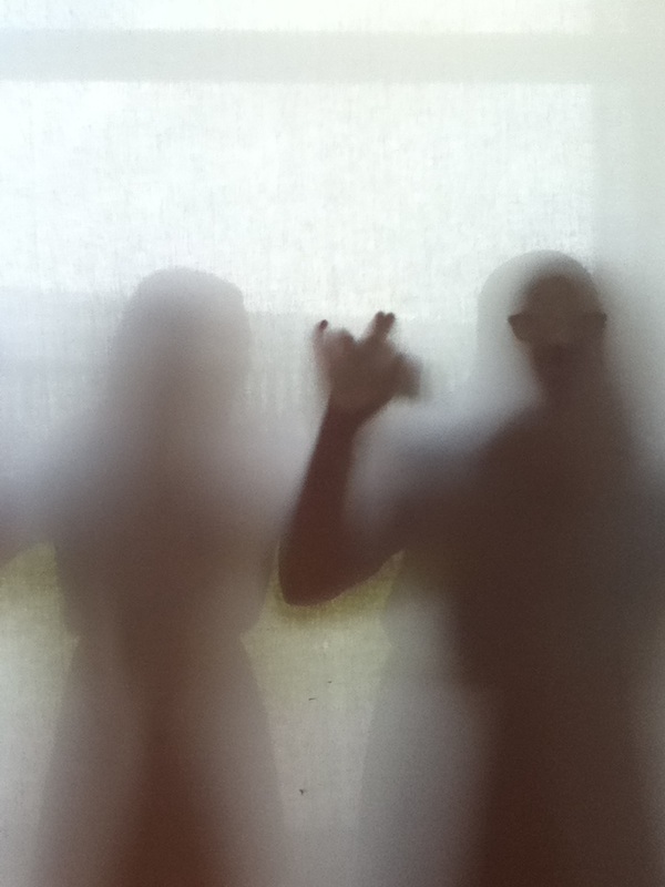
This image is the most abstract of my images considering most of it's aspects. You are not able to tell what is causing the two hands to become this certain colour and at the same time blurring the background. It is a very monotone picture consisting of a few colours and the toning is very soft and uniform. My favourite part of the image is the fact that the hand seem like shadows and are somehow out of focus. |
|
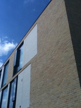
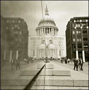
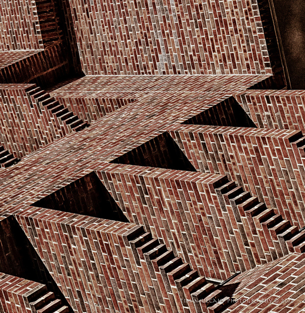
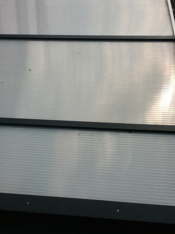
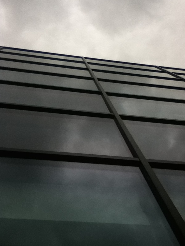
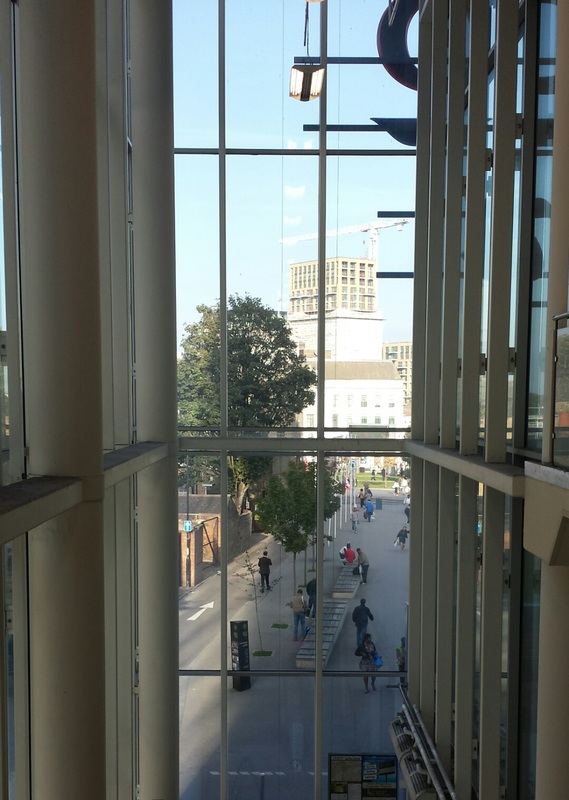
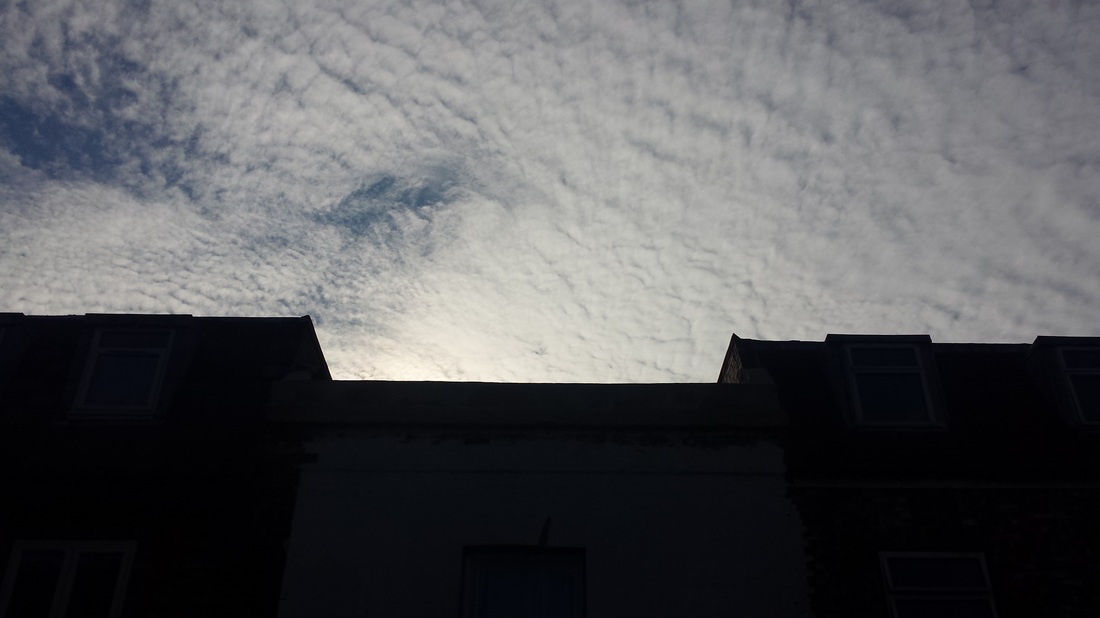
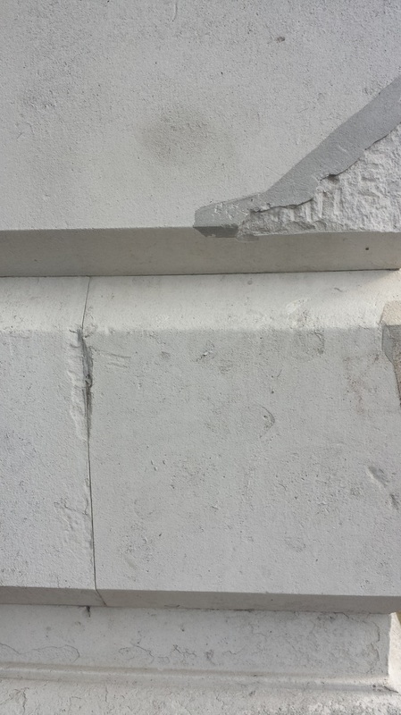
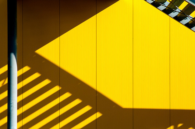
The lines of this image are what interest me most and although I find that it is least abstract of the images that I have uploaded and it is very conceptual and the open eye can determine what it is. The lining creates shapes that are divided throughout the picture and generate and interesting composition. The tones are very concrete where the building is and conflict with the smooth tones of the top left section consisting of sky and clouds. The small right-hand corner is the only dark part of the image and contrast certain other portions. |
|
Ways of Taking Images
The images and explanations below highlight the different methods of taking an image and I thought that thinking of these and explaining them in my own way would help me understand compositions and angles that would create a more interesting picture.
|
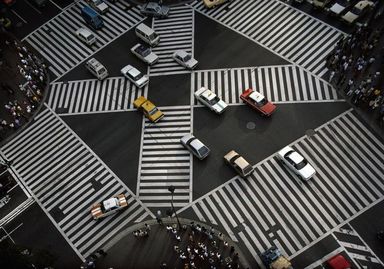
Looking DownThis effect is created when the photographer positions their-self where they can look down on and event. It could be patterns and objects or people and animals. Tilting the camera and changing the angles or zooming in/out of the subject/s could make your image a lot more effective.
|
Shadows and ReflectionsMaking reflections is simple if you want to keep it that way. You can take a picture in a mirror where you will be visible and whatever is behind you would be the background. You could also use other subjects that are reflective such as car windows.
Shadows can be made more complicated and be taken on several surfaces. Walls, floors and even other people can be used to create shadows. |
|
|
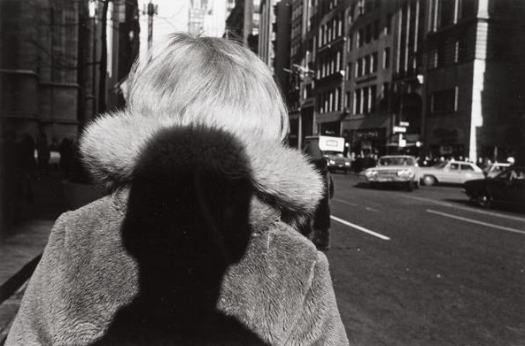
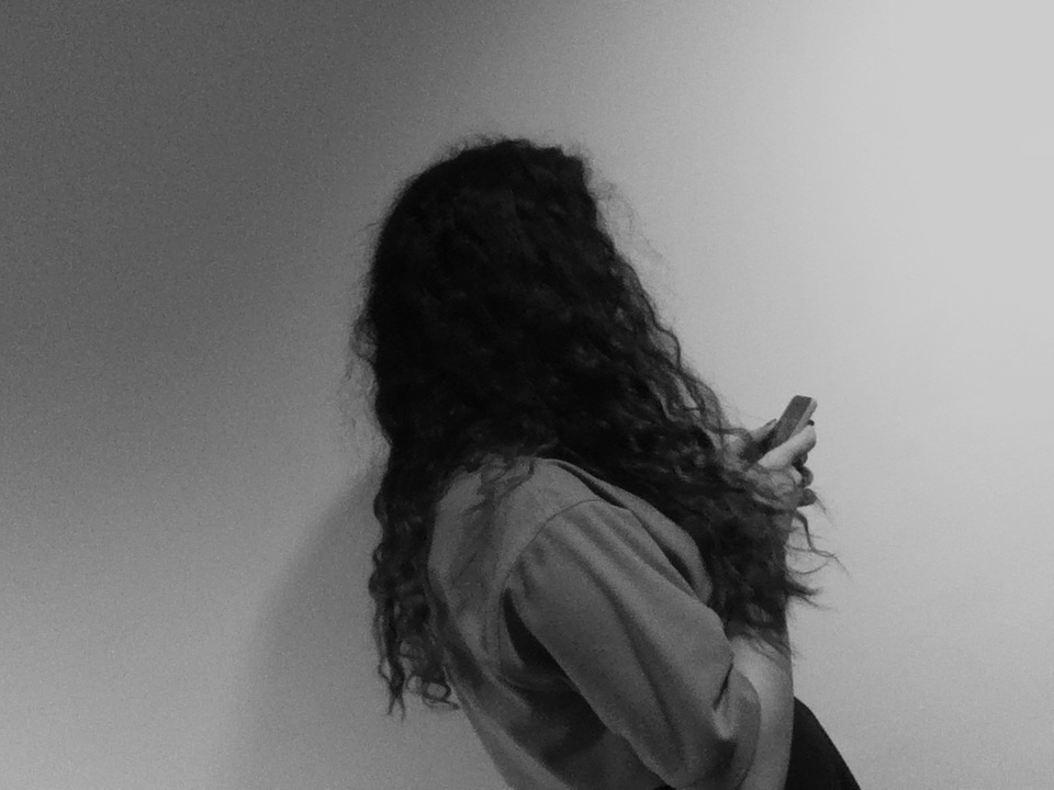
Over the Shoulder
Many photographers stand/walk behind people while traveling the streets this leads to picture where we see the back or side of the head of a pedestrian and the view in front as the background. It is usually more effective if the head and shoulder of the body is 1/3 of the way across the image and not directly in the middle. Another effect could be if the camera was tilted to the side - playing the with the angles.
|
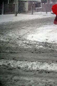
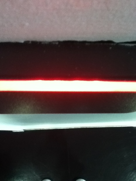
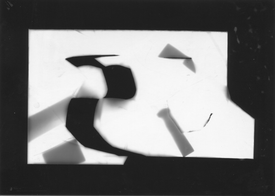
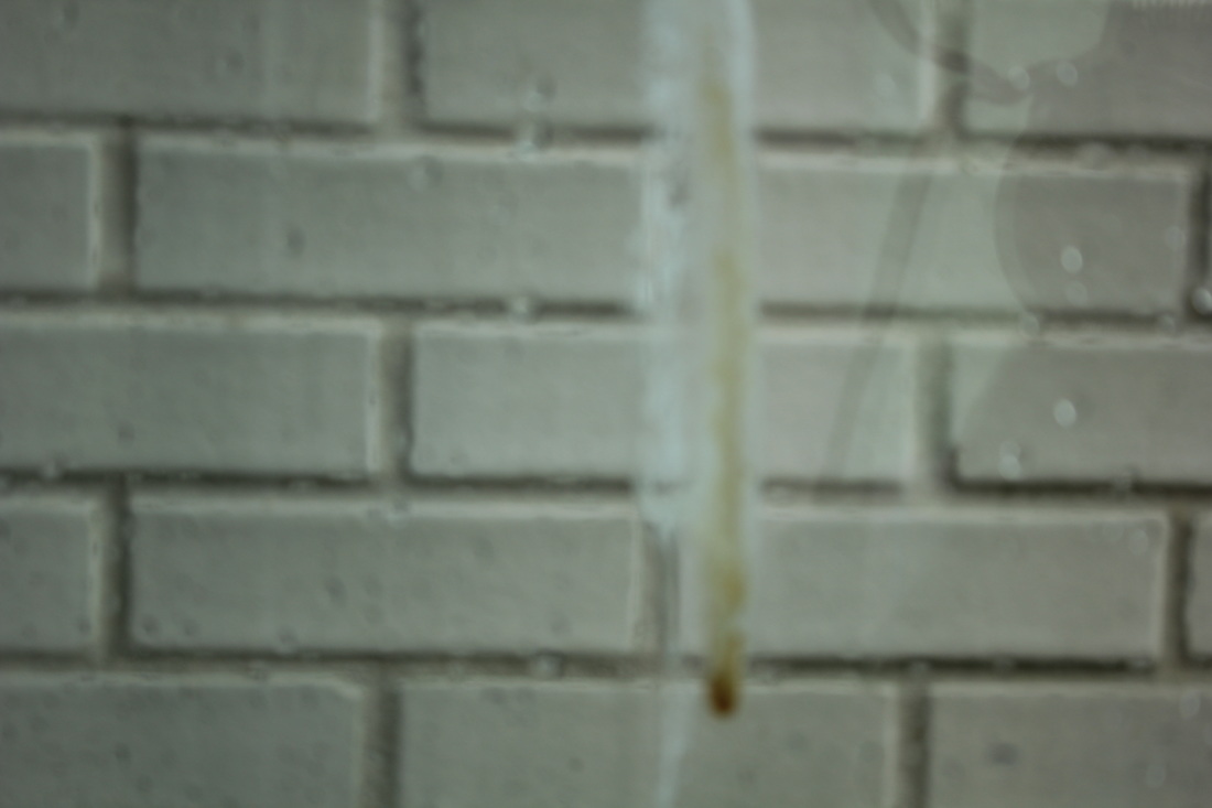
CroppingCapturing an image and cropping it so that it is more interesting or only the captivating space is visible is an effect the many photographers use.
The image to the side shows that the photographer has chosen to crop crop the rest of the colour ing the image to create and interesting contrast between the large space of white and inkling of red. |
|
|
Walk on ByCreating a walk-on-by image is simple but effective. You can ask a peer to walk in front of you or you can capture pedestrians as they walk. The only difficulty with these types of images is the pedestrians have to match the background although it can be very effective if it works.
|
SurfacesWhen you look around at your surroundings you can see a variety of patterns and textures that can be captured. It is easy to take a picture of the floor but there would be nothing interesting about that - making sure that surfaces have something that makes them interesting and unique.
|
|
The Formal ElementsThe words below are the main components that explain what makes up a photograph, having more of one can lead to an abstract image.
|
|
|
Focus:
Light: Lines: Repetition: Shape: Space: Texture: Value/Tone: |
The alteration of the distance setting on a lens, creating a sharp and/or obfuscating effect on individual sections of an image.
Illumination or luminescence of any kind, e.g; fluorescent or natural. A series of straight, curved or any shaped rule in an image. "Lines can be effective elements of composition, because they give structure to your photographs. Lines can unify composition by directing the viewer's eyes and attention to the main point of the picture or lead the eyes from one part of the picture to another. They can lead the eyes to infinity, divide the picture, and create patterns. Through linear perspective, lines can lend a sense of depth to a photograph. (Linear perspective causes receding parallel lines to appear to converge in the picture. This allows you to create an illusion of depth in your pictures.)" Taking an image with a re-occurrence of shape, colour or other elements to add a statement or intensify the allure of an image. The use of two-dimensional elements and their exterior to form to create and identifying point for the viewer of the image. An area or expanse which is free and available for supporting objects, shape or colour in an image to fill. The feel, aspect or substance of a surface, object or material shown through an image in contrast, curves or patterns. The quality and content of an object, surface or material in an image. |
Link to art #2
While exploring deeper into the more famous pieces of abstract photography, I've been able to notice a significant amount of similarity between familiar artwork and new found photographs. Below are some examples.

|
|
|
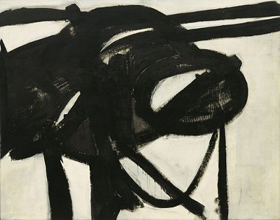
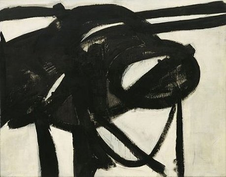
This is a piece by Franz Kline made in the 1950's and called "Chief." It displays impulsive brushstrokes of the artist along with subtle but deliberate ones. "Chief" is made up of "horizontals and verticals broken by loops and curves". It was named after and inspired by a vehicle he remembered from when he was interested in railway and Kline said himself that he wanted to display the feeling associated with the stimulus rather than the stimulus itself. From this i can interpret a bold and empowering feeling coming with the prompt because of the stark contrast of black and white. The use of black on white provokes a similarity to Japanese calligraphy, but Kline does not support this idea; "I paint the white as well as the black, and the white is just as important."
|
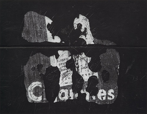
This is an image by Aaron Siskind, produced in 1960. It is a close up of a poster on a wall that has been abused through scratching and has probably been affected by weather. Siskind commented a couple years before this image, by saying "When I make a photograph I want it to be an altogether new object, complete and self-contained, whose basic condition is order-(unlike the work of events and actions whose permanent condition is change and disorder)." This applies wholly to this image because although the subject might be pedestrian among other content but on it's own it can be considered a whole new essence or as Siskind says " an altogether new object".
|
Similarities
These two pieces of work, although completely unrelated in everyway, are also visibly homogeneous. There is that same pattern of shape and repetition of the same shades. They both contain a somewhat rough texture although exhibited differently (through the strokes of the brush where the paint didn't quite reach in the painting and the scratches and indents in the photographs). I like that I can relate to the discovery of a new aspect of photography through something that already interests me like art.
Taken In School #3
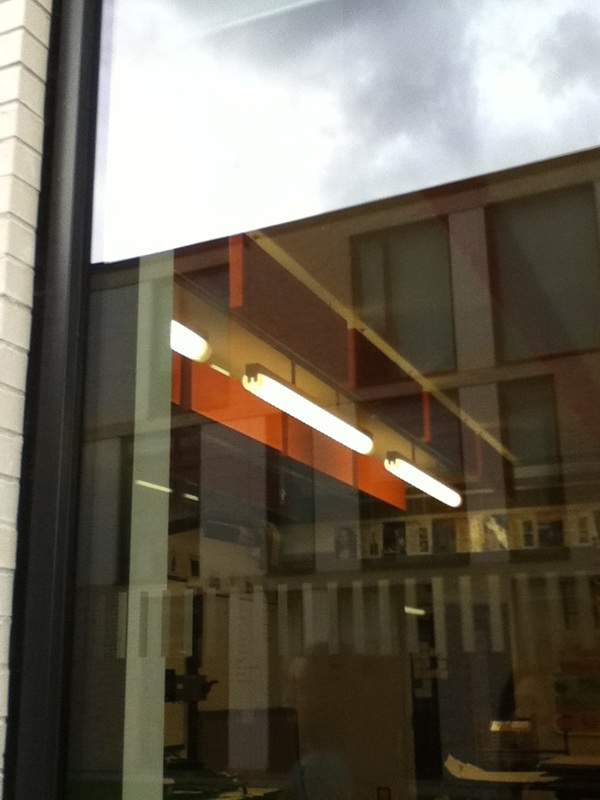
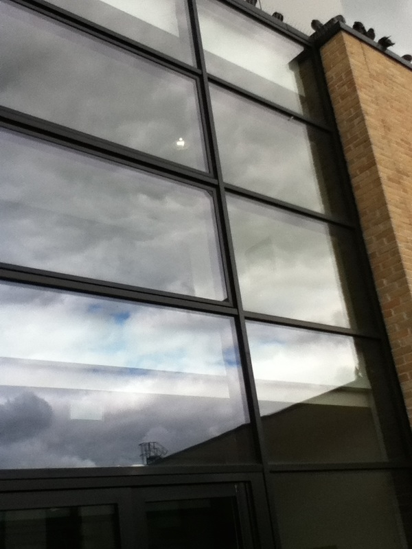
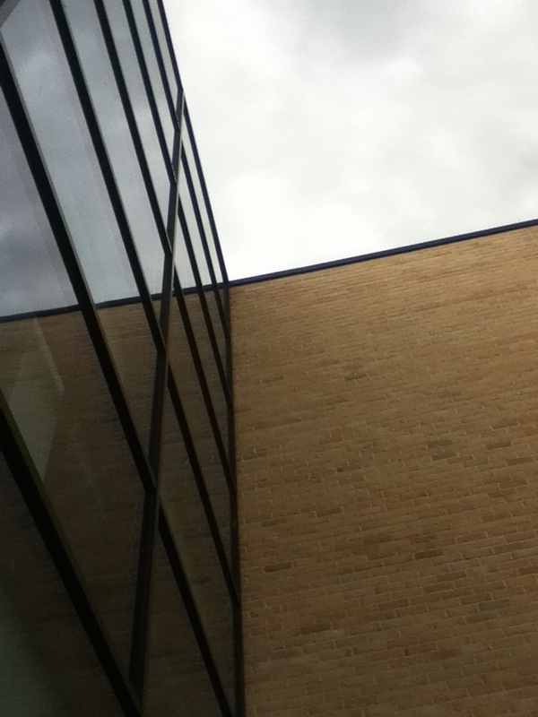

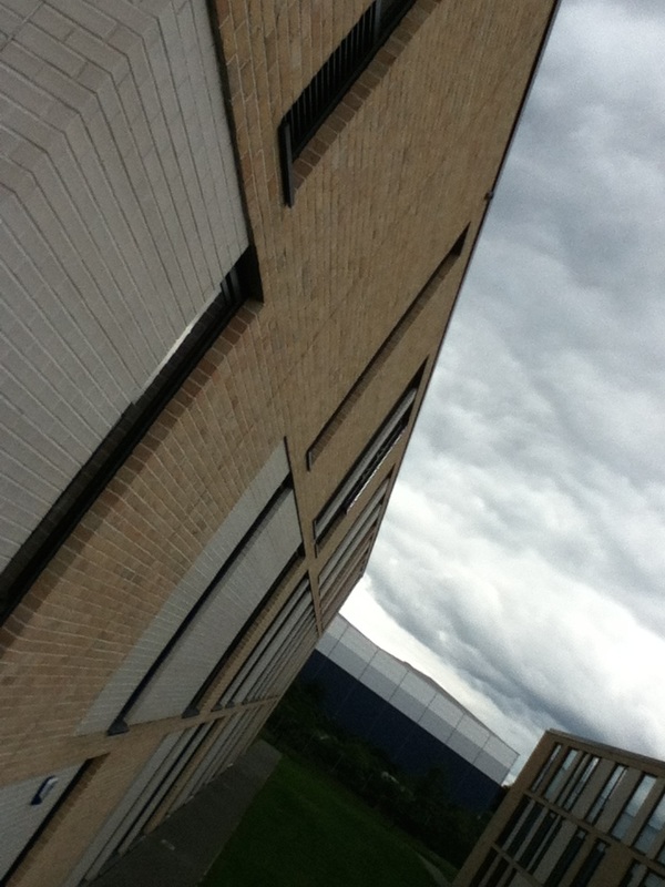
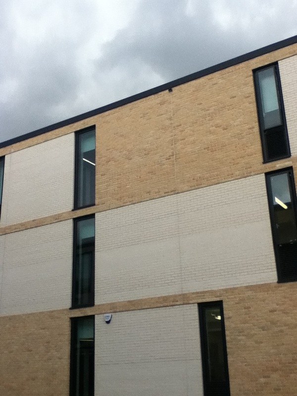
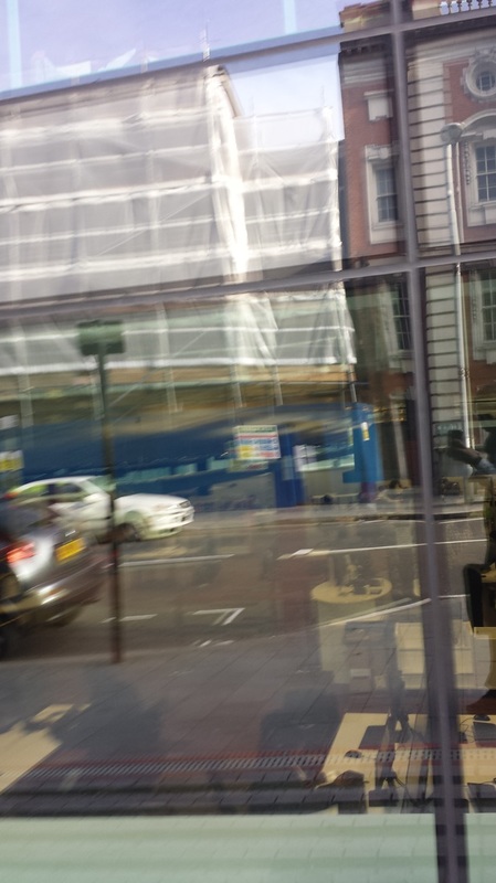
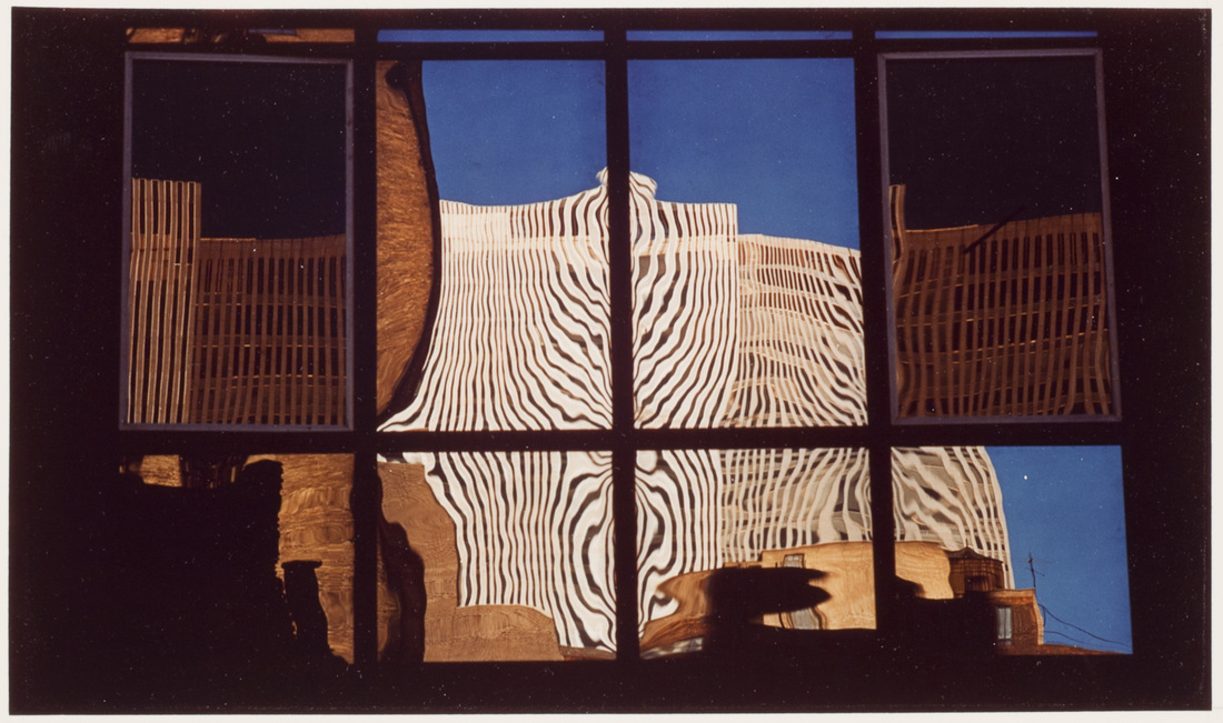
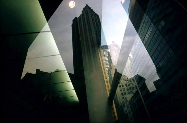
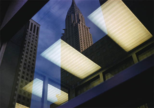
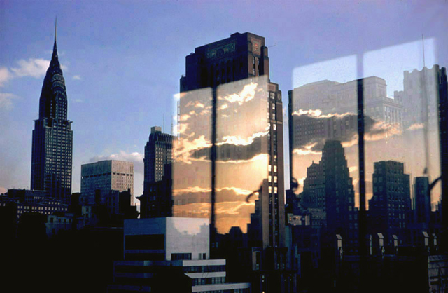
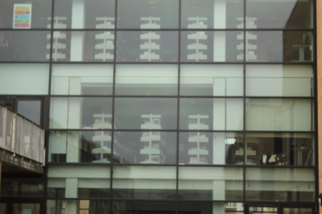
The images I have taken during today's lesson don't exactly vary in what I've decided to take a picture of but more the angles and how I have chosen to aim my camera to capture a shot. I particularly like the ones of the building because of the way they contrast or compliment the sky and how the clouds reflect onto the surface of the windows.
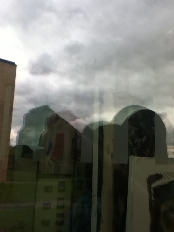
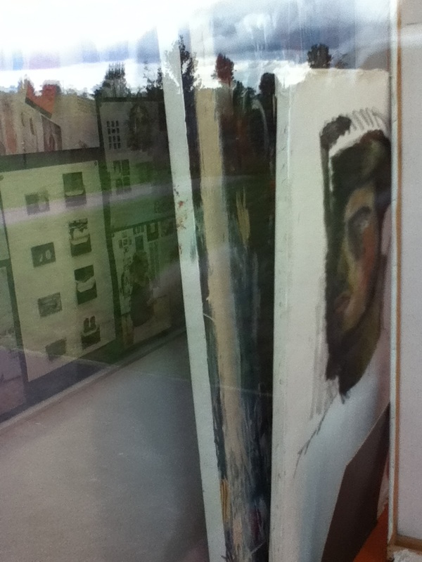
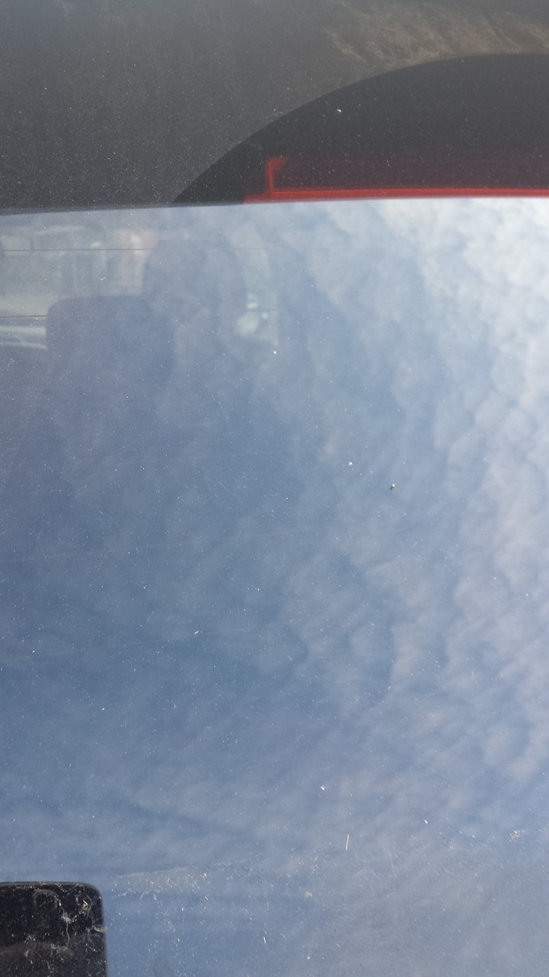
The other pictures are close ups of reflections on windows or objects through the windows. I am fond of the one where the stack of paintings are visible because where the paintings separate creates an illusion of different sections of the image.
The other pictures are close ups of reflections on windows or objects through the windows. I am fond of the one where the stack of paintings are visible because where the paintings separate creates an illusion of different sections of the image.
Experiment With Themes #1: Pattern
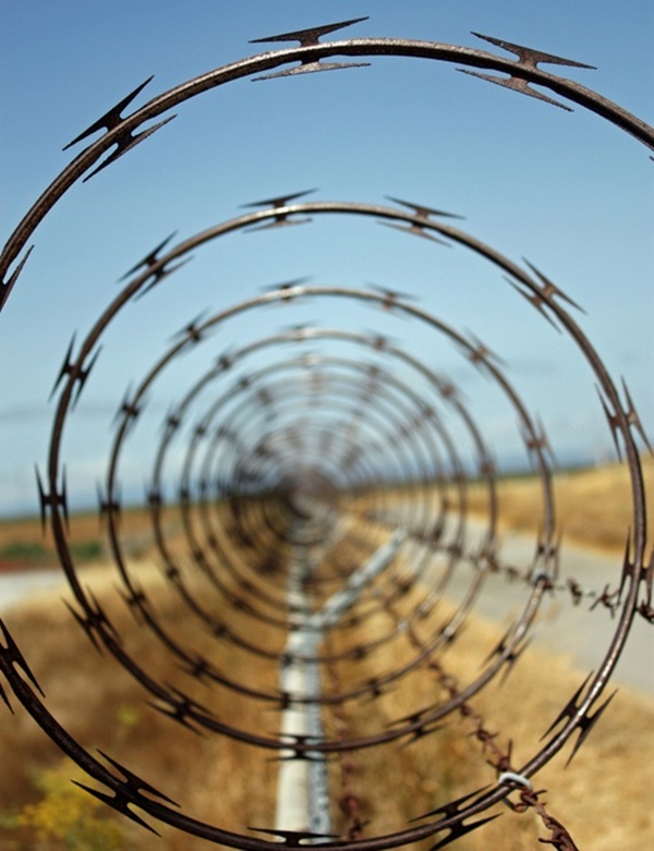
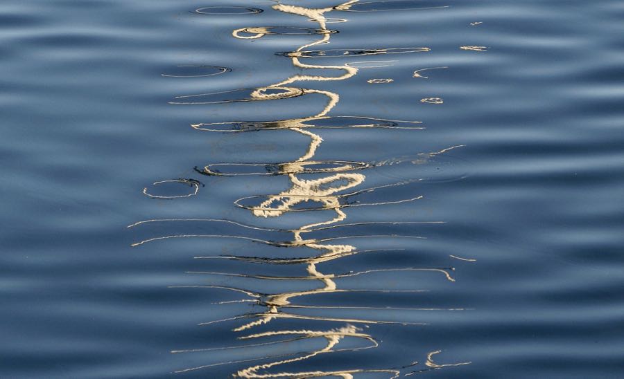
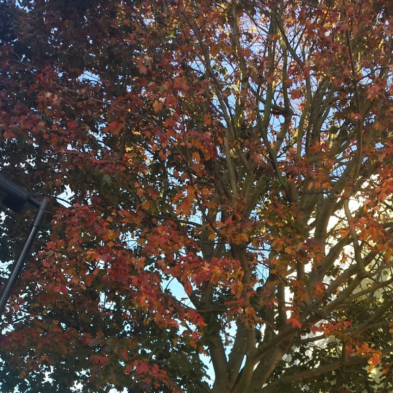
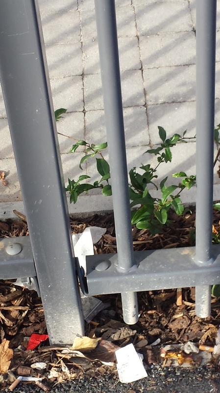
I want to begin putting my photographs into groups of differentiation and my first idea was pattern and how repetition can create a specific pattern. The images above a collection which I think display this theme in a varied method. My favourite out of these is the pattern of the wire fence in the top row, second to the left. The fence seems ongoing because of the position the image was taken from and the loss of focus towards the centre of the image. The first one on the right of the bottom row, including the rope curling along the surface of the water is also interesting because of how it also appears ongoing, but because there is also the ripple of water that can be considered as a pattern also.
Research Part 1:
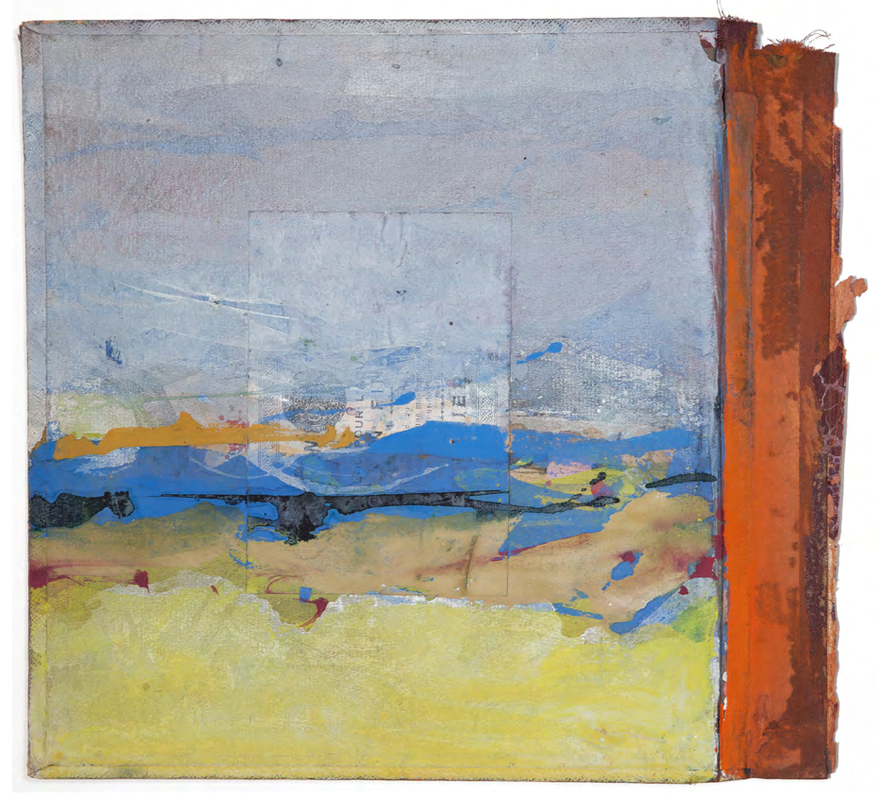
This picture mainly focuses on the space of the contents, you have to be able to imagine the space taken up by the rolls of paper(?). It is also very focused on shapes and repetition of the circular element and the spaces between them. If abstractness was a scale, I would say this image would be half-way down because although it is not totally definable, we have a clear idea of what the image is.
|
This image focuses on the value and tone of the image and also the color of the subject, this image that was taken using a phone camera looks abnormally like a painting. The tone of this image is much more smooth and the different sections flush together effortlessly. This causes an abstract effect and is remotely discrete as to what the original subject of the camera was, allowing imagination to create divergent motifs.
|
In my opinion; Line, Repetition and shape are the Formal Elements represented by this picture. The lines being the main focus, generate a series of shapes that are repeated throughout the image. Because we are able to see nothing but the repeated shapes in the image, anyone who views this image will not be able to decipher what the picture is of.
|
Taken In School #4


These images were also taken in school, after the study of the formal elements and we were asked to focus on the display of the described elements above the gallery of images. Most of my images contain one or more illustrations of the components of the formal elements and are visible and understandable once explained. Below I will explain a few of them;
|
Focus: This image does not represent focus that much although it is very blurred and can be deemed as slightly out of focus. Because of this I plan that any further pictures I take are a more evident exhibit of complete, divided or non-existent focus.
Light: There is some aspect of emphasis on light if the shine of the red light can be considered as part of the light element. The picture contains no obvious focus on natural light but that which makes producing the image possible. It is harsh and artificial and directed at the camera. Lines: Line is the main element that constructs this images and the composition is based on horizontal lines. Because line is what dominates the picture nothing else is visible, therefore we do not know where this image was taken or what it is. This makes the image widely abstract and that is due to the influence of line (along some other element). Repetition: Repetition is more or less the same aspect as line, because without repetition of line, the image would not be constructable. So repetition plays a big part also in the picture. Shape:The only shapes clear in this picture are rectangles created by the lines so I wouldn't say this image represents shape because it is not a big factor of the picture. Bearing in mind that all images have shape. Space: I think that space is the one formal element represented by all pictures. In this particular one - negative space is very reoccurring and much more than the positive space. This opinion can vary on what you consider the main subject in the image (positive space) and whatever else fills up the picture (negative space). Texture: The texture of this image seems mostly smooth; this is because of the way the surface of the subjects in the image reflect the light. The only section I consider rough or bumpy textured on the image would be the very top where the small bumps on the wall are very evident and would clearly feel rough. Value/Tone: The darkest value in this picture is in three different places and it is between the lightest values and tones. The entire picture is actually split between three very light tones and three very dark tones. |
|
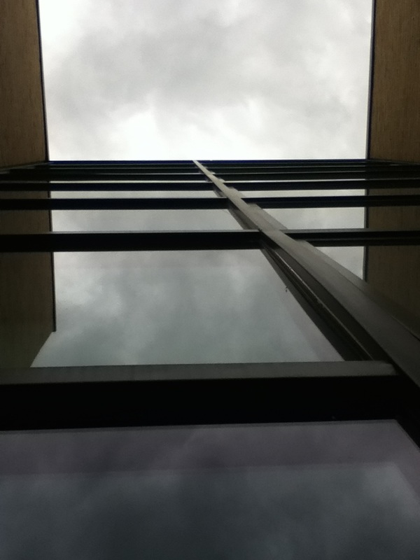
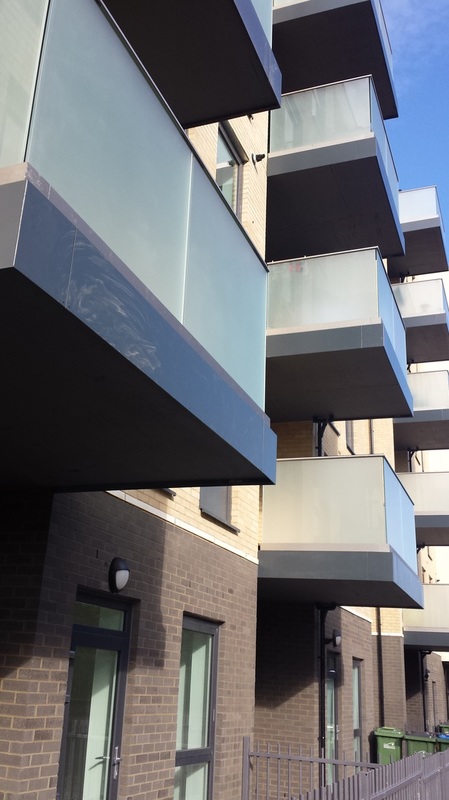
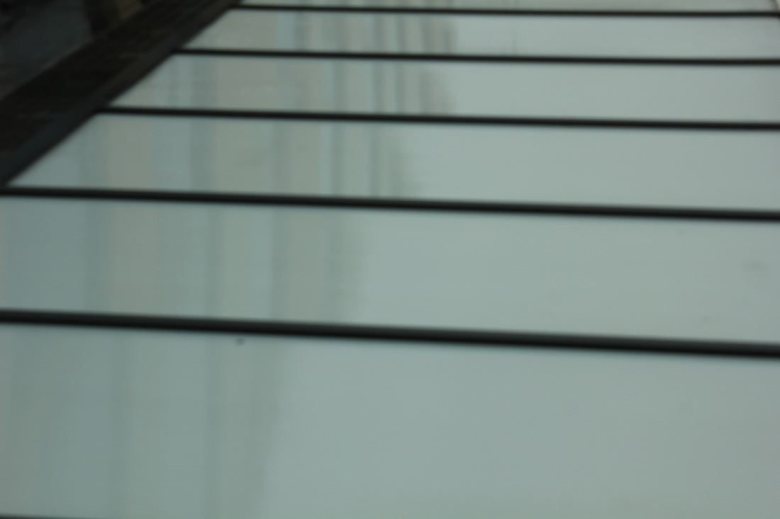
Focus: This image does not represent focus as much as other elements. It is in full focus like many images and this is an element that I will try to focus on in the future. Light: The light in this image is natural and we are able to tell the time time of day as midday or late morning. Only the top of the image is directed at the light and the rest is reflected off the camera. It is very soft and although it is not the main emphasis of the image - it fills up the negative space of the image. Lines: Line is an important element in this photography and is the positive space of the image (as it the building). The lines are straight and thick, very visible. In my opinion, line is the most dominant element in this picture and is what makes it abstract. Repetition: The many lines in the image cause repetition and create a pattern of rectangles throughout most of the image. There is also a repetition of the reflection of clouds on the windows. Shape: The shapes in this images are created from the repetition of the lines and are geometric and straight-edged. The rectangles are evenly spread and cover well over half the picture. Because shape is so part of the image, they are another well portrayed element. Space: There is a lot of depth in this is image and everything seems evenly spread out. The space of the image is very illusionary as you have to imagine how tall the building really is and how spaced out the shapes really are. There is more positive space than negative considering that the building and shapes are solid elements of the picture and the sky being the empty part of the image. Texture: Texture in this image seems very soft and smooth to imagine the touch of because of the way the surfaces react to the light and reflect everything. It would seem cold because it is visible that the lines separating the window is metal and the weather does not look hot considering the type of natural light. Value/Tone: The value of this picture is mostly dark and it covers half the image. The light is sprinkled around as a reflection and although it is not very dark, the unlit tones overtake the illuminated sections. |
|
Taken At Home #5
These images were taken at home or around my area. We were asked to spend time outside of school to take images that display abstract photography as best we could outside school. I tried to achieve this as much as I could and that I have focused on achieving the formal elements.
|
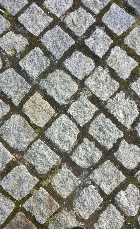
This image taken at home focuses on pattern, line, shape and repetition. The lines are straight and take a diagonal direction. The shapes are geometric and are caused by the cross-over of the lines. Repetition is formed by the re-occurrence of the rhombuses. Pattern is produced because of the colours of the lines and the tiling effects of the rocks.
The images' space seems very shallow and cramped together but this maybe because of the fact that we only see this part of the ground and nothing else. When I took this image I tilted my phones camera so it was at birds eye view and intended to capture only this part of the ground. My main focus was the lines and shapes. The most interesting aspect of this image is the tiling effect created by the cross-over of the lines - also the contrast of the colours; green of the moss and the light, natural grey of the stone. Something I could improve is the way I take the photo (angles), or whether to change the focus on certain section or all of the image. I feel like this is one of my most successful images if the goal is to produce abstraction. |

|
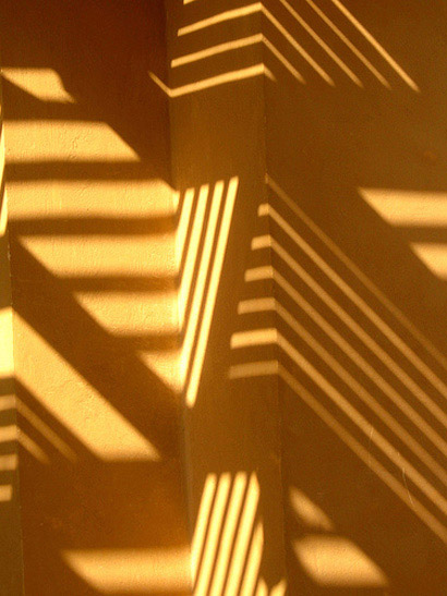
Experiment With Themes #6; Shadows
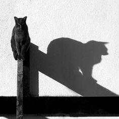
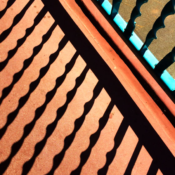
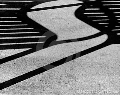
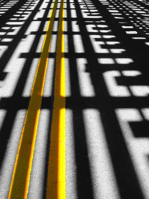
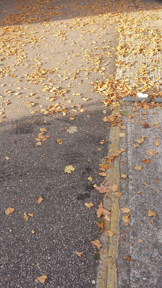
To carry on with my organizing of images into groups, I have found another compilation of images to this time represent shadows. I feel that that this combination of pictures displays shadow in a range of ways, from line cast on floors, walls and people to shadows of people and animals. The one that intrigues me the most is the one on the bottom row, third right of what appears to be the double yellow lines on a road that contrast against the dark shadows and floor. I love how the colour stands out in the image but the shadows darken some areas.
The angles of the shadow of the cat in the picture on the top row, second to left also capture the eye because of composition and lines the shadow creates.
The angles of the shadow of the cat in the picture on the top row, second to left also capture the eye because of composition and lines the shadow creates.
Class Experiment #Photograms
What are Photograms?
Photograms are images that are made, not with a camera, but by placing objects on top of photo sensitive paper that is then exposed to light. The surface of the paper that is covered by the object/s will be protected from the light creating a white impression - which can turn to a very subtle or dark grey, depending on if the light is able to reach the paper thought the object. This all depends on the opacity of the object and the time of exposure to light. The rest of the paper which is not protected from the light rays turns black. This is a process that takes place in the dark room - as Photo-Sensitive paper is sensitive to all light (apart from red light - which is why red light is used in the dark room when preparing to make Photograms). Negatives in a photogram are when the lights are dark (light, translucent objects are displayed as dark) and the darks are light (dark, opaque objects are seen as light). A photogram is a negative.
Photograms are images that are made, not with a camera, but by placing objects on top of photo sensitive paper that is then exposed to light. The surface of the paper that is covered by the object/s will be protected from the light creating a white impression - which can turn to a very subtle or dark grey, depending on if the light is able to reach the paper thought the object. This all depends on the opacity of the object and the time of exposure to light. The rest of the paper which is not protected from the light rays turns black. This is a process that takes place in the dark room - as Photo-Sensitive paper is sensitive to all light (apart from red light - which is why red light is used in the dark room when preparing to make Photograms). Negatives in a photogram are when the lights are dark (light, translucent objects are displayed as dark) and the darks are light (dark, opaque objects are seen as light). A photogram is a negative.
Photograms can be used to portray abstraction because you are never really sure about what is being used to create a Photogram. They also display many of the formal elements.
|
|
The two works to the side are my favourite Photograms and they are by Man Ray, the creator of Rayographs (the same aspect just different nouns). My favourite feature is the composition and arrangements of the objects used to make the Photograms. I also like the ideas that might lay behind both of these pieces of art. What they both remind me of is home because of the use of light bulbs and one of them sparks objectives of relationships and love or physical attraction. If I could ask the photographer one thing it would be; What initiated the creation of these two works, what gave you the inspiration?
|
Greg Stimac #Research
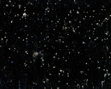
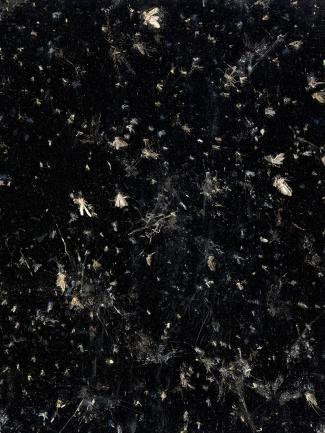
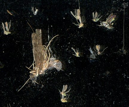
The images above are a collection pictures by the photographer Greg Stimac who is an artist from California. above are pictures taking by him of a collection of many moths, but when zoomed out, the image represents photogram characteristics.
Own Photograms;
These are Photograms that I made during my provided time in the dark room. Most if what I have made focuses on the line element and is very basic. However in my opinion this is a very creative idea because it shows that abstraction can be achieved using the simplest of objects and ideas.
|
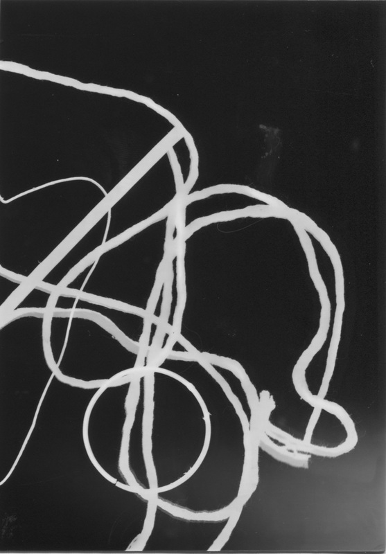
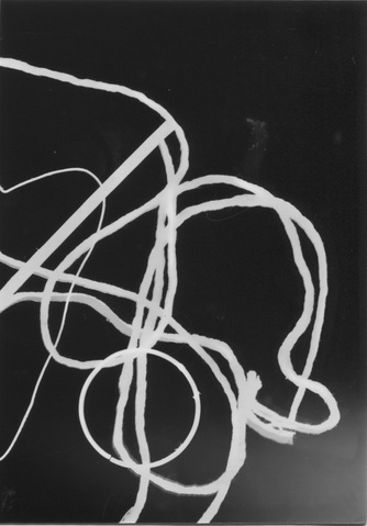
This image was made using string found in the dark room and placed randomly on the sensitive paper. Exposure to light was maybe only a six seconds long or less because I thought that it might corrupt the image and it might turn all black. Luckily, it has not done this and perhaps turned out very successfully. The best outcome, I think, is the way the string is composed and the contrast to the darker spaces. In natural daylight the Photogram is a very clear black and white and there are hardly any greys. The least fortunate section would have to be the bottom right-hand corner where it seems to not be exposed to enough light, this is something I will try to fix. Although I am happy with the outcome of this image I will try to develop it further in the future. I will continue experimenting with these three Photograms to visualise how abstract a Photogram can really become. |
|
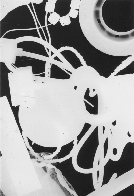
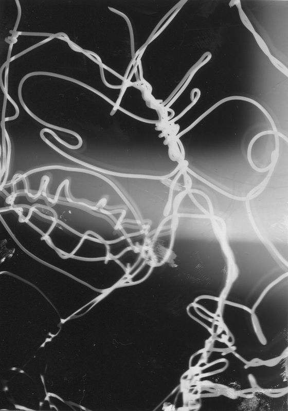
Using the Photograms that I created, I have cut them up and re-arranged them into completely different shapes and have been rewarded with the outcomes below. I used the upset Photograms and put them on top of light sensitive paper, exposing for a little bit longer to ensure that the light was able to penetrate through the paper when I took them out, the darker sections of the previous Photograms caused different tones throughout the images.
(Click images for caption)
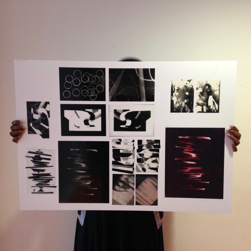
In a class discussion we were taught how to use Photoshop to develop out final photogram into a duo-tone which would change the colour and texture of our photogram. I chose the colour of mine to red because I felt it bought out the contrast of the tones. After this was complete we were asked to choose one image from each step of the photogram process to display on our Final Outcome Board.
First Final Outcome #Overall Analysis
At the start of the project on Abstraction, my thoughts were to take images, with a camera, of subjects that did not have a concrete idea and that the viewer would not understand. Now, my opinion has not changed drastically but expanded and I am- more open to the scaling of Abstraction - the fact all photos are abstract but some are more than others.
We first began researching pictures that we thought were abstract, and I found certain ones where I thought that they displayed a range of abstraction. Through my research I was able to learn that all images are abstract considering they are 2D transformations of the real world; however there are certain aspects that differentiate pictures and make them more abstract than each other. For example, one image may be a photogram (which tend to be on a higher level of abstraction) and another maybe a simple, decipherable image but it would also be considered abstract because it is an alteration of reality. My research was through websites such as Tumblr, Pinterest and Flickr; scanning through and saving the images that intrigued me.
On top of this, during class we were given an image composed of a table covered in shadows that consisted of lines and shapes, the image had no colour. We were asked to answer questions about the image and also try to sketch the picture to deepen our field of vision without being told what the image was of. The first attempt I took at sketching the image went horribly wrong because I was focused on drawing an object that wasn't necessarily there, instead of focusing on capturing lines and light or dark shades. I think that after a few goes, I was able to prioritize the more important aspects of the image and produce a successful illustration. With guidance, I was able to understand that the image was more central to the elementary ideas.
The next few lessons consisted of research and class discussions of abstraction and our progressing opinions and developing ideas as a class. To make sure we had concrete examples and could expand out ideas, we were asked to make a mind-map during class, either on a sheet of paper or on Popplet. I decided I could think better if it was done on paper and put down as many relevant ideas I could come up with, my favourite being shadows and reflections.
Taking my first set of picture showed me how difficult it really was to find the perfect moment to take an image that illustrates abstraction, maybe this was because my head was still wrapped around the idea of artwork, but fortunately I managed to capture a few images that were satisfactory. In that same lesson, the entire class was asked to think about the list of "Formal Elements" we were given, and I learnt that every picture consists of a balance of each of the elements but when an image contains more of one, it is likely to become increasingly abstract.
To combine my separate view of art and photography in the abstract region, I thought it was a good idea to find artwork and photographs that were abstract and had similar qualities and structures. Surprisingly, there were many and although they were completely irrelevant to one another, most of the pairs I'd found held much resemblance. This, I can say now, definitely helped me understand that just because and artist uses their eyes as a lens and a canvas for film, doesn't mean it is any different from photography.
After my revelation, I took more pictures inside the school to show if my practical understanding of abstraction had improved and I believe that it was easier to take picture knowing there wasn't anything specific I had to look for.
Using the subject of Formal Elements, I thought it would be a good idea to, for the ones that intrigued me most, make a collection and see where the difference between some of the more similar, like line and shape or pattern and repetition. Sometimes, formal elements overlap and that does not mean an image is any less abstract, it just contains more of a selection of elements rather than just one.
After more research on pictures that interest me, I was finally able to take some images at and around my home. The images I took definitely represented the formal elements and abstraction a lot more then any of the one I took in school did and this shows in my work. I think the reason for this was because outside school there is more for me to capture and focus on and a lot more variety in surroundings.
After I'd taken my first set of pictures at home, I repeated the Formal Elements idea, but this time made a combination for shadows which was interesting because I realized there a various ways in which shadows can be created and handled.
The next part of my abstraction journey bought me back to photograms, which I'd studied a little earlier on in the course. As a class we were told that abstraction can come in the form of photograms because they are not decipherable at most times. Also, they are all tones and no colour which shows dominance in the elements already. After being asked, I researched Man Ray, who is the somewhat father of photograms/rayographs. I found some interesting work, some of which I was already familiar. As expected, groups of us went into the darkroom and made as interesting and unique of photograms we could produce, testing how we could elevate our work and be more creative by playing with the use of developer, time of exposure and the shapes/objects we used.
As an unusual request, we were asked to cut up out favourite photogram into and interesting pattern, which was confusing at first. Too make sure I made a quality cut up, I decided to practice on a few of less outstanding products and once I was comfortable, I moved onto a photogram I had made of string and nails, I chose this because I thought the composition of the objects was unusual and it was also the only one that came out as a complete negative. I also chose one that of hoops I'd found in the darkroom. Just before we cut them up we were asked to take a digital image of our chosen photograms (which was then uploaded and printed,) so that we'd still have a copy.
This process lead to developing new photograms, made up of the cute pieces of photogram. I thought this was a brilliant idea because when the new photogram was exposed, the darker areas of the cut-up would block the light, causing that to stay white. In contrast, the lighter areas where the light was blocked before would now become dark because it was easier for the light to penetrate through. I think we were asked to do this because it would develop our creative thinking and would prepare us for when we had to do it alone. Also, it showed us all that photography can go to many lengths and doesn't always involve the picture from the camera.
After these cut-ups were produced, we moved on to how we could develop them further by adding the use of Photoshop, an adding duo-tone, which would change the colour and texture of our images (taken of the photograms made from cut-ups). So that we had concrete collection of the progress of our photogram procedure, we mounted one image from each step of the way onto a white board in a befitting arrangement.
Overall, I feel as though from the very beginning of my abstract journey I struggled, but as I began to understand and discover new concepts, it was finally enjoyable and easier to earn good results, whether in the dark room or on camera. My biggest mistake was looking for something abnormal to capture when I didn't need to because, I could just change the focus of my lens or get a shot of a certain pattern.
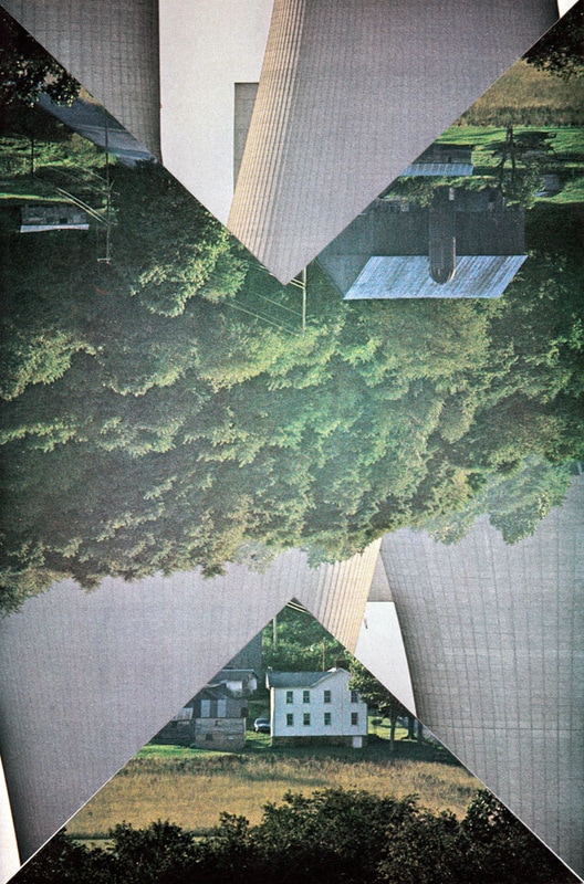
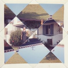
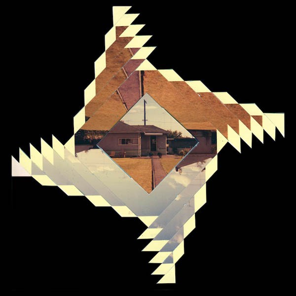
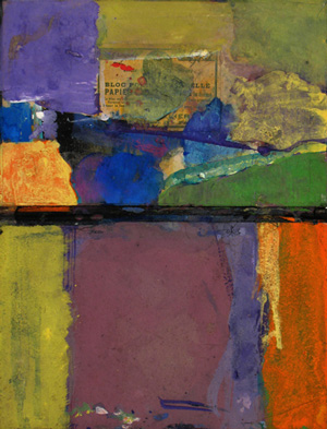
Artist Research: Randy Grskovic
Randy Grskovic is a Artist and a Curator (someone who oversees work at a museum or collects artwork - in Grskovic's case, a collector of family photos) who lives in Toronto, Ontario. Unfortunately I wasn't able to find any background information on him or about what inspired by him, but when we were told to research him and shown artwork made by him I was really curios as to what made him come up with the idea of cutting up other peoples photos.
Randy uses Family Pictures (most of them holding some sort of important memory) taken by other people to slice up and put back together. He would arrange the pieces of the image so that they were so abstract; you wouldn't be able to decipher what the original image was of. Some of them were decipherable - but not many.
Here is some work that belongs to Randy that I really found interesting;

|
This is video about Randy and his work.
The photo to the side is my favourite image by Randy because of how abstract it is and also because of the fact that he mixed two images together. I think the darker image was some sort of statue - and the other one was originally woman in a bikini smiling for the picture. I really like how the picture is not so impressionistic that we can still separate the two images. My favourite concept of the image is the contrast of colours. When I look at this image the first thing I see is the girls smile, it is because it is more evident and is near to the middle of the picture. I don't think that I will ever understand why Randy made this image the way is but it is very inspiring. If I could ask him a question I would ask what inspired him to create this piece of work.
|

This is a more famous piece of work by Randy. This kind of work is his main focus - retrieving an image that doesn't belong to him with an important memory and cutting the image up. Then placing the pieces of the image together in an abstract way. Most of his work has some sort of pattern. My favourite aspect is the choice to keep the white boarder around the image and stick it on a black background.
As I said, I will never understand Randy's intention and why his art work is the way it is. However I have found a quote by him that intrigues me; “The memory has changed and so has the document. The photograph as well as any other document is never an accurate depiction of truth.” This could explain why he uses photos with an important memory and arranges it differently. "the memory has changed and so has the document" suggests that he wants people to see that the memory of the past is different and so should the image. The fact that his artwork is abstract could mean people are unclear about the past. I am glad I found this quote because it really helped me.
As I said, I will never understand Randy's intention and why his art work is the way it is. However I have found a quote by him that intrigues me; “The memory has changed and so has the document. The photograph as well as any other document is never an accurate depiction of truth.” This could explain why he uses photos with an important memory and arranges it differently. "the memory has changed and so has the document" suggests that he wants people to see that the memory of the past is different and so should the image. The fact that his artwork is abstract could mean people are unclear about the past. I am glad I found this quote because it really helped me.
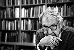
Artist Research: Ernst Haas
|
Ernst Haas was a photojournalist (a normal journalist, but specializes in telling stories through images) and a colour photographer. Haas's work was major part of the first single-artist for colour photography in New-York's Museum of Modern Art.
His early work on the Austrian returning prisoners of war lead to an offer from Life Magazine, which he refused because he wanted to hold on to his independence as a photographer. Throughout his career Haas traveled extensively and when he moved to America in 1951 he began experimenting with the Kodachrome color film. This was when his colour photography began. Most of Haas's pictures are very discrete in that they are always hard to understand and pick out. He plays a lot with the formal elements and his pictures are very unique. Ernst Haas said “There is only you and your camera. The limitations in your photography are in yourself, for what we see is what we are.” This shows that he believes, we can only capture what we want to see and that we limit ourselves as photographers. |
Here is a slide show of some of my favourite work by Haas:
|
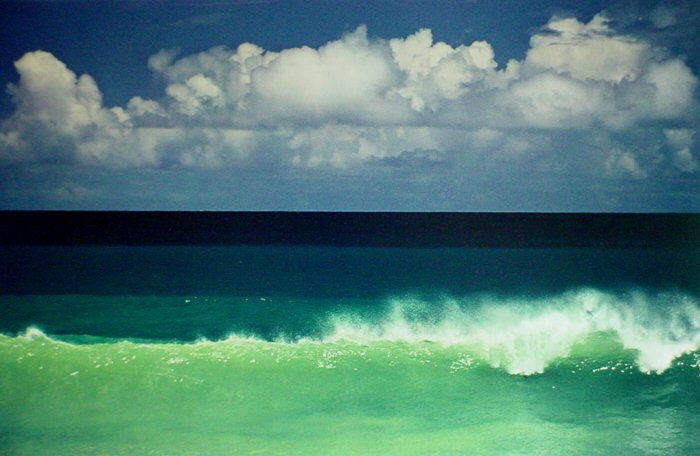
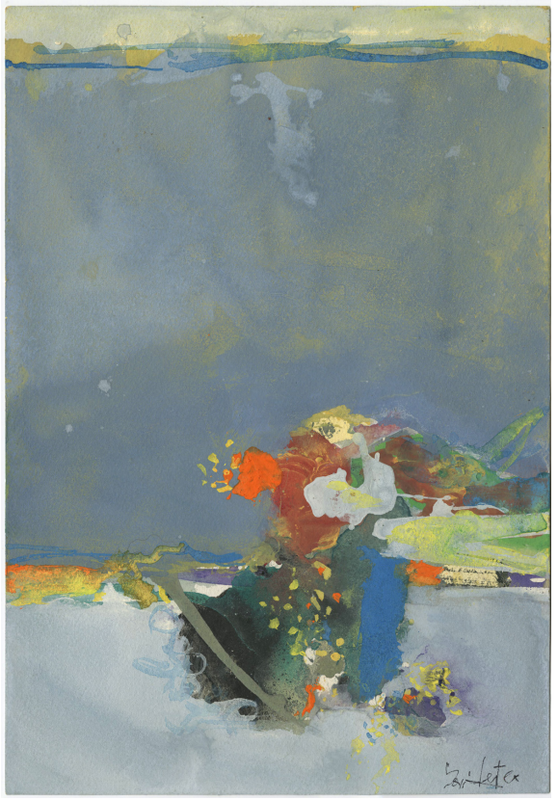
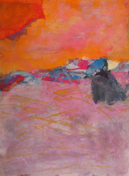
Image Analysis
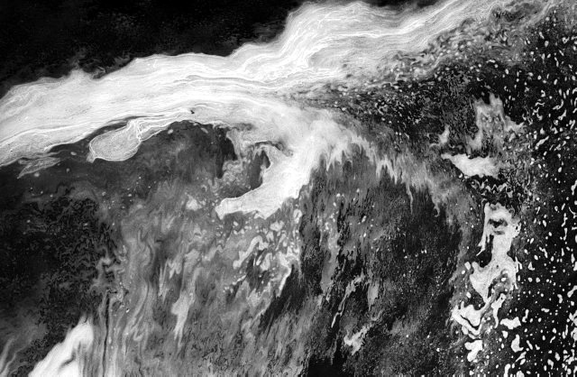
This image is by Ernst Haas and is taken with a long shutter speed, meaning that the camera captured the moving subject, which in this case is water that is mid-wave, while it is mid-motion. We can tell that the water is part of a bigger matter because of the shallow depth of the image where the image is in more focus on certain fragments of the picture and less on other parts. In the image I can see foam of water that predominates the top section of the image in a slightly vertically bent horizontal line and dips into the centre. Particles of foam that have been separated from the main body have been scattered mainly along the lower right and look moderately like snow falling against the black background of the picture. Leaving the shutter open for a long while has caused a massive impact on the appearance of the texture of the water, it has created an effect of paint strokes on the foam and where they would be separate the specks have conjoined; since it was mid-mobile and removed chance the lens from sharpening on every detail of the image. This makes the water foam loom extremely like a painters stroke. The water on the lower left of the image has also been effected and appears very blurred. A situation this image reminds me of is what washing a car window would look like from the inside of the car – how the foam would visibly ooze down the window, there would be other particles of water spread across the aperture. Single words cannot describe this image, I think, but certain phrases such as “Water and its foam leak along a window against a black background, with a comprehension of an airbrush affect…” would be fitting. A person who had not seen this picture would probably not completely be able to perceive an accurate image with just words because of the complicated system of the image, but explaining the depth, texture and significance of the effect the long shutter speed has caused would help them conjure a reasonable image. This image would be considered very abstract to me because it does not have a fully concrete existence, however there is still a very natural aspect to the image because of its decipherable origin, which is water. Leaving the shutter on for a long time has created an abstraction new to me that I hope to try at one point.
Clearly we can understand that a camera has been used to capture this image because of the process (which took research to understand) of leaving the shutter open and imprisoning a moving subject. The effect that has been created is very different to if the same image was taken at normal shutter speed and I think this influences the abstractness of the photograph greatly because without it, it would have simply been alike to any other facsimile of moving water. There are no straight lines in this photograph but there is a line of foam which is horizontal, but at a vertical angle. The image is a greyscale and this has probably also been cause by the process of taking the image however there are light whites, creamy whites, lighter and darker greys and a downright black background – the different tones have probably been caused dependant on how that part of the substance reflects the light of the natural day or even the flash of the camera. Patterns of chaos have been generated by the spread of the particles of water as they move through the air; it is thes e patterns that produce the intricate detail of the picture. The artist has used great amounts of contrast between the jet background and the lighter colours of motif and this has enhanced the chances of the image catching any viewer’s attention. Real life is very varied from this image because we do not see smudged amounts of foam and water against a dark background every time we witness a splash or even great wave of water, however it does link to real life through the idea of it being an image originating from natural resources that have not been physically changed. The effect created by the long shutter speed is what makes this picture special in my opinion. I like how the image looks diluted and disfigured and out of focus because of the artist’s choice of picturing a matter that is moving.
As said before, there is a very shallow depth in this image and because of the variation of focus we can determine the space throughout the image. The white horizontal line across the top of the image is what interests me because of its boldness and the fact the without its existence the image would seem bare and not complete. It contrasts the most to the rest of the image because of its imposing colour and that it has been most affected by the movement/shutter time. One of the important questions for the artist would be about his inspiration and how he achieved this image, whether it took him more than one occasion to perfect it and how he captured the wave – was it a natural one at the beach or one he fabricated himself? The process of constructing this image was understood by research in my case and research has also understood things like what kinds of themes Haas chooses to display his image through. I have learnt that “Haas was an early innovator in colour photography” meaning he was an early capturer of colour photography. It is interesting that among all his creative colour photos, the greyscale one was the most intriguing. Knowing certain facts about Haas gives me an impression that Haas concentrates on colour work, and maybe this image was most interesting because his creativity made up for the lack of beloved colour.
If it was an option for me to name the image, it would be difficult because of the detail of the image – I would call it “Aesthetic Aqua” because the water in this image really brings out beauty. Throughout the image I know that there is an eruption of water, where or when cannot be known however, I know this because I have been able to interpret it through sight and confirm in my research. The feelings that radiate off this image when I look at it are not clear and can relate to moisture or mist, when I imagine being part of this image there are two reactions; a shiver from realizing the that the temperature could be very cold or relaxation upon realizing that the matter could also be warm. I also imagine suffocating from not being able to breathe at the intuition of the water engulfing my respiratory system – for this reason it is hard for me to imagine actually living in the image. This image can do a lot of emotional effect if the viewer cares enough to drown in the image. The artist could have many motives but I imagine he made it to express his creativity, this is not interpreted from anything in the actual picture itself but from research where I learn that Haas thought of “photography as a medium for expression and creativity” and this links on from my opinion as to why Ernst Haas might have decided to conjure this image. What he is expressing in this image, however, is not clear.
The contrast and composition of this image are both very effective and work well with the idea of the picture. They bring out the simple object and confine it in a picture of a complicated array of the subjects itself spread apart. The composition of the water particles distributed across the image in an unsystematic method increase the allure of the image and the contrast of colours makes sure to attain attention and when combined, they uphold any surveillance obtained. The outcome of the movement of content and the time the shutter was open for produce an even more absorbing aura because they make any viewer think about the image. In my own opinion, there is nothing that has ruined or imprecise about the photograph. Other people’s reactions may differ from mine, but I’m evaluating that they will be along the same lines of my judgement. There is not anything that I believe a spectator can identify is inaccurate or that could be improved and this is because I suspect that if altered, the image may lose its purpose and no longer have any of the qualities or characteristics that it nurtures as it is.
Overall, when I try to capture this image I will aim to experiment with different moving subjects that are not water and will determine which motif responded not just similarly, but holds the same sort of expressive, creative and somewhat emotional quality the original stimulus sustains.
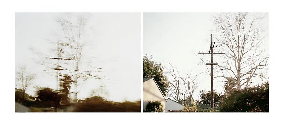
How to make an image like Ernst Haas #Further Research
“A few words about the question of whether photography is art or not: I never understood the question.” The quote above directly links to my struggle at the beginning of this project and I am glad that I have been able to understand that there is no difference, just like Haas states here.
|
Here I will be attempting to make a sort of recipe of how to make one version of Ernst Haas's images;
How to make a photograph of reflections on windows and glass;
|
Inspired by Ernst Haas
The images above are responses to Ernst Haas's work taken in lesson. I feel that I wasn't able to achieve perfectly complimentary images because of the limited photographing material that was available in school. One of the images that did somewhat represent the work of Haas is below;
|
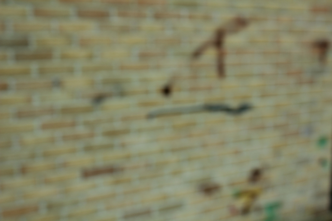
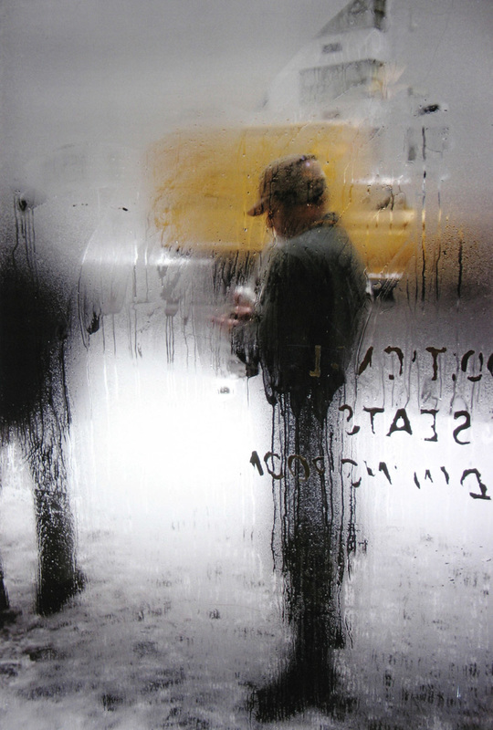
I feel as if this image is definitely a representation of Haas's work because it makes you think about what you are looking at. Once you realize that it is a wall with graffiti, you can derive other themes from the colours and shapes that have been blurred out. For me, the instant I look at the image it reminds me of sea, because the brown and black lines on the top right resemble a boat on water but also because the splash of yellow and green remind me of an island. There is a lot of pattern in this image applied from the bricks of the wall, however because some are different tones and combined with the loss of focus, it looks as if it is moving. This is not one of my best images but I believe it is the best out of this collection of images.
Further Research #Uta Barth |

|
My work never directly addresses the literal subject matter of the photograph, but attempts to ask questions about vision itself. |
Uta Barth is a photographer who uses camera to display 'empty' images through blurring and the natural effects of light. She uses photography to show the difference between how the human eye sees the world and how a camera interprets it. I think her work is interesting because even though there is not much matter in the images, your eyes are drawn to the smallest things in the usually unnoticeable corners of a energetic picture. What is really captivating is the way she uses light to arrange the composition of her images.
|
|
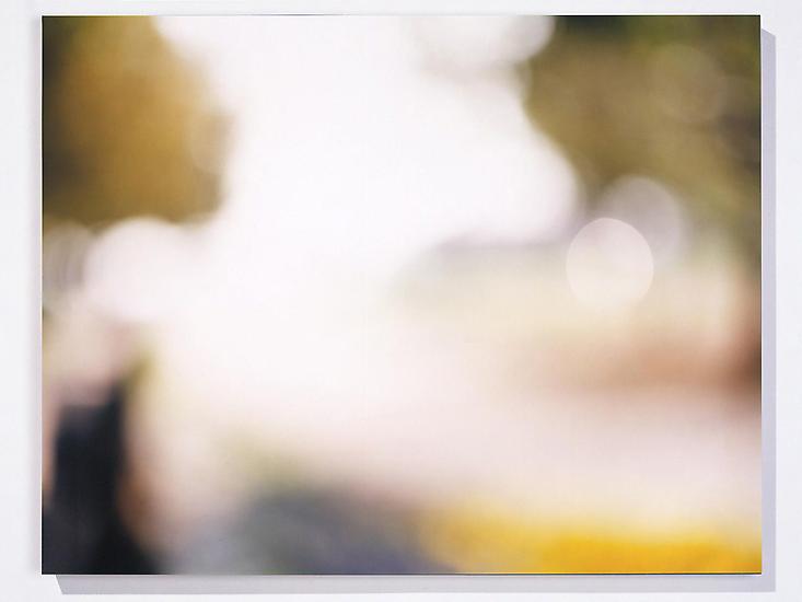
The pictures above are all by Uta Barth and you can really see how she uses minimal subject matter and focuses the image on the display of light or the blurring of the entire image. When I look at the majority of these picture my eyes are immediately drawn to the singular splashes of colour or the abnormal cut off of half an object of focus. I really enjoy looking at her pictures because the context is so unsually relaxing and I think that her aim was to show the strain our eyes have to take to focus on the minimum and appreciate it at the same time, but that a camera can be used to capture the smallest of things with large amounts of identity.
I feel that the images I took as a response to Ernst Haas fit more as a response to Uta Barth and without any explanation, you can see the resemblance.
I feel that the images I took as a response to Ernst Haas fit more as a response to Uta Barth and without any explanation, you can see the resemblance.
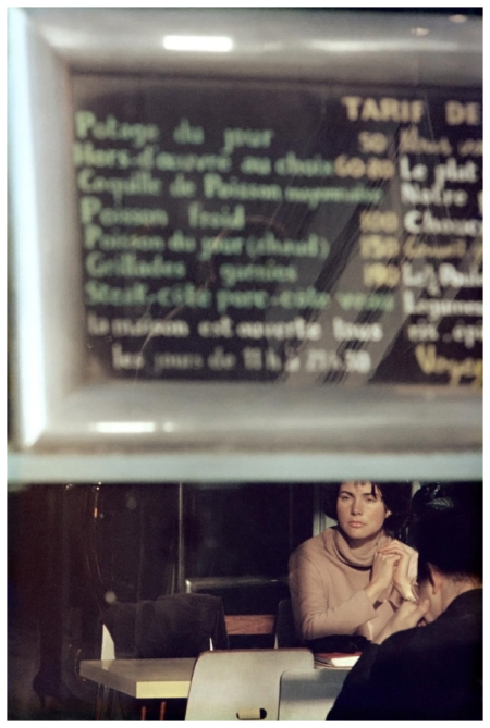
Further Research, in Focus #Saul Lieter
|
Saul Leiter was an American photographer and painter. He started off taking black and white pictures but in 1948 he began with coloured images. He is associated with contemporary artists such as Robert Frank and Diane Arbus and later worked as a fashion photographer for magazines such as Elle, Vogue and Nova.
Photography allows you to learn to look and see. You begin to see things you'd never paid attention to. |
|
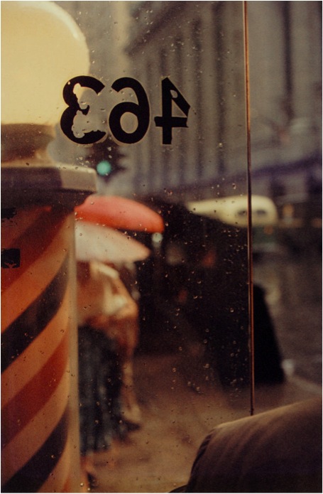
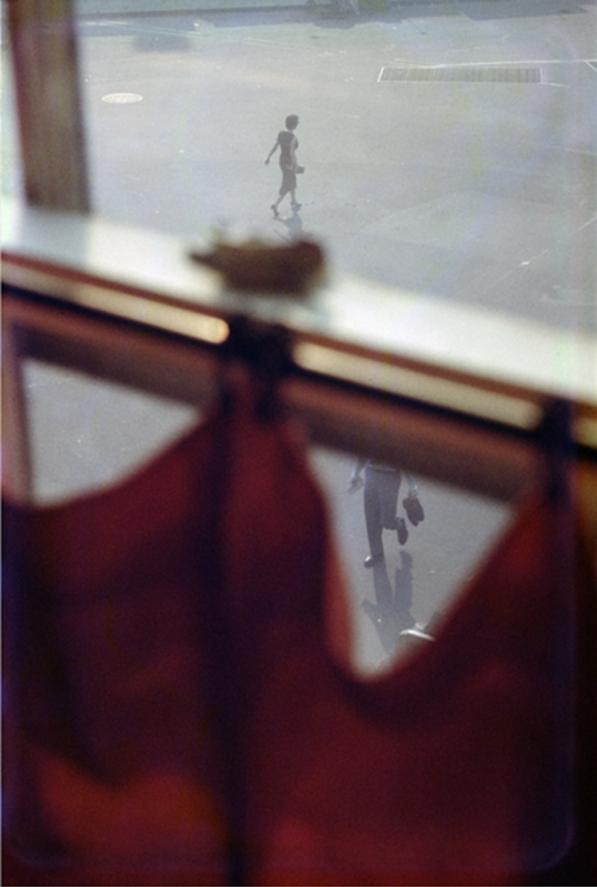
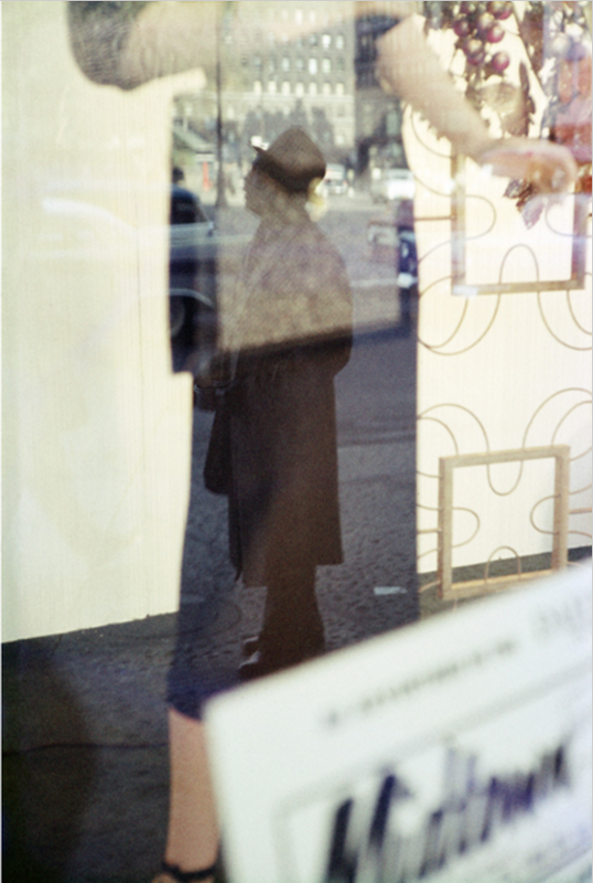
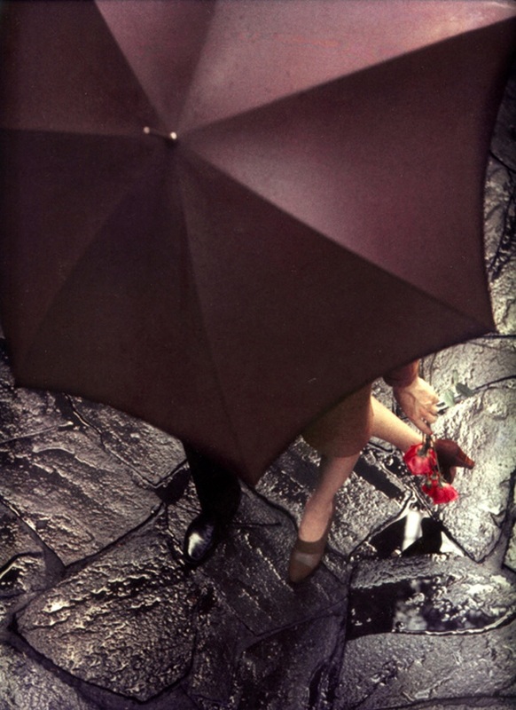
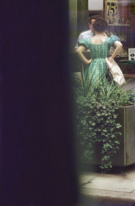

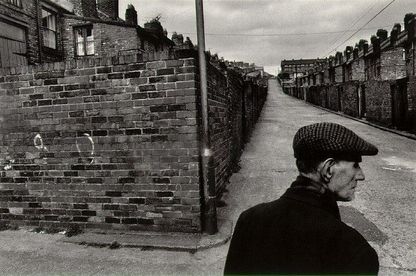
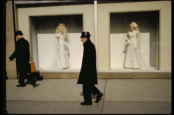
These, above, are all images made by Saul Leiter a photographer who was around at the same time as Ernst Haas. Some of his work is seen as the most esteemed pieces of street photography and out of tens of thousands, many images have not yet even been printed. Leiter first trained as a painter before discovering photography and this probably lead to his keen eye for great composition and use of the formal elements in his images. Most of his work distorts reality and causes the viewer to put their mind in figuring out what the subject is. Leiter also uses blockages in his images - half the image is blocked by an object and only a line of the shot will be visible, I like this because your eyes are instantly drawn to that strip and you have to decipher the content quickly, as if it will disappear under whatever is covering the rest of the image.
Space is one of the most important and dominant elements in Leiter's photos and this shows in every one of his images through the composition. I think that space used in his images decides the way the image turns out and how it will be viewed because it defines the properties of the image.
Another thing Saul Leiter tends to do in his images is blur out almost the entirety of an image and then only allow a small amount to be in focus (you can do this by putting a section of an image in focus and then moving your camera around so everything else is blurred, before snapping the shot). This idea completely confuses my eyes and causes me to blink at first, attempting to put the entire image in focus.Five thing I have noticed about Saul Leiter's images that are predominant are:
- Colour - Saul Leiter is very creative with his use of colour, only adding glimpses and isolating or including a massive chunk. The colors in his images usually compliment each other.
- Reflection
- Composition
- Aura of Mystery
- Play with Light
|
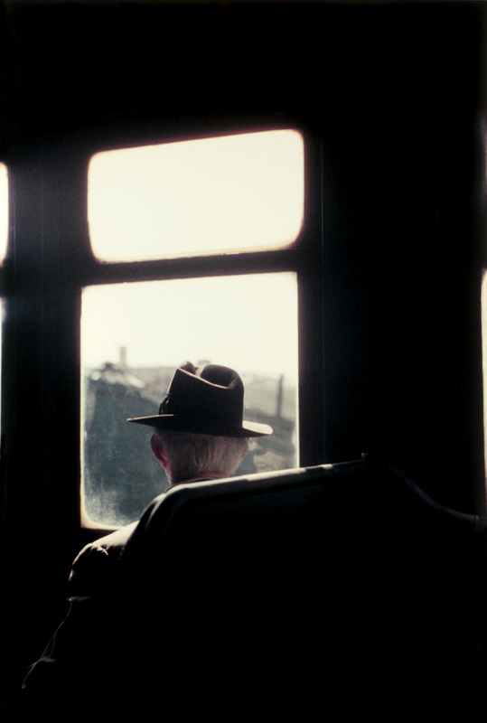
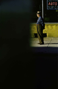
I chose this image of Leiter's to analyse in detail because it represents what I have noticed in most of Saul Leiter's images. It has the complimentary colours (blue of the shirt and yellow strip of the wall), but it also has only a small oblong of subject matter visible at the top right. The most unusual thing about this image is the isolation of the small part of the image, done deliberately to capture that section and put emphasis on it. I think the most important formal element in this image is space, because the use of space is what stands out the most and without the focus on space this picture wouldn't be itself. I feel that the segregation of that part of the image is what makes the image interesting. Saul Leiter's images are all abstract because of the fact that they disturb the balance of the formal elements and each focus on one more than the other. They all develop a single element and create a distinct identity for it rather than representing all of the elements.
“One has to be determined. One has to be ambitious. I much prefer to drink coffee, listen to music and to paint when I feel like it..." I chose this quote of Saul Leiter to display on my website because it shows how carefree and positive Leiter is about his work. This quote teaches me that it is okay to be ambitious about something without doing it right there and then, that you have to be ready to do something to do the best you can at it.
|
|
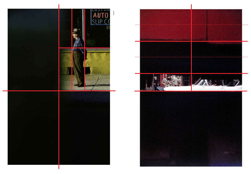
As was said before, Saul Leiter completely focuses on space in this images composition and that is what create the image. The large portion of the image that is covered somehow has its own entity and builds up the interesting section. The image itself can be split into many sections. The image shows how these sections vary with the components in it. The diagram on the right shows another one of Saul Leiter's images, similar to this one and with the same focus on space and isolation.
Saul Leiter #Paintings

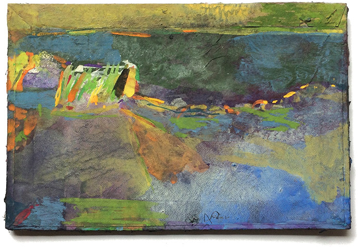
As a class we were asked to look at Saul Leiter's painting and to compare them with his paintings with his photography so that we could notice a pattern. There definitely is a pattern and you could say that Saul Leiter experiments with colour and space in photography the same way he might do so in his paintings. He sort of uses the camera as a brush and light, shape, colour and other formal elements as his paint.

You can clearly see that although they do not relate they have the same kind of structure and appearance and the space has been represented in the same way. Saul Leiter has definitely combined his work of art and photography to produce his exquisite work. The similarities in his work are the use of space, how sections of Saul Leiter's paintings are covered with single sheets of paint and for example the centre may be filled with more detail and paint. The texture of the images and paintings are obviously different in that they are two separate works of art. There is also variation in the minor scale of the composition of the images. Despite this, it is visible that Leiter recycled and developed ideas in his artwork which I think is extremely creative.
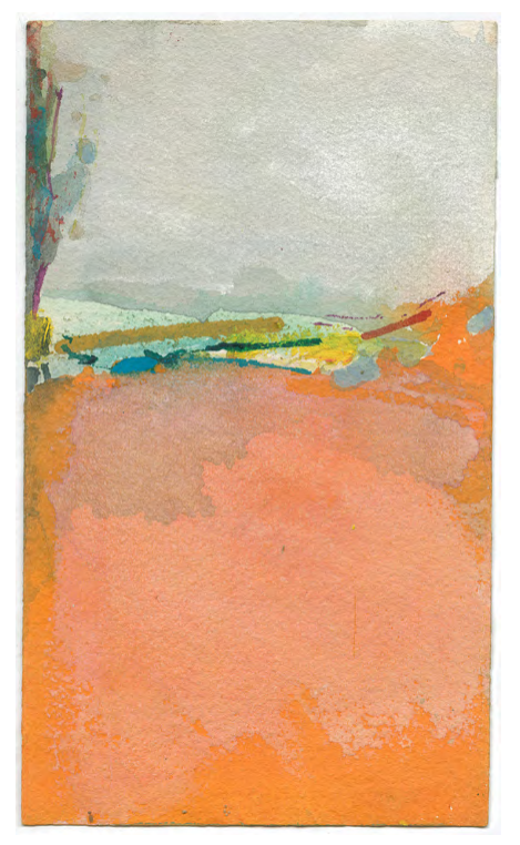
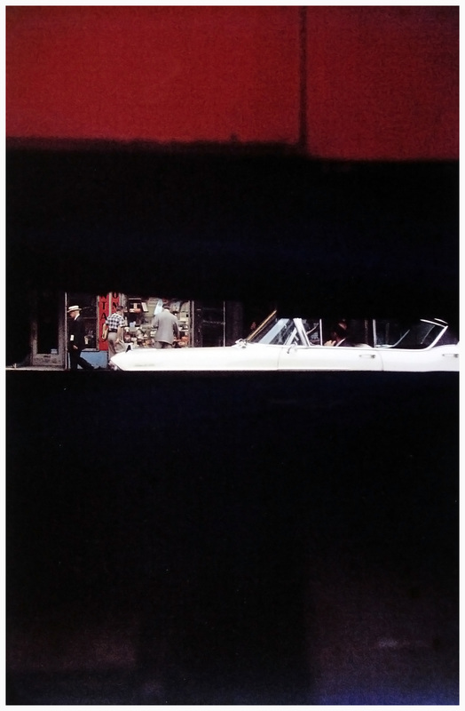
On the left is my painted version of the picture on the right, I tried to capture the main aspects of the image while trying not to obviously link them. The yellow of the vehicle, man and the texture of the blur of the fog on the windows were what I tried to symbolize. Though they are not identical, upon close inspection the similarities of the spacing and colour are very noticeable.
I have chosen this image as my final piece because I feel that it fits with the criteria we were studying against Saul Leiter. It displays a variety of colour, is through a window and causes the reader to stop and think. I want to print it out in four sections and separate them along my Final Piece Board so that they look obstructed.
The Process: