Photo Safari.
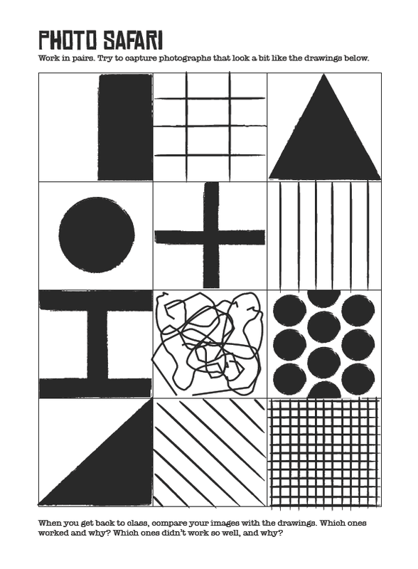
Photo Safari (IPodgraphy)
For our first lesson we were asked to go out in pairs (or alone) and take pictures, using IPods, that somehow resembled the drawings on the picture above. We had around 40-45 minutes to complete this task.
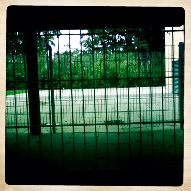
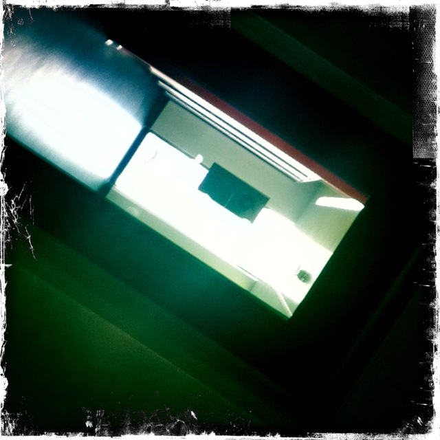
I really enjoyed searching the school for elements that were similar to the drawing; I also found it interesting to see what other people had found and taken Photos of. Many of the pictures I took were somehow a comparability of the representation I was aiming for although they were some of the easier ones to find an ally for. The harder ones took me a bit longer, but I managed to find 8 equivalents to the provided pictures.
For me, it was hard to find a match to the drawing of the 'squiggly lines', the vertical/parallel lines and the 12"12 little squires. I think this was because I concentrated more on the bolder and easier looking shapes first, I wanted to pay attention to the other, more difficult ones after - but ran out of time.
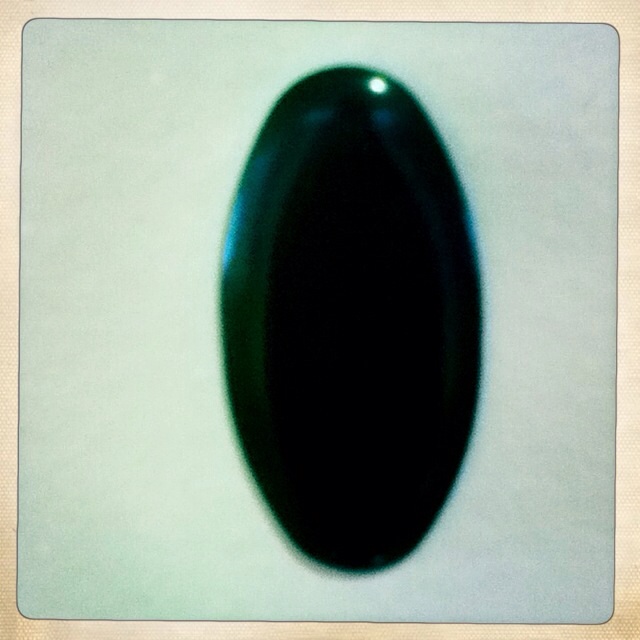
As I said, the bolder shapes, like the square split into a black and a white triangle and the single black circle in the middle of the white square, were easier for me to find around the school.
If we do repeat something like this, I will make sure to give more time to the more complex shapes so that I can improve my work.
I really enjoyed searching the school for elements that were similar to the drawing; I also found it interesting to see what other people had found and taken Photos of. Many of the pictures I took were somehow a comparability of the representation I was aiming for although they were some of the easier ones to find an ally for. The harder ones took me a bit longer, but I managed to find 8 equivalents to the provided pictures.
For me, it was hard to find a match to the drawing of the 'squiggly lines', the vertical/parallel lines and the 12"12 little squires. I think this was because I concentrated more on the bolder and easier looking shapes first, I wanted to pay attention to the other, more difficult ones after - but ran out of time.
As I said, the bolder shapes, like the square split into a black and a white triangle and the single black circle in the middle of the white square, were easier for me to find around the school.
If we do repeat something like this, I will make sure to give more time to the more complex shapes so that I can improve my work.
The Pictures I Took;
|
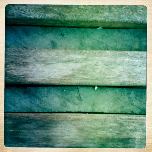
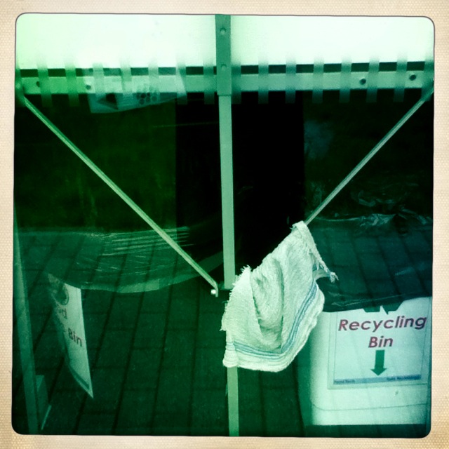
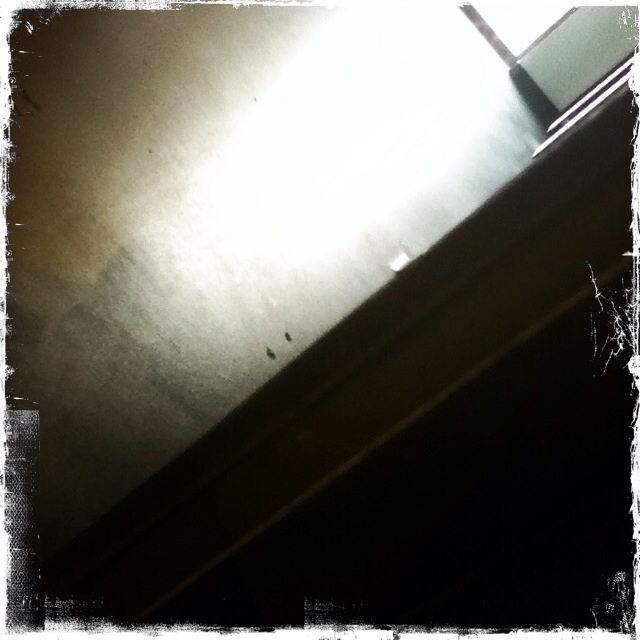
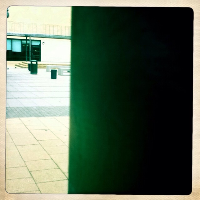
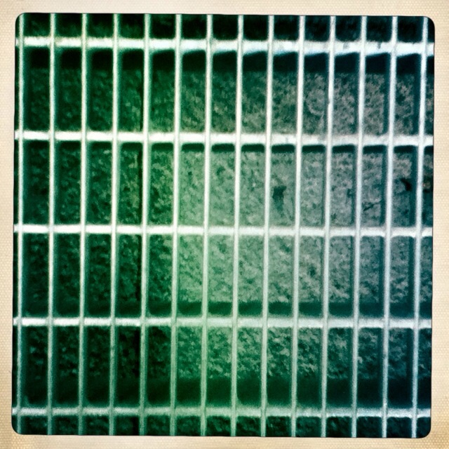
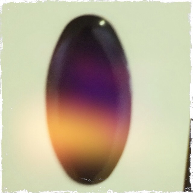
These are a few of the pictures that I took, and some of the ones that I re-took after an after thought, or to straighten out the picture.
I re-took some of the pictures because they; 1) Weren't in line with the square outline of the Hipstamatic App we were using. Or 2) I thought I could of have taken a better picture. I was somewhat proud of my pictures, but my favourite was the triangular one with the recycling bin next to it, I didn't notice it until the a few minutes before the end. It is one of my favourites because I think that it shows a lot more than, say, the one of the bench. I retook the picture of the circles because of the flashlight which was on which then caused a line of colour across the middle, I thought it would look better in black and white. |
|
John Baldessari
John Baldessari is a famous American contemporary artist who was born on the 17th of June 1931 in National City; California. His mum was a Danish nurse and his father was a Italian salvage dealer, he was the younger of two children (he had an older sister). When he was 28 he began teaching art in the San Diego school system and kept teaching for three decades. He is known as the Father of Conceptual Art because of the concept or hidden message behind his work.
This video summarises the history of him and his work;
The video below the first one explains two pieces of artwork by John that really interest me (The repetition of "I will not make any more boring art" and the cremating of all his artwork);
This video summarises the history of him and his work;
The video below the first one explains two pieces of artwork by John that really interest me (The repetition of "I will not make any more boring art" and the cremating of all his artwork);
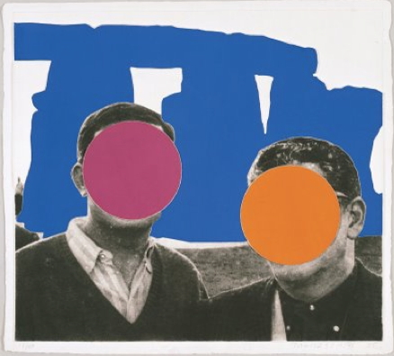
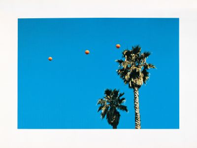
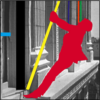
Above are some of my favourite works by him. I find compelling the fact that some of the pictures aren't his, but he has edited them to his liking and made them more gripping and fascinating.
|
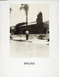
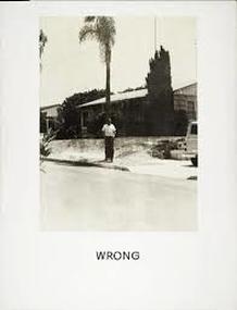
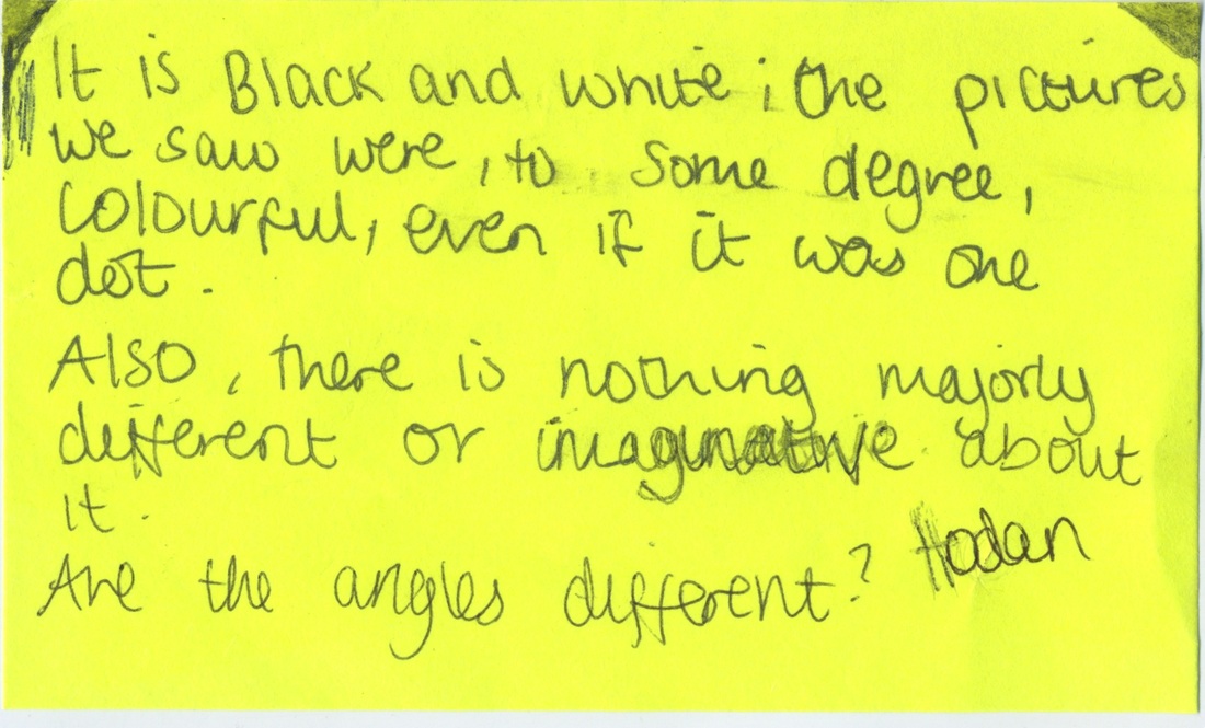
The picture to the left is named "Wrong" and is a picture by John Baldessari. Each person was given a post-it note to write on; exploring why this picture was named "Wrong" and the hidden messages behind Conceptual Art. My post-it note is below;
|
My answer was not wrong, but it I didn't cover all of the things that could have been "Wrong" with the image. Here are what some examples of what people thought was wrong with the picture;
- The camera is out of focus
- Apparently the composition is wrong but I don't think there is anything wrong with it
- It's boring
- It has no colour and is very simple
- There is nothing imaginative about it
- It is pointless
- The man should be placed somewhere else
- Some of the objects (tree, car) don't fit in the frame
- There is nothing wrong with this image because art is everywhere and everything
- It's depressing
- Everything is wrong in this photo
- It's boring and the artist said that he would never make any more boring art
- He has used one of his 'mistakes' as a work of art
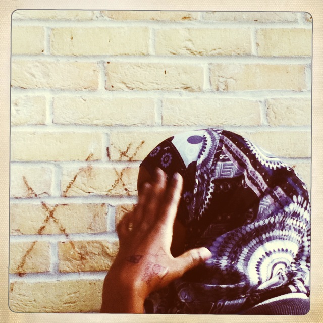
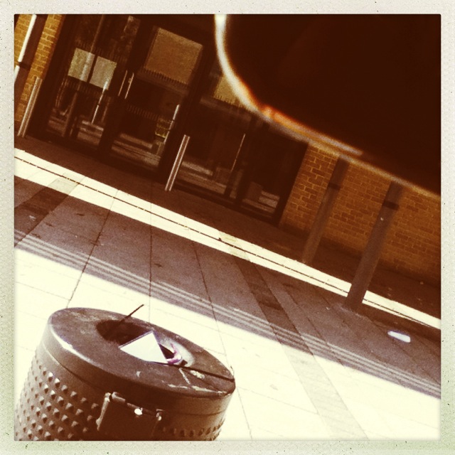
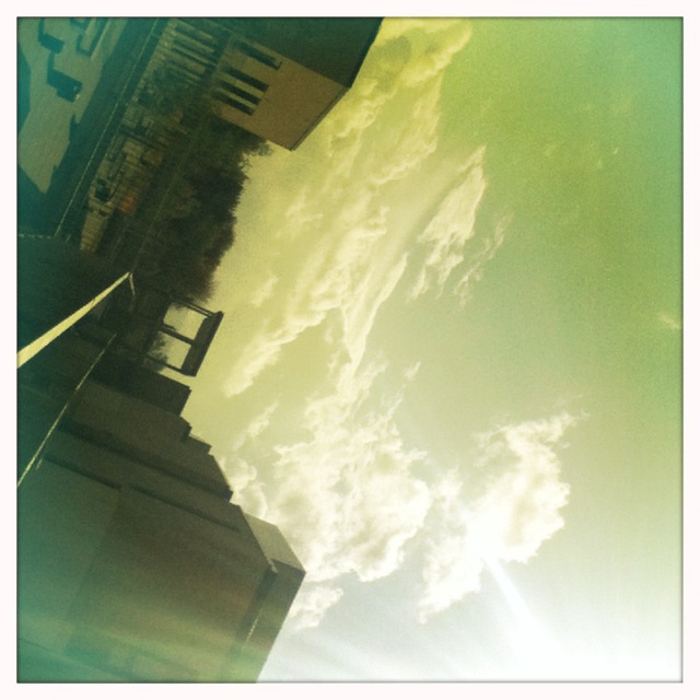
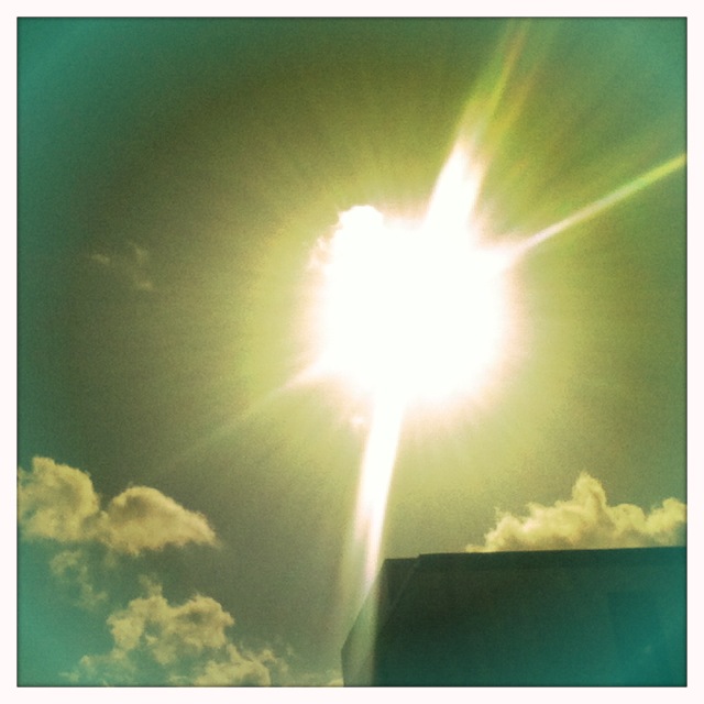
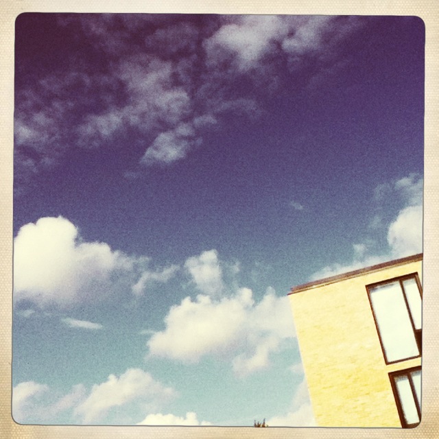
After this task we were asked to take a few pictures of our own that included (deliberate) "Wrong" features. On the top right are some that I took using the app "Hipstamatic" on the I-pods;

|
The picture to the left is my favourite out of all the "Wrong" images because although it is wrong, it is still interesting. I like how the sun seems to have colours radiating off of it, how the clouds are all gathered in one corner and far away from the sun. Focusing on ideas surrounding John Baldessari, I would say this could be a Concept of Art. There could be a hidden message that the is sun pushing the clouds away with rays of its light. In other words - light against dark.
|
