End of Year Project; Natural World.
For our end of year 10 project we have been asked to choose a theme from three given choices, which were;
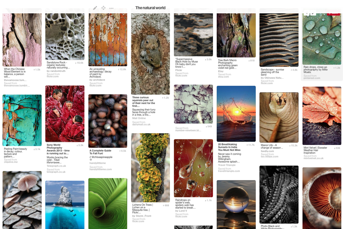
The Natural World Natural forms and landscapes have been a popular subject of photographers since the birth of the medium. Nature is transformed by being photographed. Photographers have looked at nature from very close up and from very far away. They have been interested in its formal qualities (shape, pattern, line, texture etc.), its 'beauty', its ecological importance and as a background to human activity.
Key artists/photographers: Anna Atkins, Letha Wilson, Karl Blossfeldt, Myoung Ho Lee, Edward Weston, Jem Southam, Olivia Parker
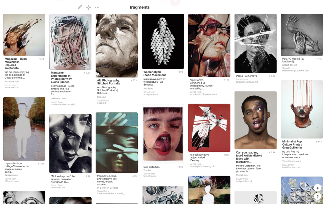
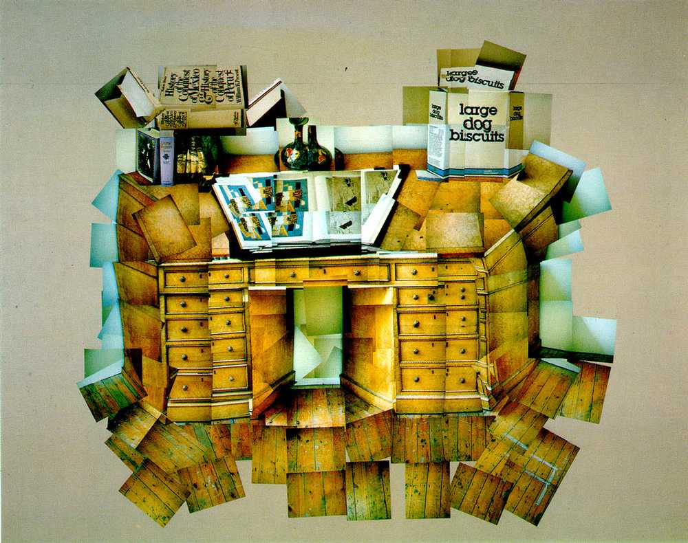
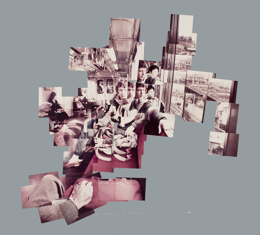
Fragments Some photographers prefer to capture details and fragments of objects, places and people. Photographs can also be manipulated through collage and photomontage so that fragments of different subjects are presented in the same composition. Photographs themselves only capture a small section of reality so are fragments of a bigger whole.
Key artists/photographers: David Hockney, Hannah Hoch, Lucas Simões, Duane Michals, Maurizio Galimberti, Sohei Nishino
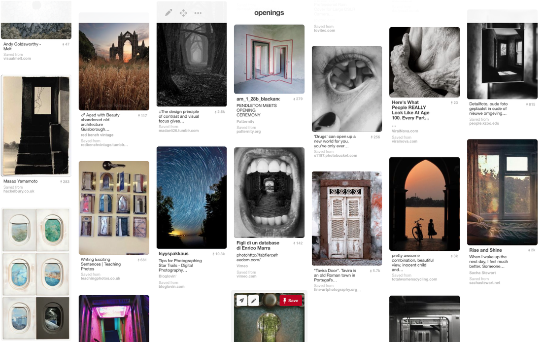
Openings Openings such as doors and windows play an important part in the compositions of some photographers. The light used from open doors and windows can be used to outline a subject. You may wish to explore the idea of openings more broadly to include other kinds of apertures and even ways in which to open the surface of the photograph itself.
Key artists/photographers: Lee Friedlander, Uta Barth, Rinko Kawauchi, Lucio Fontana, Shizuka Yokomizo, Ralph Gibson, Tom Hunter
We were asked to pick a single theme to focus on for the term and we would use as stimulus for research and a final piece.
The Natural World Natural forms and landscapes have been a popular subject of photographers since the birth of the medium. Nature is transformed by being photographed. Photographers have looked at nature from very close up and from very far away. They have been interested in its formal qualities (shape, pattern, line, texture etc.), its 'beauty', its ecological importance and as a background to human activity.
Key artists/photographers: Anna Atkins, Letha Wilson, Karl Blossfeldt, Myoung Ho Lee, Edward Weston, Jem Southam, Olivia Parker
Fragments Some photographers prefer to capture details and fragments of objects, places and people. Photographs can also be manipulated through collage and photomontage so that fragments of different subjects are presented in the same composition. Photographs themselves only capture a small section of reality so are fragments of a bigger whole.
Key artists/photographers: David Hockney, Hannah Hoch, Lucas Simões, Duane Michals, Maurizio Galimberti, Sohei Nishino
Openings Openings such as doors and windows play an important part in the compositions of some photographers. The light used from open doors and windows can be used to outline a subject. You may wish to explore the idea of openings more broadly to include other kinds of apertures and even ways in which to open the surface of the photograph itself.
Key artists/photographers: Lee Friedlander, Uta Barth, Rinko Kawauchi, Lucio Fontana, Shizuka Yokomizo, Ralph Gibson, Tom Hunter
We were asked to pick a single theme to focus on for the term and we would use as stimulus for research and a final piece.
I chose the Natural World as my theme simply because I assumed it would allow me to have a wide basis of exploration and would create room for a build up of ideas. This theme also stood out as one that would involve a lot of interesting facts and a learning process. While the other two ideas seem equally as interesting, they don't seem as available to abstraction or general as The Natural World.
Below are the Pinterest Boards that I used to research the three choices and expand my knowledge of them. I also looked at pictures of Opening and Fragments because my initial thoughts could have been wrong and I could have been inspired by something I saw and changed my mind.
|
|
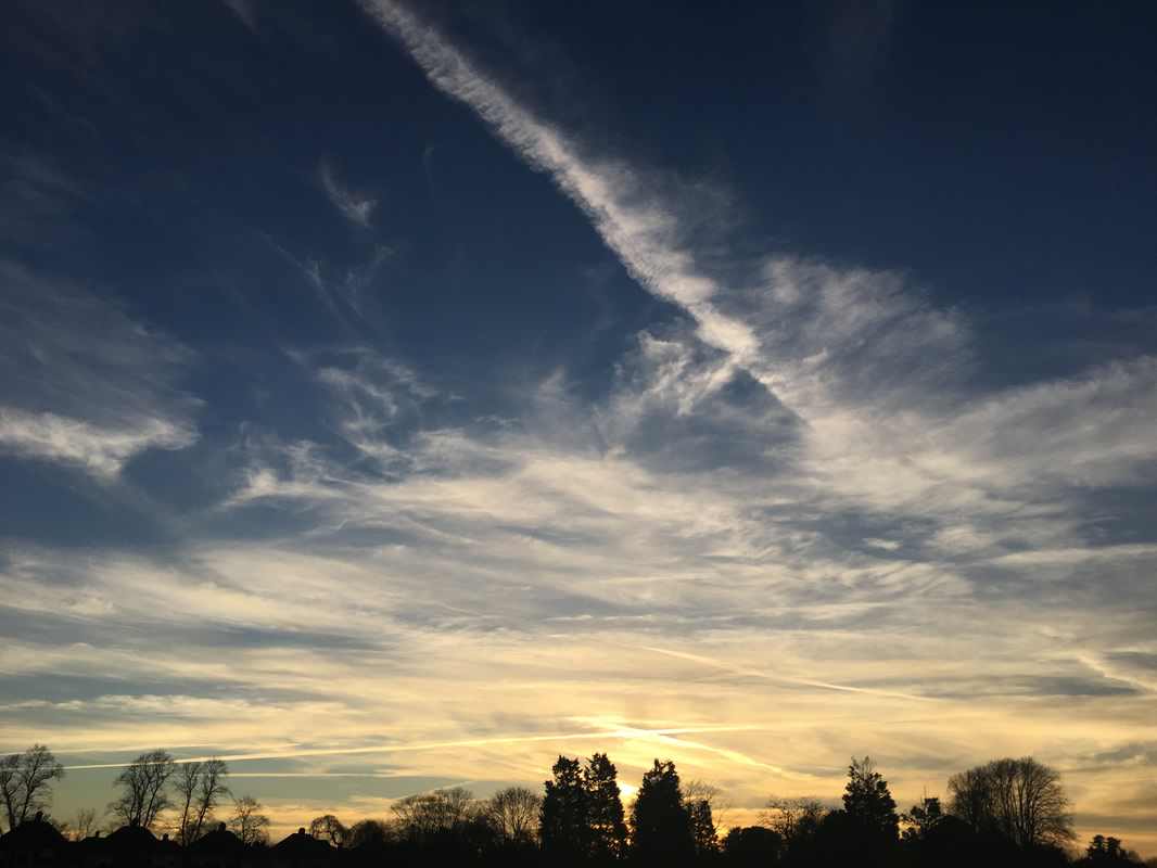
First Set of Images Inspired by "Natural World";
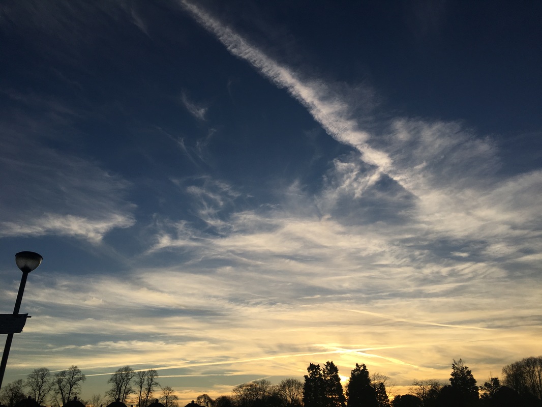
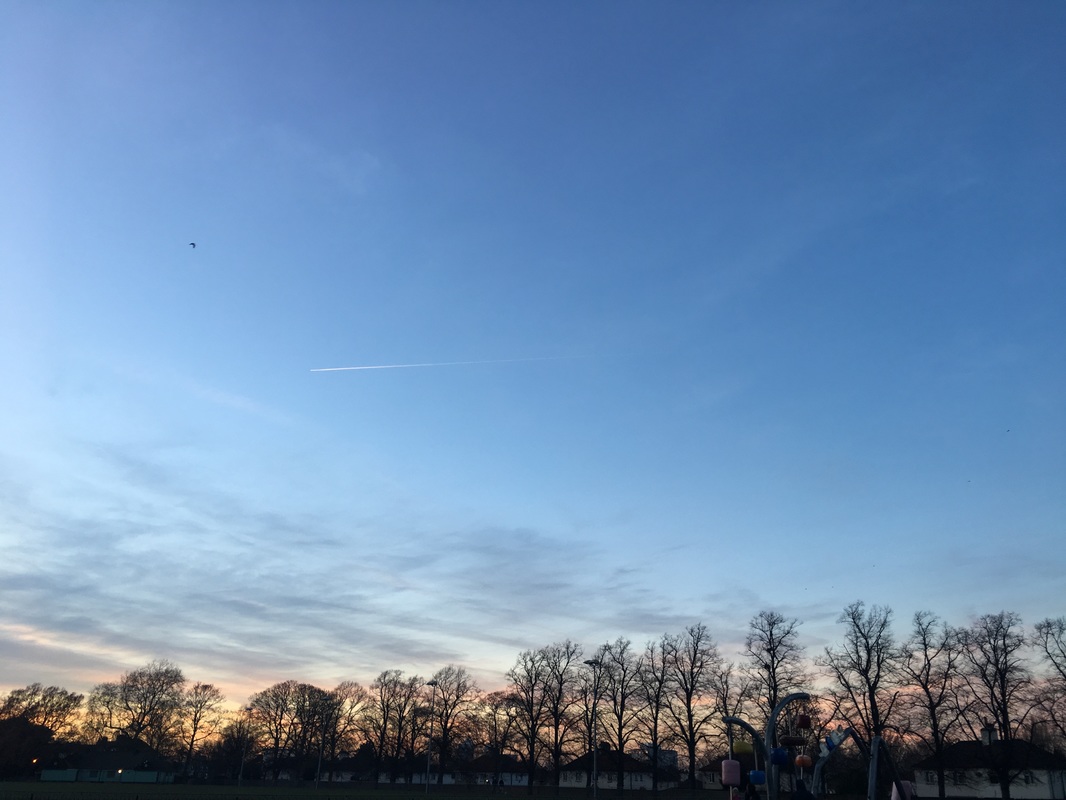
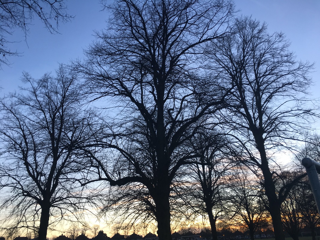

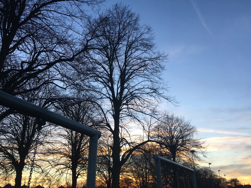
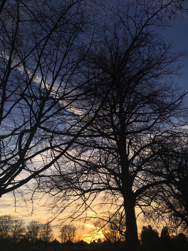
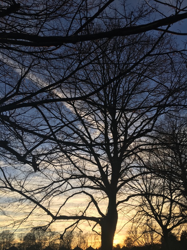

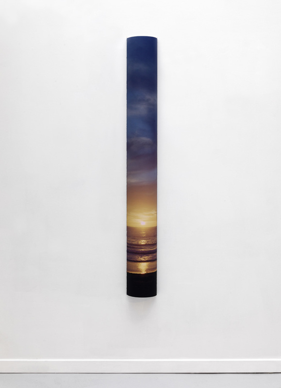
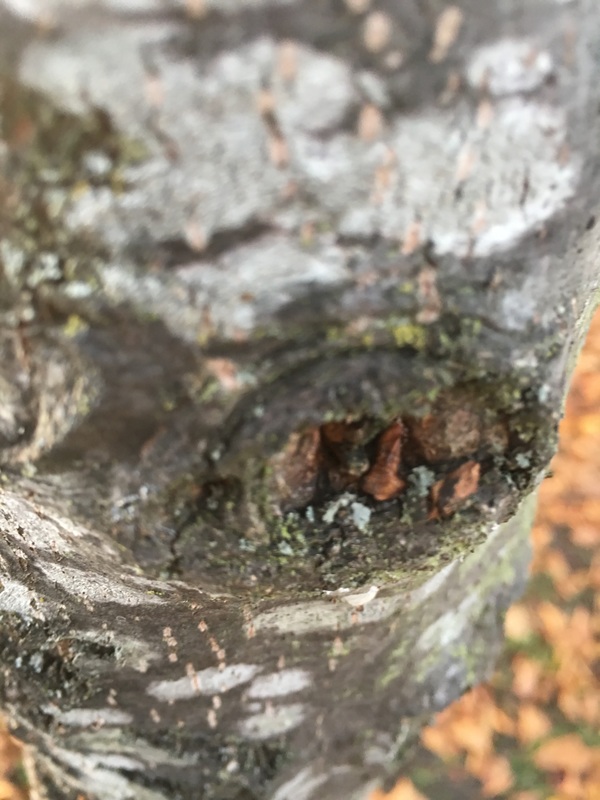
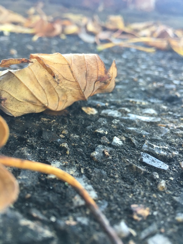
These are images taken before my exploration of the natural world and I'd been introduced to new ideas through research. They are very similar and all contain a sunset. I don't think that this is very creative or imaginative but I wanted to start with what I knew and build from there. However, I now know that taking pictures of nature doesn't apply to all Natural world photography.
"The biggest cliche in photography is sunrise and sunset" Catherine Opie |
This quote is significant to me because there is something that I can learn. The fact that the recurring component in my first set of images is a "cliche" is not necessarily negative, however it informs me of its un-originality and does encourage me to explore other options.
|
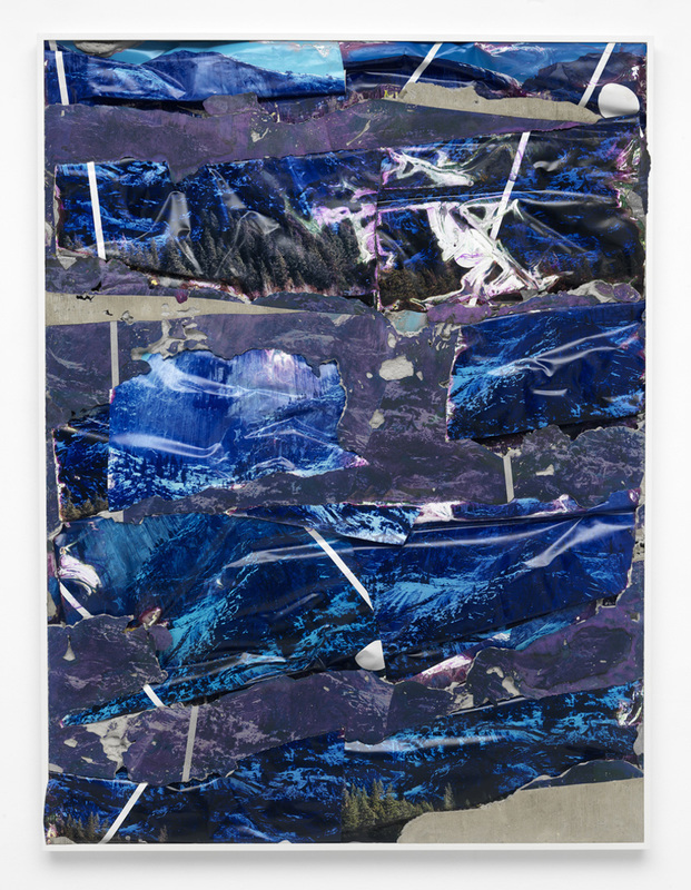
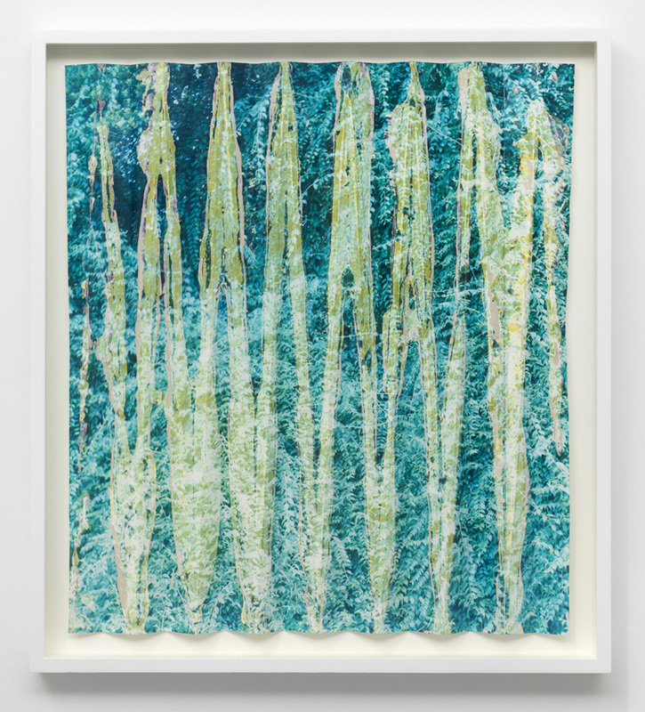
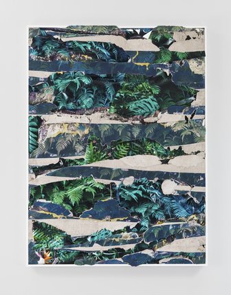
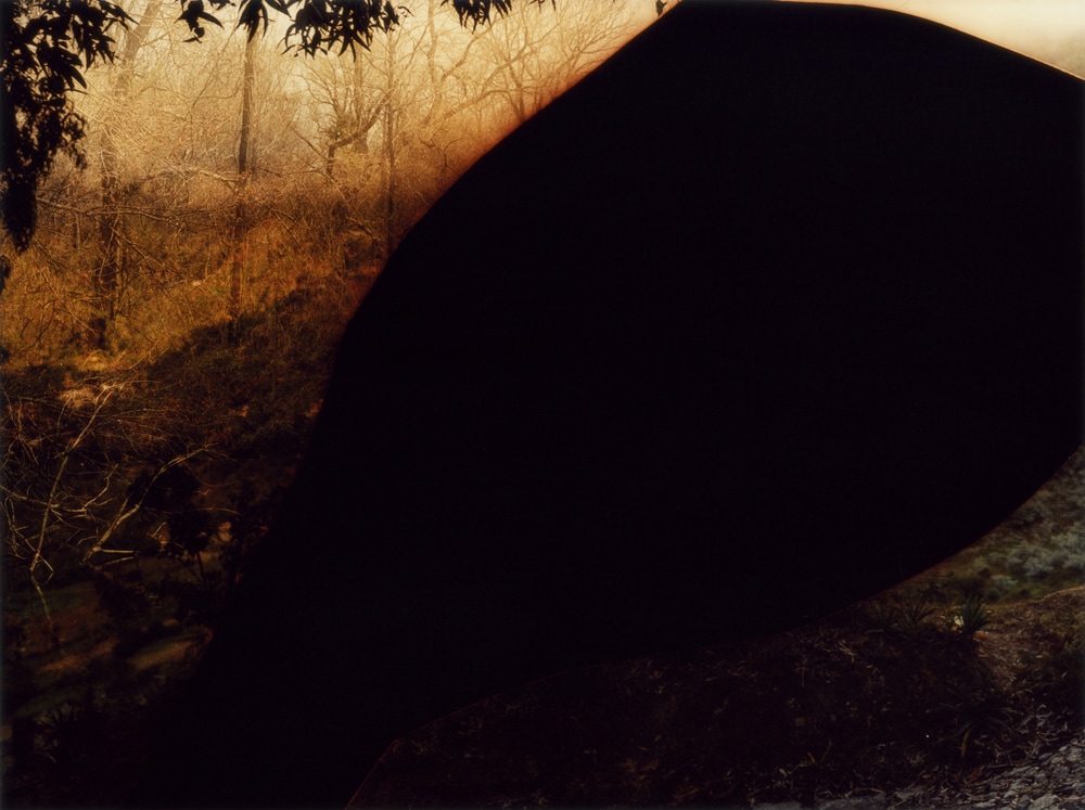
#1Letha Wilson
"Through such interventions, Wilson creates abstract approximations of each landscape's most immediate visual and sensory effects." Art in America/Anne Doran |
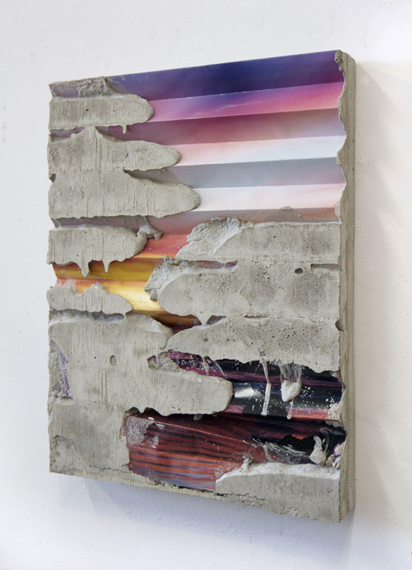
Letha Wilson is a mixed media artist who lives lives in Brooklyn. Her short outdoor trips to the rocky mountains in Colorado have made the natural world and its photographic reproduction the foundation of her work. Her artwork defines the lines bewteen nature and architecture, during and interview with Hyperallergic she metions that she is tring to "mix the physical presence of an artwork with an image" and I think that this means she attempts to represent the concept of the art and the solid existence of the components of the image, in the product. Letha Wilson extends her images of nature into the man-made world of sculptures and architecture, often adding construction materials to her already adapted images. Letha Wilson considers herself an amateur photographer - this interests me because many of the images that she uses are pictures of landscapes such as deserts or mountains which are costumized and amalgamated with closeup images of other material. The images I took seemed very "cliche", this view further encouraged by the quote, but looking at Letha Wilson's work I am doubting my initial opinions.
|

|
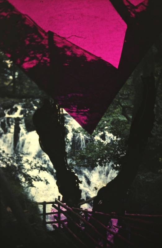
The outcome on the side is the first image I saw that really caught my attention by Letha Wilson. The image consists of what I think is a combination of a number of images taken of different subjects. Each of the images are repeated in separate sections and there is a difference in the texture of the different image prints. Many of the elements in the images are indistinguishable, although you can tell there is some display of shrubs and water, which when intergrated create and abnormal effect. It looks as if a blue hue has been added to some of the images and there is a sort of luminescent result, almost like the image is reflecting light and the material used is shiny. Upon the research of the artist, the fact that she uses concrete in her artwork and this could be the reason there are some patches of smooth looking grey matter taht does not seem like any type of printed image. It could be that under the cut up, reformed images there is a base of concrete or construction material. This images seems iridescent, as if it would give off luminous colours when viewed from different angles. Some parts of the image contain white pieces of paper that may be the edge of the prints but some of the paper is also bent and reflects light and this creates the illusion that the image has lustre. This image is both a combination naturalisitic and abstraction, considering that the images taken were just pictures of whats seems to be natural elements that have been cut and refined when fixed with other pieces of photography. The abstraction comes from this process of cutting and sticking together. The research I have done on this artist makes me believe that the most
|
interesting part of this image is the fact that it conveys many different meanings in just one final product, from the display of shrubs and water and the involvement of the building material. The idea behind this one piece of work is something that really makes you think because if you don't think about it, you likely won't grasp the underlining message.
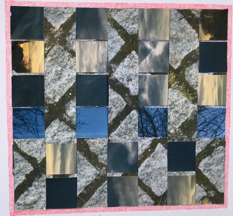
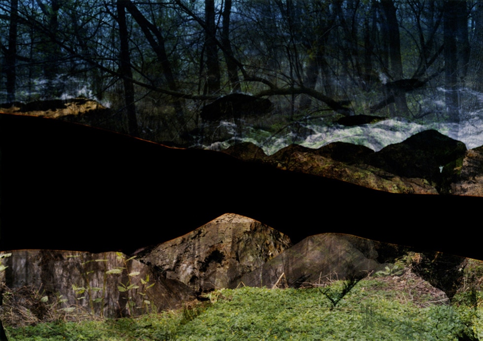
#My Response to Letha Wilson (using original sunset images)
Below is something I have decided to work on using Letha Wilson's work as inspiration and although I didn't have the time or the correct equipment, I used ideas that were introduced to me at n earlier stage in photography such as the cutting up and putting back together, except this time, I also combined weaving. The images I combined to make my final outcome are below;
|
|
I began by choosing a selection of images for this process, which involved two images from the set of pictures taken before but also and image from my abstract page that would be a representation of the concrete that Letha Wilson uses. This was followed by cutting out equal sized sections of each image, so that they would fit together, and then placed then in different positions until I found one that I thought was effective. I glued the image cut-outs together and then put them on a mounting board. This experience helped me in the fact that I had a chance to look at photography from the perspective where the content of the image is not necessarily as important as the presentation and the communication of a message. I hope to use Letha's work for development using more digital techniques in the future.
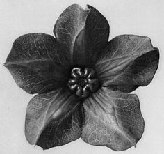
#2Karl Blossfeldt
|
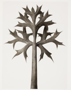
Karl Blossfeldt was a German artist, sculpter and photographer who is known mostly for his close up photographic images of plants and living things. His main inspiration was the way plants grow and viewed them as 'artistic and architectural' constitutions. Blossfeldt used a home made camera to capture the images that were published as 'Urformen der Kunst' or 'Primal Forms of Art'. The camera could magnify a subject thirty times its size, and this allowed Blossfeldt to view the intricate details of the plants structure. His images revealed abstract and almost unnatural properties of nature. Karl Blossfeldt's work interests me somewhat because of its ability to display nature as something so uniform and unusual, he brings to light the most delicate characteristics of a plant. However, his work introduced me to a new side of photography where taking images is not the main foundation. He fuses science with photography, and the fact that as a photographer, I can bring in aspects that interest me from outside photogarphy and use my sentiment of them to convey a certain view through my photographs is something that interests me. Blossfeldts admiration of the growth of plants is what lead him to create such successful photographs.
|
|
|
This image by Karl Blossfeldt really caught my attention when I was going through some of his work. This is an image that expresses Karl's view of plants very well. He stated that "The best conststructions for industrial design have already been anticipated in nature" which is a very eye opening statement and I think that it is seen through this image. The recurring pattern in the image causes a very dramatic effect, like a optical illusion. The image presents the plant as unreal and artificial, much like constructions in industrial design, as if it is itself man-made. This shows the intricate details and delicate properties of the plant as something unnatural and abstract, and the waxy coverage of the image is used as an advantage. Through this image Karl Blossfeldt clearly saw a completely different subject, almost like a different character of the plant. He creates a sculpture from nature.
|
|
#3David Hockney
|
|
David Hockney, who does not work with the natural world, is an artist who worked with photographs and has a collection of photo collages and photo montages called "Jointers" from the 1980's. This consisted of whole images incorporated of "individually photographed details". This concept interested me because Karl Blossfledt's work seemed to be minute sections of a plant, enlarged and made to seem like complete structures. The last image that I analysed reminded me of the work we did during school of David Hockney and I was then provided the with the idea of creating an image made from a series of images curated as a response to Karl Blossfeldt, but with implications of Hockney's work.
|
Response to Karl Blossfeldt
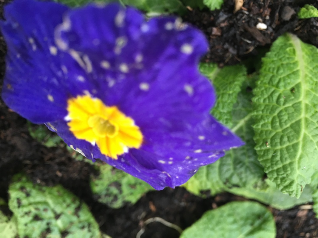
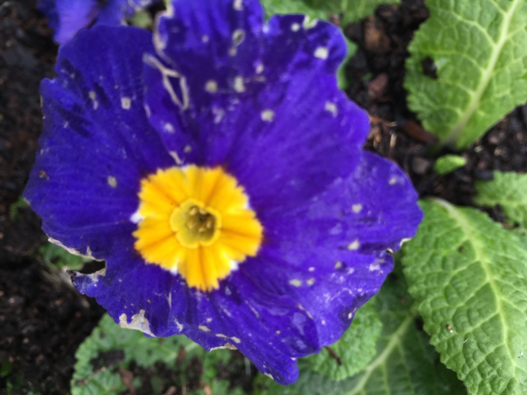
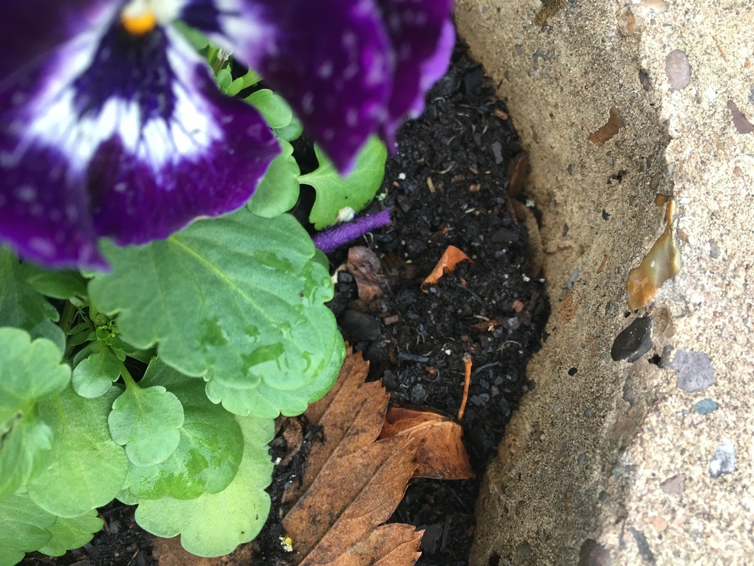
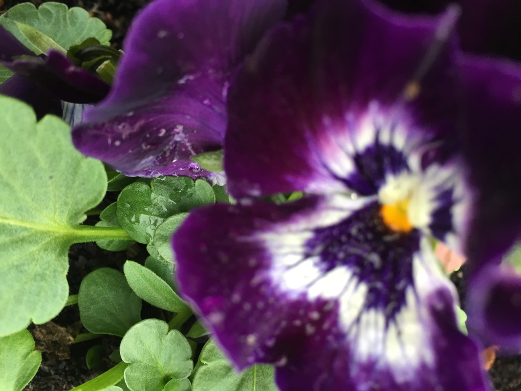
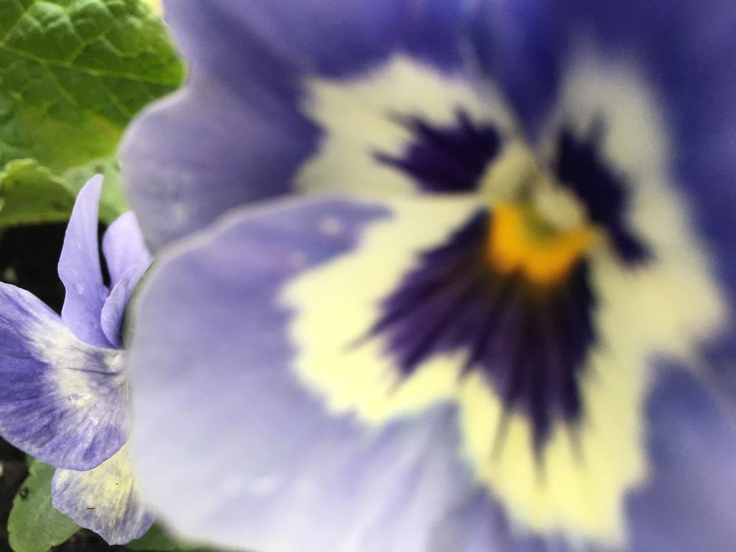
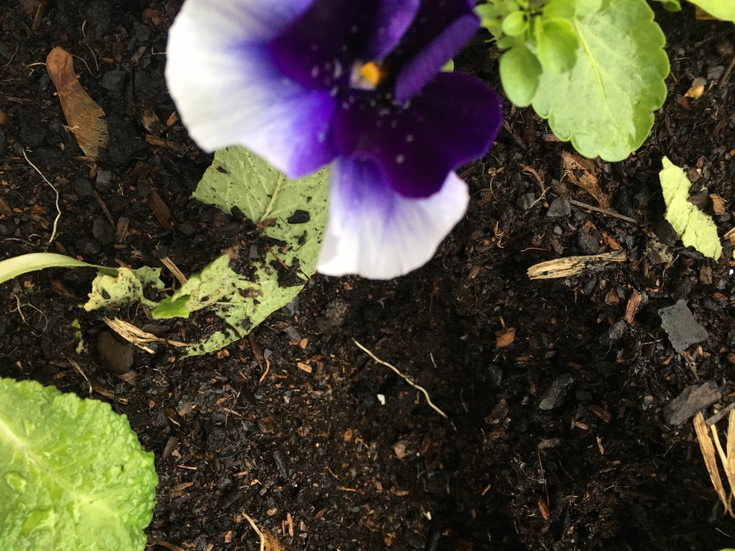
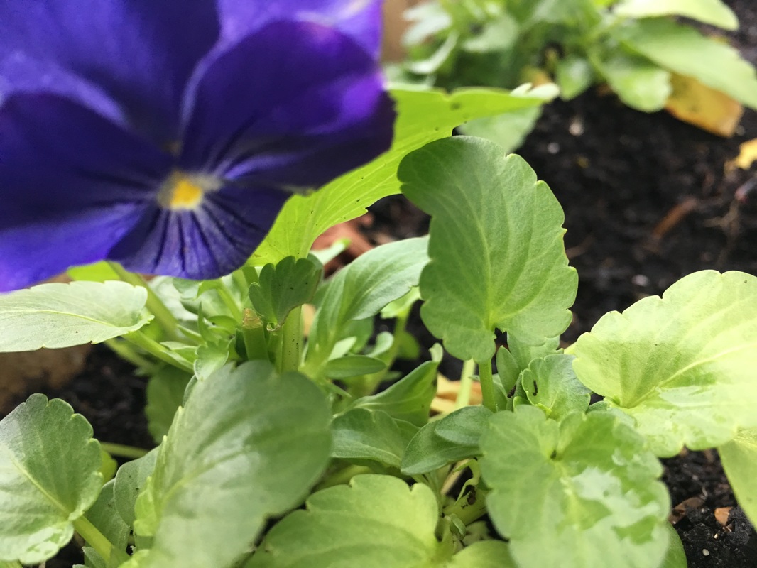
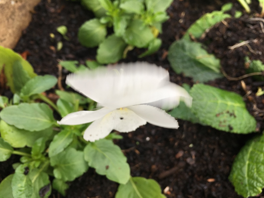
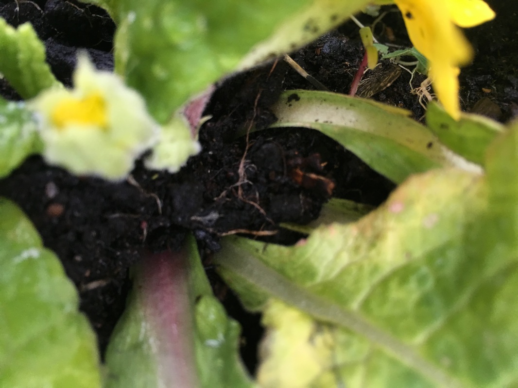
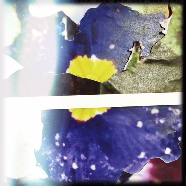
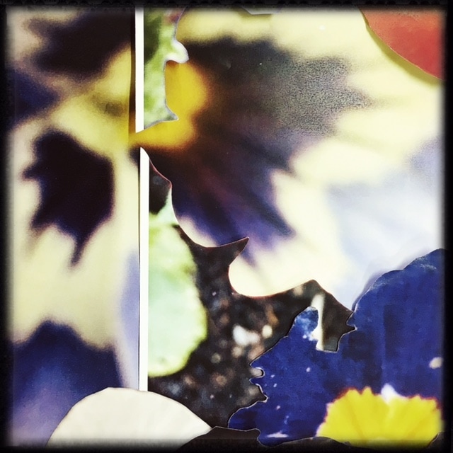
These images were taken in response to Karl Blossfeldts work, and his emphasis on detail and structure of plants and nature. There was one image that was not intended for this purpose, which is the image of the soil and blue petal, however looking at this image caused me to realise the fact that the image closely the same concepts in Karl's work. These images clearly depicted some of the ideas of Blossfeldt's work regardless of the fact that I did not have have the resources to create images identical to Karl's.
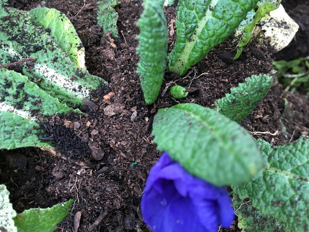


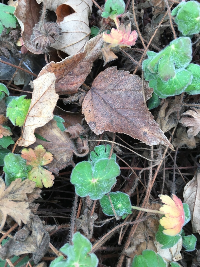
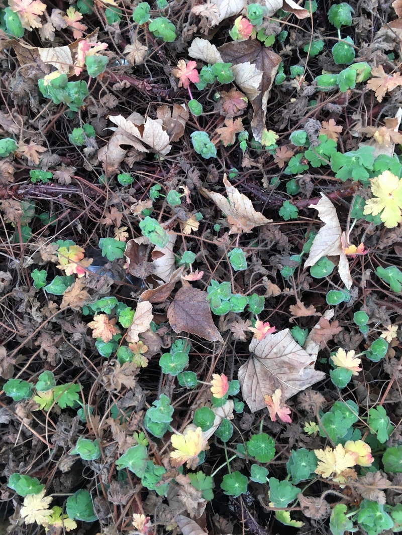
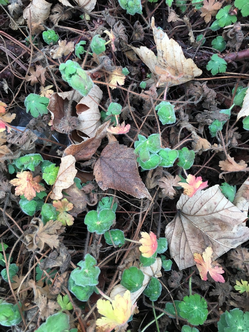
The three images below are three that I took from different distances, and the closer I came with the camera to the shrub, the more the detail was emphasized in the image and in the third image there seems to be a display of the intricacy in Karl's images. I like the way the the twigs and brown and green leaves, but also the faint presence of the ice of the edges of leaves, leave an almost blue hue on the image. Overall, I feel as though this has turned out very well. The detail of the pictures may not be to the extent of Blossfeldt's images but they are redolent of them.
|
|

|
Photoshop Edit;
|
|
I used Photoshop to create this image because I felt that there was a need for the combination of Karl Blossfeldt's work along with David Hockney's work. The final product was somewhat of a sucess, however there was a disappoinmemt in the complexity of the image, which was mostly due to the lack of my skills concerning Photoshop. This image was achieved through the use of the video to the side, which explained the process in a simple, understandable manner. Although the collage is aesthetically pleasing, I find the composition of the different images boring and also the the fact that I only used the three original images is something that contributes to the absence of complication. Despite this, I think that it is still somewhat a good beginning, offering room for improvemnt. I think that my next step should be to use another video to contribute to the development of this image.
|
After my research I have made a mind map of the ideas and themes I have discovered and have interested me.
Photoshop#2 ; Final Outcome 1
After returning to the edit on photoshop, I used the same method to begin re-editing the image. I think that this second round was more succesful in combining the ideas of the two artists. The process has more interesting content than it would have on its own and produces a better product. I also think that the pattern of the image is really interesting and resembles the work of Karl Blossfeldt.
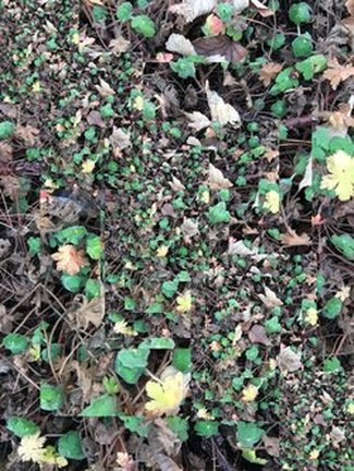
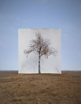
#3Myuong Ho Lee
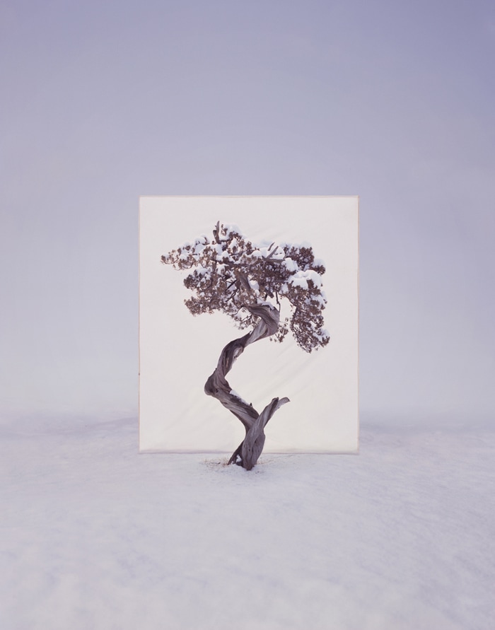
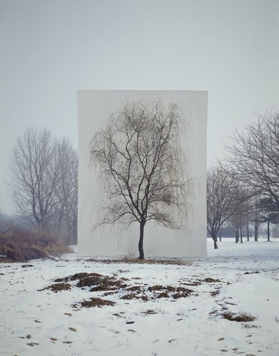
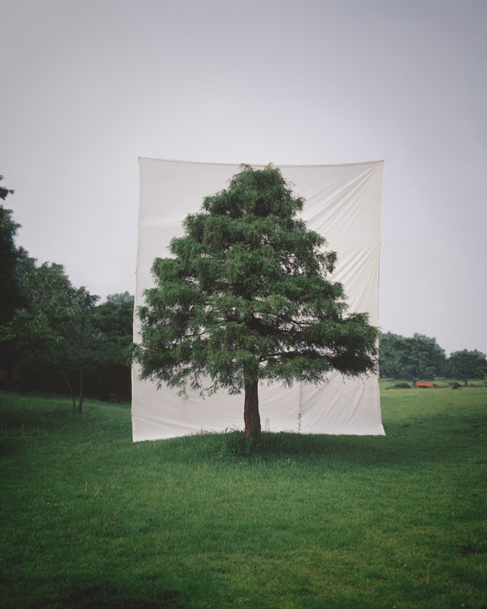
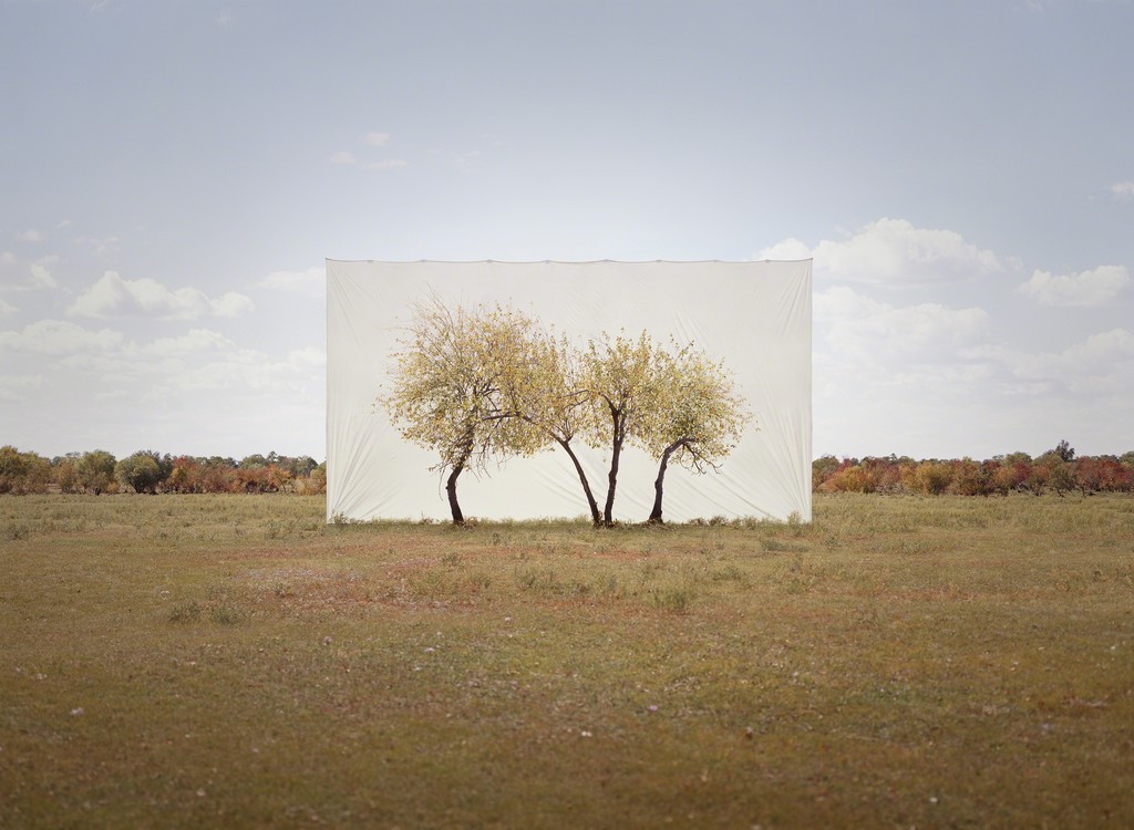
|
Myuong Ho Lee works with trees from Korea, "combining a respect for nature with a highly conceptual investigation into image making", he uses stunning trees and captures them with a white backdrop, taking them from coinciding within its habitat, to being alienated and almost idolised. I like this idea because it almost intertwines with Karl Blossfeldts work and Letha Wilson's aswell. The representation of Myuong Ho Lee's presentation of nature is displaying clear implications but also whilst retaining natures originality and variety. One of Myuong Ho Lee's pieces is to the side and it is taken in what looks like a relatively empty field, with the one tree in exception. The landscape is completely void of anything, yet the complexity of nature is there. I think the fact that his images have been returned to the city (this image was taken in a Toronto exhibit), shows the complete contrast between the natural world and the world we live in today
|
|
Image Set #2
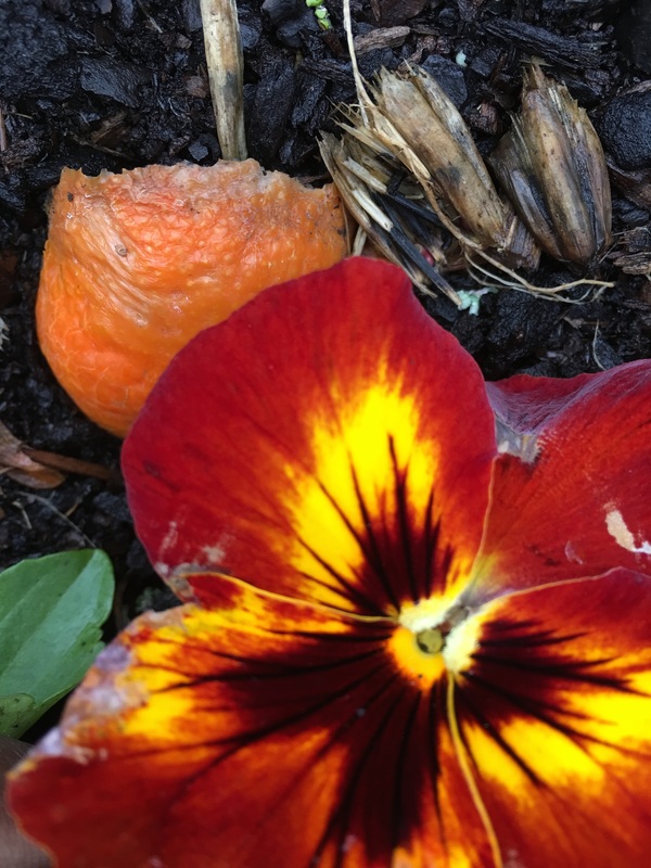
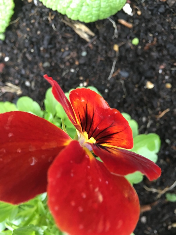
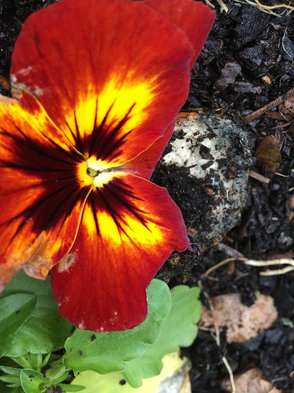
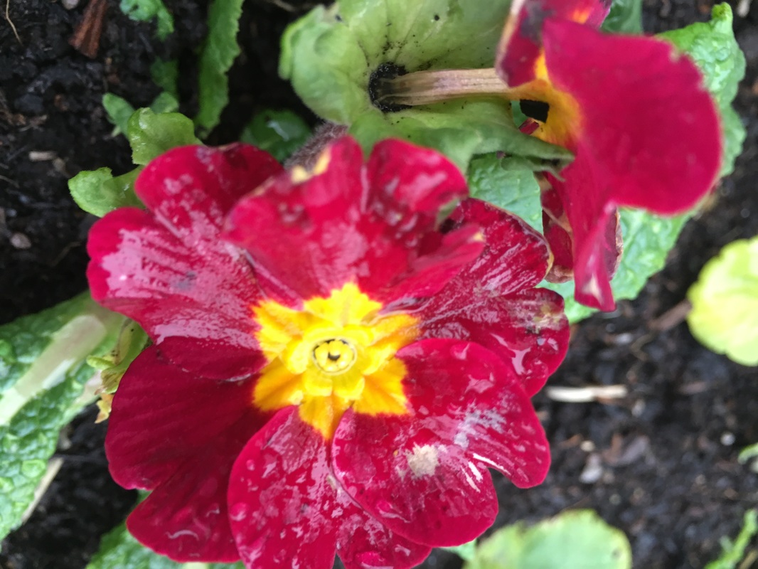
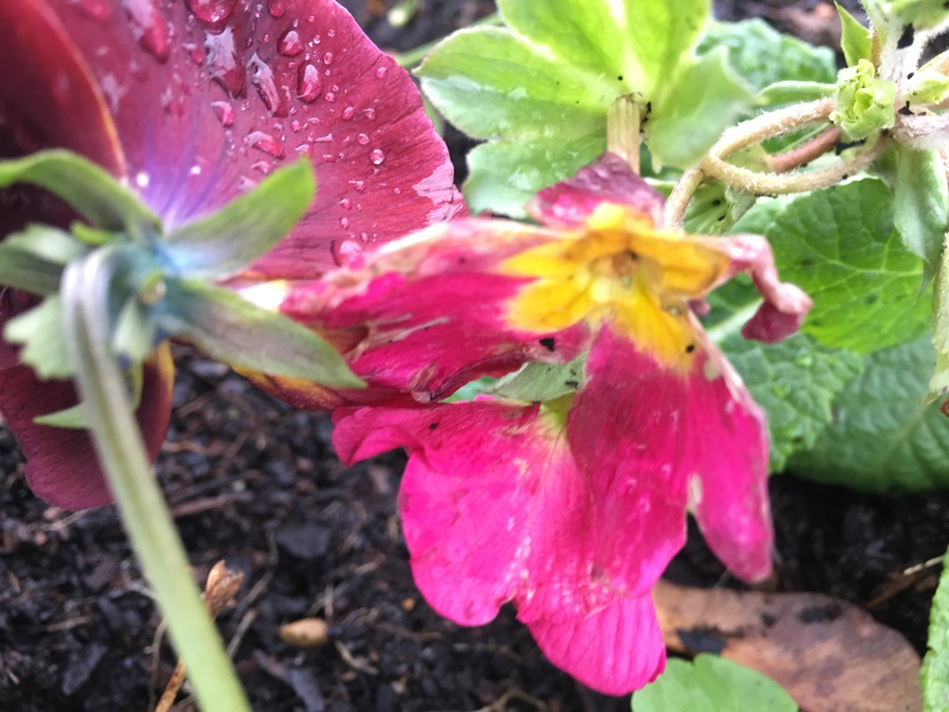
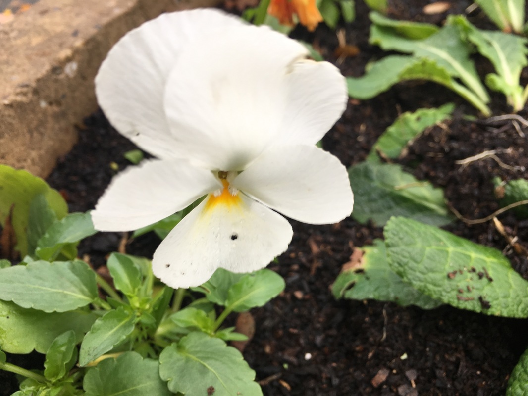
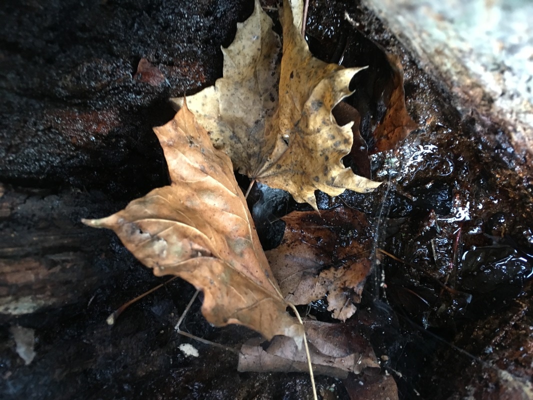
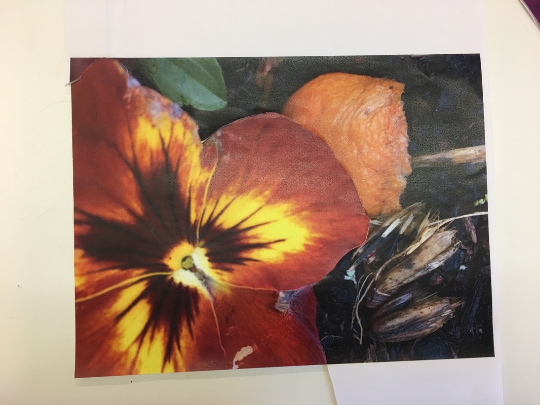
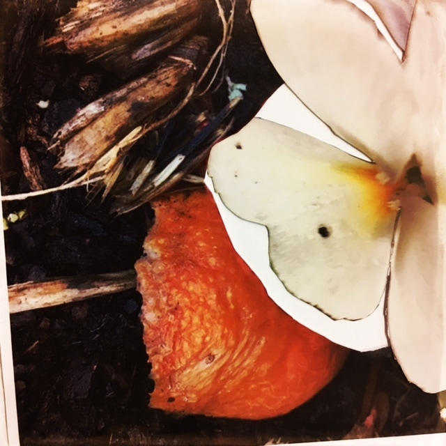
These images were taken in a couple of flower pots kept in the neighbourhood of my house. I think these images are far from adventurous but provide insight into the natural world and have different aspects of nature with them. For example, there is an image which contains a flower that is reminiscent of fire and heat, and in the same image there is half an orange that is well into the rotting procedure. I think that this image is interesting because it displays an object that gives a prominent reminder of somehthing alive which is in direct contrast to another subject that represents regression and death. It is interesting that an image can represent such a figurative message. I also like the colour presented throughout the images.
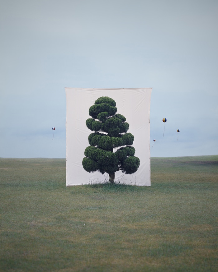
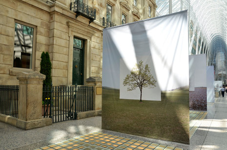
Response to Myoung Ho Lee; Final Outcome #2
Because Myoung Ho Lee takes images of trees in his native Korea, I thought that it would be good to take images of trees in Thomas Tallis. However, I do not have a large screen like Myoung Ho Lee so I planned on using Photoshop to edit a blank box, like a screen.
|
|
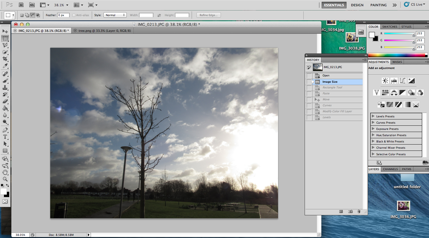
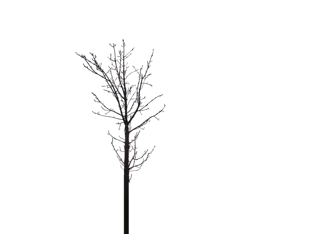
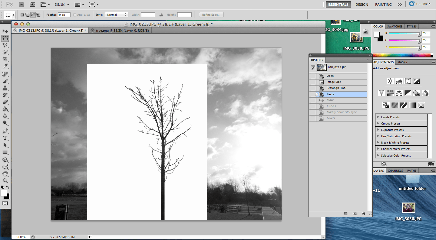
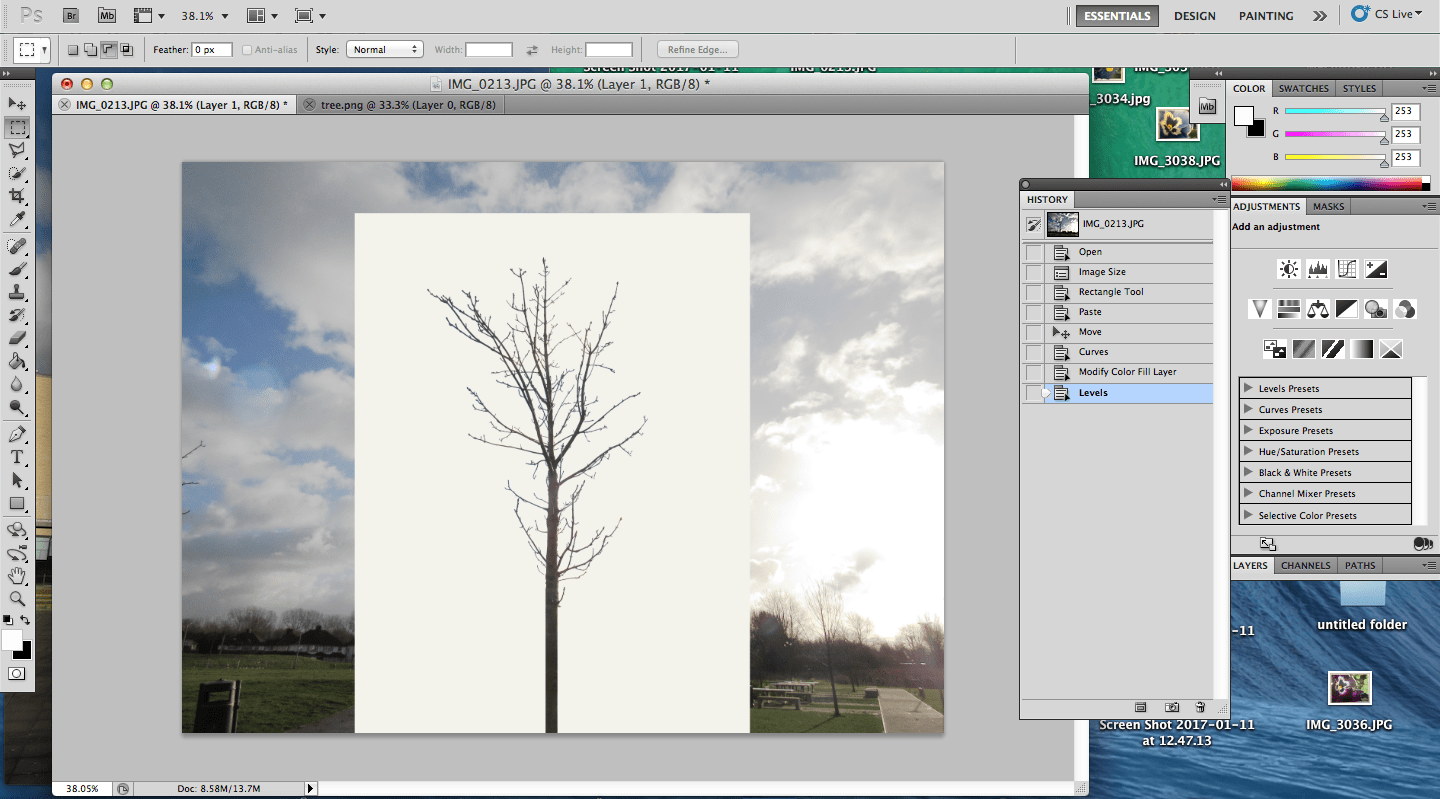
Th process of this Photoshop experience began with the selection of the tree, so that it would be isolated in the first layer and we would be able to paste it onto the second layer. This was done by adjusting the darkness of the tree, so that it would be black, and then selecting all the black areas of the image. Then was the removing of the selection of the unneeded dark sections. Once this was done and the tree was the only selection of the image, the selection had to be reversed so that everything but the tree was selected and then promptly deleted, leaving a transparent background and the tree. This is shown in the second image, wich was saved (in an appropriate size) for later use.
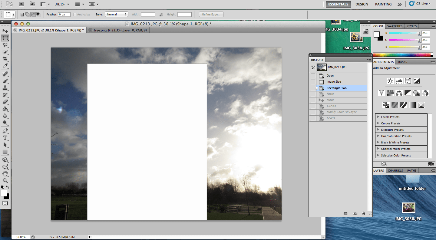
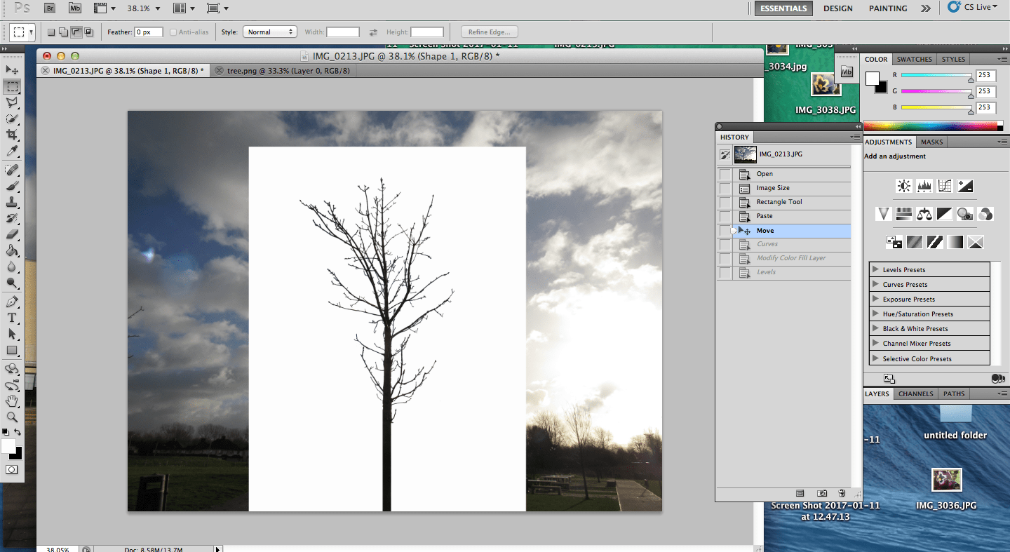
The next step was to open up a second image (the same size as the saved tree) and the rest of the process was pretty simple, consisting of drawing a white rectangle to represent the white backdrop that is used by Myoung Ho Lee, and then uploading the tree and its transparent background as a layer ontop of the first. This meant that the tree was then placed ontop of the picture in its original place because the two images were the same size. From this point, all that was need was the adjusting of the white "backdrop", making sure it was in the middle and positioned right as well as correcting the toning of the tree since it was still black from the selection process and this only involved modifying the colour.
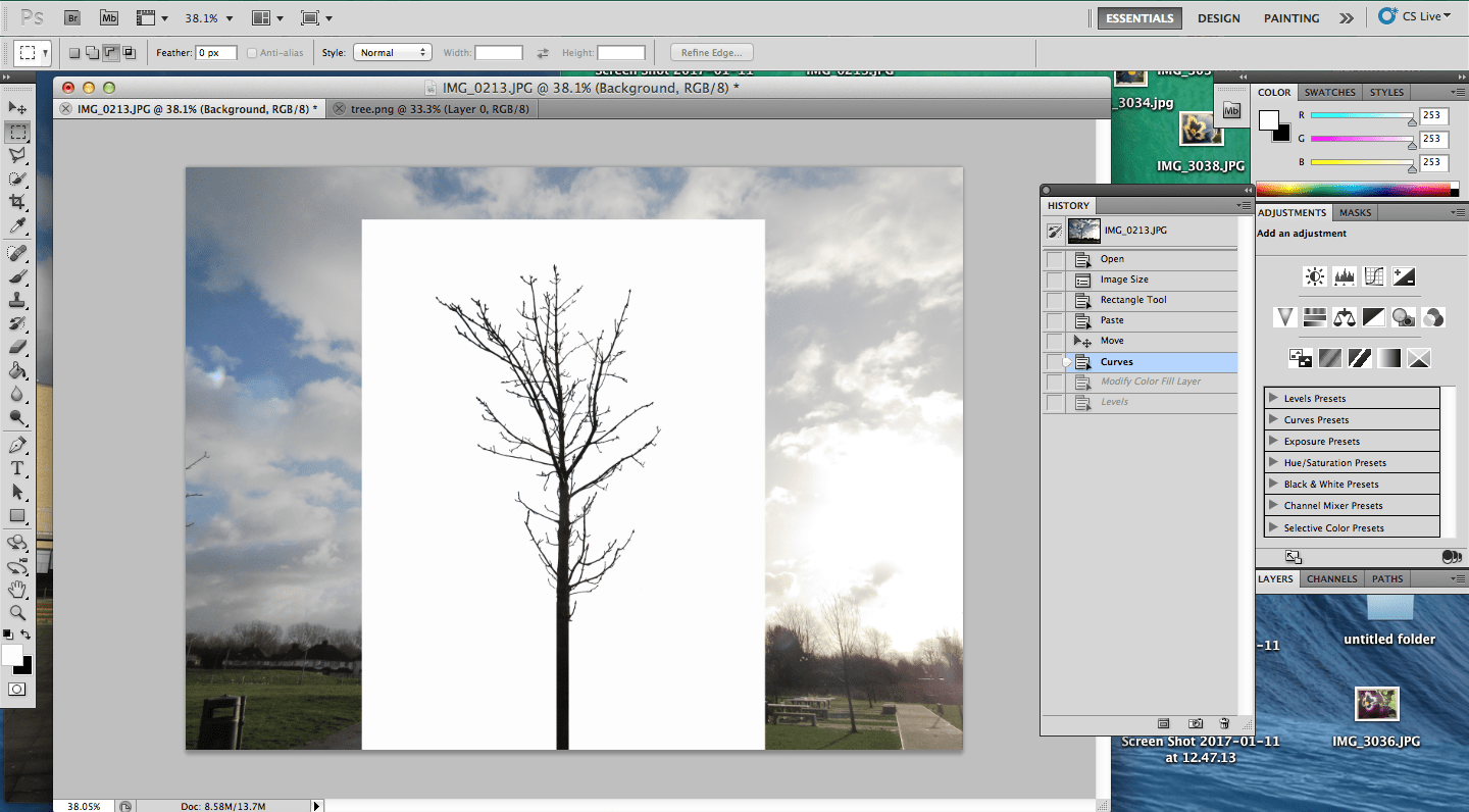
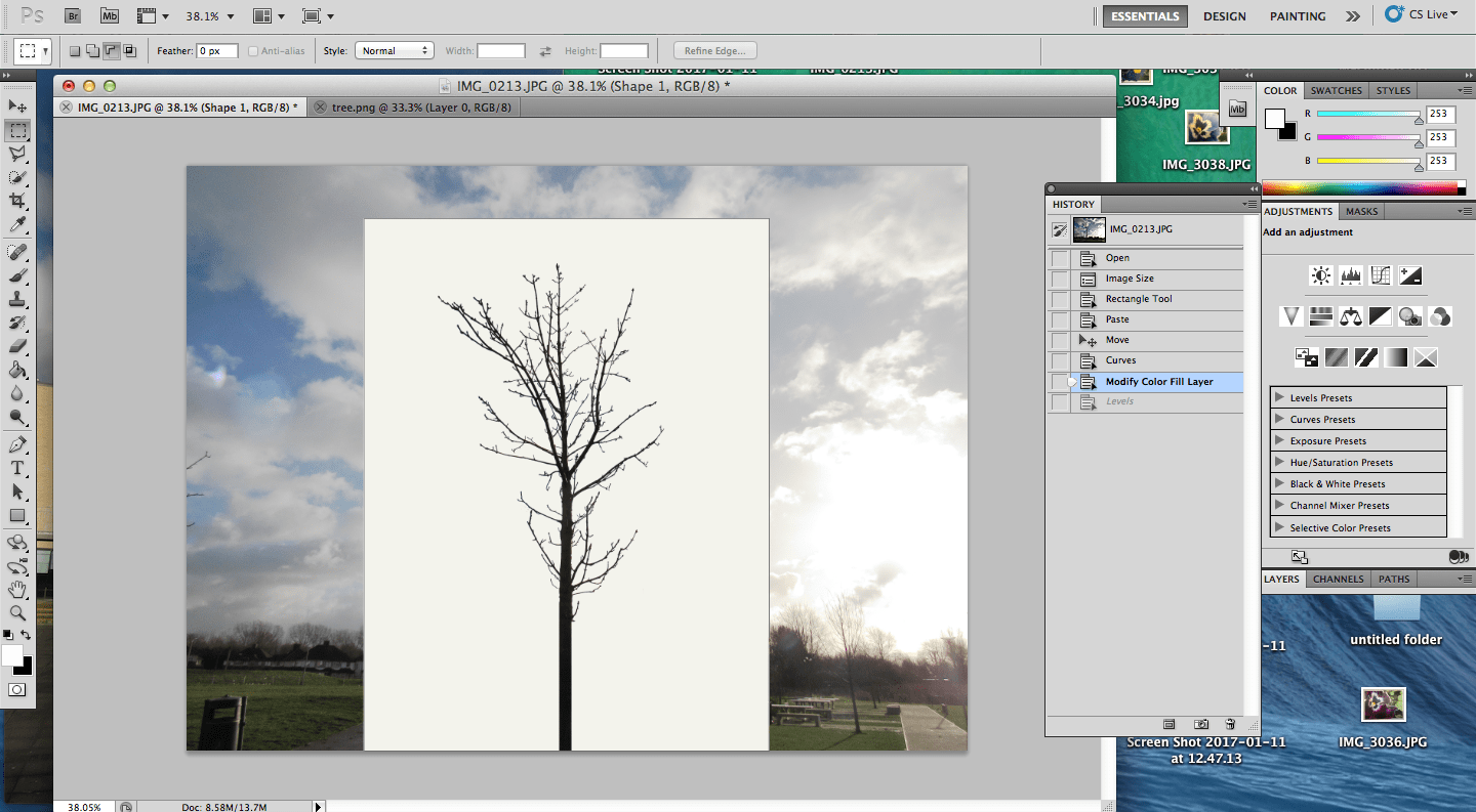
After this, there was the problem of the white box wich appeared too white and artificial, and to make it seem more real, the colour could be changed from a pure white to a slightly grey/green white. Lastly the background was tone corrected, by turning darker areas lighter and really light areas darker. This concludes the journey through wich my final outcome was achieved.
Overall, I think it was a success and I enjoyed learning how to do some of the more difficult Photoshop tricks. I think it was a good idea to try to experiment what it would be like to photoshop a backdrop on instead of using an actual one.
The next step was to open up a second image (the same size as the saved tree) and the rest of the process was pretty simple, consisting of drawing a white rectangle to represent the white backdrop that is used by Myoung Ho Lee, and then uploading the tree and its transparent background as a layer ontop of the first. This meant that the tree was then placed ontop of the picture in its original place because the two images were the same size. From this point, all that was need was the adjusting of the white "backdrop", making sure it was in the middle and positioned right as well as correcting the toning of the tree since it was still black from the selection process and this only involved modifying the colour.
After this, there was the problem of the white box wich appeared too white and artificial, and to make it seem more real, the colour could be changed from a pure white to a slightly grey/green white. Lastly the background was tone corrected, by turning darker areas lighter and really light areas darker. This concludes the journey through wich my final outcome was achieved.
Overall, I think it was a success and I enjoyed learning how to do some of the more difficult Photoshop tricks. I think it was a good idea to try to experiment what it would be like to photoshop a backdrop on instead of using an actual one.
#4Dafna Talmor
|
We had the oppurtunity to work with Dafna Talmor, an artist and photographer for a day in a workshop. Dafna was here to talk to us about her 'Constructed Lanscapes' collection. This consists of the altering of colour negatives (taken of landscapes) through cutting and/or interlinking of several images. Dafna explained that she felt this created a virtual place, and since she mostly used images of places of importance to her, there was a materialization of somewhere that combined the destinations. Dafna brought with her images from a prior neighbours family, who were deceased and when she let us experiment with the colour negatives, she explained her thoughts on how when the images were meddled with, the original ones did not exist anymore and were a resemblence of how the famil was also no longer alive. I feel as if this is a very dark interpretation - much like the dark spaces in many of her creations.
|
Dafna explained to us that her experiments did not always go according to plan, and that most were unsuccesful. That is why when my first outcome was not how I expected it to turn out, it was not a shock but rather an expectation. I understood that it required skilled hands or luck. Unfortunetly, because of my absence for the last part of the workshop, I was not able to make a second attempt, regardless of this, I am sure that I would have tried to experiment with more cutting and less colour application and instead of launching in, I know now that it is wise to dedicate thought to the process rather than launching in.
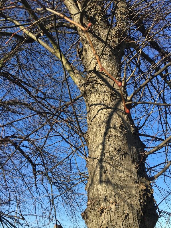
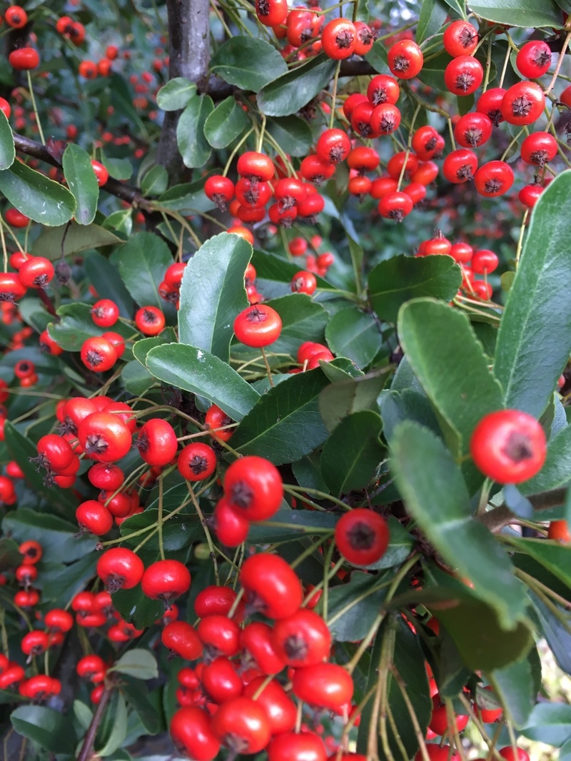
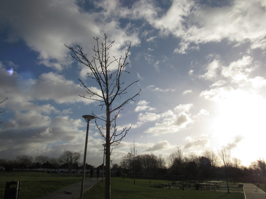
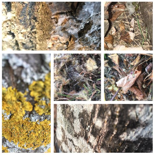
Images set #3 ; Texture exploration

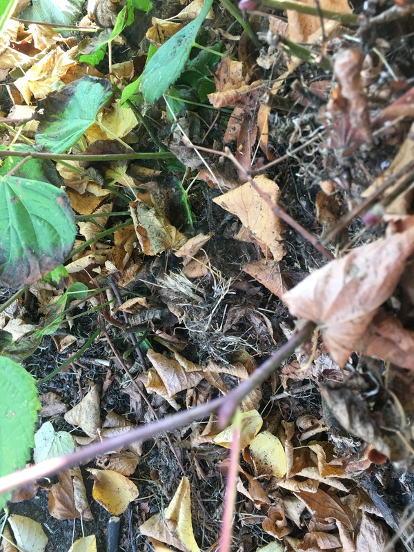
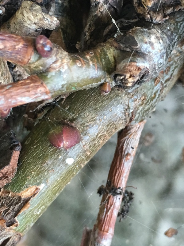
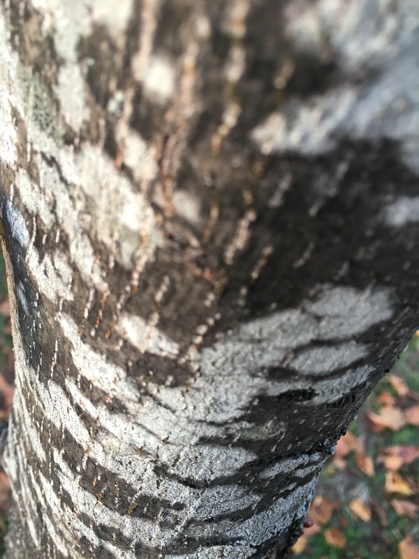
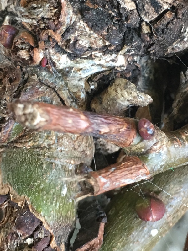
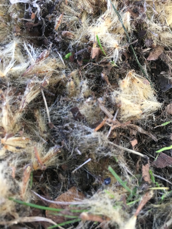
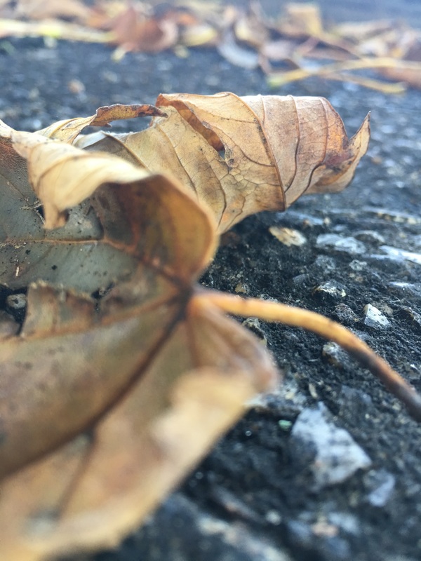
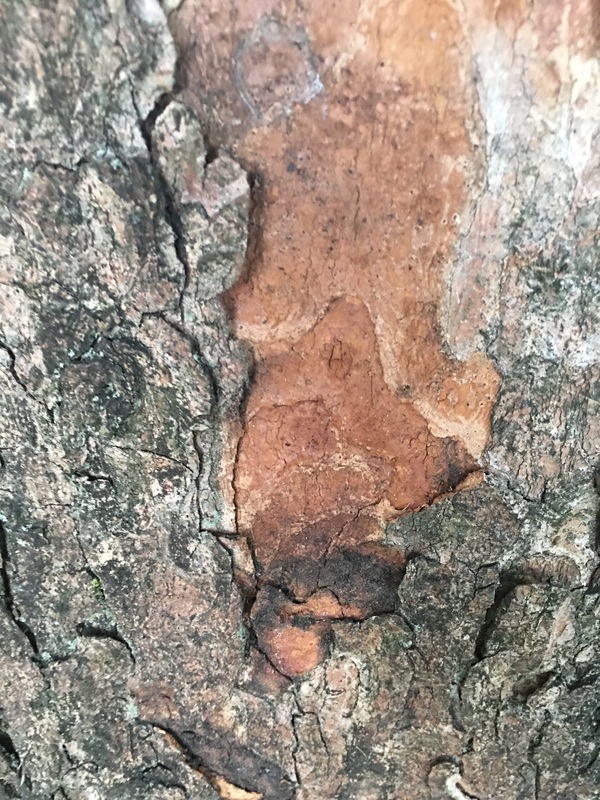
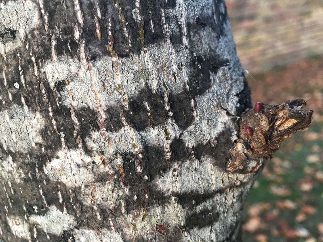
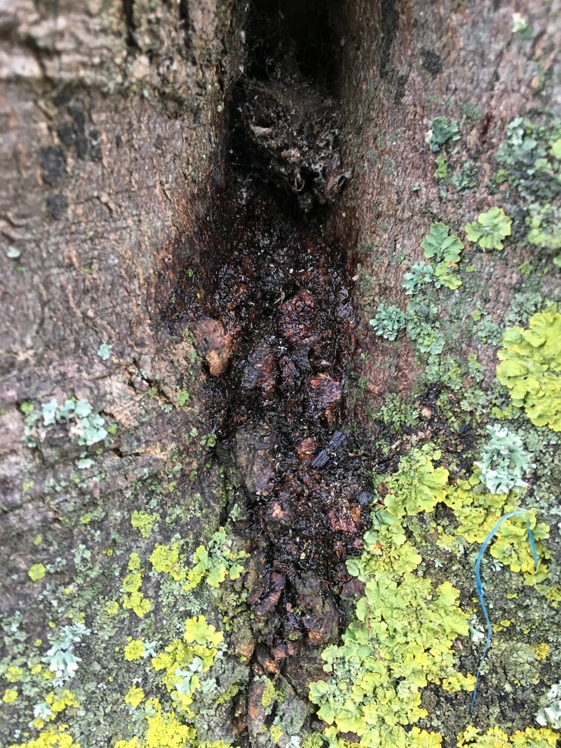
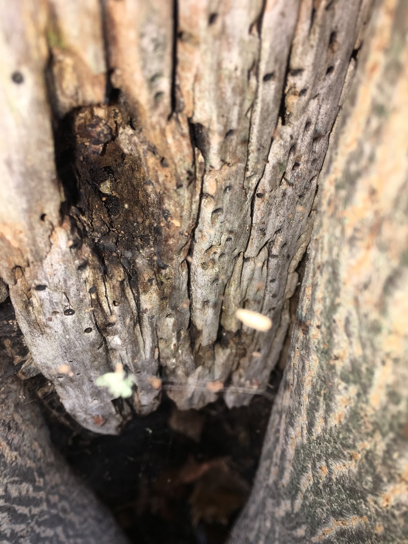
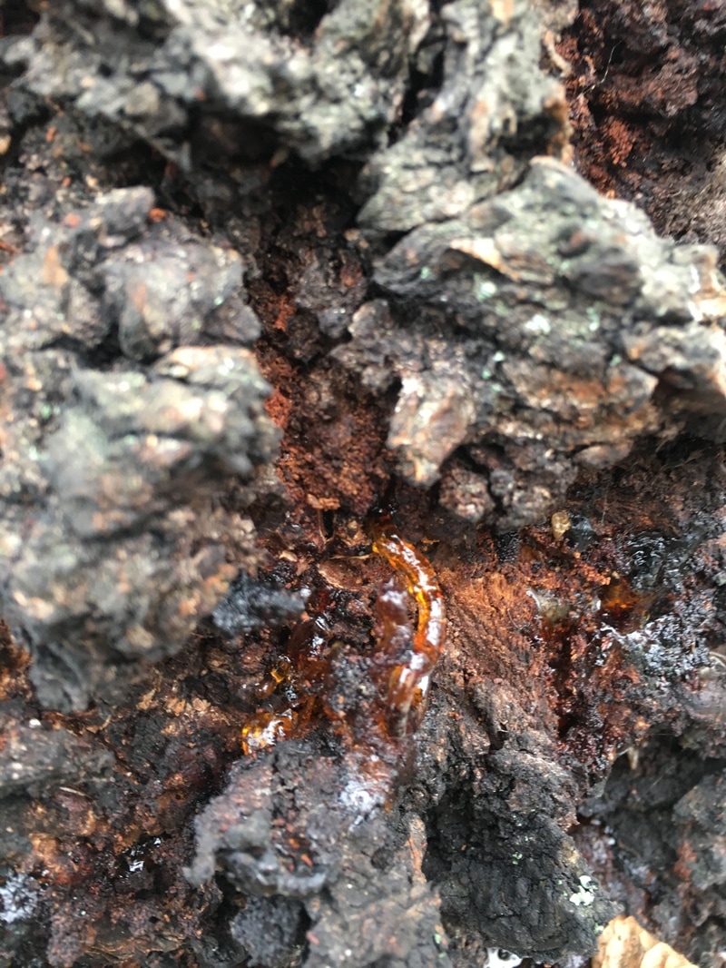
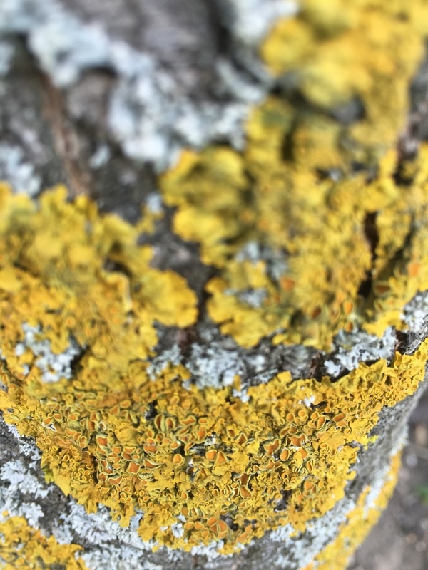
The images above were taken in a park near me and were taken in pursuit of the detail that trees and their properties provided. I used my IPhone to take these images and I feel that they are very successful representations of the natural world. I chose trees as my subject when I could have picked a large number of other narratives because I thought about the place of trees in the natural world. The idea that without trees and plants, there would be not much in existence, including humans, and that places them in importance above many other things.


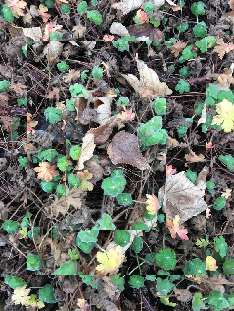
For my final outcome on these image I chose a few that would work well together. I then used an app to create a collage for the images, which is how I mounted them below. I think that this was a view into another section of my theme, seperate from what I have been researching and although I will try to develop it and incorporate it into my prior ideas, this is still an important discovery and something that needs to be documented.
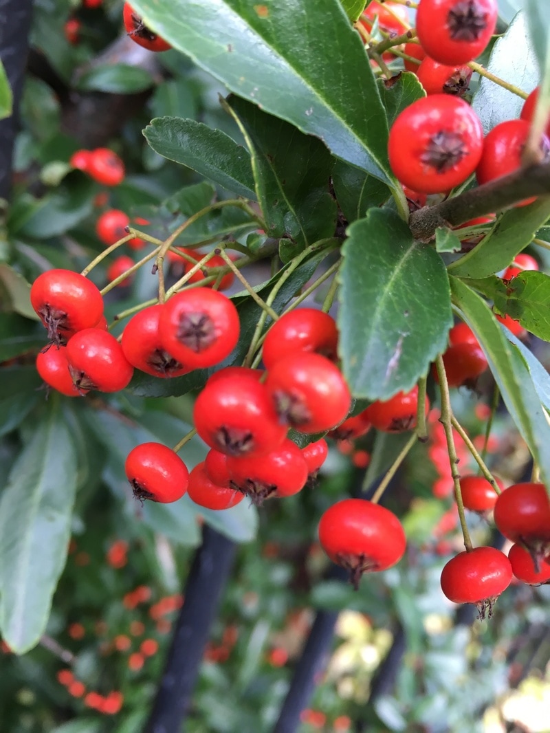
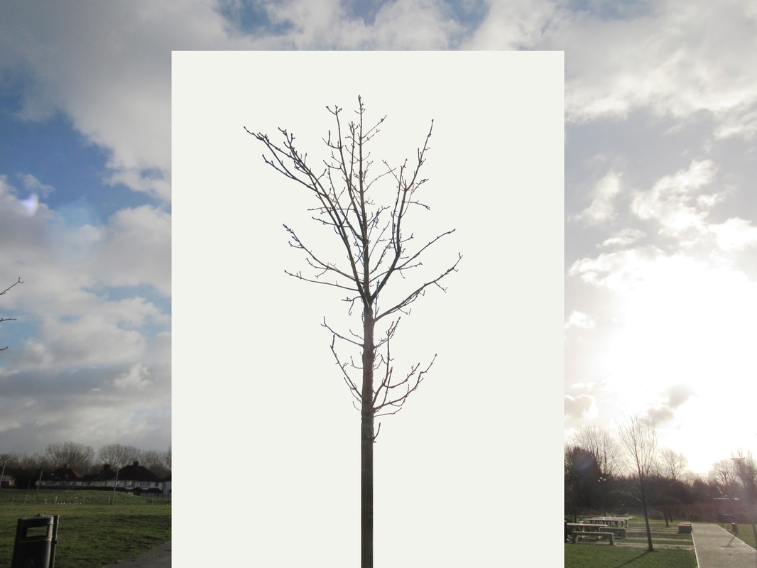
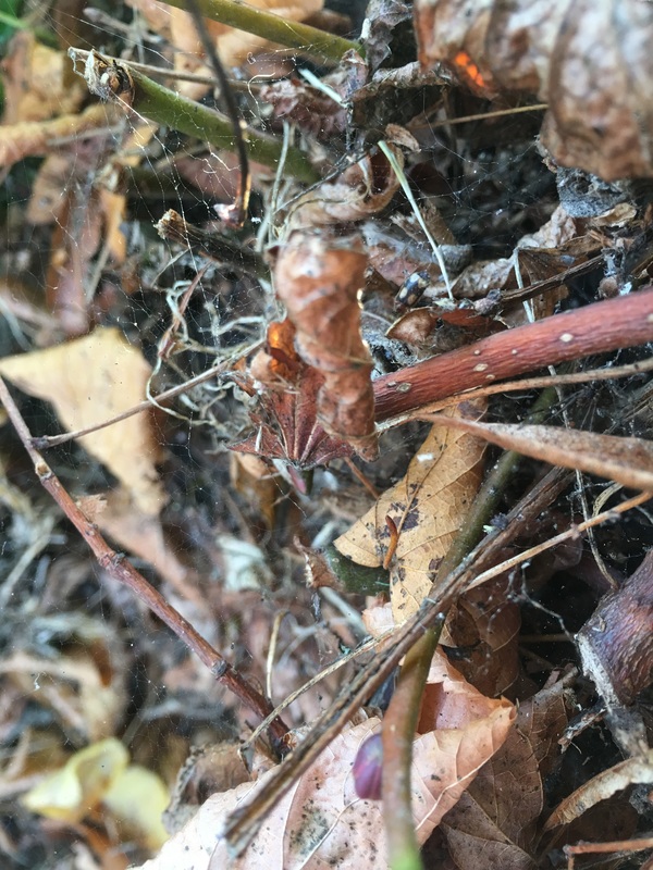
Further Exploration;
As further development from my texture exploration, and as a distant idea inspired by Myoung Ho Lee's taking of the white backdrops into nature, I decided to take the remains from the images that I used for the final outcome back where I origianlly took the images and retake similar images. The results are below. I feel as though this is just something to show that photography is a distant version of the real world and is something more like a souvenir of a time and place rather than a real presence, because a photo will only remind you of an extract of an exact moment and not a whole picture. Photographs are a containment of time and progress made does not come through in an image - thats why when I returned to the same trees there was a significant difference and change in their appearence.
Last Final Piece;
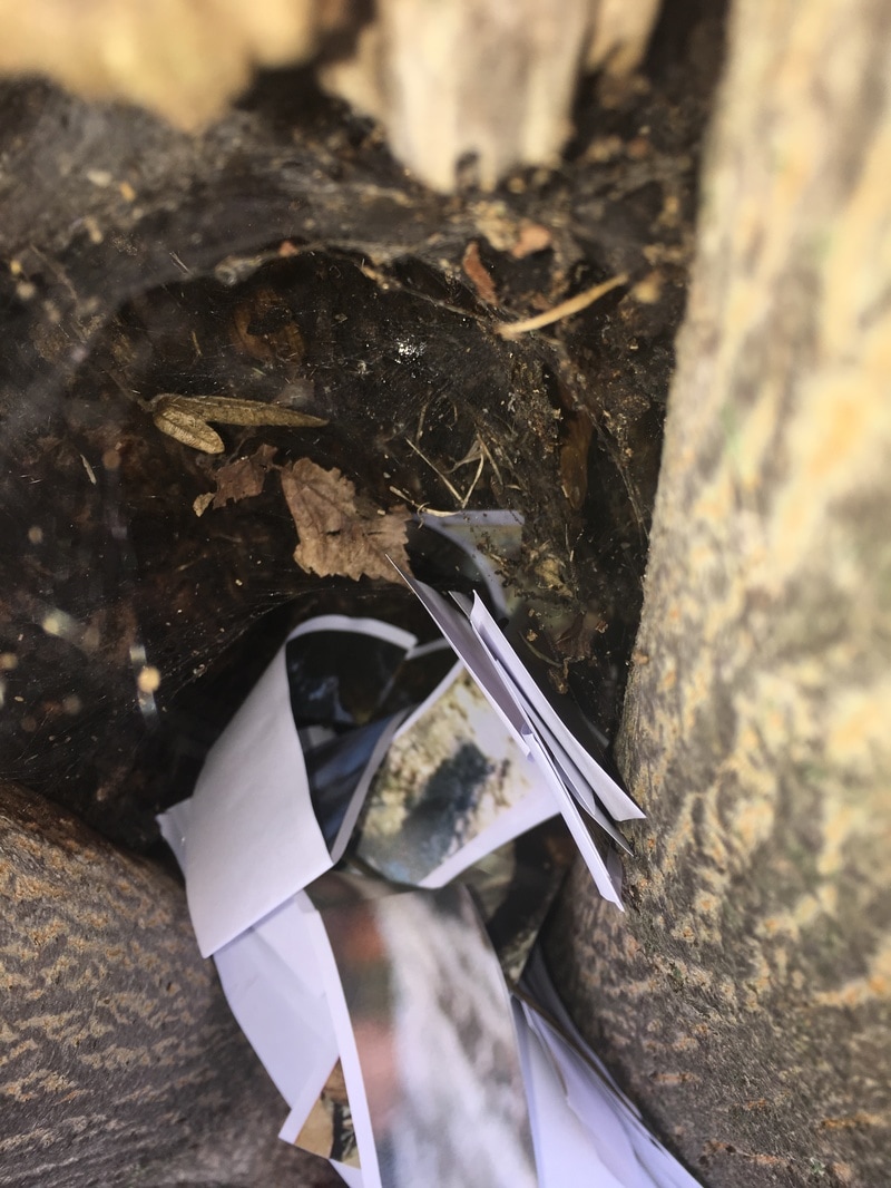
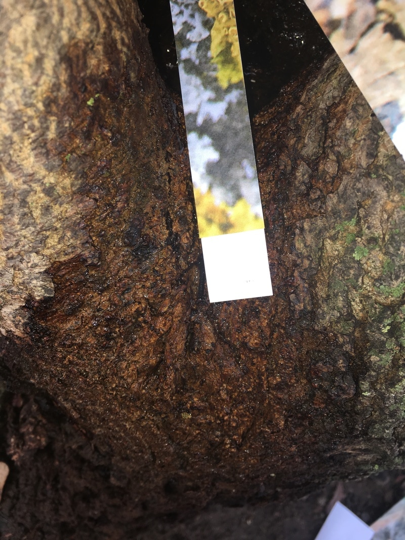
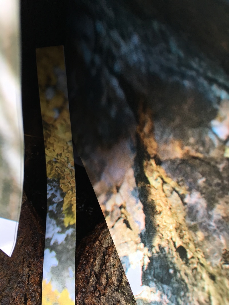
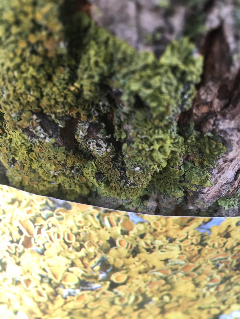
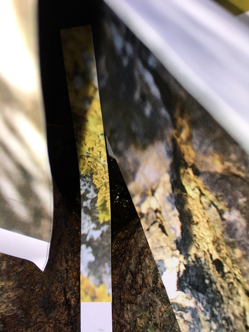
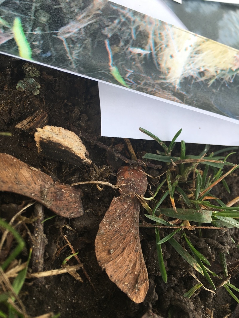
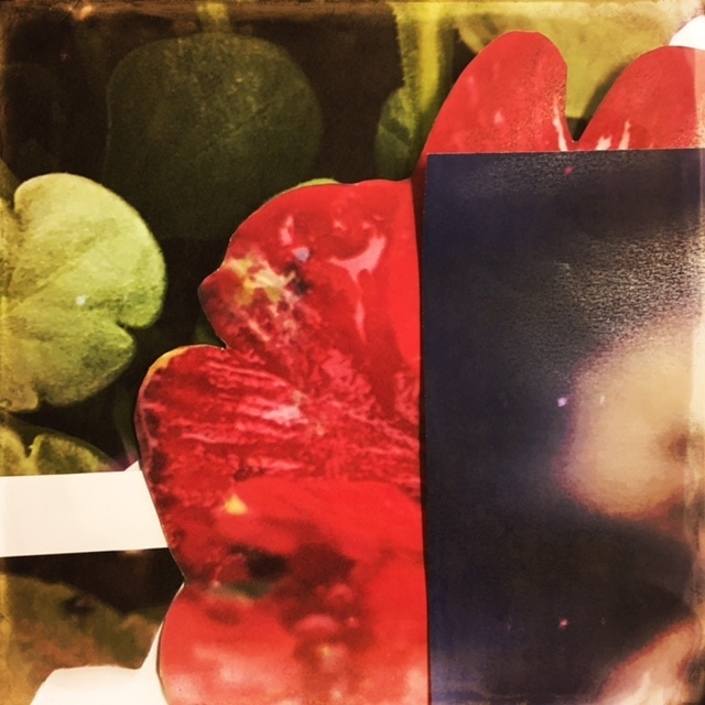
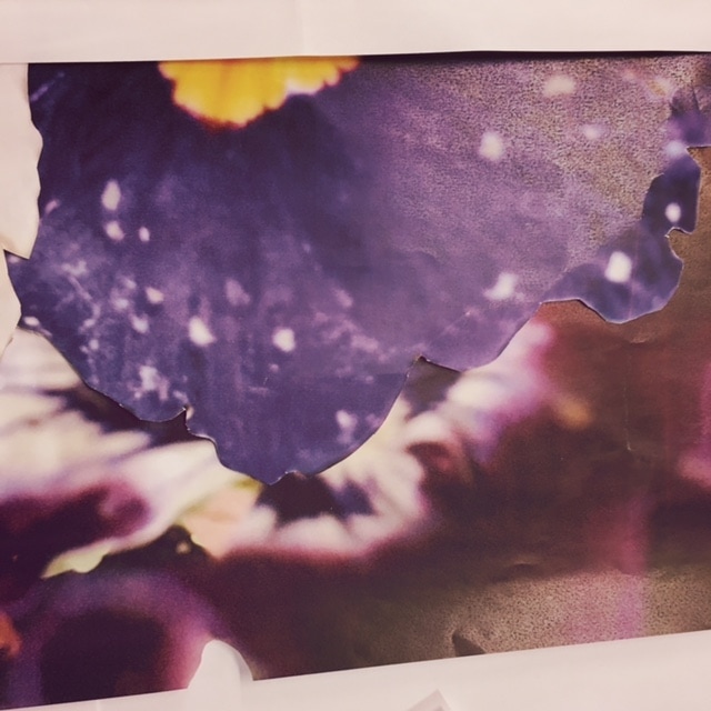
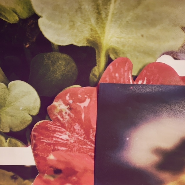
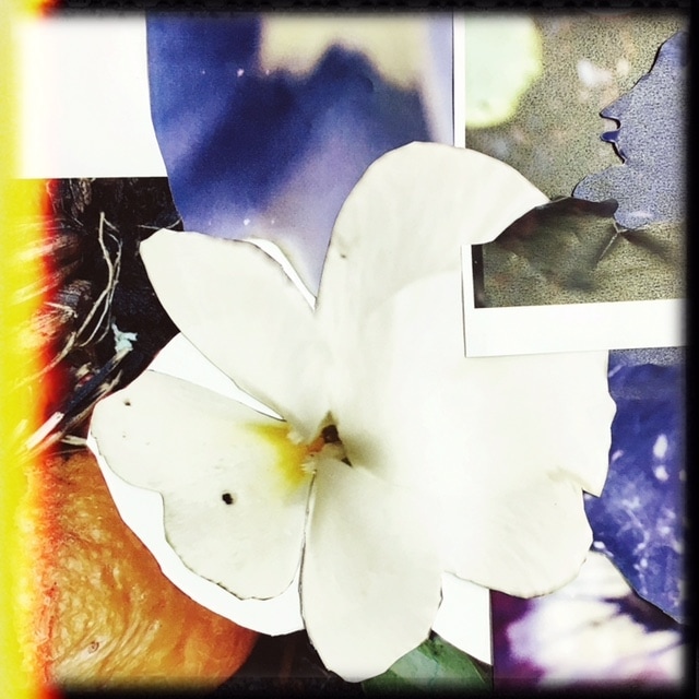
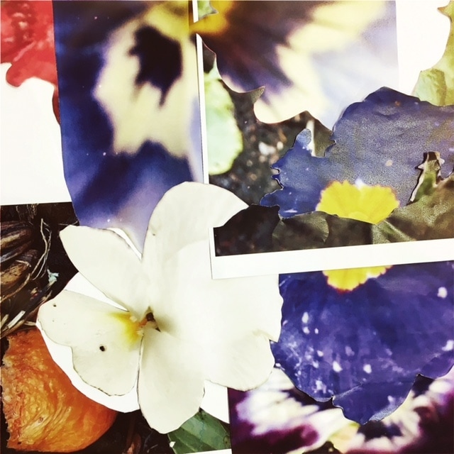
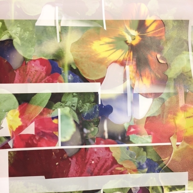
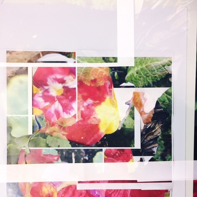
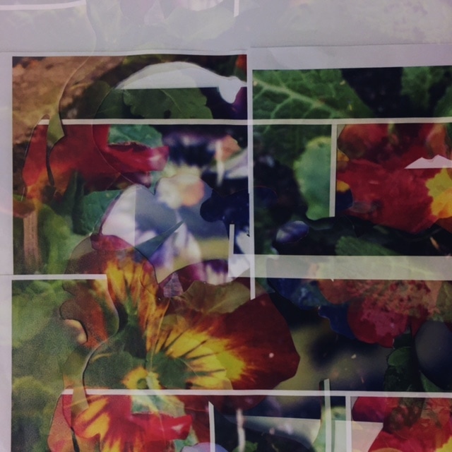
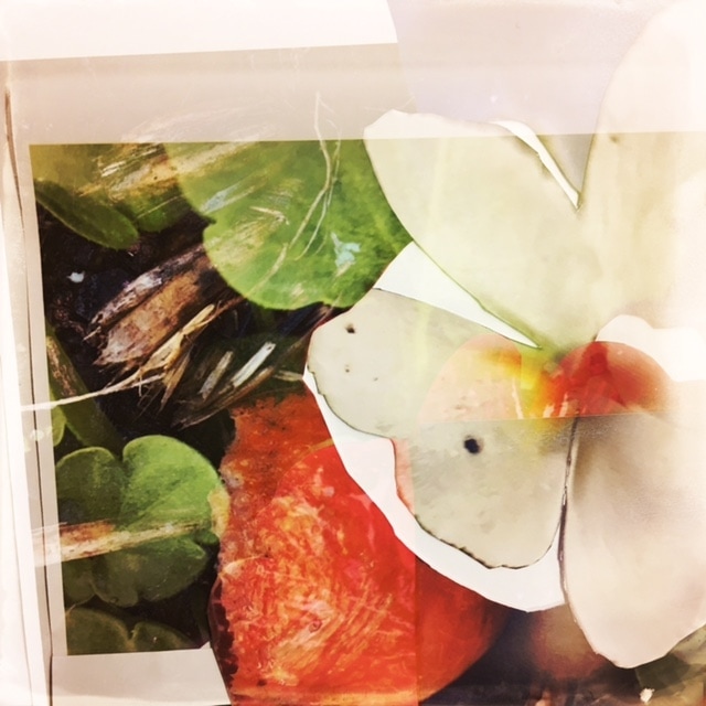
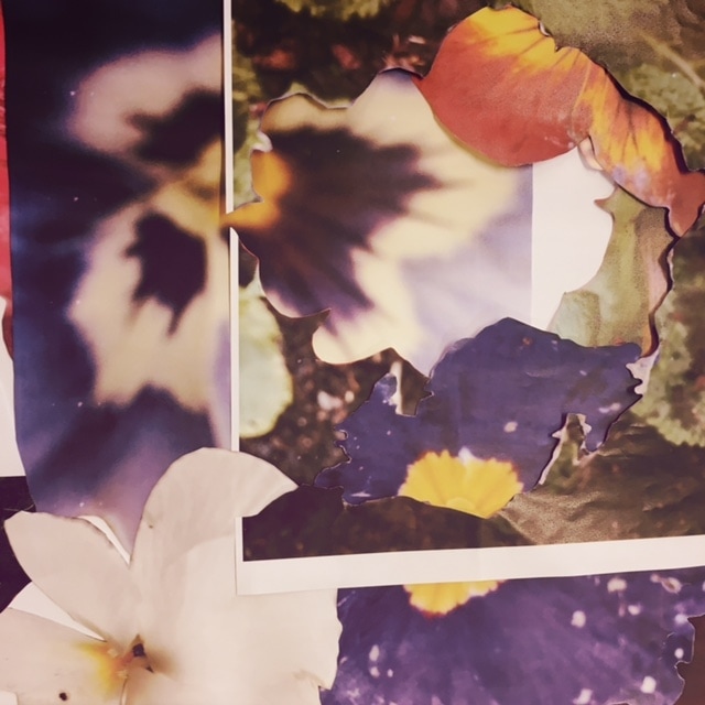
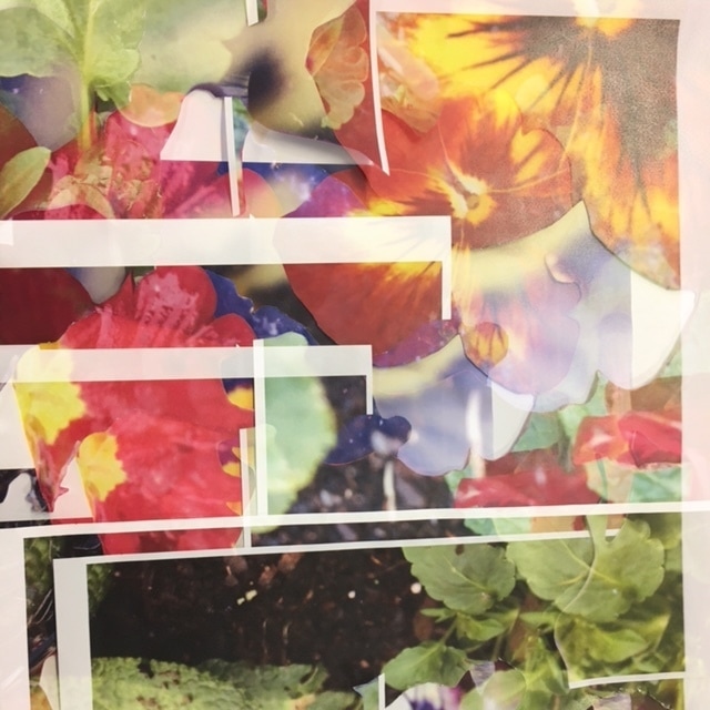
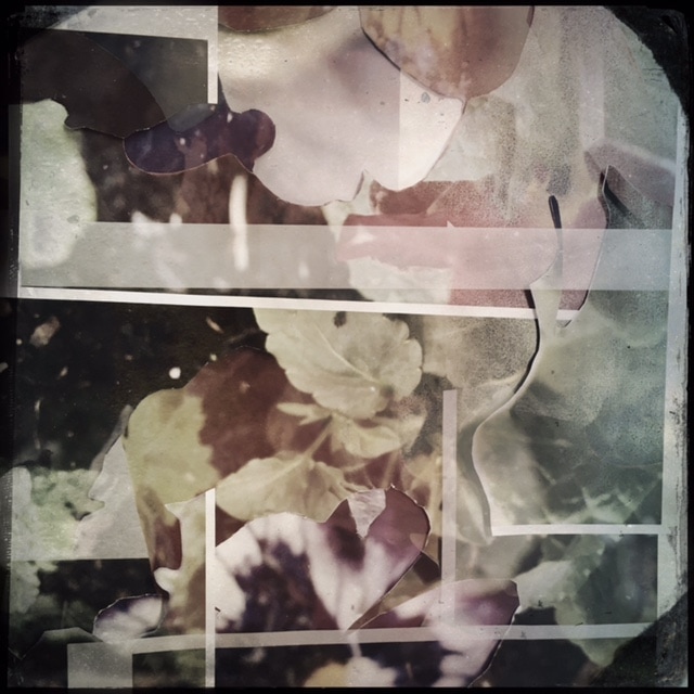
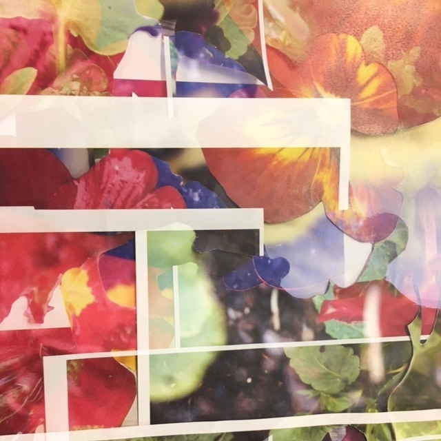
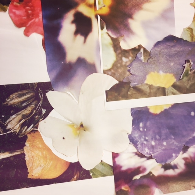
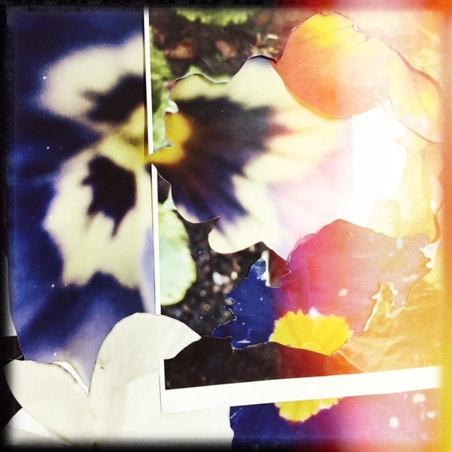
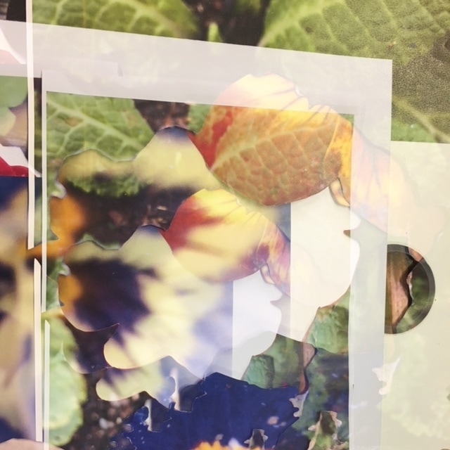
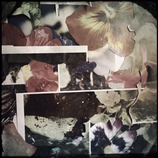
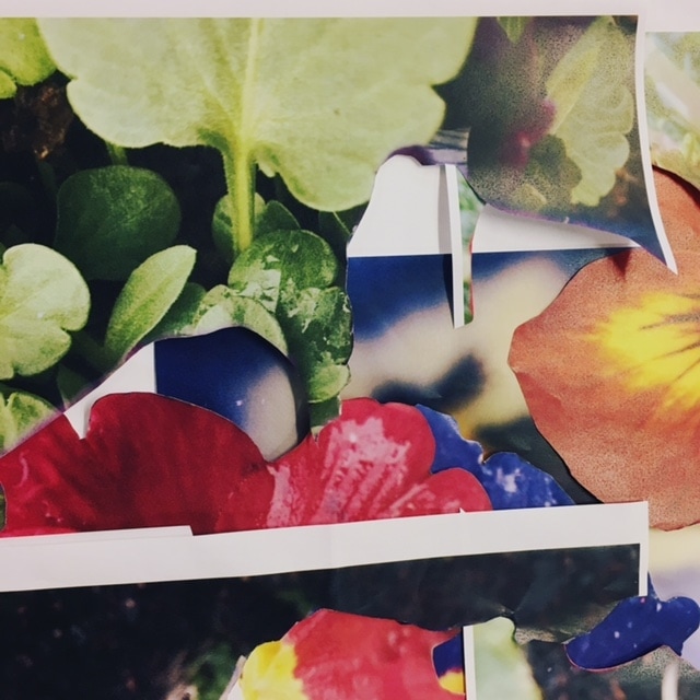
For my last final piece of this unit, I decided to bring in as many aspects of photography and this theme as possible. At first I wanted to do photograms of flowers that I'd used in previous pictures, however, after some thought and discussion with my teacher I came to the conclusion about the pictures I'd taken previously, and how I hadn't taken the process further, I then decided that I would print these images in large and cut out the flower from the prints. I did this because I was inspired by Letha Wilson's habit of disrupting the surfaces of her images and presenting her work in an interesting way. Below are the flowers that I cut out along with the paper they were cut from;
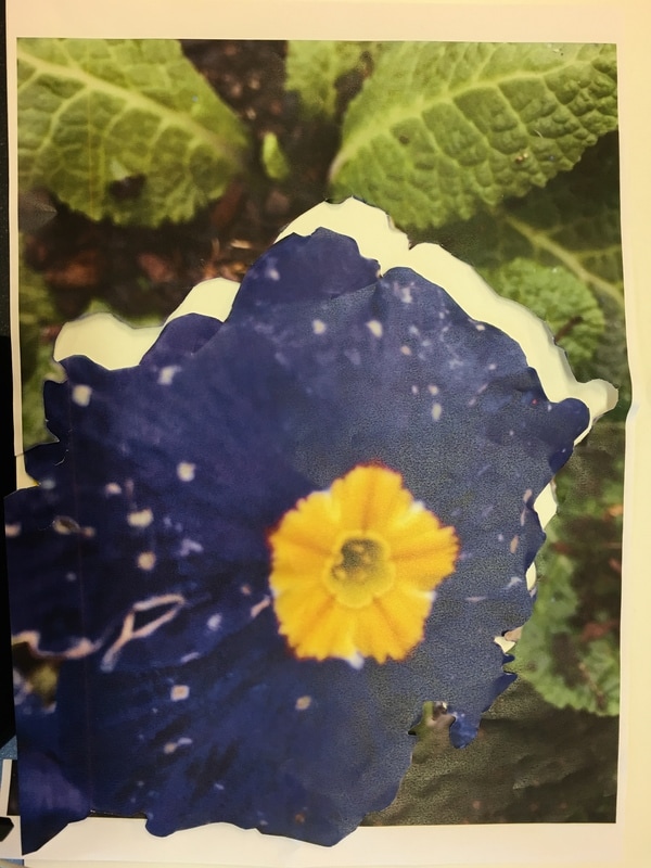
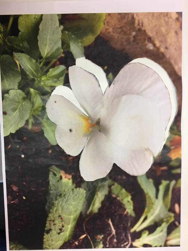
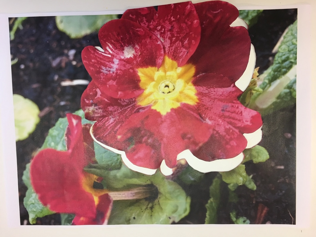
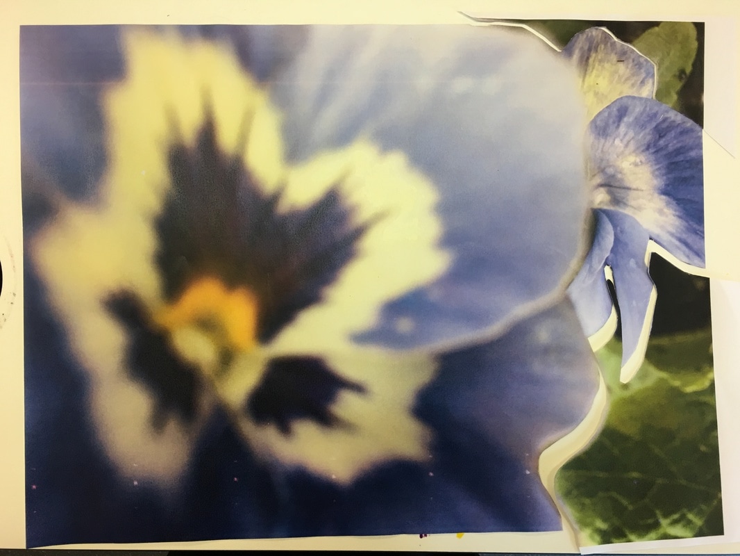
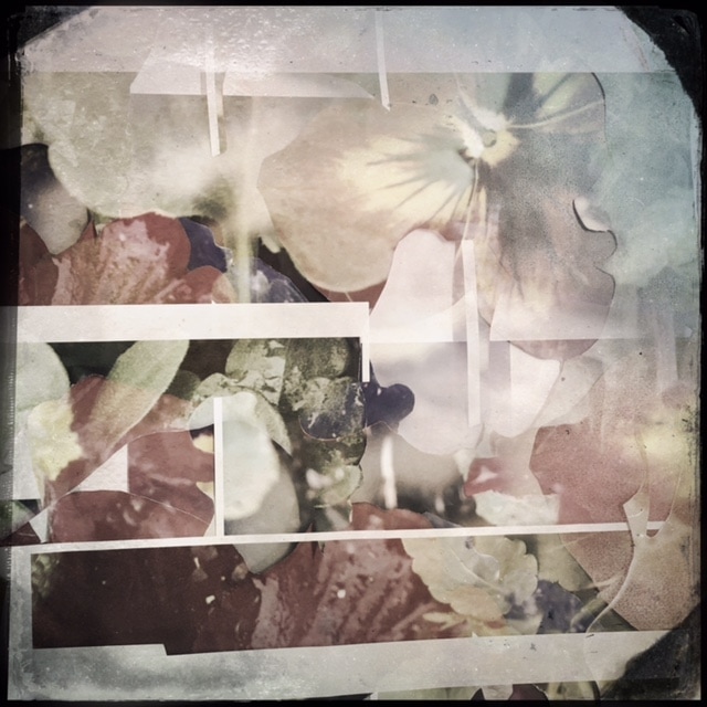
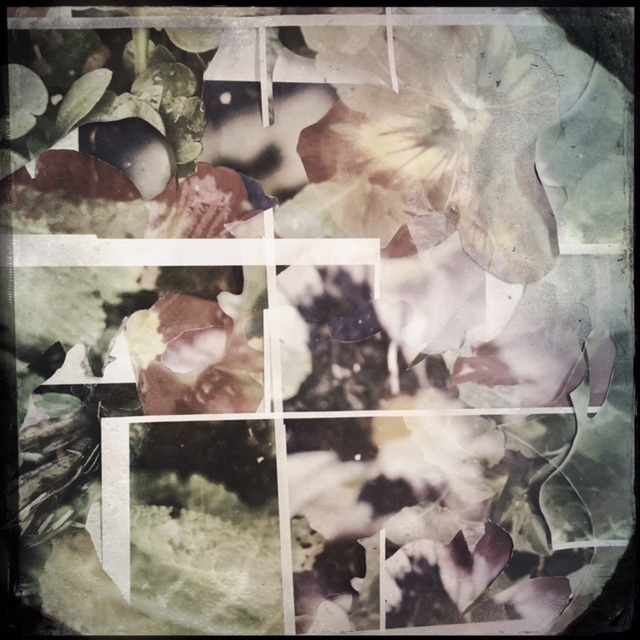
I then placed the collection of flower cut-outs and where they were cut from in an arrangement on a mounting board, but before I could permenantly mount them, I was introduced to Hipstamatic wich is an app that gives you the option to take pictures using different films and lenses. I then began experimenting with double exposure, meaning I could take two images, from any angle and distance, and the app would combine the two of them. This was an interesting procedure because I got to see what different lenses could change my work for the better, but I also got to explore the effect of these lenses and see something other than the regular lense I use everday and even used to take these images. The results are below;
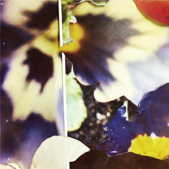
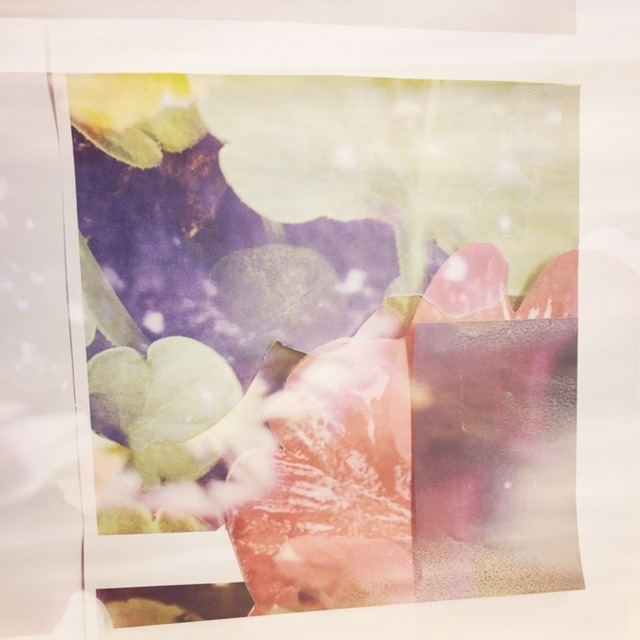
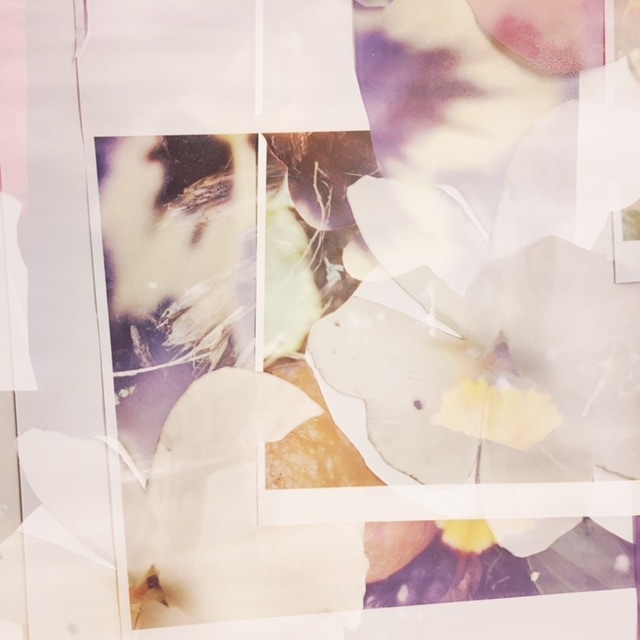
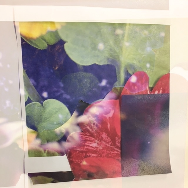
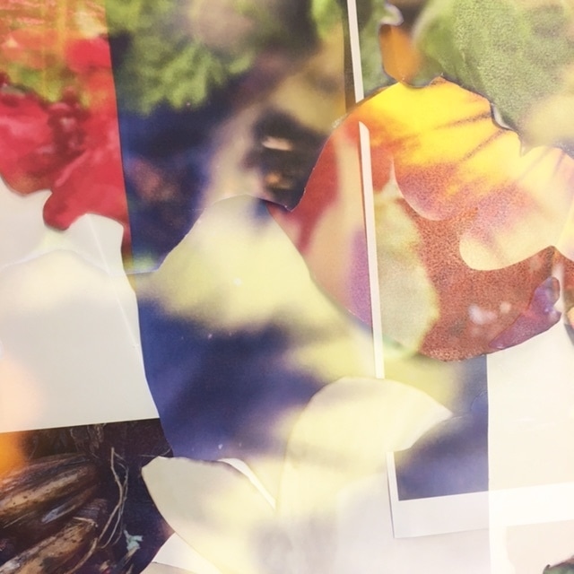
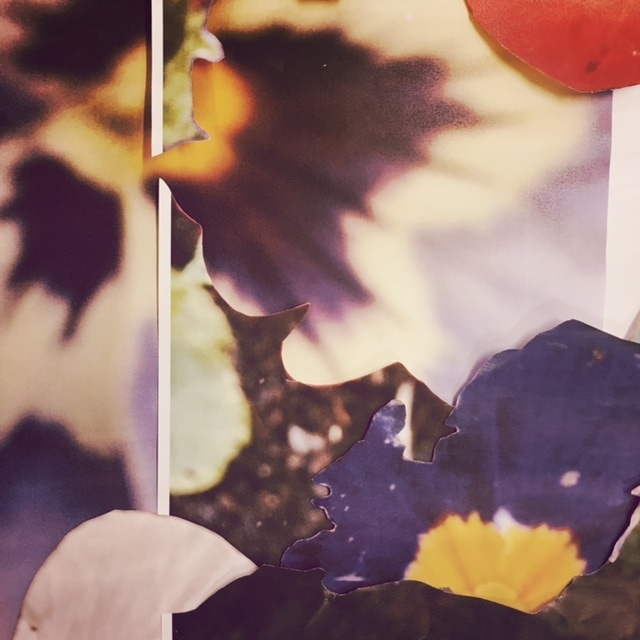

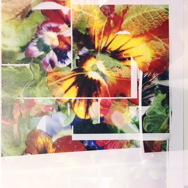
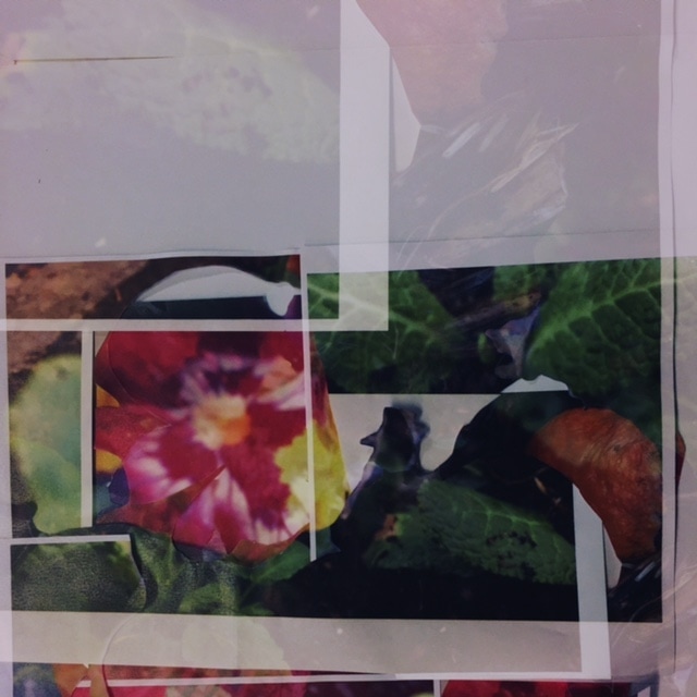
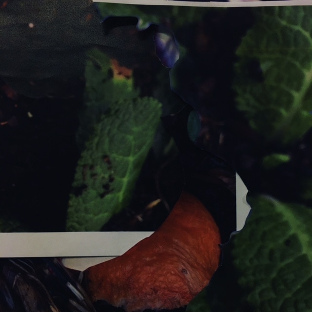
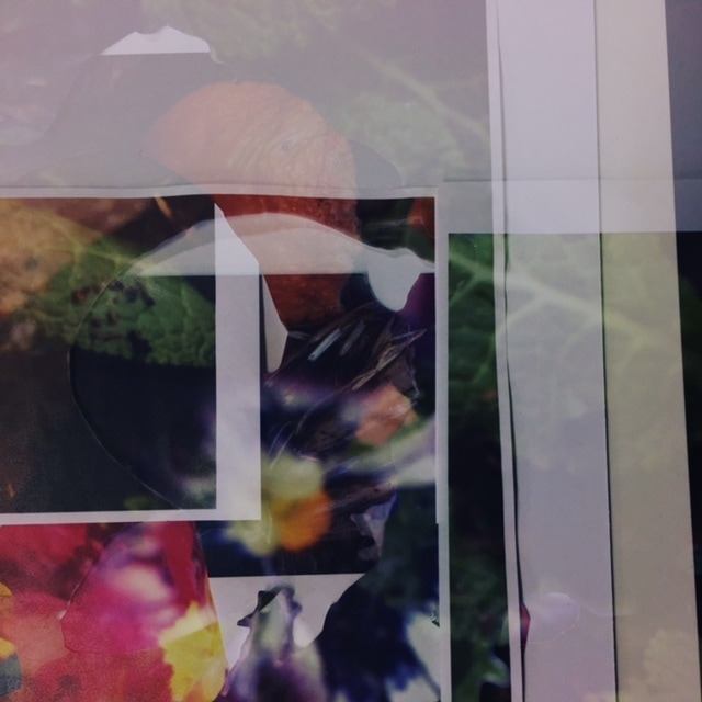
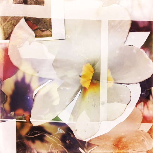
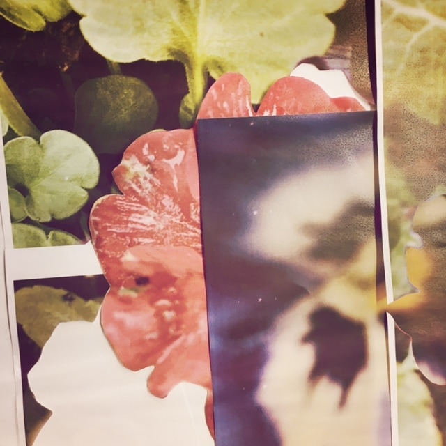

|
This is one of my favourite images from these images because it looks real and makes the subjects of the picture seem like they are authentic objects rather than printed paper, I do not think that this is one of the images where I used Double-exposure, but I know that I have changed the lens and there also appears to be an effect on. I like the contrast of the colours and the different textures that are shown through the image. The plain white section sof the image, although they would probably ruin another image and make it uninteresting seperate but also bring the image together at the same time. I feel as if the picture would be too full on and packed if there were not white sections. If I had more time to explore with these images during my controlled assessment, I could have tried thaking this picture, printing it and then putting the printed image back into the printer so I could print the same image the other way around (or another image completely) to see what kind of effect that would make. My favourite part of this image is probably most definently the colours because they are so vivid and sharp. I think that this image further proves the analogy of photography and the real world, where photography is not anything authentic and is just adaptable residue of real life because the image looks so real and like I have used actual material, wich is decieving. However this is all because I have edited it and its content has been "shaped by technology".
|
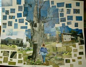
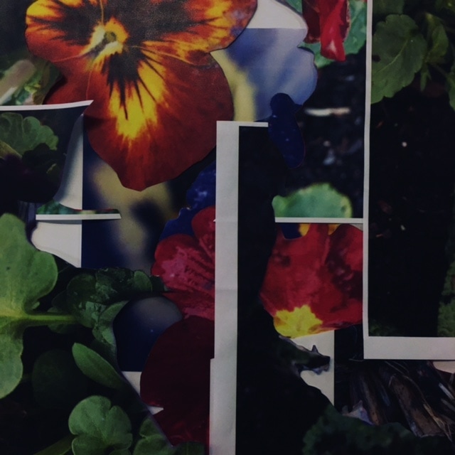
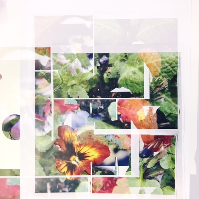
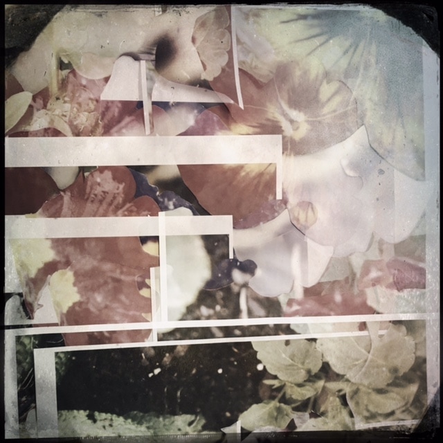
Mounted Final piece
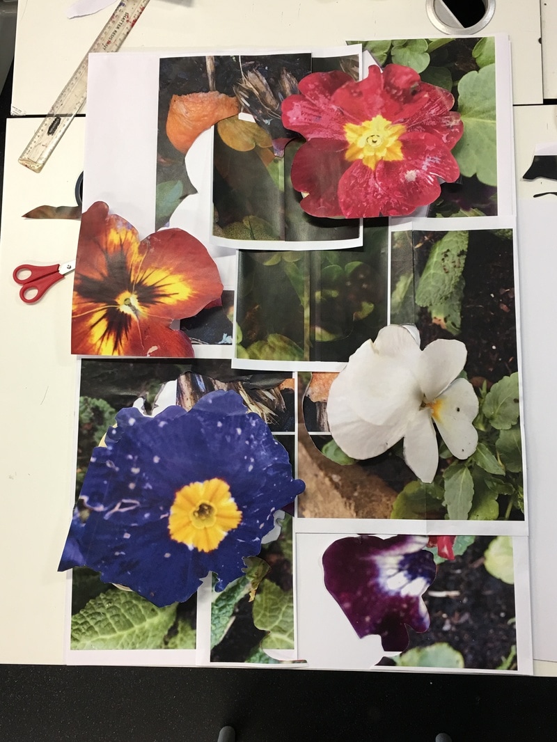
After I was done with exploring Hipstamatic, I decided to mount my images on my board,and after several chages of compostition and content, I came up with this one. The blue, white, orange and red flowers are all raised above the rest of the images and are made to appear 3D because I thought that since they were the main subject of my project and of the images I took, they should be displayed in a different way. I also kept the white edges of the images because I think they provided some insight into the fact these are images taken and printed and they somehow make the flowers seem even more real in contrast to the paper behind them.
Overall, I think this a very succesfull final outcome.
Overall, I think this a very succesfull final outcome.
