PERSONAL PROJECT - EDGES
This personal project is based on the theme "Edges". When I first thought about the theme of the project my initial thought was that it would be simple - but - as I was given ideas and encouraged to think deeper; I realized there were many interesting aspects that surrounded it.
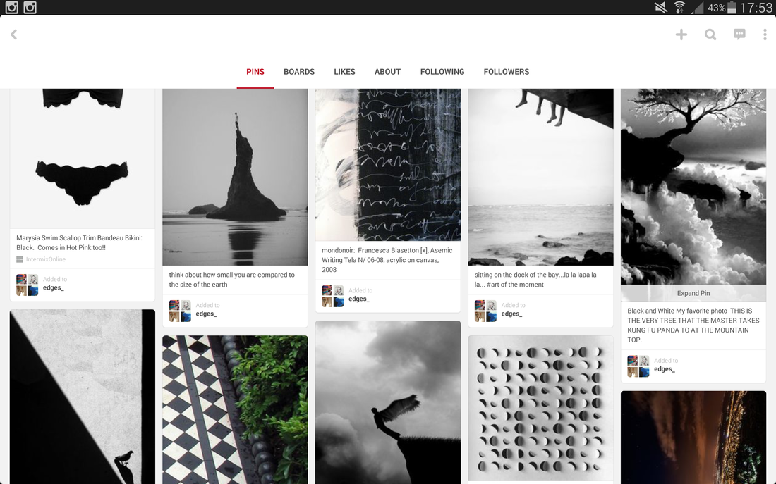
The Pinterest board below is one I made when we were asked to research ideas about edges. Click on the image to be directed to the pinterest board.
The Pinterest board below is one I made when we were asked to research ideas about edges. Click on the image to be directed to the pinterest board.
My Pinterest board focuses on emotional and obvious edges - sometimes both in one picture - I want to mainly focus Figurative edges because edges like buildings or tiles seem to overrated and apparent. I wanted to make my ideas unique and interesting.
|
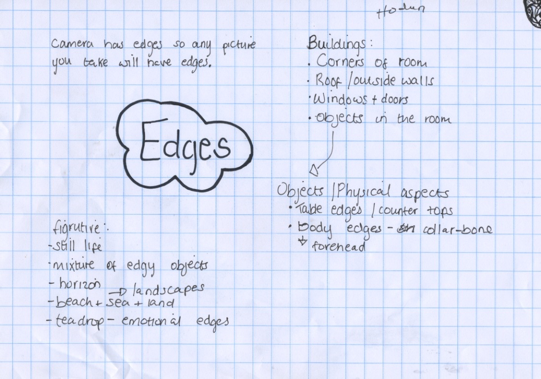
Before we fully started the project work we were asked to come up with things that represented or had edges, based on our own ideas and things we had seen on Pinterest but also on other websites ( for example; I used Tumblr as a main source for ideas).
This sticky note was used to jot-down anything that came to mind or that I had seen. My least creative idea was probably the buildings because that is evident - my more creative ideas were the Figurative edges and the fact that any picture has edge because a camera lens is square. (click on the picture to get a full view) |
Attempt One; Edges using iPods.For our first attempt at taking images that focused on edges, we used the I-pods and a range of apps (such as Hipstamatic). I used an app that uses greyscale on the pictures. I like the greyscale because it focuses the picture more on the edges and less on the colours.
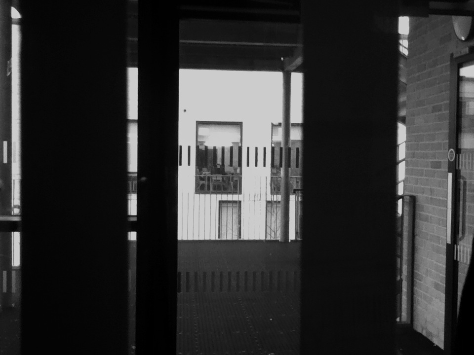
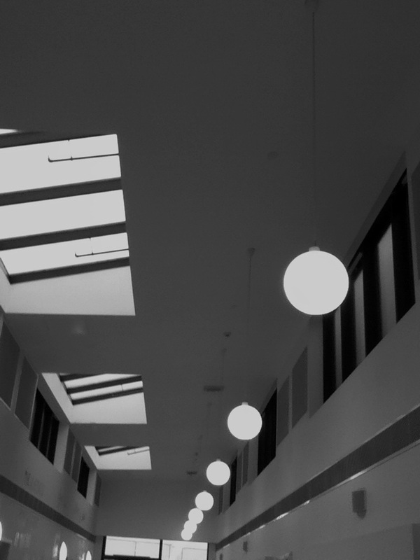
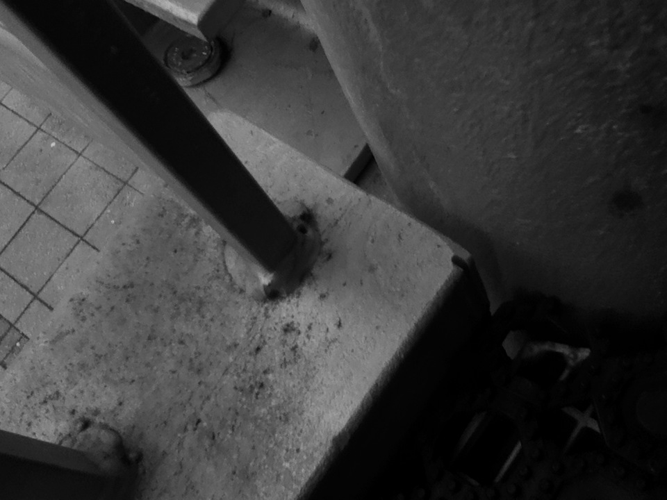
Pictures taken at home: |
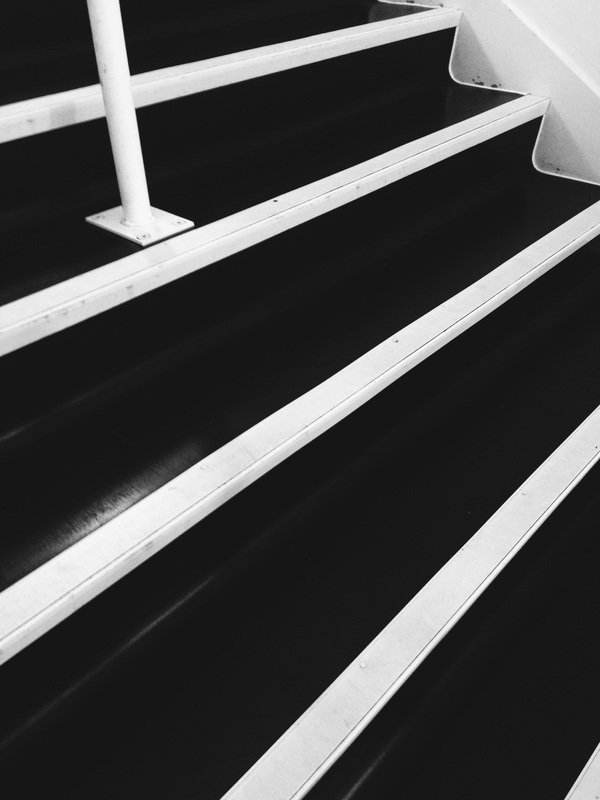
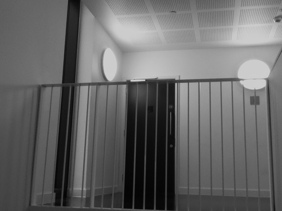
This picture is one of my favourites out of all the pictures I took, I think it turned out really interesting for a picture that is of the stairs. It doesn't go with what I am planning to be my finishing project but it is defiantly a picture that I am proud of and will try to fit in my project.
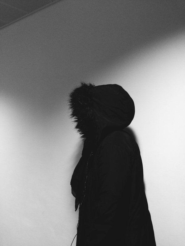
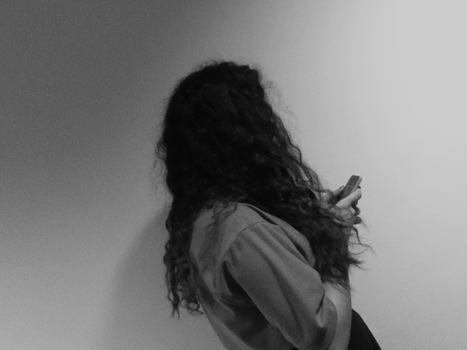
This picture was taken off me by a fellow classmate. The idea was to create a silhouette of me, wearing my black jacket, against a white wall. It turned out more engaging than we thought it would. and I like the fact that it will fit in my theme of Figurative Edges.

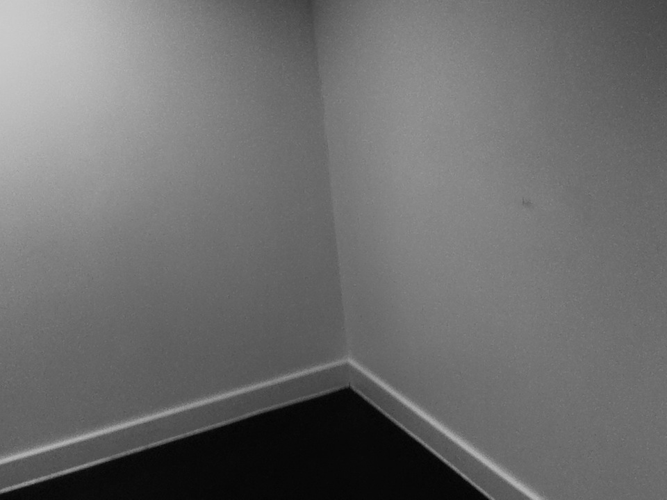
This is an image that didn't turn out well for me. I thought that it would be interesting, and while it is still a good picture, it is not something that would catch anyone's eye or compel them. I was thinking about using Photoshop to edit it and make it more intriguing.
|


|
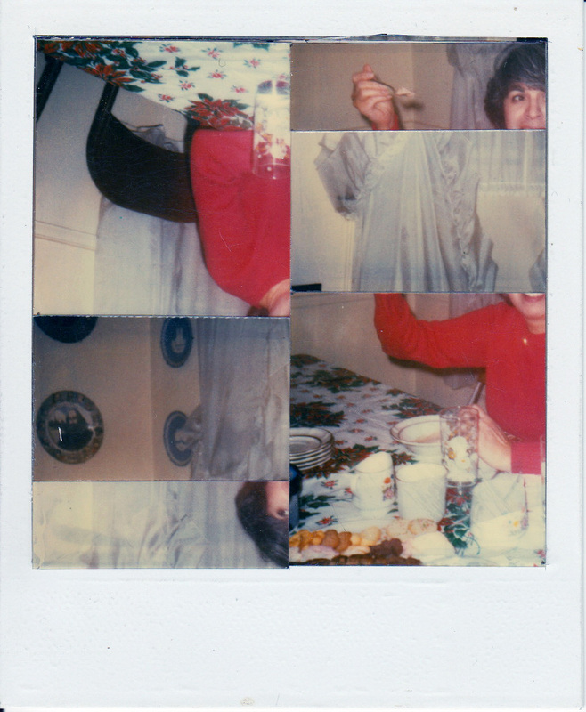
This is a full image of the picture we were asked to annotate.
|
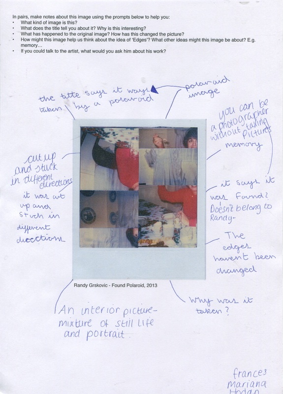
We were given this image by our teacher to mind map around before we did our research on Randy Grskovic. Looking back on my ideas I think that me and the other two classmates I worked with had a good idea about this image.
Artist Research
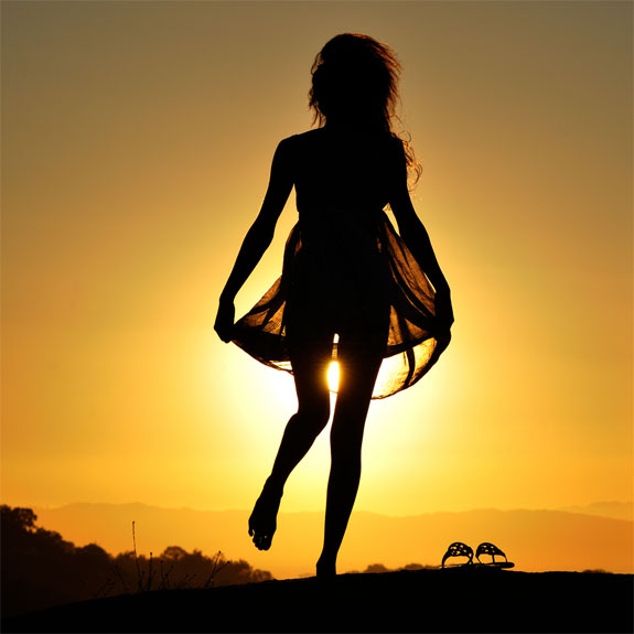
The artist I have chosen to research is called TJ Scott, who is in fact not a photographer but a film-director. He was born in Canada but is based in Los Angeles. What intrigues me about his work is the use of silhouette's.


|
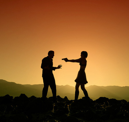
To the left is my favourite image by TJ Scott, it has a meaning behind it and is also a silhouette. There are many questions that come along with it; like why is the female holding a gun toward a male? What happened to get them in to this situation.? Are they on a mountain?
What I like most about Art and Photography is the questions and unlimited imagination that comes along with it, and since that picture offers all of that - it is my favourite by TJ Scott. Above is a slideshow of more of TJ Scott's work.
|

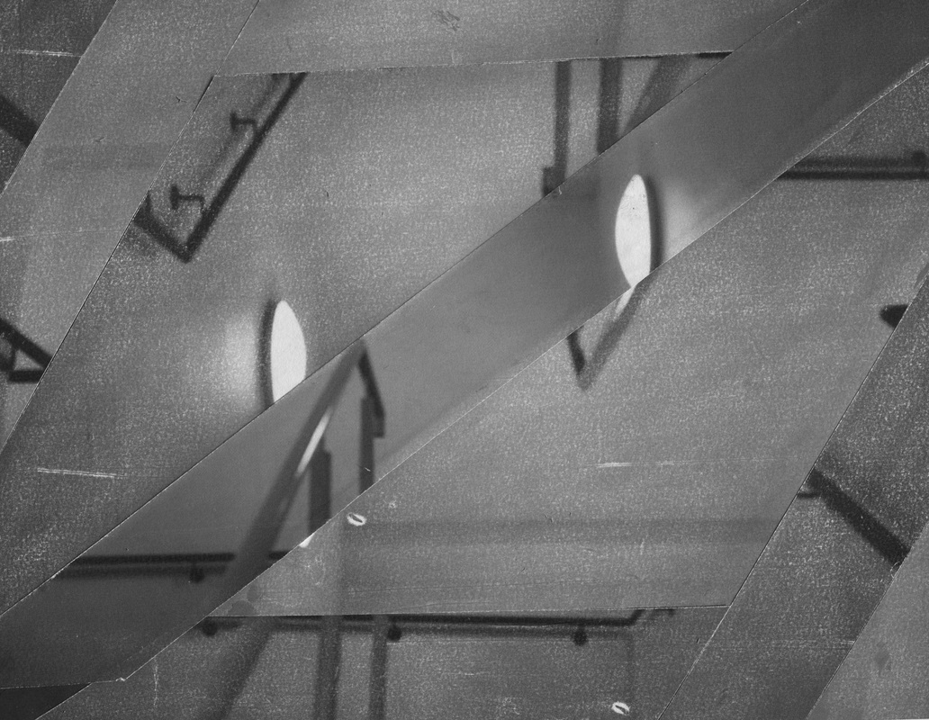
Using Randy Grskovic's work as a stimulus, This is my attempt at cutting up a piece of work (taken by me) and putting it back together.
As you can see, only one strip does not have white dots on it. This is because once I had rearranged my image I used a rubber to fade out the pieces apart from the one in the middle. The one piece that hasn't been faded out is also from another copy of the same image (mostly because I accidently cut the other one).it is not to un-realistic and you can still tell it was staircase railing but it is harder to tell and you have to look closely.
As you can see, only one strip does not have white dots on it. This is because once I had rearranged my image I used a rubber to fade out the pieces apart from the one in the middle. The one piece that hasn't been faded out is also from another copy of the same image (mostly because I accidently cut the other one).it is not to un-realistic and you can still tell it was staircase railing but it is harder to tell and you have to look closely.
WWW; The overall outcome of the image was great. I especially like the contrast of the fading. I also like the way the railing are all over the picture and not in one place like they should be.
EBI; I need to be careful whilst making it, most of the work is improvising based on mistakes. Like the idea of fading came from glue and the strip of image came from the fact that I cut it. The piece of work didn't come out like I imagined it would and so I wont know if the original idea was better.
EBI; I need to be careful whilst making it, most of the work is improvising based on mistakes. Like the idea of fading came from glue and the strip of image came from the fact that I cut it. The piece of work didn't come out like I imagined it would and so I wont know if the original idea was better.
Photoshop
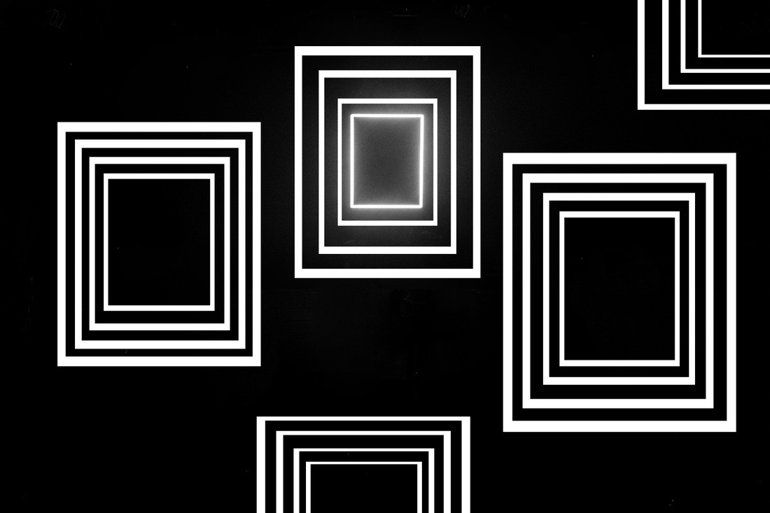
Photoshop is something that I have used before so when we were shown how to use it for creating edges on the inside of an image - I struggled to get the hang of it. Once I understood what we had to do though, I started exploring creative ways to make edges. within an image. below is my first example;
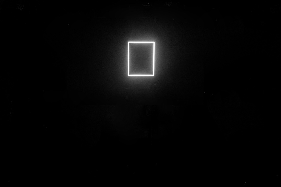
This is my first attempt at creating edges inside of a picture after I learnt how to use Photoshop. This image started of with the glowing rectangle near the centre of the page and I develop it on from there. Using the shape drawing button - I made a small (but larger than the first) rectangle around the original rectangle. If you press shift the shape you are drawing will come out equal, in this case mine would have came out a square, but I didn't want that so I didn't press shift. I then made another two rectangles around each other. By the time I had done this and idea was forming my head; I began making another group of rectangles to the right of and identical to the first group. once I had done that, I began on another set on the other side of the first group of rectangles. At this point I stopped to look at my work. I thought that maybe it would look better if I made it look like a pattern. That is why I created edges of a group of rectangles at the top right and in the middle at the bottom.
|
WWW; I think that this picture turned out great for my first try on Photoshop and I have managed to insert some edges into the picture. What I like most about the image is the fact that it looks like a pattern, something that would be on wallpaper or tile.. I also like how only one of the boxes glows.
|
EBI; This image could have gone better if I had used a variety of shapes - instead of just rectangles. Some people would find this boring. I also could have tried to make more edges within the image itself.
|
Photoshop - Final Piece

|
|
|
|
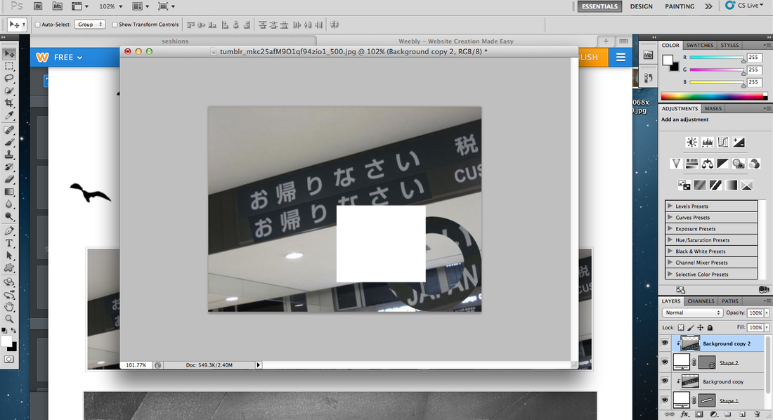
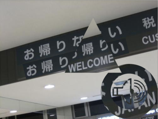
This is what I decided was going to be my final piece on the Photo shopping edges section for my Edges project. I began with a simple image I found on Tumblr and used Photoshop to create shapes inside it. I started of with the writing of "WELCOME TO JAPAN" which was in both English and Japanese. I used a rectangular box to cover up the English version and covered it with the Japanese version. once I had done this I thought about where the picture was taken and what it is of. Because it is an airport I thought about the main aspects of it. the noise was the first thing that came to mind and so I used the shape of a microphone with waves coming out to put in the corner. I then put a circle around it so that it looks like a sign. the next thing I did was to make a triangle and put it over the writing so that you could see the word welcome overlapping the Japanese.. I did this because otherwise the picture might have been confusing.

|
WWW; I liked the way I used the shapes to represent something that the picture already represented and also how I used my "EBI" from the last Photoshop and used a variety of shapes to create edges within the picture.
EBI; So far I have no Photoshopped images which include colour or that are mine so my target for the next time I use Photoshopis to use a picture that is mine or varies in colour. 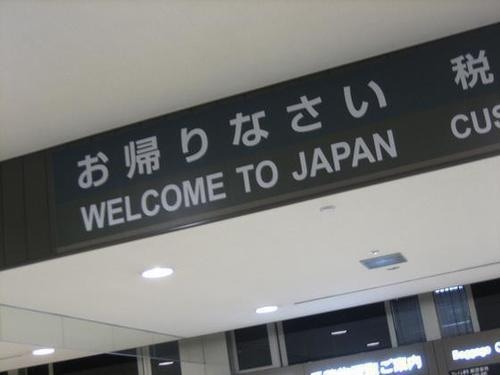
|
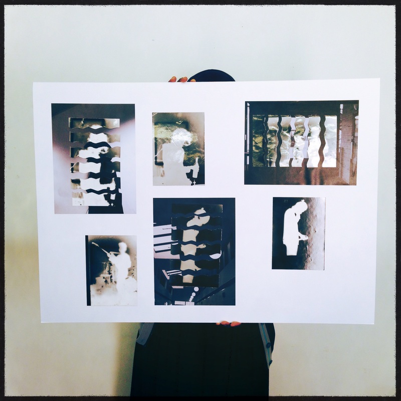
Edges Project: Final Piece
For my Final Piece on this project I have decided to focus on the idea of silhouette as an edge. I have decided to use Photograms to represent these silhouette's because of the black and white effect it causes. Below are the Photograms and a description of how I made them.
|
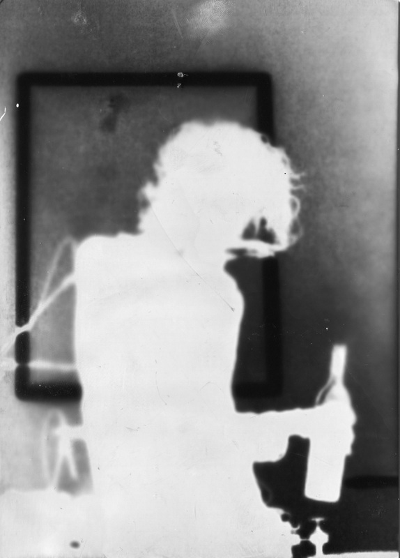
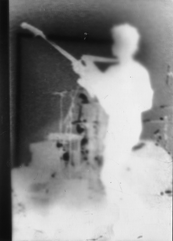
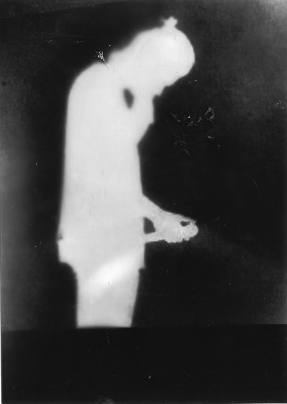
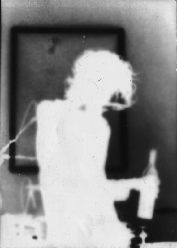
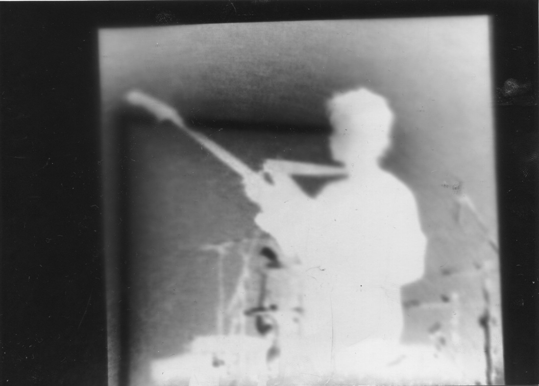
These are silhouettes of a musician that I made in the Dark room. The process in which I made them is quiet simple, but very effective. Firstly, I printed out a few pictures of the silhouette of a musical artist that inspired me. The images I printed are to the right. I then took the pictures to the dark room where I positioned them (one by one) onto light sensitive paper. Once I did this, I developed the Light -Sensitive paper and what came out was a monochrome negative Photogram.
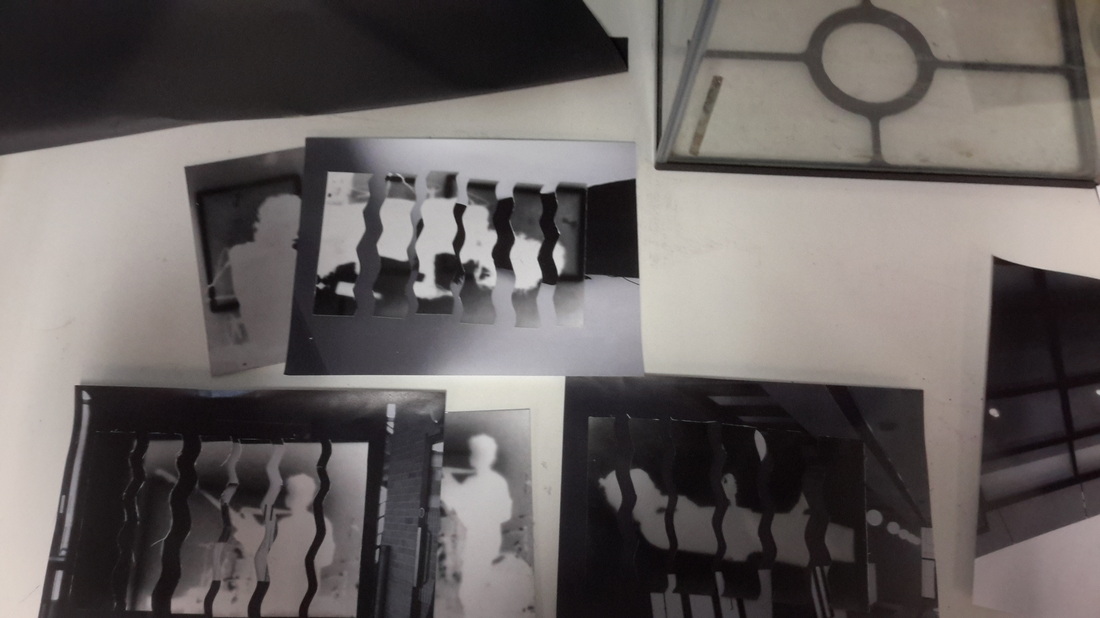
As you can see below, I cut the Photograms so that they were the same size. Afterwards, I sliced the Photograms using a wavy pattern. Because I had made two Photograms of each image I planned on using - I had time to practice cutting it neatly. Once I had done this I decided on the image that I was going to stick the pieces of Photogram on, I chose my favourites from the pictures taken with the I-pods. Sticking down the images was a matter of knowing if the pieces were in line or not, which wasn't difficult but I struggled on with the first image. |
|